Tag: mutual funds

The Path Dependency of SIP Returns

Our previous post on Lumpsum vs. SIP returns showed how, given the way returns are statistically distributed, lumpsums tend to perform better than SIPs. The analysis side-stepped a lot of issues with using a single market-price time-series by fitting the weekly returns of the index into a Generalised Lambda Distribution and then using that model to run a simulation. This may not seem “real” to most investors. Even through the weekly returns obtained by querying the model is from the same distribution as that of the index, it may not reproduce the exact path that the index took. In this post, we will present a simpler analysis that should be more intuitive.

Random sampling

Most SIP/DCA investors setup a monthly purchase and let it run for a period of time. So we will mimic that process by using monthly returns for our analysis. Moreover, instead of building a statistical model, we will just randomly shuffle the observed set of monthly returns to obtain a return series for our simulation. Each simulation will then end up having the same monthly returns but in a different (random) order. We then calculate SIP/DCA returns for each of those and plot them as a histogram.

Analysis

Here is how NIFTY 50’s randomized monthly SIP/DCA looks like:
NIFTY 50.monthly sip random shuffle
What the above chart means is that both SIP/DCA and lumpsum actual returns are path dependent. A re-ordering of the same monthly returns end up giving vastly different results. This also shows why even if a particular investment gives superior returns, individual investors can still end up with poor returns because of path dependency.

Below are the charts for MIDCAP and SMALLCAP indices:
NIFTY MIDCAP 100.monthly sip random shuffle
NIFTY SMLCAP 100 monthly sip random shuffle

*Key assumption here is that monthly returns are randomly distributed. But trend-followers would disagree on that point.

Code is on github.
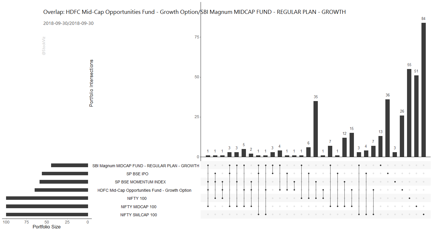
Mutual fund portfolio overlap in UpSet charts

Mutual funds come in different shapes and sizes. Very often, fund investors end up being exposed to the same set of stocks even if they invest in different funds. And not only can there be significant overlap in mutual fund portfolios, some fund managers could be “hugging” the benchmark index. For example, a mid-cap fund could have too much of an overlap with the mid-cap index, effectively making it a more expensive version of an index fund. Therefore, it makes sense for investors to check the portfolio overlap of funds that they are considering not only with each other but also with index constituents.

A common way to visualize overlaps is with a Venn diagram. However, when you have more than five sets (portfolios,) a Venn diagram becomes hard to read. Enter UpSet charts. Here is an UpSet chart that our Overlap Tool creates for the HDFC Mid-Cap Opportunities Fund and SBI Magnum Mid-Cap Fund portfolios:
HDFC Mid-Cap Opportunities Fund and SBI Magnum Mid-Cap Fund portfolio upset chart

Key regions of the chart:

  • Bottom-left: size of each portfolio.
  • Bottom-right: the intersection under consideration.
  • Top-right: the size of the intersection.
  • Titles: Funds being analyzed and their portfolio disclosure dates.

In this example, to see the overlap between the two funds, search for the connection between the 1st and the 4th rows in the bottom-right region and look up – you will see the size of the intersection to be 4. i.e., the funds only have four stocks in common even through each one has more than 50 stocks in its portfolio.

We have included some common indices to help investors identify index-hugging as well. You can run the Overlap Tool here. For an intro to the other tools available on StockViz Tools, please read this post.

Mutual Funds: A quick note on performance metrics

There is absolutely zero stability in metrics used to analyze mutual fund performance. Whether it is alpha, beta or information ratio, they all vary over time and across market environments. Using them to pick the next “winning” fund is pointless. They are, at best, a measure of what happened in the past.

We take a 200-week sliding window of midcap mutual fund returns and calculate its alpha, beta and information ratio. Here’s how these numbers stack up for the HDFC Mid-Cap Opportunities Fund.
HDFC Midcap fund

What is apparent here is that

  1. There is no case for dropping a fund because of declining alpha. Alpha keeps changing through time.
  2. You cannot escape negative beta.
  3. Managers seem to be able to outperform on the way up but not under-perform drastically on the way down. This is asymmetric risk/reward for those who can stick with investments through long periods of time.
  4. Some argue that recent SEBI regulations on mutual fund holdings will erode alpha. Only time will tell if that is true because of (1) and (2).
  5. Under-performance is not permanent. See ICICI’s fund below.

ICICI midcap mutual fund

What we see here is that at least in the midcap space, funds have been able to outperform the index in the past (both recent and distant.) However, that is no guide to the future.

Notes:

  • The total-return index doesn’t go back long enough to be used for this analysis.
  • The risk-free rate used was the 0-5 year YTM adjusted for the weekly time-series.

Code, charts and time-series alpha, beta and IR for about a dozen mutual funds that are over 10-years old are on github.

Tax Drag on Compounding

The long-term capital gains tax on equity returns of 10% may not seem as much but it makes a huge difference if you are one of those “long-term” mutual fund investors who switch funds every year. To think through the effect of the tax on compounded returns, imagine a simple scenario where you invest in the midcap index and just sell and buy it back at the end of every year. In this hypothetical scenario, from the year 2002 through now, gross returns of buy-and-hold would have been 2245% vs. 1754% after tax. That’s ~22% of profits gone poof.

after tax midcap 100 returns

Will mutual fund investors be better behaved given this new normal?

Code and more charts on github.

Should You Buy What Mutual Funds Buy? [Update]

Back in November-2015, we had concluded that it does not make sense following mutual fund entries and exits from individual stocks. Using an expanded data set of 260 funds, we still reach the same conclusion. Median returns over 10, 20 and 50 days on additions were 0.49%, 1.81% and 4.88% whereas exits clocked -0.01%, 0.90% and 3.27%.

Direct equity investors would do well to ignore what fund managers a doing.

Code and results are on github.