Tag: chart

Broker Industry Snapshot 2018-09

There are a lot of conflicting statistics regarding the brokerage industry in India. Depending on the source of the data and what gets counted, one ends up with different numbers. The numbers vary depending on whether only unique demat accounts (based on PAN) are measured, the definition of an “active” account, whether purely derivative accounts are to be included, etc. The NSE has been publishing aggregated statistics for “active” accounts (measured by UCC) for different brokers for a while now. Below are some charts constructed from that data.

Number of active accounts

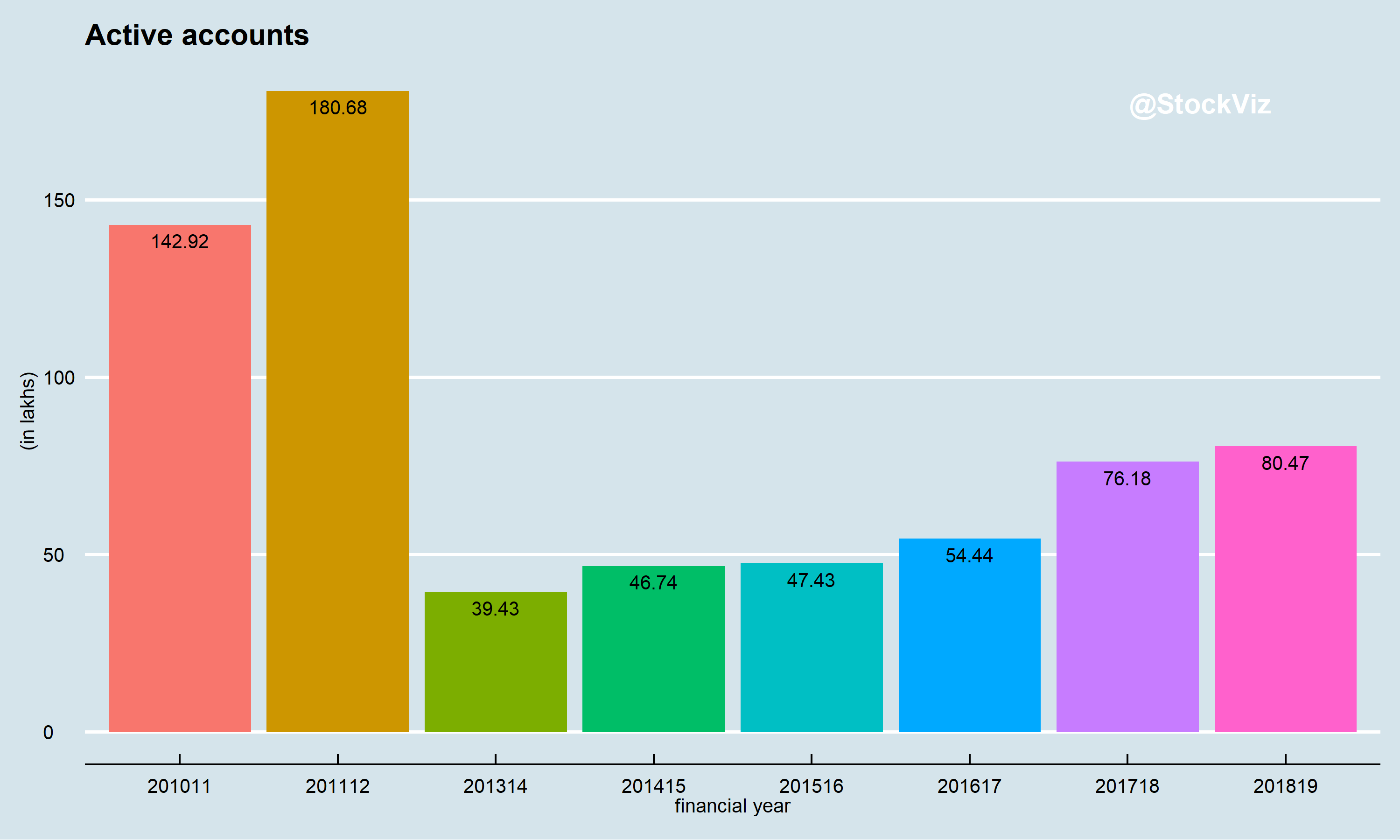
It looks like SEBI’s drive to redefine an “active” account lead to large scale deactivation of accounts in 2013-14. Duplicate accounts notwithstanding, you could tell that its a bull market by the 40% jump in active accounts between FY2016-17 and FY2017-18. However, 80 lakh total active accounts looks skinny.

The changing face of the industry


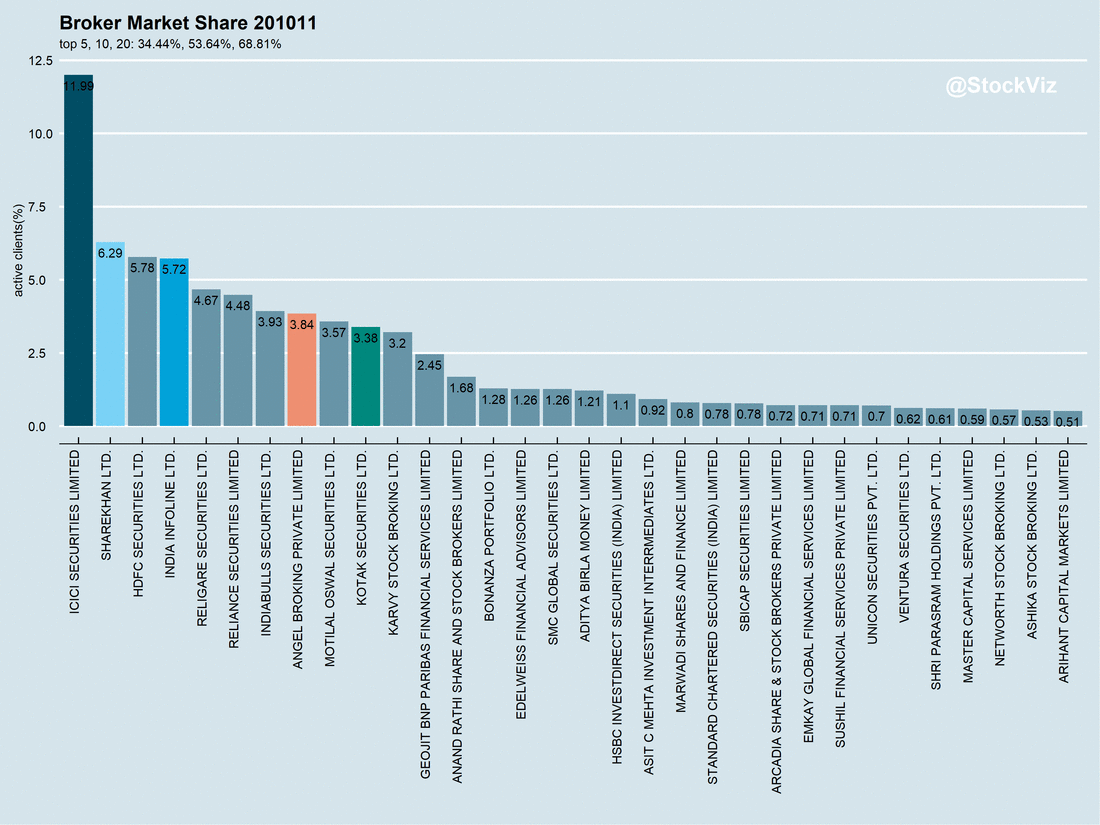
According to the latest numbers available, top 20 brokers by market-share (based on number of active accounts) had cornered 76% of the market, compared to 69% back in FY2010-11. The top 5 have further widened the lead with the rest. However, there has been a lot of churn in the leadership. At current growth rates, it appears that it is only a matter of time before discount broking displaces full-service broking.

We don’t have much more to add at this point but we will keep yanking on this thread over the days to come.

Mutual fund portfolio overlap in UpSet charts

Mutual funds come in different shapes and sizes. Very often, fund investors end up being exposed to the same set of stocks even if they invest in different funds. And not only can there be significant overlap in mutual fund portfolios, some fund managers could be “hugging” the benchmark index. For example, a mid-cap fund could have too much of an overlap with the mid-cap index, effectively making it a more expensive version of an index fund. Therefore, it makes sense for investors to check the portfolio overlap of funds that they are considering not only with each other but also with index constituents.

A common way to visualize overlaps is with a Venn diagram. However, when you have more than five sets (portfolios,) a Venn diagram becomes hard to read. Enter UpSet charts. Here is an UpSet chart that our Overlap Tool creates for the HDFC Mid-Cap Opportunities Fund and SBI Magnum Mid-Cap Fund portfolios:
HDFC Mid-Cap Opportunities Fund and SBI Magnum Mid-Cap Fund portfolio upset chart

Key regions of the chart:

  • Bottom-left: size of each portfolio.
  • Bottom-right: the intersection under consideration.
  • Top-right: the size of the intersection.
  • Titles: Funds being analyzed and their portfolio disclosure dates.

In this example, to see the overlap between the two funds, search for the connection between the 1st and the 4th rows in the bottom-right region and look up – you will see the size of the intersection to be 4. i.e., the funds only have four stocks in common even through each one has more than 50 stocks in its portfolio.

We have included some common indices to help investors identify index-hugging as well. You can run the Overlap Tool here. For an intro to the other tools available on StockViz Tools, please read this post.