Category: Investing Insight

Investing insight to make you a better investor.

MAD – Moving Average Distance

Sometimes, a research paper comes along that gives academic rigor to an obvious thing that trend-followers were doing for decades and makes you sit up and take notice. Moving Average Distance as a Predictor of Equity Returns, Avramov, Kaplanski and Subrahmanyam (SSRN) does just that.

Turns out, a simple moving average crossover signal proves robust to momentum, 52-week highs, profitability, and other prominent anomalies.

A later paper extends it to international stocks and finds similar results (SSRN).

A quick backtest shows that it works for Indian stocks as well.

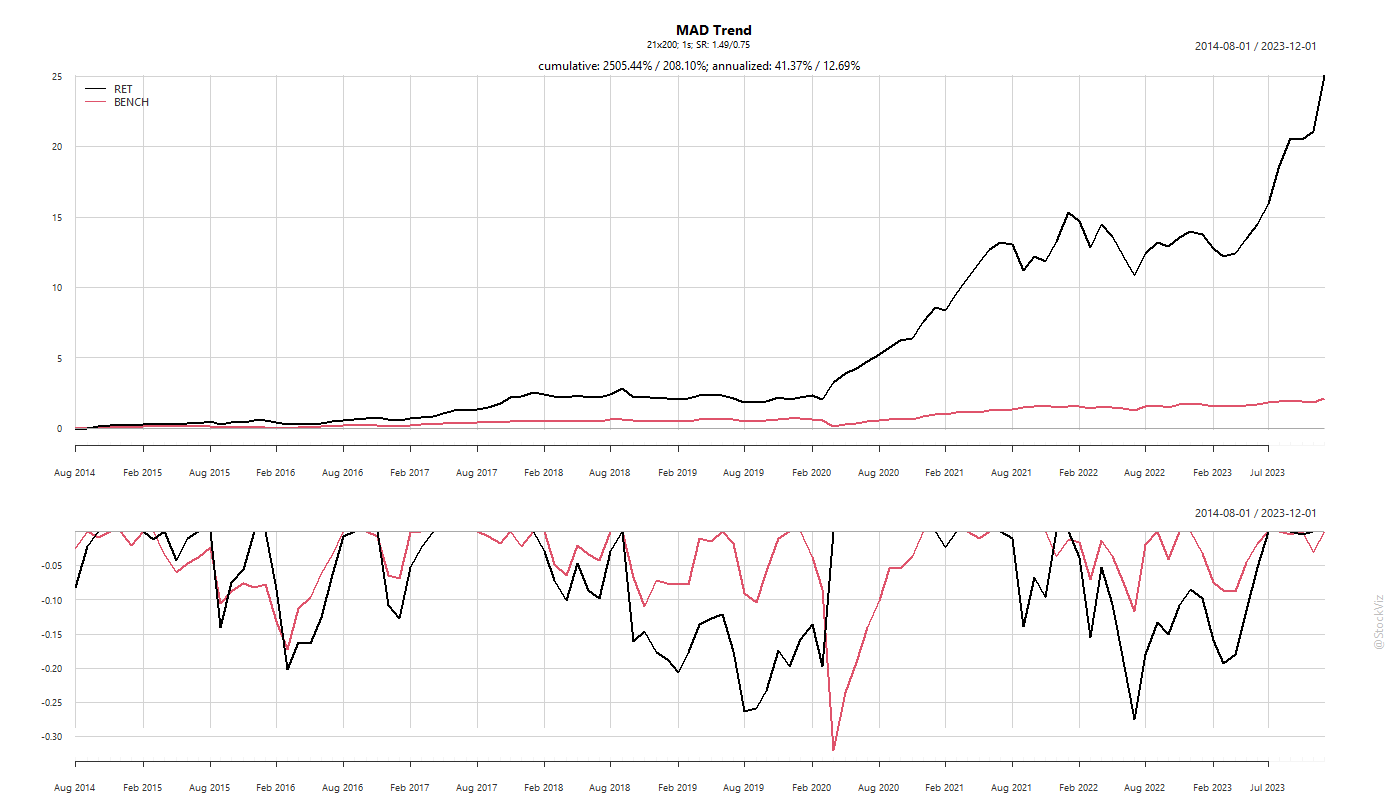
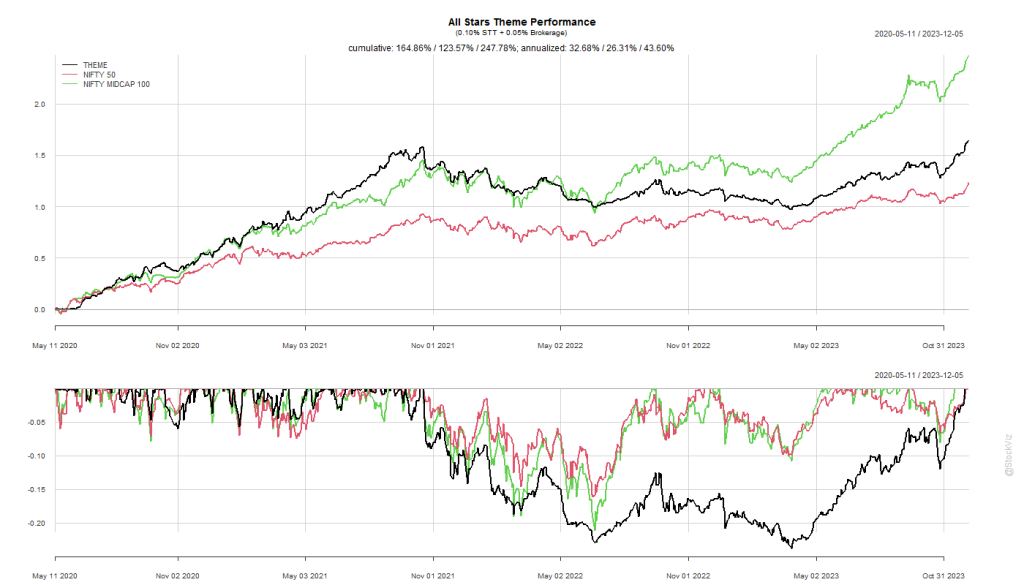
It looks like COVID turbo-charged this strategy. The pre-COVID equity curve is saner.

The returns are good but it comes with some nasty drawdowns. Not sure if most investors can stomach a 25% drawdown that lasts over a year. Can it be made better by applying a volatility filter?

By sacrificing 2 points of returns, you can get to a sub 20% drawdown. Also, the filter worked during the most recent 2021-23 drawdown as well.

You can follow along the live version of this strategy here: MAD 21/200

Code and charts on github.

Rolling Sharpe

In an earlier post, we discussed how the risk-free rate influences the Sharpe Ratio. Another problem with using lifetime Sharpe to gauge investments is that if you are in the middle of a bull market, then everything looks good.

For example, our All Stars strategy recently hit a Sharpe of 2.0, which is sort of a holy grail in investing. However, if you had looked at it a few months ago, when it was still recovering from a drawdown, you would’ve stayed clear of it. So, what changed? The everything rally in stocks.

One way to avoid falling into this trap is to also look at the rolling Sharpe ratio over the life of the strategy.

While this is particularly true for momentum strategies that all look exceptional in bull markets, value strategies are not immune to this effect either.

Lifetime metrics are also sensitive to launch dates as well. Long running strategies would’ve seen their fair share of market ups and downs compared to newer ones launched during bear markets.

Rolling metrics will help investors get a better idea about strategy performance.

Skew

Our previous post discussed how the implied volatility (IV) of OTM puts are often higher than the IV of OTM calls. We would like to add that this “smirk” is very much warranted – it is not an invitation to sell OTM puts. Returns of financial instruments often have negative skew – a fancy way to say that they often take an escalator up, and an elevator down.

Here are the daily and weekly return skews of the NIFTY 50 TR index and the SPY ETF:

The market is willing to pay up to hedge against this risk. If you sell the skew, you’ll have to hedge against it by some other means. Otherwise, it is like picking up pennies in front of a bulldozer.

The Smirk

When you use the Black-Scholes-Merton (BSM) model, you end up with theoretical prices that assumes that volatility affects all strikes uniformly. i.e., strikes have no bearing on implied volatility (IV). This was largely true in the market as well until the crash of 1987. However, after the October 1987 crash, the implied volatility computed from option prices using the BSM model started differing between puts and calls. This is called “volatility smile“, or the smirk, given its actual shape.

The reason for this is quite simple, markets take the stairs up and the elevator down. Fat tails, if you must. So, put options sellers require a little bit of an incentive to take on that risk.

How crooked is the smirk? If you take the ratio of the IVs of OTM puts to OTM calls and plot them, you’ll notice that as you get farther away from spot, the distribution flattens out.

Notice the area below 1.0? Those are the days when the calls were trading at a higher IV than the puts.

On the left of zero are the calls with descending order of strikes and on the right are puts with ascending order of strikes. The farther away from zero, the more OTM they are.

Also, unlike the stylized charts of IV you might have seen with sweet smiles, the reality is quite different.

If this tickles your curiosity, do read The Risk-Reversal Premium, Hull and Sinclair (SSRN)

Code and charts on github.

Midcap Select Index Futures, Part II

At the launch of Nifty Midcap Select Index futures, we had pointed out that strategies that work on the broader Midcap 150 index should work on it as well. Since then, MIDCPNIFTY has had a colorful journey with the exchange experimenting with different tenures and expiries. However, the experimentation phase seems to be over and volumes have steadily improved with the product finding decent traction.

Some quick thoughts on liquidity:

  • Simply don’t trade the opening and closing stubs and you are golden.
  • Also, stick to the nearest expiry – the spreads on the other two will make your eyes bleed.
  • The tightest spreads can be usually found around 15 minutes to close – great if you are taking positional trades end-of-the-day.

On the face of it, MIDCPNIFTY futures look good enough to trade. Happy hunting!