Momentum has proved to be the premier anomaly in different markets. And so has low-volatility. What happens if you combine both of them? Also, what if you also add low volatility of volatility into the mix?
There are a couple of ways to skin this cat. You can start with low-volatility and add momentum. Or, you could go the other way – start with momentum and then add a volatility sort.
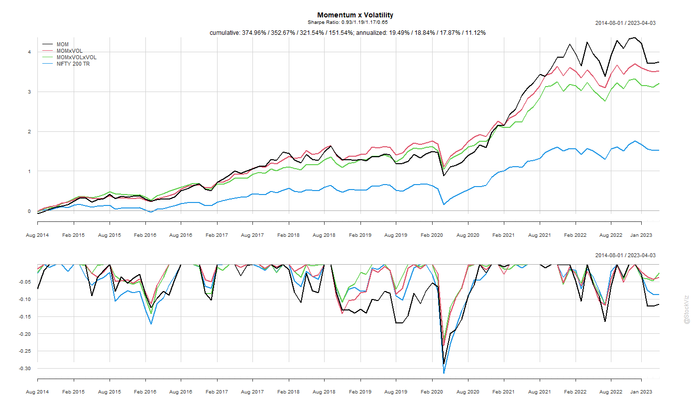
tl;dr: go with low-volatility first, momentum second (VOLxMOM).
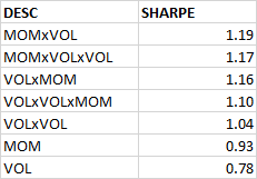
While a simple momentum sort gives the highest return, adding a low-volatility filter to it gets you a better risk-adjusted return.
The order of the sort – first volatility and then momentum or first momentum and then volatility – doesn’t seem to matter much for the Sharpe rankings but the former ended up with slightly better returns.
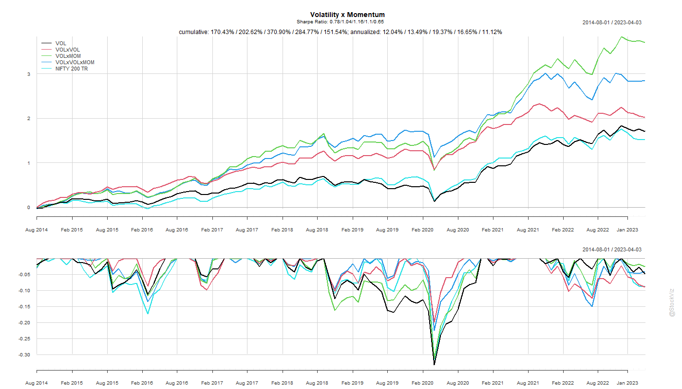
We are often told that missing the 10-biggest days in the market leads to sub-par returns. While it is certainly true, what is often not said is that those really big days occur around really bad days. Welcome to tail-risk.
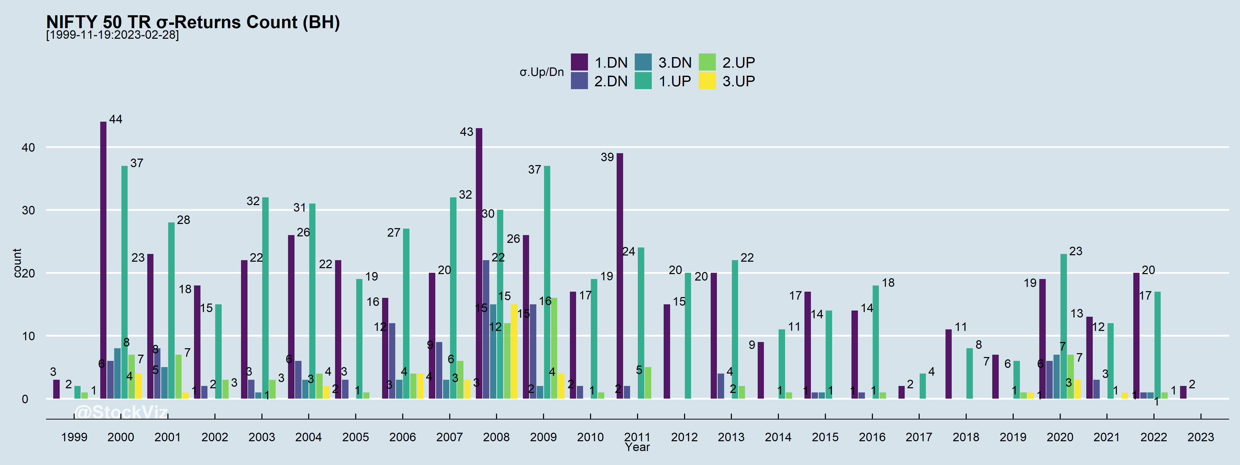
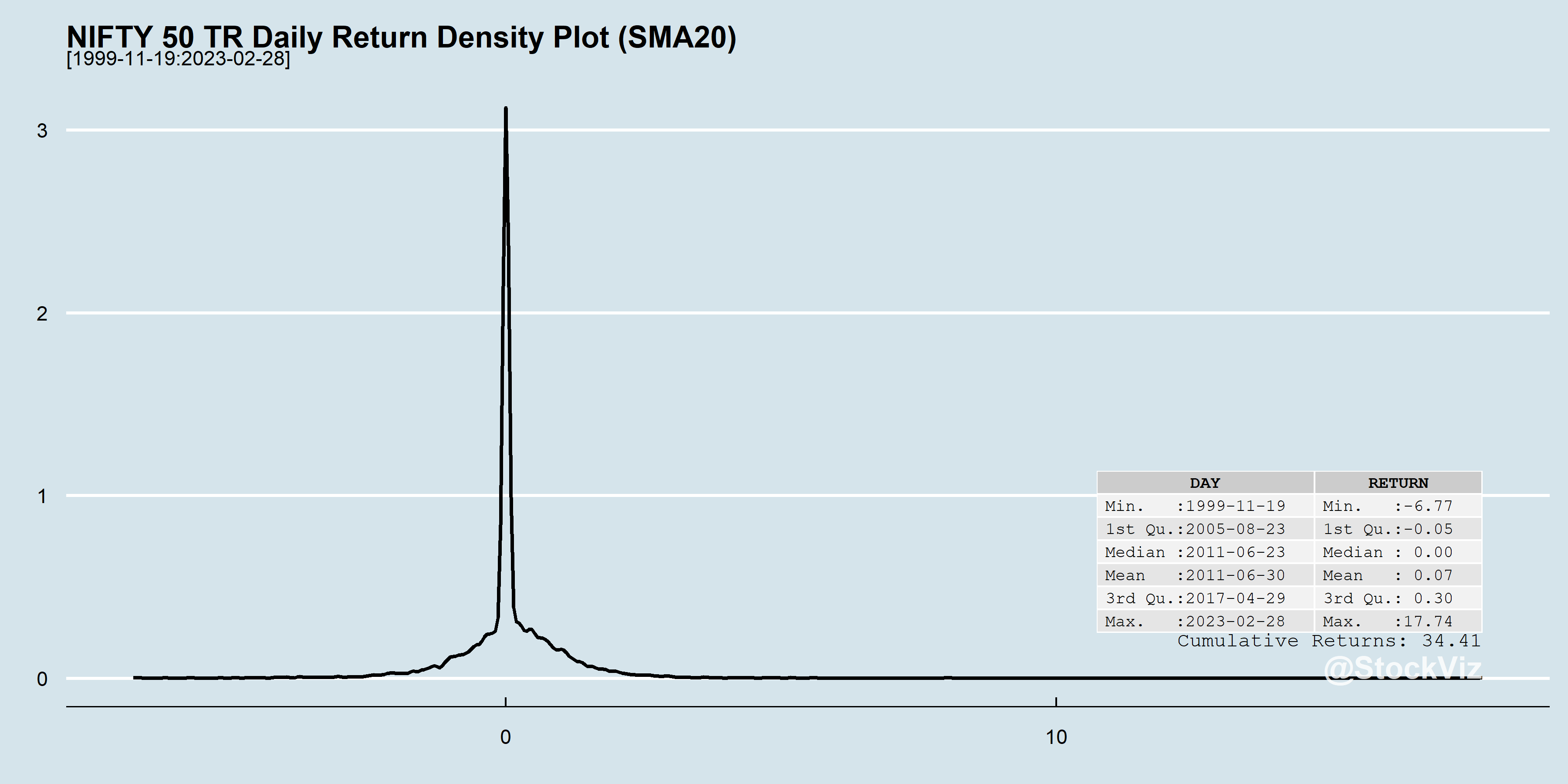
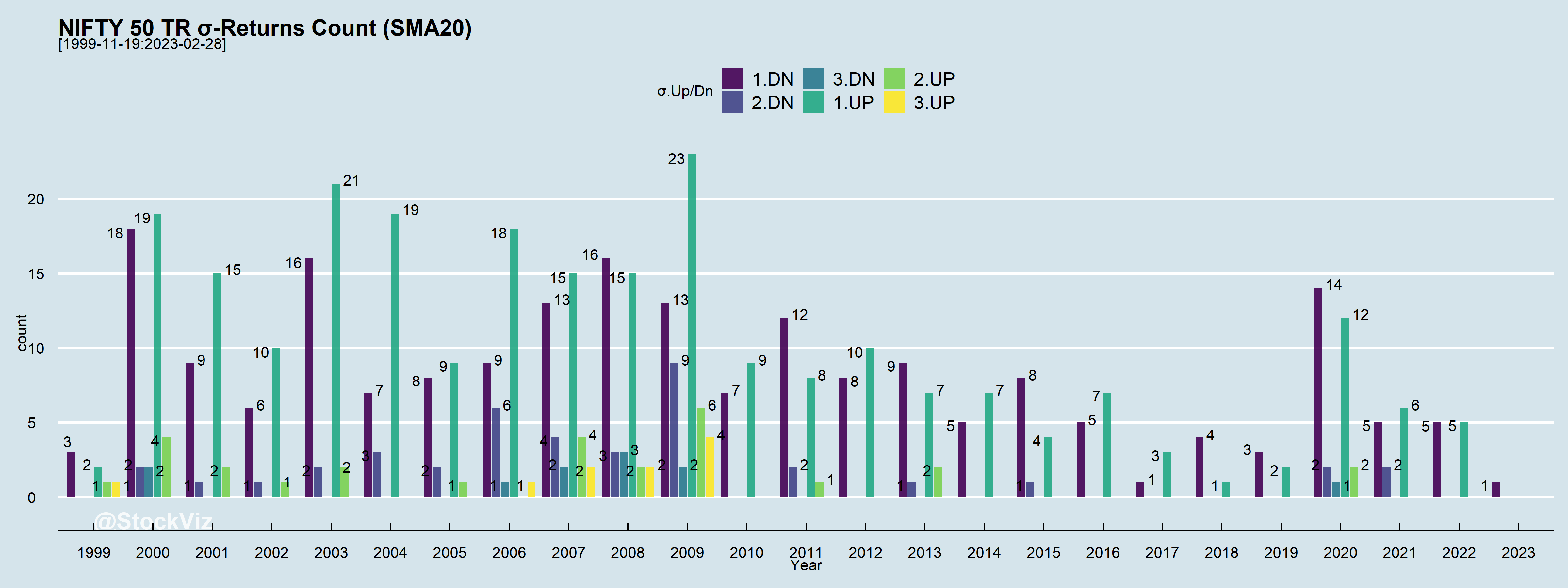
The average daily return of the NIFTY 50 is 0.06%. The worst daily return is ~ -13% and the best is ~18%. Welcome to tail-risk.
In any given year, there are a lot of days when returns fall out of 1, 2 or even 3 standard deviations (σs), Up and Down.
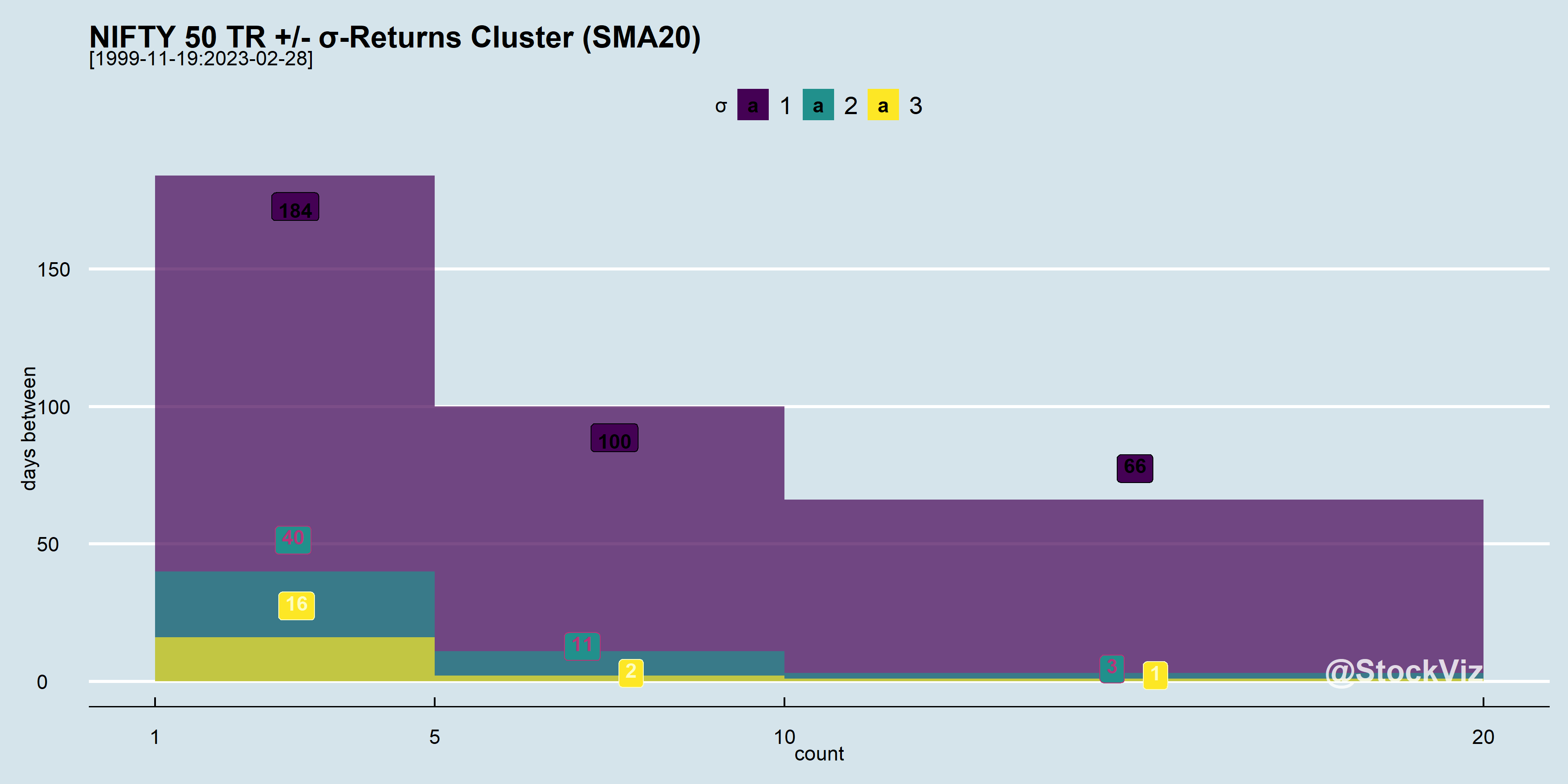
And these σ moves tend to happen close to each other. i.e., volatility clusters.
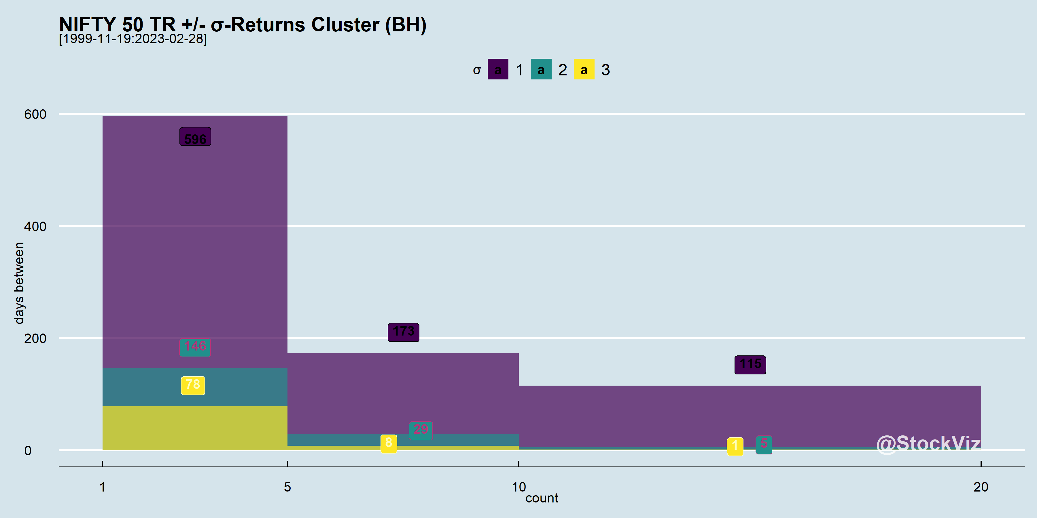
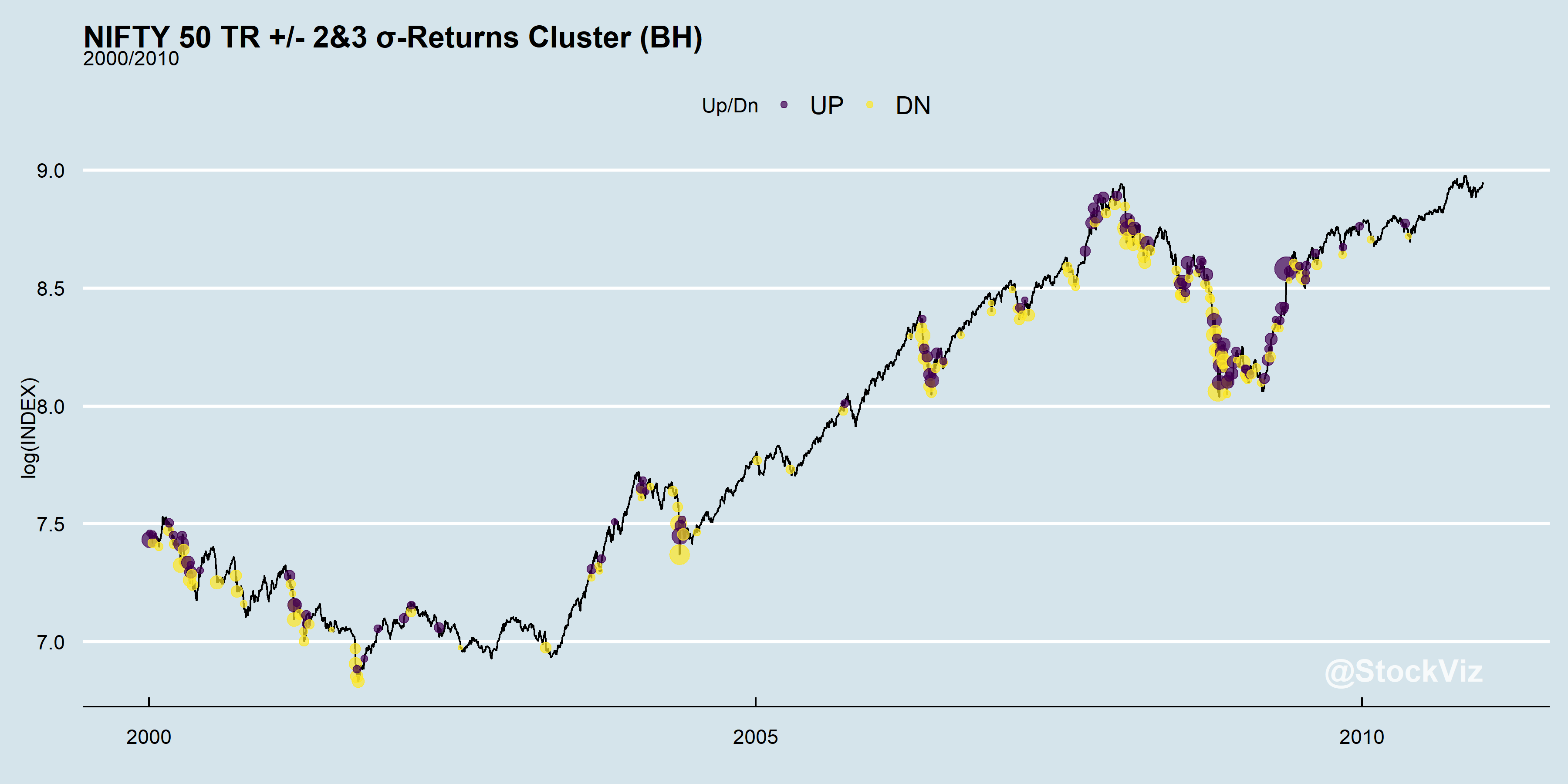
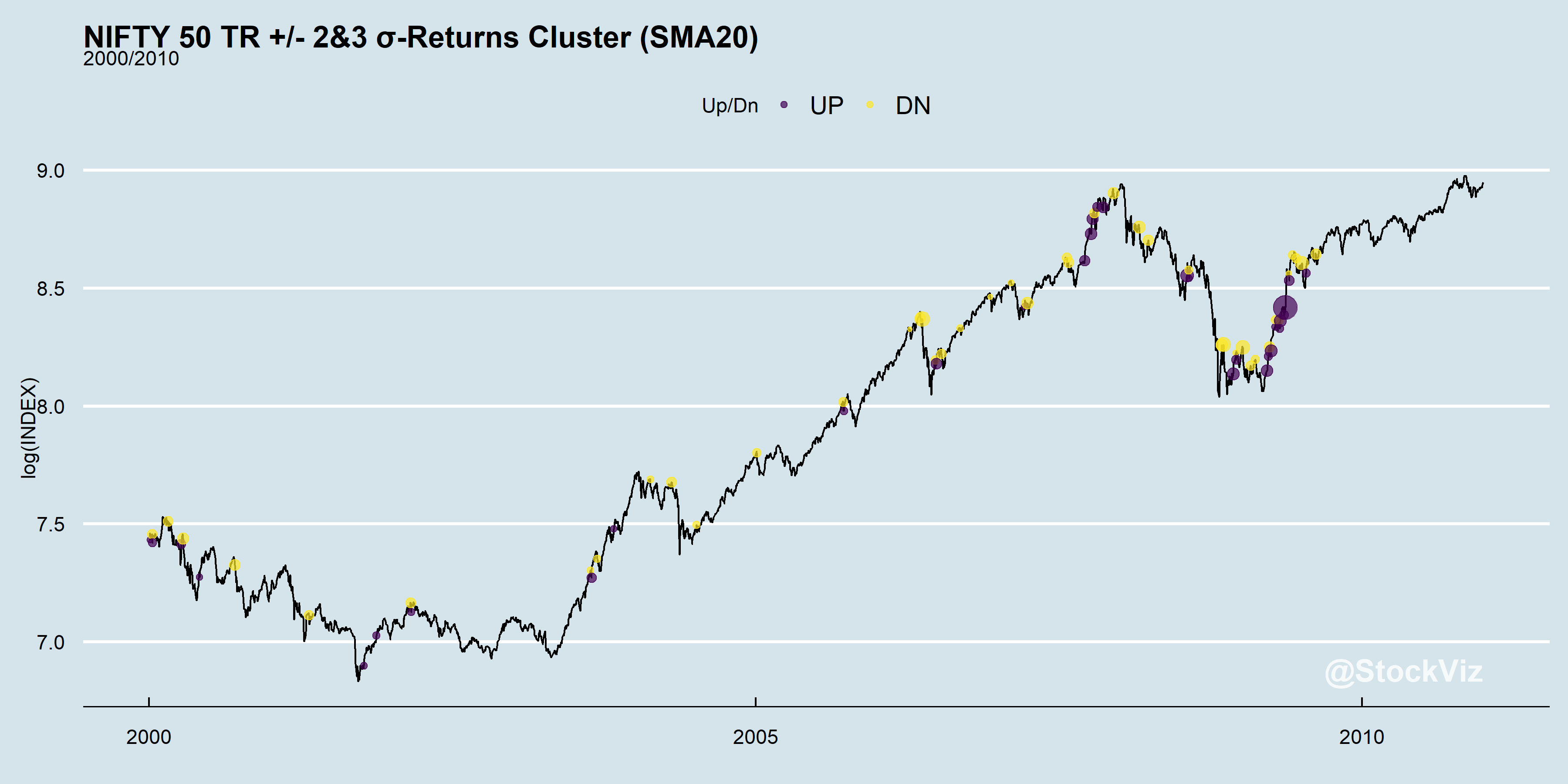
What the histogram above is showing is that most of the 3σ moves have happened within 5 days of each other! Let’s zoom in on a 10-year period of the index and mark the outliers on it:
Now, lets pick a very simple actively managed strategy that tries to side-step the –σ moves. The details of the strategy itself is unimportant. Suffice to say that it creates excess returns compared to buy & hold.
The average daily return of this strategy is 0.07%. The worst daily return is ~ -7% and the best is ~18%. At least some of the left-tail has been clipped but at what cost?
Notice how both the number of large Up and Down days are lower here compared to buy & hold?
Outliers still cluster but there a lot less of them.
This is the nature of market volatility. Investors have to either commit to buy & hold and catch all the moves or commit to an actively managed strategy knowing that while trying to side-step –σ moves, some +σ moves will also be sacrificed. It is the FOMO that keeps investors switching between the two, resulting in sub-par returns.
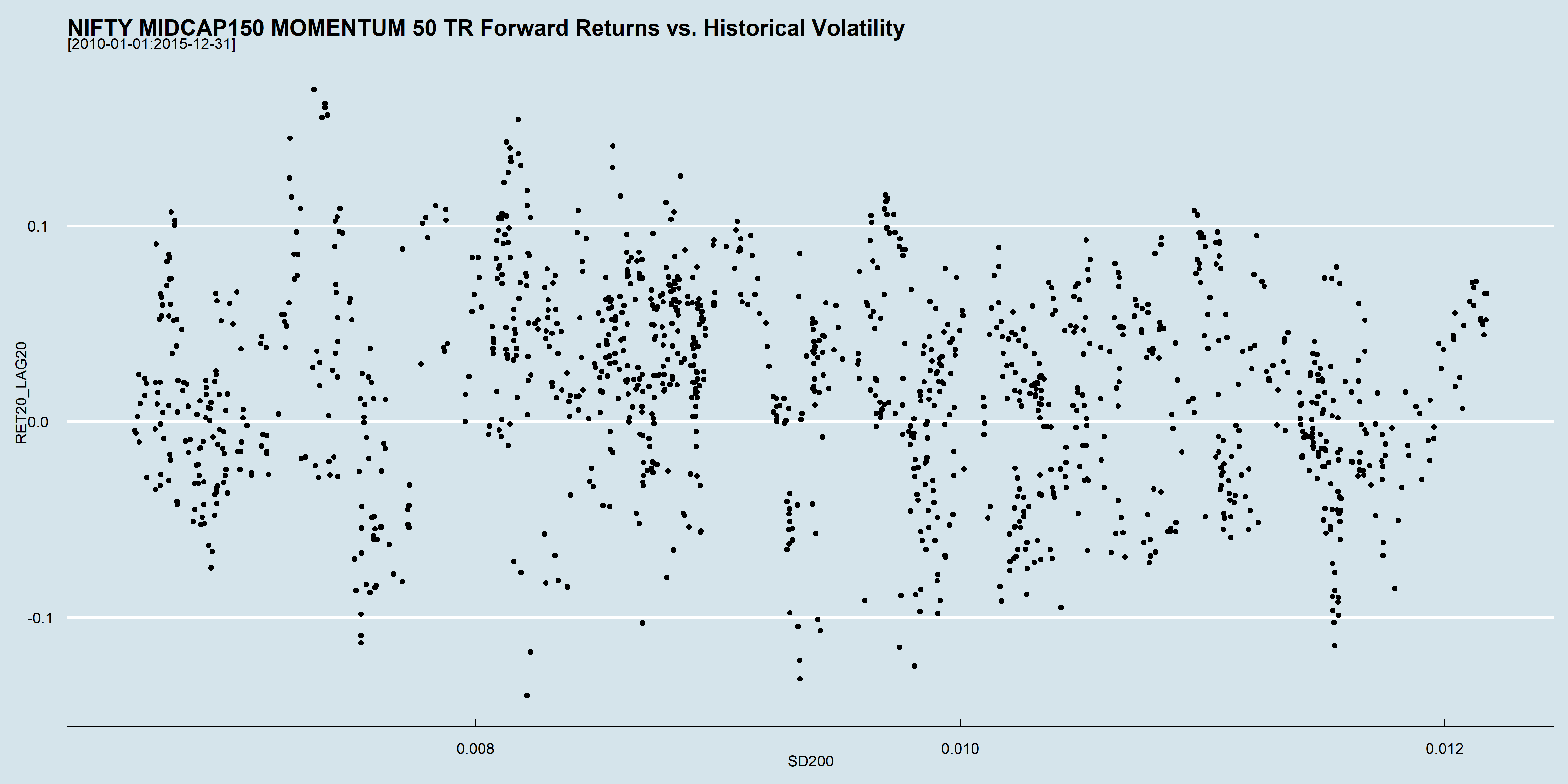
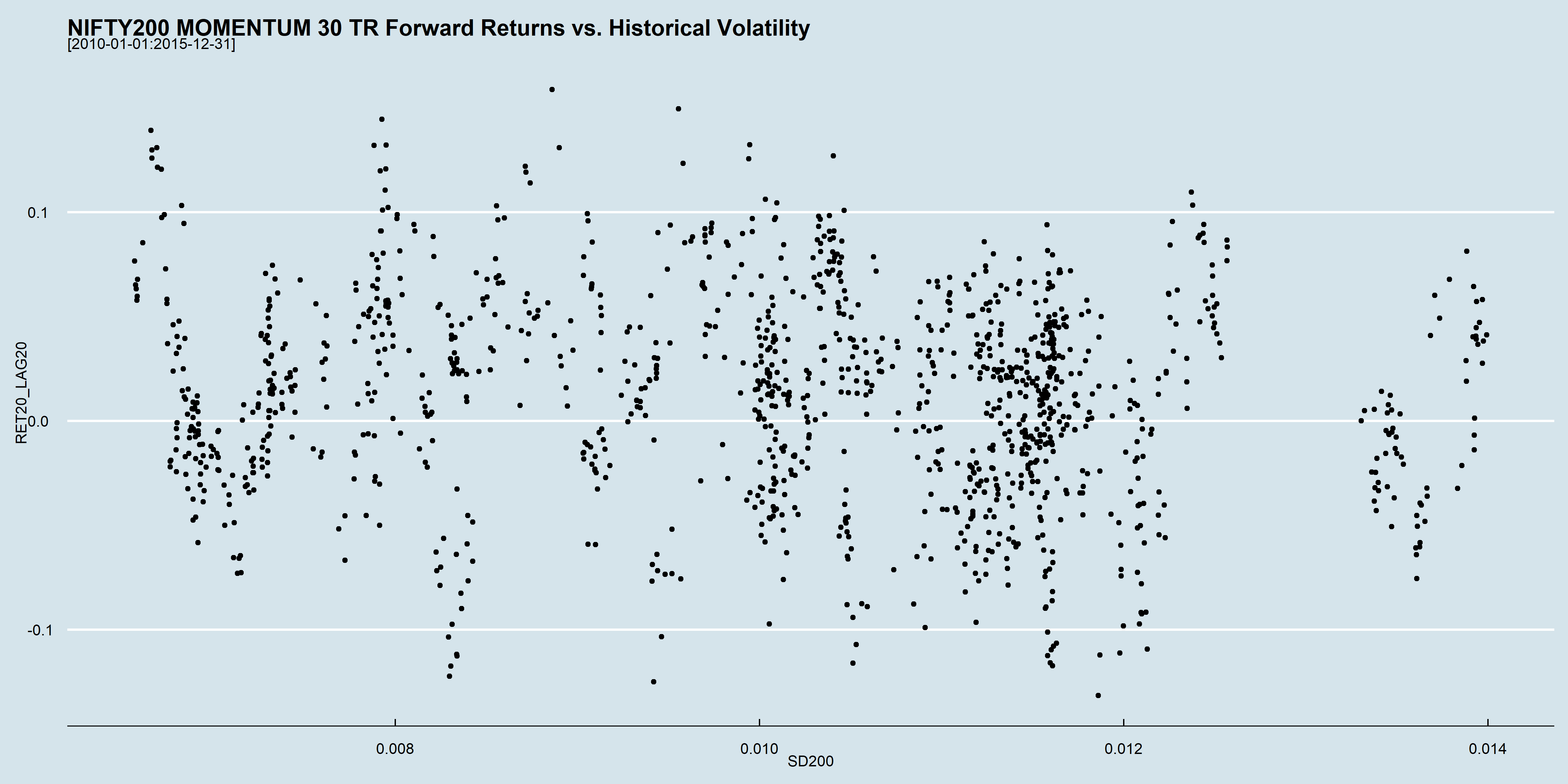
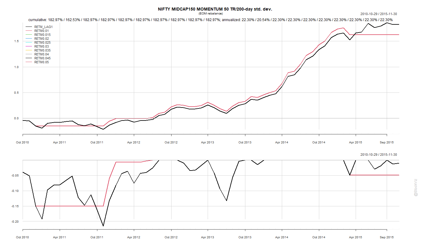
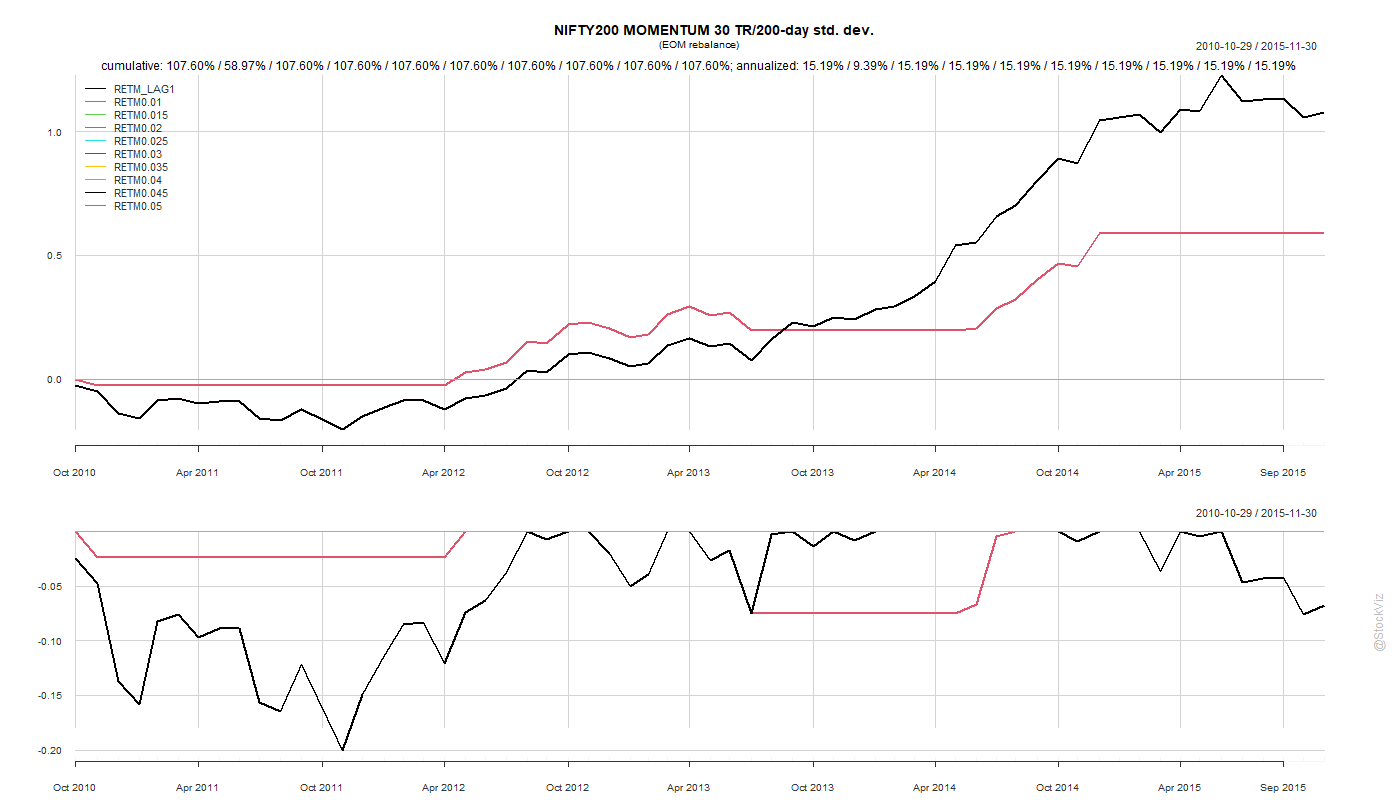
The standard deviation over 200-days and future 20-day returns from 2010 through 2015 of NIFTY MIDCAP150 MOMENTUM 50 TR and NIFTY200 MOMENTUM 30 TR looks like this:
Can historical volatility, as measured by standard deviation, be used to enter and exit momentum strategies?
On a rolling basis, there doesn’t seem to be a strong correlation between historical volatility and future returns. Back-tests over this period might give you a config that might look like it works but it is probably a fluke.
Given that liquid ETFs for these indices are not available and we are stuck with index funds for the foreseeable future, we setup a back-test to calculate the 200-day std. dev. at the end of each month to decide whether to hold it for the next month. Needless to say, the results were pretty lackluster.
We chose the 2010-2015 period because it avoids the 2008 crash and the subsequent recovery. The back-tests look phenomenal when you include that data but we wanted to see how such a strategy would perform in “normal” markets before stress-testing it. We don’t want to be the generals always fighting the last war.
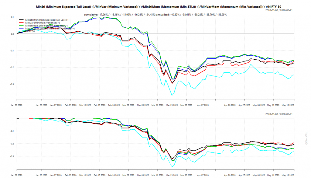
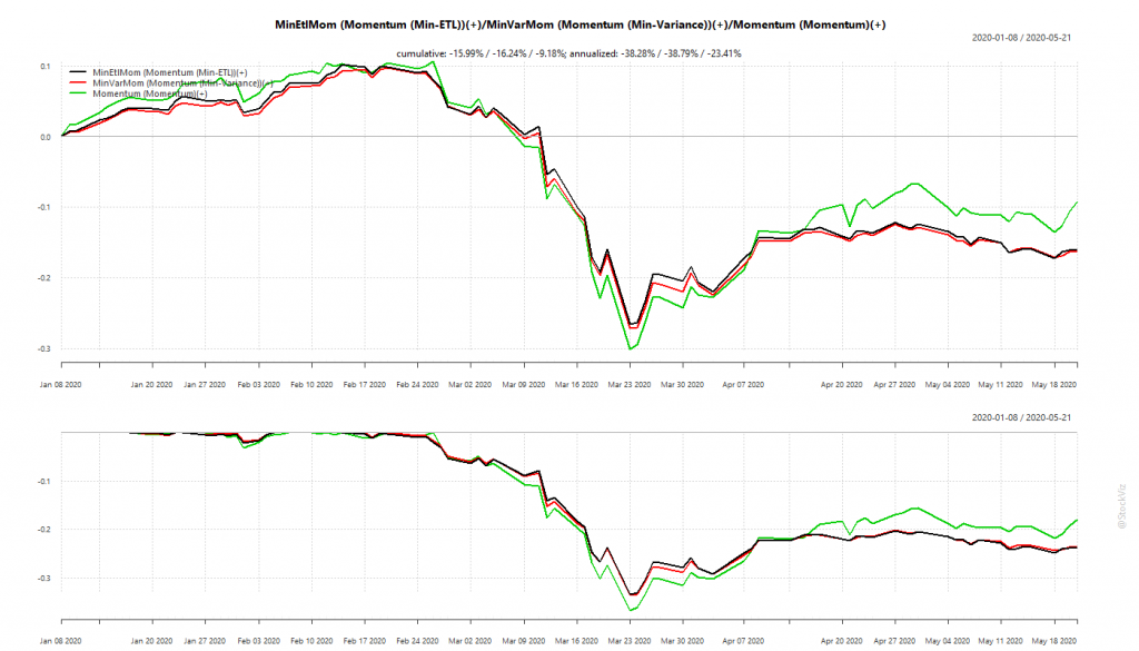
We had discussed portfolios optimized for minimum volatility back in January (see: Low Volatility: Stock vs. Portfolio) and had setup Themes that track such strategies. Broadly, these fall into ETL (Expected Tail Loss) and Min-Var (Minimum Variance) optimized portfolios that either take in the entire universe of stocks or only those that have a high momentum score. So, we have Minimum Expected Tail Loss, Minimum Variance, Momentum (Min-ETL) and Momentum (Min-Variance).
We expect optimized portfolios of momentum stocks to perform better during market up-trends. During bears, we expect them to have lower drawdowns than the market. The Corona Virus Panic put these portfolios in through the wringer. Glad to report that they came out largely unscathed.
Minimum Volatility Portfolios vs. NIFTY 50
Our back-tests showed that optimized momentum portfolio would under-perform “raw” momentum during up-trends but should have lower drawdowns during down-trends.
Momentum: Optimized vs. raw
Optimized momentum portfolios saved the investor about 3-4% in drawdowns compared to the “raw” momentum portfolio. May not sound like much in this instance but think about the cumulative effect over multiple market corrections when you invest for the long-term.
Overall, optimized portfolios delivered what they promised.
WhatsApp us at +91-80-26650232 if you are interested in knowing more about these strategies.
Typically, investors expect higher returns from high risk investments compared to low risk ones. However, realized returns are the opposite of what they expect.
High Beta vs. Low Vol
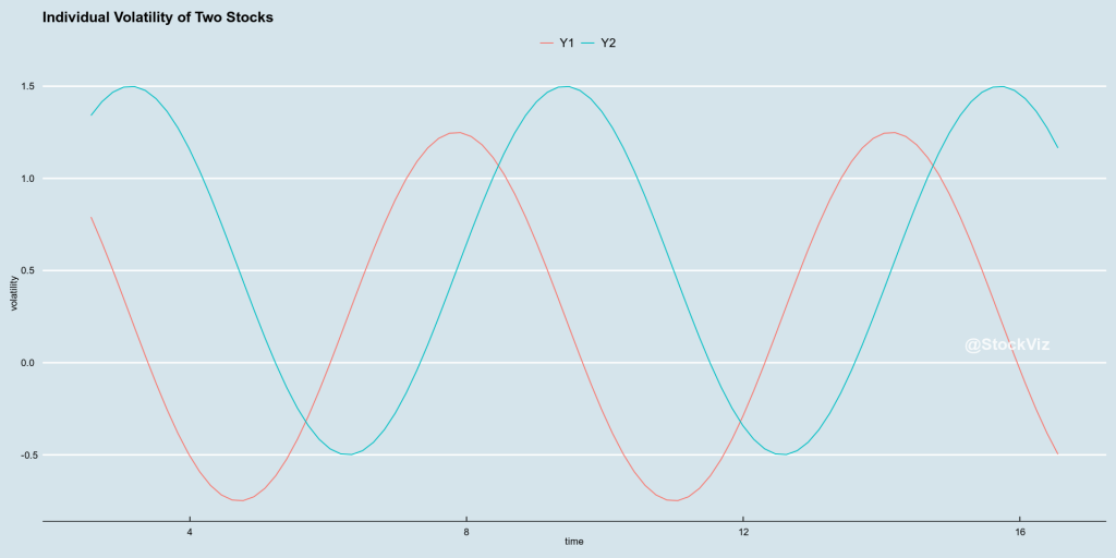
This anomaly, where lower risk systematically results in higher returns, has spawned a number of “betting against beta” strategies. A common approach is to rank a universe of stocks by volatility and create a portfolio off the top-N. However, this approach could lead to a highly volatile portfolio if relative correlations are not considered.
1+1 = 0
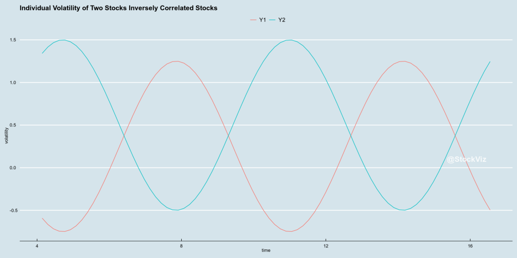
Here are two stocks with their volatility plotted against time:
correlated low-vol stocks
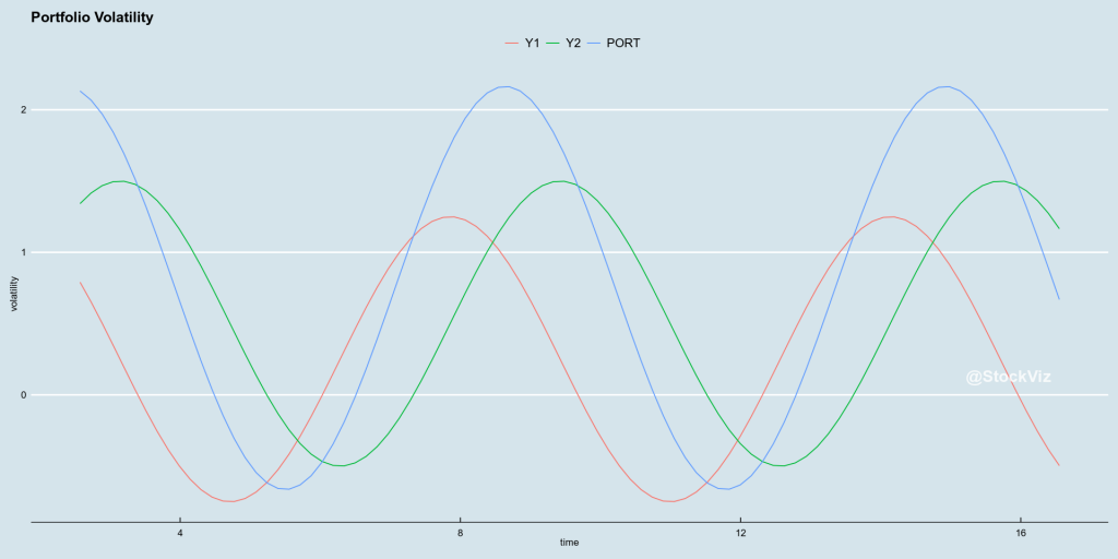
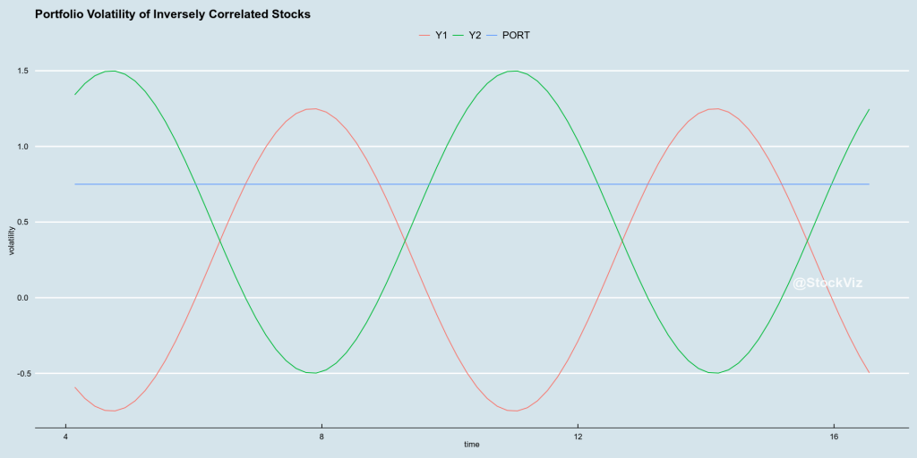
If you create a portfolio off these two stocks, what happens to portfolio volatility?
A portfolio made off low-vol stocks can be high vol
In the worst case scenario, where all the volatilities are correlated, portfolio volatility can end up being a sum of all component volatility.
If low-vol stocks can create a high-vol portfolio, can high-vol stocks create a low-vol portfolio? Yes! It all depends on how the volatilities are correlated.
inversely correlated high-vol stocks
In the best case scenario, portfolio volatility can be a very low constant value if the components are inversely correlated.
a low-vol portfolio created off volatile components
It doesn’t matter if individual volatilities are high or low. What matters is the correlation of volatilities.
Portfolio Optimization
A simple ranking of stocks will not help in creating a low-vol portfolio. What we need is a holistic approach that considers the correlation of volatilities and optimizes the entire portfolio.
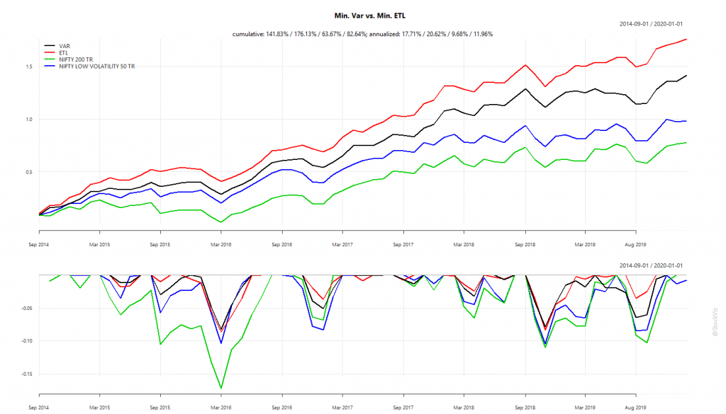
One way to go about this is to use gradient descent. Start with a random portfolio and go in the direction that minimizes variance (min-var) or expected tail loss (min-ETL)
min-var and min-ETL backtest
With a monthly rebalance, the chances of the portfolio getting trapped in a local-minima are low. And the backtest looks promising.
Investing in Low-Volatility Portfolios
Equity investors can map our Minimum Variance and Minimum ETL Themes to their portfolios to gain exposure to these low-vol strategies.