The best part about StockViz Investment Themes is that you can setup a portfolio of stocks that follows a particular strategy. It is a convenient way for you to:
- stick to a strategy
- follow a preset rebalancing schedule
- think in terms of your portfolio strategy rather than individual stocks
- avoid common behavioral pitfalls
- systematically track your P&L and strategy performance
In StockViz, there are two smart-beta themes: Market Fliers tracks a high-volatility and high-beta portfolio while Market Elephants tracks a low-beta portfolio. Between the two strategies and the Nifty, what should an investor prefer?
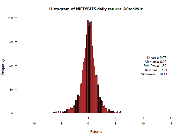
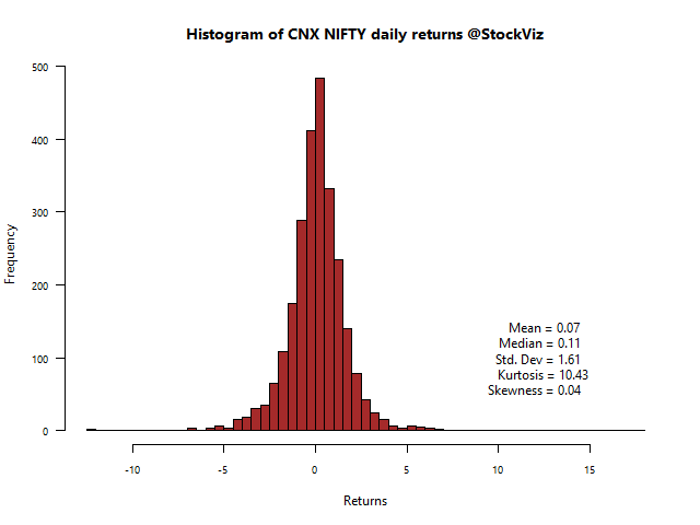
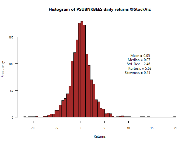
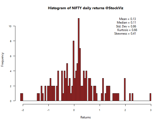
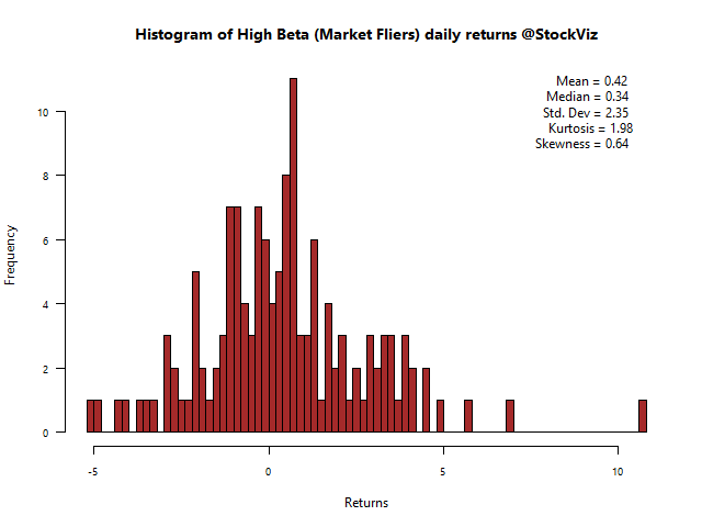
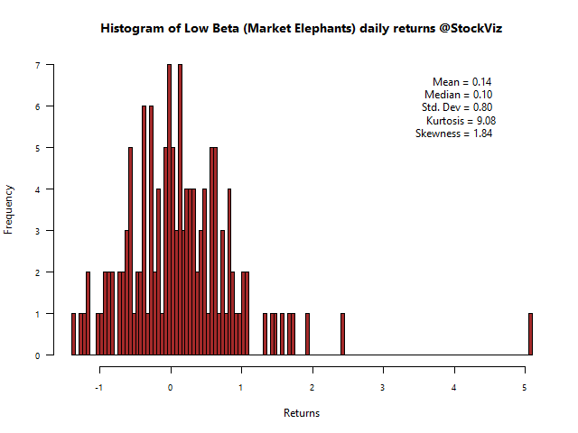
Daily Returns
In a bull-market, such as the one we are in, it makes sense to be in a high-beta portfolio. Notice how narrow the low-beta histogram is compared to high-beta, indicating little variation in day-to-day returns. However, you cannot escape the gigantic 10%+ outlier in the Market Fliers.
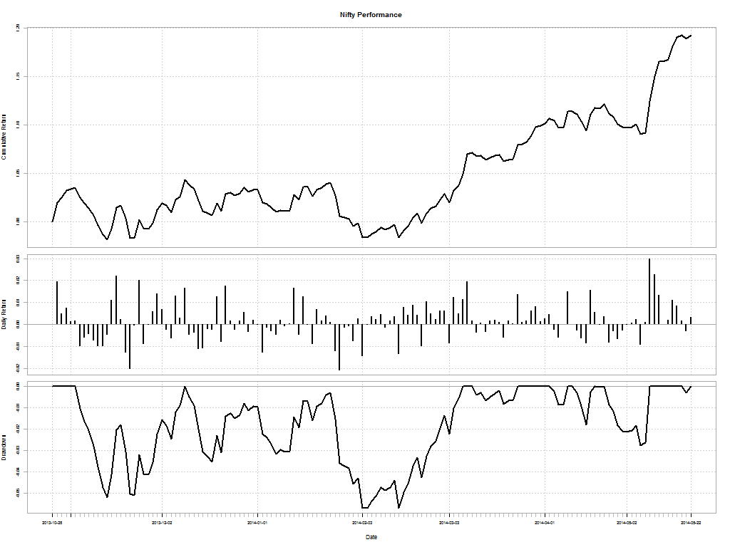
Nifty
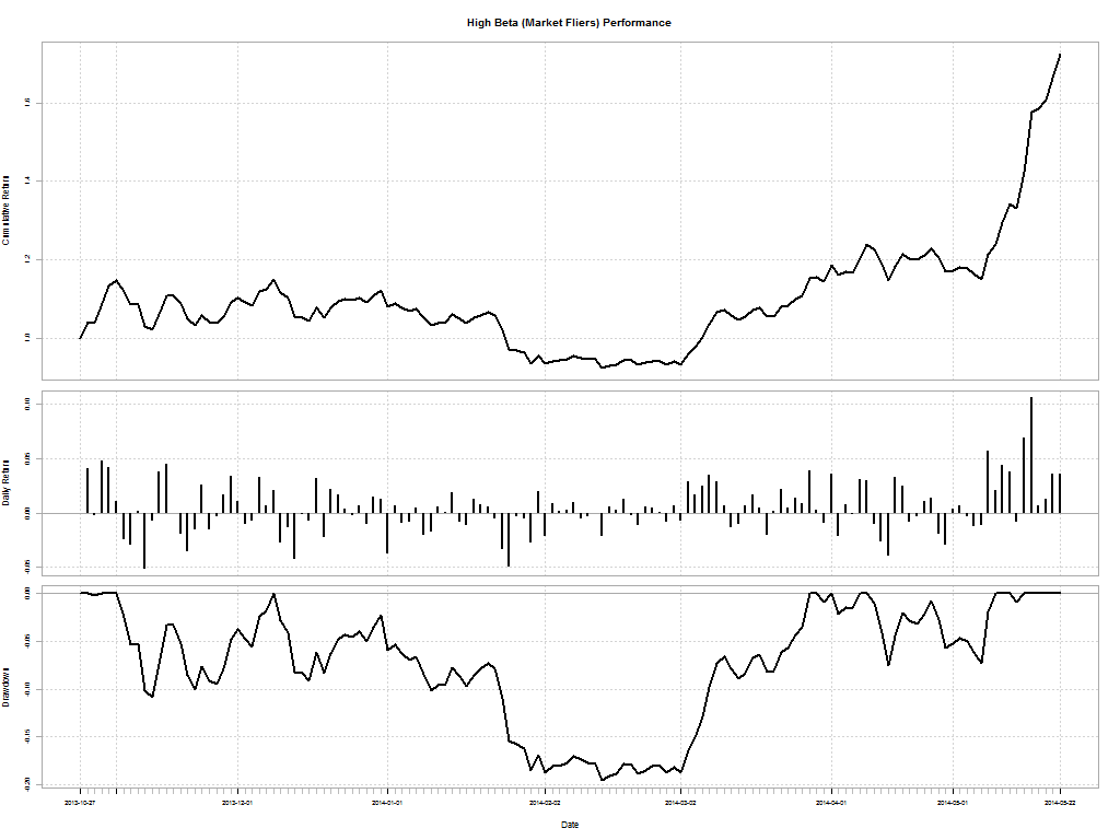
High Beta (Market Fliers)
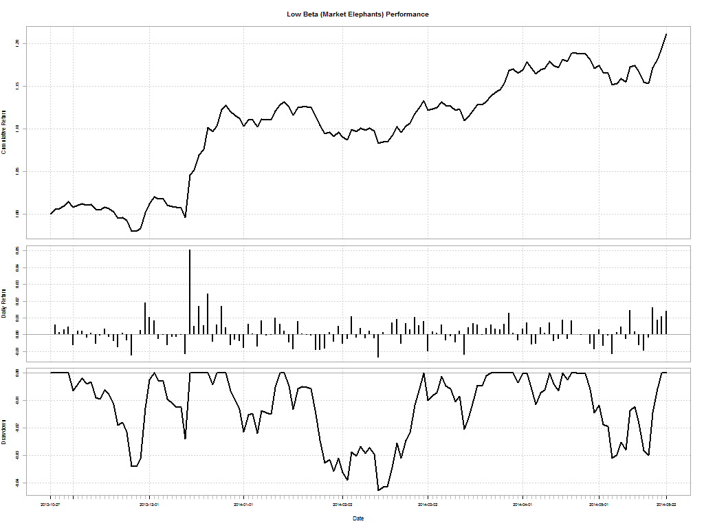
Low Beta (Market Elephants)
Drawdowns
Any investment will have drawdowns: it is the peak-to-trough decline during a specific period. Market fliers had a horrible couple of months in December-Jan where it saw a jaw-dropping 20% draw-down that took 29 days to recover from.
Nifty
| From |
Trough |
To |
Depth |
Length |
To Trough |
Recovery |
| 2013-Dec-10 |
2014-Feb-04 |
2014-Mar-06 |
-0.057 |
61 |
40 |
21 |
| 2013-Nov-05 |
2013-Nov-13 |
2013-Dec-09 |
-0.0519 |
24 |
7 |
17 |
| 2014-Apr-25 |
2014-May-07 |
2014-May-09 |
-0.0275 |
10 |
8 |
2 |
| 2014-Apr-11 |
2014-Apr-16 |
2014-Apr-21 |
-0.0178 |
5 |
3 |
2 |
| 2014-Apr-03 |
2014-Apr-04 |
2014-Apr-09 |
-0.0086 |
4 |
2 |
2 |
High Beta (Market Fliers)
| From |
Trough |
To |
Depth |
Length |
To Trough |
Recovery |
| 2013-Dec-09 |
2014-Feb-12 |
2014-Mar-27 |
-0.1955 |
75 |
46 |
29 |
2013-Nov-05 |
2013-Nov-12 |
2013-Dec-08 |
-0.1083 |
22 |
5 |
17 |
2014-Apr-10 |
2014-Apr-15 |
2014-May-11 |
-0.0751 |
18 |
3 |
15 |
2014-Apr-02 |
2014-Apr-02 |
2014-Apr-08 |
-0.0215 |
4 |
1 |
3 |
2014-Mar-31 |
2014-Mar-31 |
2014-Apr-01 |
-0.0092 |
2 |
1 |
1 |
Low Beta (Market Elephants)
| From |
Trough |
To |
Depth |
Length |
To Trough |
Recovery |
| 2014-Jan-15 |
2014-Feb-12 |
2014-Feb-27 |
-0.0427 |
31 |
21 |
10 |
2013-Nov-04 |
2013-Nov-25 |
2013-Dec-02 |
-0.0338 |
19 |
14 |
5 |
2014-Apr-24 |
2014-May-06 |
2014-May-21 |
-0.0309 |
19 |
8 |
11 |
2013-Dec-03 |
2013-Dec-12 |
2013-Dec-15 |
-0.024 |
8 |
7 |
1 |
2013-Dec-29 |
2014-Jan-06 |
2014-Jan-13 |
-0.0219 |
12 |
7 |
5 |
Performance
The wealth chart for market filers is basically a parabola at this point. During the period, the Nifty clocked in +19.26%, Market Fliers +72.42% and Market Elephants +21.16%
Nifty
High Beta (Market Fliers)
Low Beta (Market Elephants)
Performance vs. Drawdown
How do you tell if these Themes are better than the Nifty? One way to measure relative performance is through the Calmar ratio and the Sterling ratio.
The Calmar ratio is a comparison of the average annual compounded rate of return and the maximum drawdown risk. The lower the Calmar Ratio, the worse the investment performed on a risk-adjusted basis over the specified time period; the higher the Calmar Ratio, the better it performed.
The Sterling ratio = Compounded Annual Return ÷ (Avg. Max Drawdown – 10%)
Just like the Calmar ratio, a higher Sterling ratio is generally better because it means that the investment is receiving a higher return relative to risk.
|
Calmar Ratio |
Sterling Ratio |
| Nifty |
6.487609 |
2.35644 |
| Market Fliers |
8.720311 |
5.768798 |
| Market Elephants |
9.828884 |
2.942523 |
As you can see, smart beta strategies beat the Nifty both in absolute returns and in risk.
Note: The analysis starts from 2013-Oct-28.