The Size Factor
All things being equal, micro-caps outperform mega-caps in the long-run — investors are compensated for the higher systematic (business cycle) risk that they take when they invest in micro-cap stocks. One way to boost relative performance vs. a market-cap weighted index is to invest in an equal-weighted basket of stocks that are in the index. Alternately, investors can add a basket of micro-cap stocks to their portfolio to juice overall returns.
Market-cap Deciles
We had discussed how we can divide the universe of listed stocks in deciles based on their free-float market cap here. Given our ability to automate systematic investment strategies, we created an auto-rebalanced Theme each for every decile.
Investors can now gain exposure to an equal-weight portfolio of micro caps by investing in the Decile 9 Theme and mega-caps by investing in the Decile 0 Theme. Returns and risk go down as you climb up the market-cap ladder. Our Market Dashboard gives an idea of how returns have been distributed across the deciles:
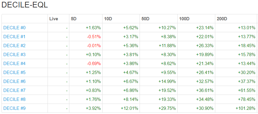
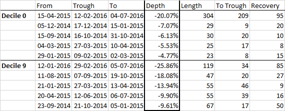
Notice how the drawdowns are deeper with micro-caps:
Investors who whethered the steeper drawdowns of micro-caps have experienced returns an order of magnitude larger than mega-cap investors. Check out the ‘Size Factor’ in our Investment Themes page for other Market-cap based Themes.