Definition
Internal Bar Strength (IBS) is based on the position of the day’s close in relation to the day’s range: it takes a value of 0 if the closing price is the lowest price of the day, and 1 if the closing price is the highest price of the day. The IBS effect may be related to intraday over-reactions to news or market movements, which are then “corrected” the next day.
IBS = (Close – Low)/(High – Low)
It is a mean-reversion strategy.
Back test
The paper from Alexander Soffronow Pagonidis claims that low IBS values are associated with high returns, while high IBS values are associated with low returns. Average returns when IBS is below 0.20 are .35% while average returns when IBS is above 0.80 are -0.13%.
We put this to the test on 16 NSE indices. Calculating IBS and trading at the close. To keep things simple, we assumed that we can trade at closing prices. Buy at the close if IBS is below 0.2, and sell at the close if IBS exceeds 0.8, exit the position at the following market close. If a back test on indices proved promising, we figured we would try this out on individual stocks next. However, IBS returns trailed buy-and-hold by a significant margin.
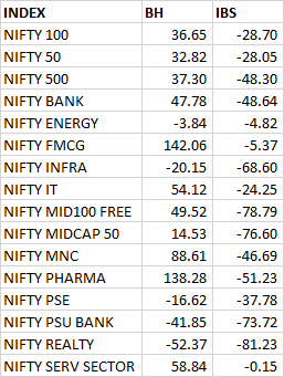
Using IBS to trade mean reversion, as the author intended, is a losing proposition. What if we do the reverse?
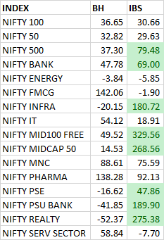
It “works” for about half the indices – could be pure luck.
Conclusion
It looks like IBS either doesn’t hold for Indian markets or for the indices we tested.
Source: The IBS Effect: Mean Reversion in Equity ETFs (pdf)
Equity curves: IBS Mean Reversion (pdf)