Introduction
The Relative Strength Spread takes all the stocks in the CNX 500 index, sorts them by their relative performance vs. the index and takes the ratio between the median relative performance of the top decile and the bottom decile. When you plot the spread, a rising chart indicates that relative strength leaders are performing better than relative strength laggards.
Relative Strength Spread Charts
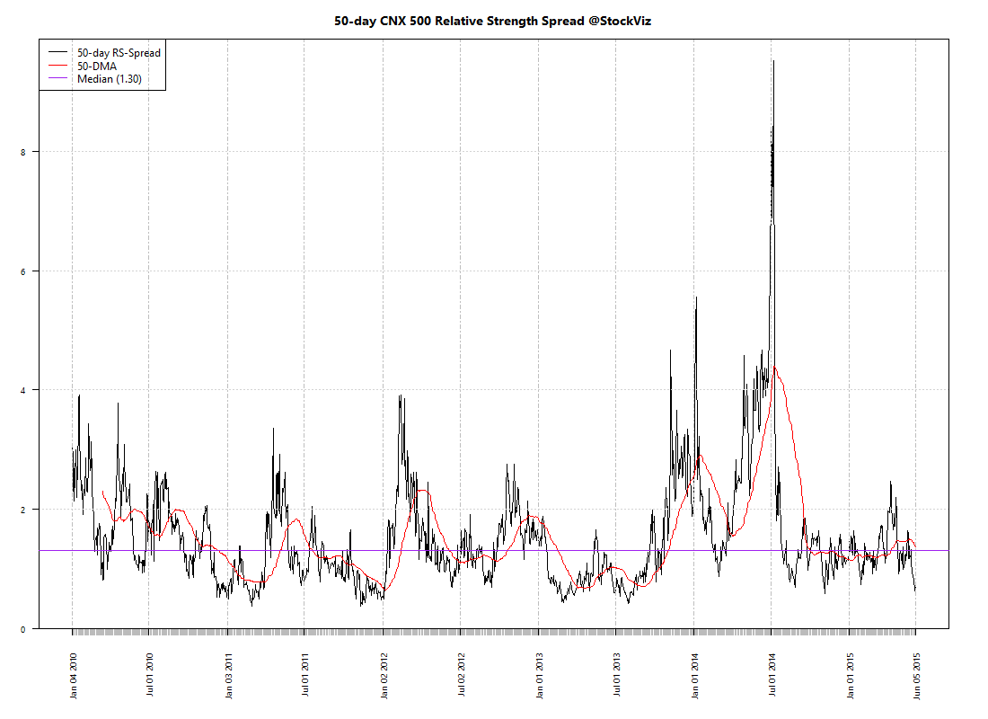
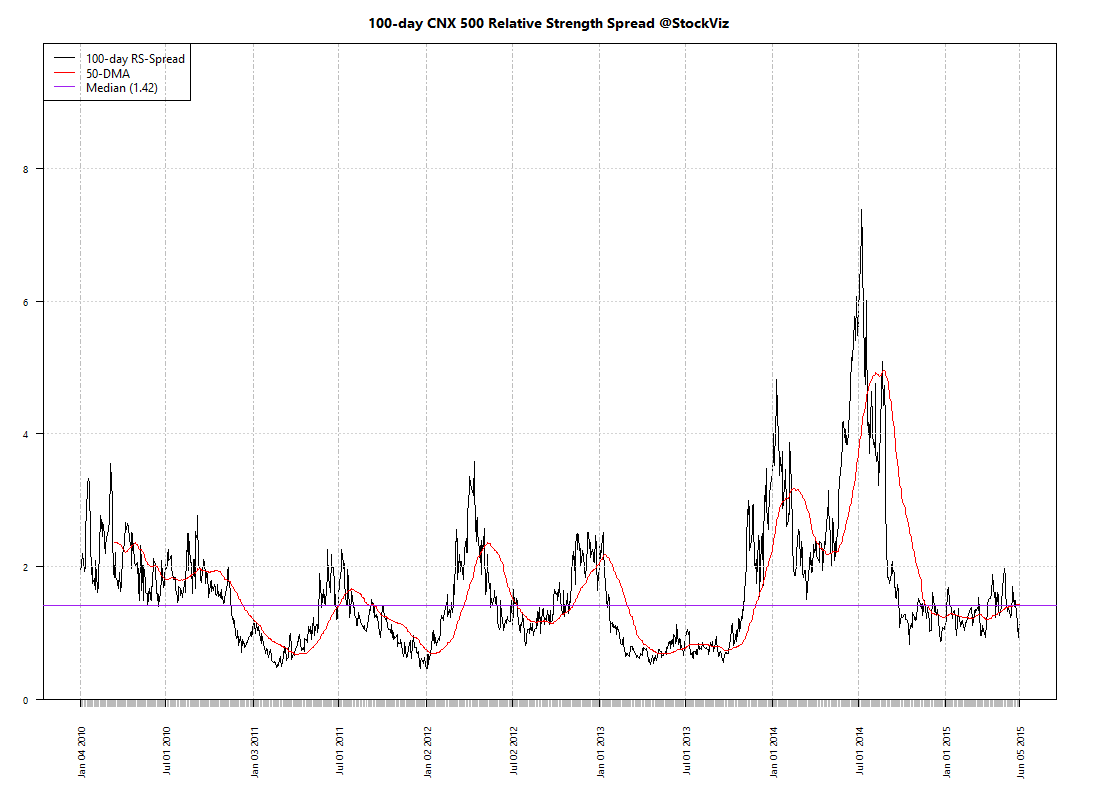
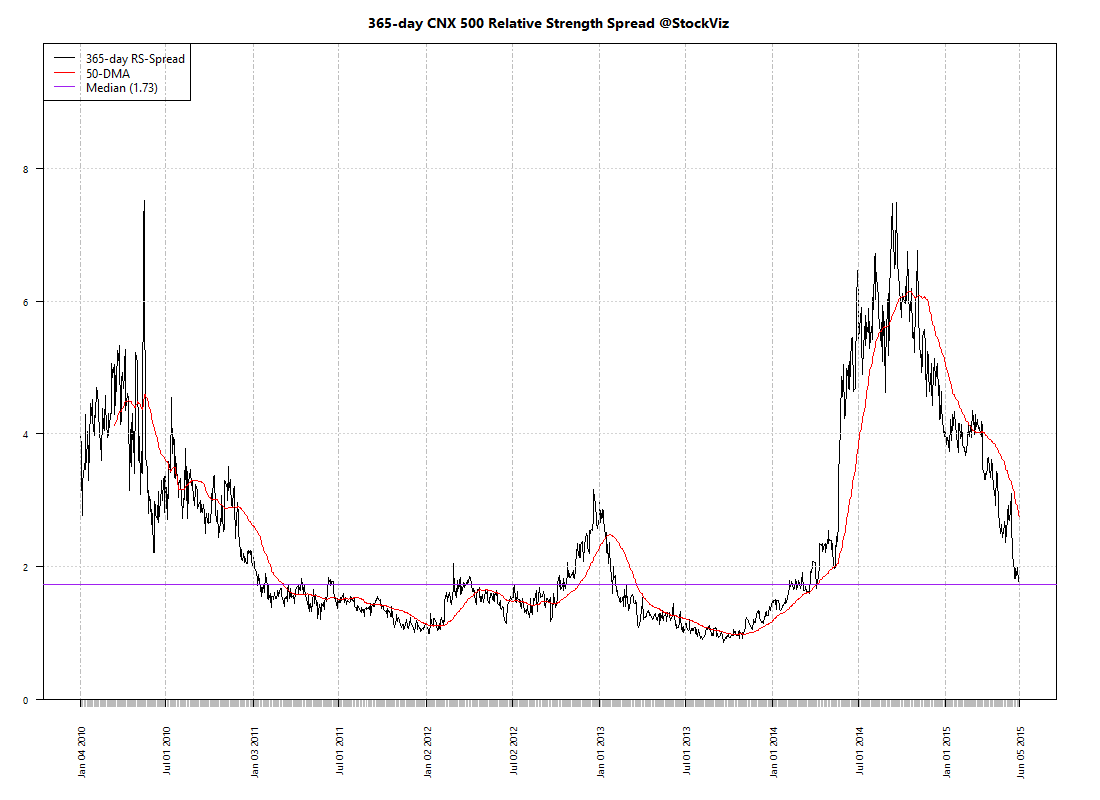
High Relative Strength Spread environments provide the largest momentum profits – winning trades easily eclipse losing trades.
The 365-day RS-Spread chart clearly demarcates the “Modi-Mania.” The Modi-Mania was manna from heaven for trend-following strategies. However, the post-Modi-Mania phase has seem most momentum algorithms struggle.
A silver-lining is that the 50-day chart shows that we are probably due for a momentum comeback. But it is not uncommon to have prolonged periods of the “doldrums” where momentum is just “average.” It maybe tempting to give up on trend-following strategies during these periods. But just like how we cannot predict momentum crashes, we cannot predict momentum comebacks. So it is important to maintain allocation to momentum strategies.
Conclusion
The Relative Strength Spread index can be useful in explaining momentum profits. However, it is not much of a predictor of future momentum returns. It could also be used to explain the “skill vs. luck” question of returns – just like how a rising tide lifts all boats, a high RS-Spread environment will lift all portfolio returns.
Going forward, we will update the 50-day Relative Strength Spread chart on our weekly Index Update posts.