Category: Your Money

Correlation Update 17.10.2015

Nifty one year daily return correlations

Nifty one year daily return correlations

Nifty one month daily return correlations

Nifty one month daily return correlations

Bank Nifty one year daily return correlations

Bank Nifty one year daily return correlations

Bank Nifty one month daily return correlations

Bank Nifty one month daily return correlations

Midcap one year daily return correlations

Midcap one year daily return correlations

Midcap one month daily return correlations

Midcap one month daily return correlations

A lot of thick blue squares mean that positive correlations are high. Red squares mean negative correlations are high. Whites are the doldrums.

Relative Strength Spread Charts

What is Relative Strength Spread?

Relative Strength Spread of a stock is the relative cumulative performance of the stock vs. the CNX 500 index over the same period.

We had discussed how the Relative Strength Spread Index is a coincident indicator of momentum earlier. With a new update, we are publishing charts of relative strengths of individual stocks over multiple lookback periods. This can be found under the ‘Quant’ tab of the equity pages.

How to interpret Relative Strength Spread?

Relative Strength Spread is a measure of historical out-performance. By observing the RS-Spread over different lookback periods, investors can get a sense of future direction of momentum. For example, if you look at the RS-Spread of TATAMOTORS, you can observe how the stock lagged the broad market for the better part of the year before suddenly turning around in the last few days.

TATAMOTORS.relstrength

Now contrast that to BHARATFORG:

BHARATFORG.relstrength

Unlike a price or return chart that looks at an individual stock, the RS-Spread chart incorporates information from a broad set of stocks and compares it to the market average. It has more information content than the ‘Relative Momentum’ chart as well.

A quick note on bonds

We compared the total returns from the short-end of the curve to Nifty. Here’s what we found:

  1. IRR over the last 10 years for bonds was 6.53%.
  2. Biggest drawdown was -5.04%.
  3. Only two years of negative correlation with NIFTY.

Annual returns:
nifty.vs.0-5.bonds

Equity curve:
0-5's vs. NIFTY returns

Drawdowns:
0-5s.NIFTY.drawdowns

The right place for bonds in a portfolio is for regular income. From a returns perspective, you are better off investing in equities. Bonds are no less volatile when compared to the returns they give, and are mostly correlated with equity volatility.

ARMA + GARCH to Predict VIX

GARCH(1,1)

GARCH(1,1) is a common approach for modeling volatility. They were developed by Robert Engle to deal with the problem of auto-correlated residuals (which occurs when you have volatility clustering, for example) in time-series regression.

What we did:

  1. Picked the best fit ARIMA(p,d,q) model for historical VIX over different look back periods
  2. Created a GARCH(1,1) model based on ARMA(p,q)
  3. Predicted t+1 VIX

500-day lookback

We found that modeling based on the previous 500-day VIX closing levels gave us the least prediction errors. The appendix has the charts for other lookback periods.

Prediction vs. Actual

VIX.prediction.500

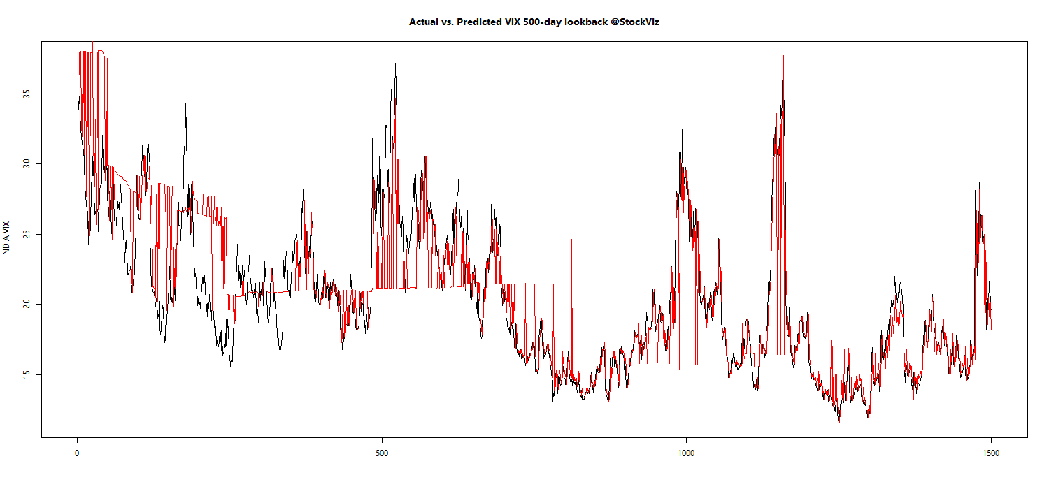
Note how in some periods, the predicted value (red) is just the previous value.

Prediction error

VIX.prediction.pctError.500

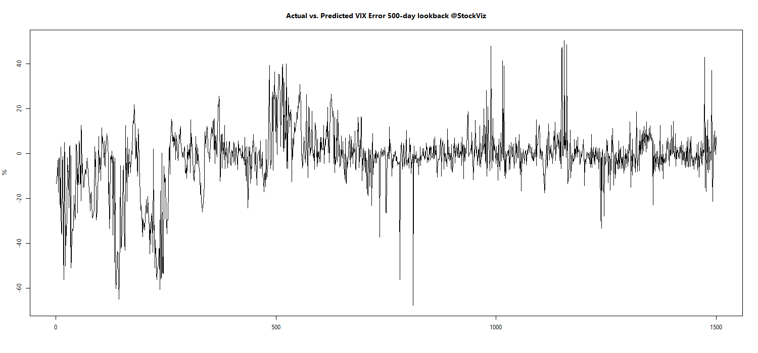
Values less than zero implies that the model prediction overshoots the actual VIX level the next day.

Prediction vs. Actual Density Plot

VIX.prediction.density.500

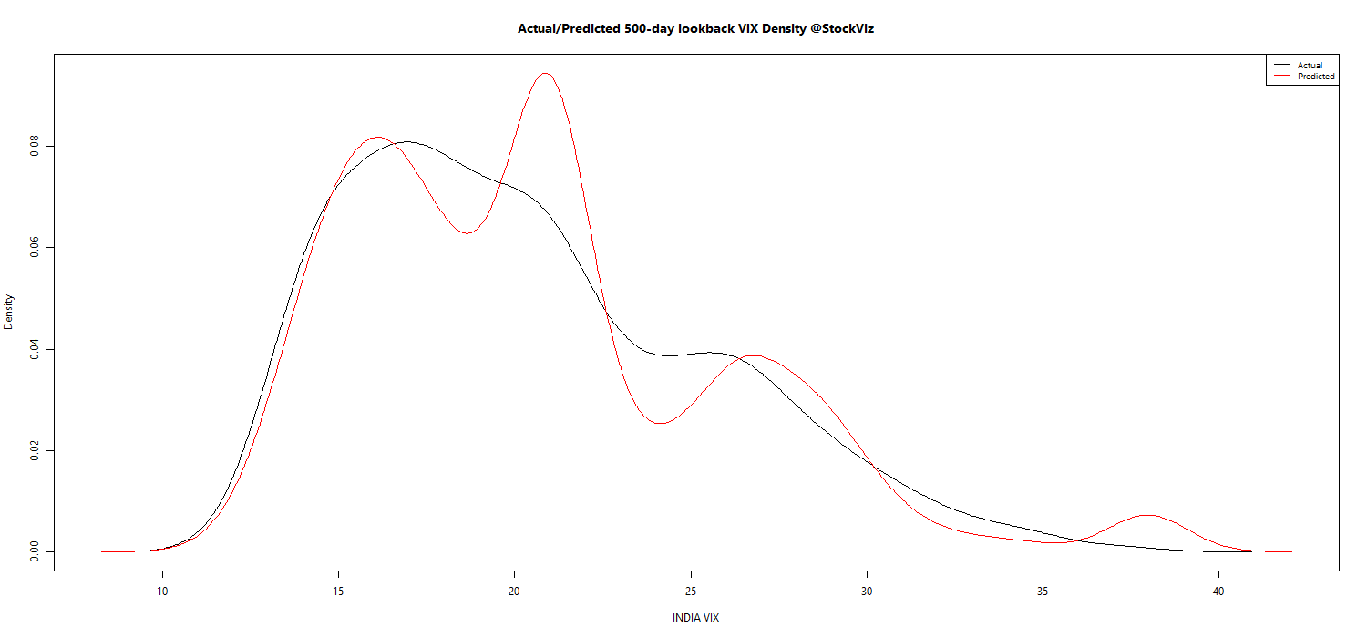
The model bias towards higher estimation of VIX is made explicit here.

Next steps

We will integrate this model to our morning ‘Options Daily’ posts so that we get an idea of both the current state of VIX and the expected modeled behavior.

Caveats:

  1. The 500-day lookback is purely empirical. Maybe some other look-back period that we have not tested would have been ideal to model. We will never know.
  2. Only the known history can be modeled. The outputs should be used along with market determined proxies of expected volatility.
  3. There is always a probability distribution around a predicted value. We will publish this in our daily posts.

Appendix

VIX.pacf

VIX.acf

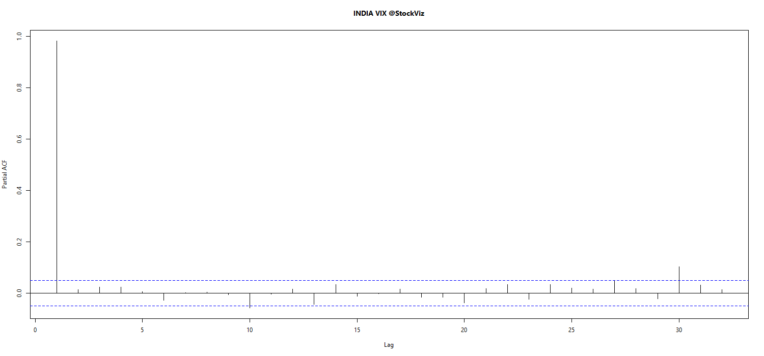
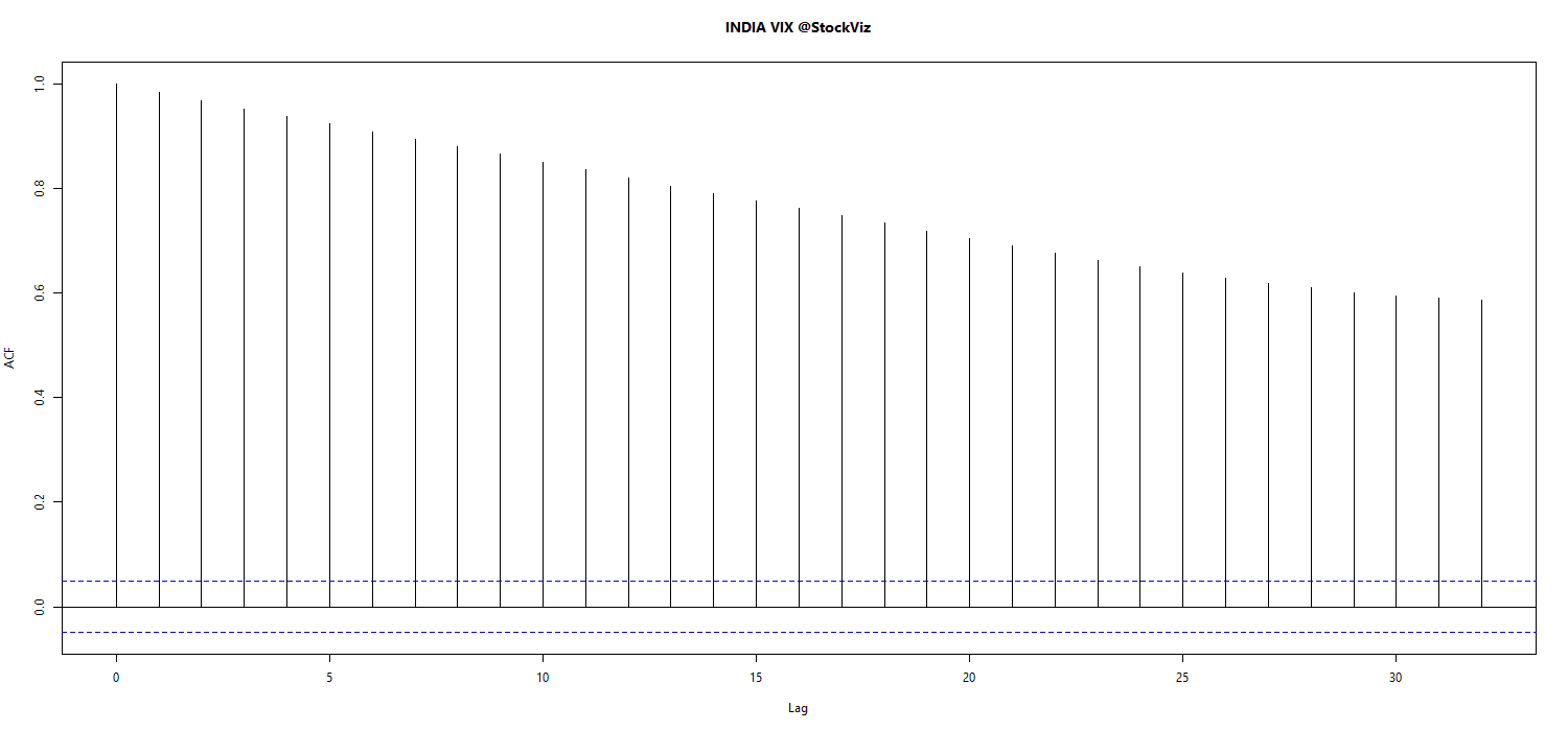
VIX Model vs. Actual across various lookback periods. (pdf)

quant.stackexchange

Volatility Forecasting I: GARCH Models, Rob Reider (pdf)