Tag: quant

Stop-loss and Re-entry

Introduction

A trailing stop is a percentage below the most recent high at which you exit a trade. It allows you to lock-in gains while avoiding catastrophic loss. There are lot of opinions about where these should be set. And more importantly, when to re-enter. What follows is a discussion on how different stops and re-entry rules affect trading frequency and returns.

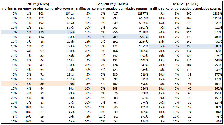
We will consider time-series from 2010 through now on the NIFTY, BANK NIFTY and CNX MIDCAP indices. During this time, the cumulative buy-and-hold returns were 61.47%, 104.81% and 75.61% respectively.

A simple 5-3 Rule

“A good plan violently executed now is better than a perfect plan executed next week.”
– George S. Patton

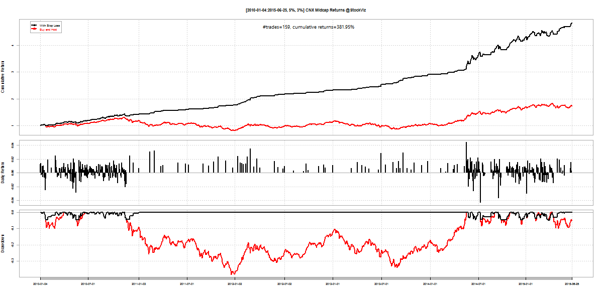
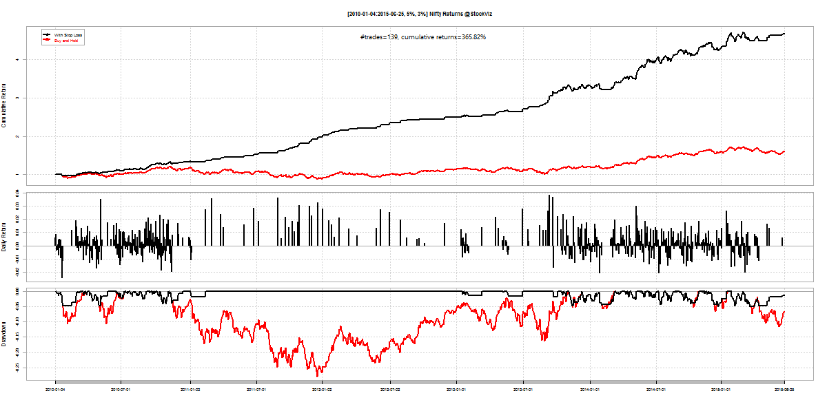
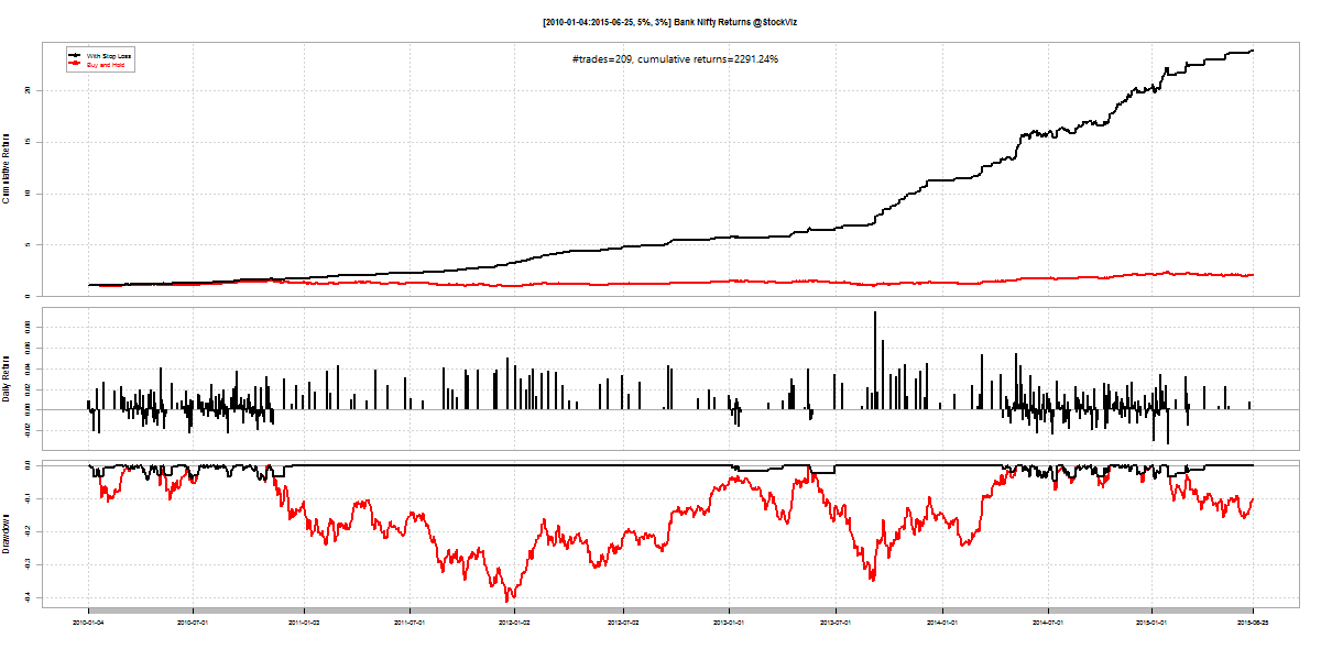
To get us started, we propose a trailing-stop loss at 5% and a re-entry rule that triggers when the index covers 3% from the lowest level since exiting the trade. This rule significantly increases returns and reduces draw-downs across all indices.
nifty.stop-loss.2010.5.3

bank-nifty.stop-loss.2010.5.3

mid-cap.stop-loss.2010.5.3

Index #trades cum. returns
Nifty 139 366%
Bank Nifty 209 2291%
Midcap 159 382%
The boost in returns come at additional trading costs. And even though the average number of trades work out to less than one a week, there maybe periods where it might trigger every day.

The 5-3 Trading frequency

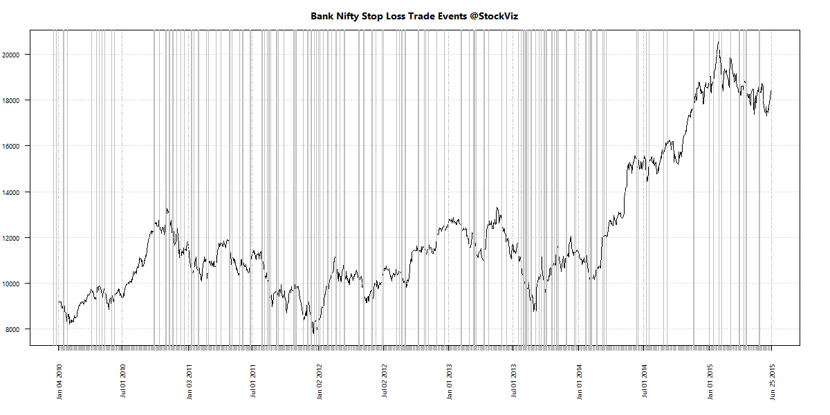
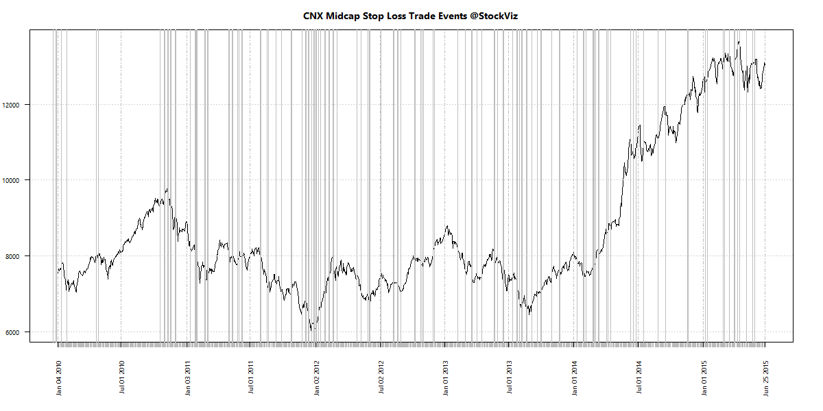
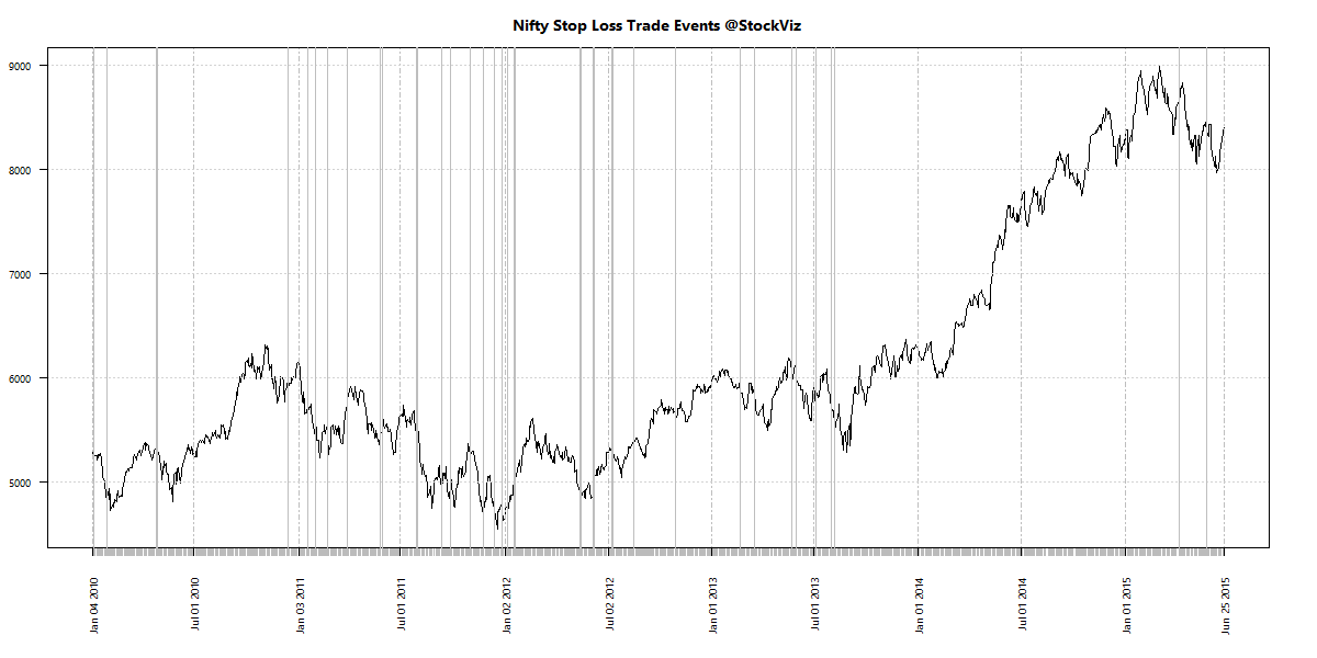
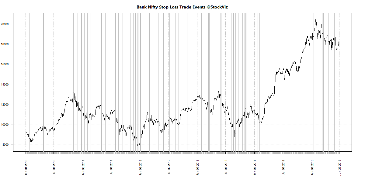
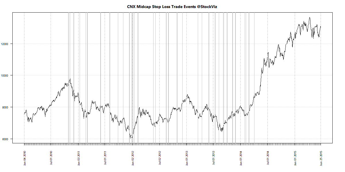
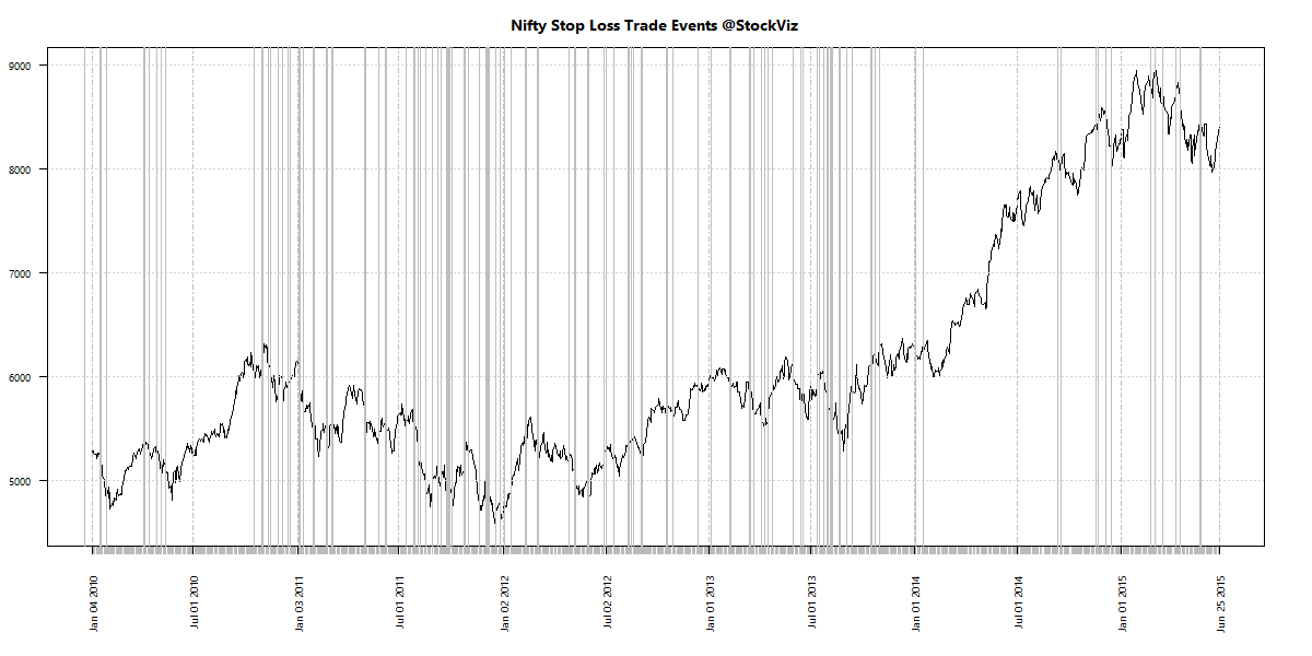
Let’s plot the days on which this rule triggers (both buys and sells.)
nifty.stop-loss.trades

bank-nifty.stop-loss.trades

mid-cap.stop-loss.trades

By the looks of it, the stop-loss and re-entry bands are too narrow.

The 10-5 Rule

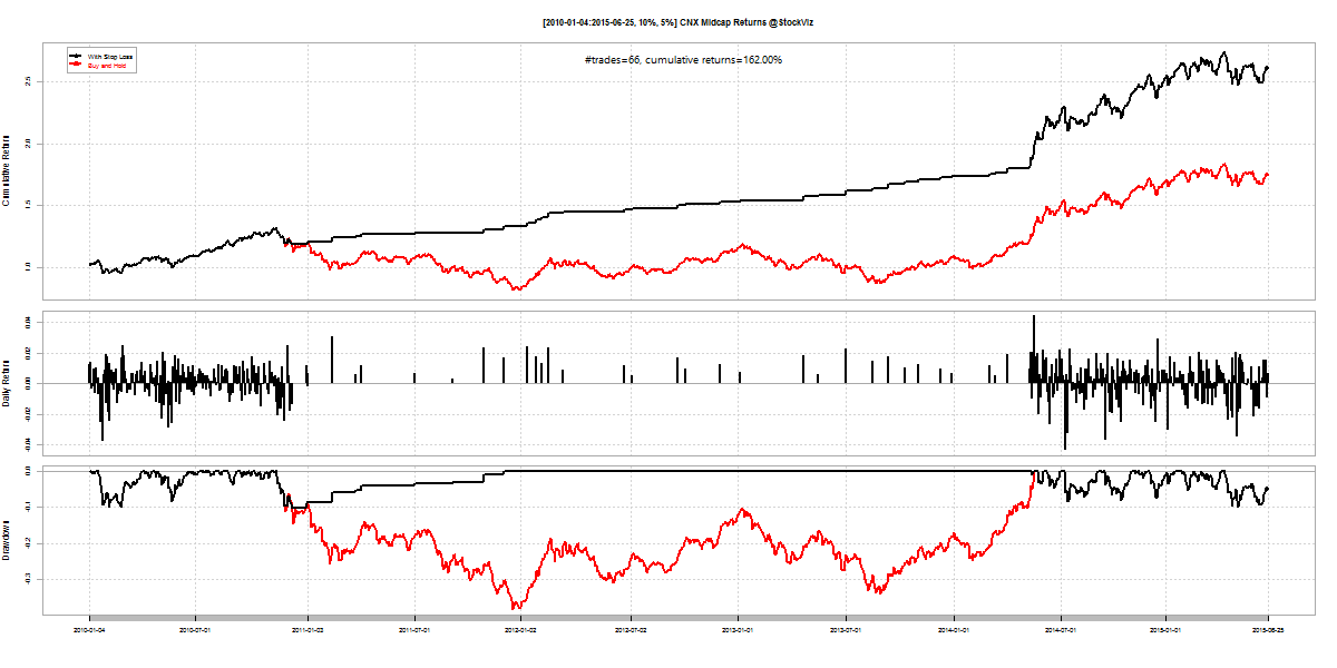
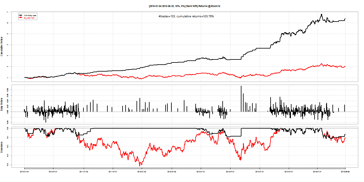
Suppose we set the trailing-stop loss at 10% and re-enter when the index covers 5%, we end up with a strategy with lower number of trades and yet, better returns and buy-and-hold.

Index #trades cum. returns
Nifty 50 100%
Bank Nifty 103 536%
Midcap 66 162%
Lower trading but lower returns as well.

Returns:
nifty.stop-loss.2010.10.5

bank-nifty.stop-loss.2010.10.5

mid-cap.stop-loss.2010.10.5

Trading Events:

nifty.stop-loss.trades.10-5

bank-nifty.stop-loss.trades.10-5

cnx-midcap.stop-loss.trades.10-5

Trailing stop-loss and re-entry scenarios

The master list of different strategies, their trading frequencies and cumulative returns.
trailing stop-loss and re-entry scenarios

Conclusion

Having a trailing stop-loss and re-entry strategy enhances returns but at the price of increased trading frequency. No combination of strategies can escape the doldrums – where the index is basically flat and you are getting whipsawed.

With a 15% tax on short-term gains, over the 5-year period, you should handicap strategy returns by 75% to do an apples-to-apples comparison on the tax-free buy-and-hold returns. If you use the 10-5 rule, it means you will only come-out ahead trading the Bank Nifty. So you are better off with the 5-3 rule given where trading costs stand.
Mutual Fund Performance Chasing

Introduction

Mutual fund sales brochures and distributors often highlight past performance. Why? Because performance sells. The disclaimer that “past performance is not an indicator of future returns” is buried in small-print at the back of the book.

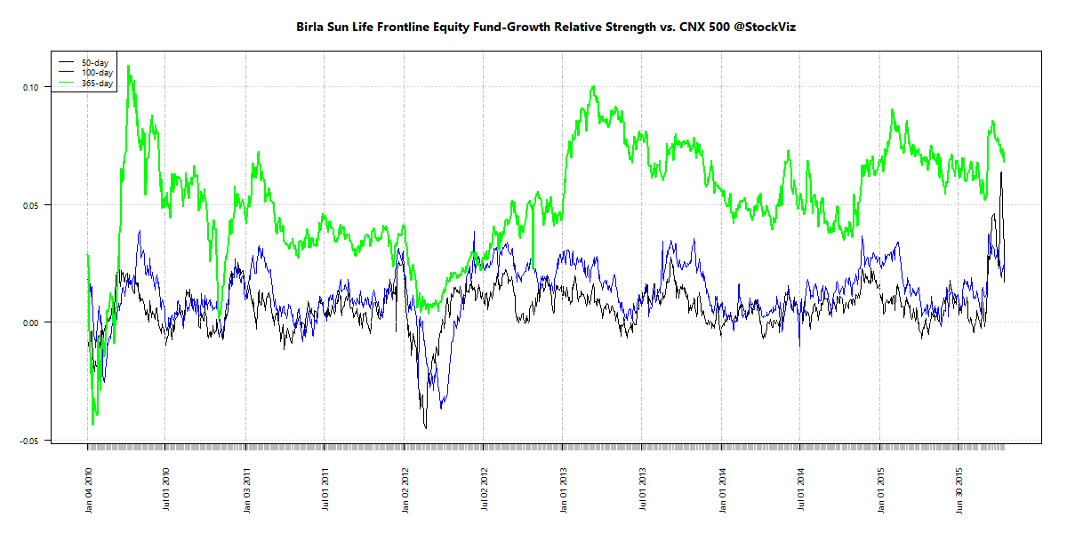
To see how bad a predictor past performance is of future returns, we came up with a novel idea. We used the Relative Strength Spread that we wrote about recently and applied it to mutual fund returns. This gave us three things:

  1. Normalized returns with respect to CNX 500 irrespective of the fund’s benchmark.
  2. A visualization of the performance gap between the best and the worst funds. And,
  3. A parade of top-10 and bottom-10 funds across different periods of time.

Relative Performance

Here’s how the spread between the top and bottom-decile looks like with a 100-day lookback:
CNX 500.mf.relative-spread-index.100

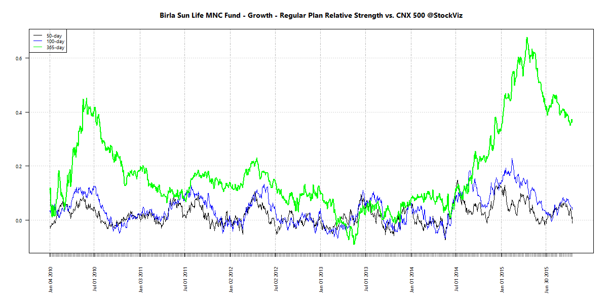
And with a 365-day lookback:
CNX 500.mf.relative-spread-index.365

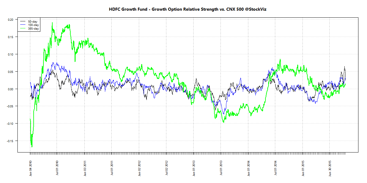
When the broad markets go up, the performance gap between the best and the worst funds widen. Some managers wring more out the markets than the others. However, during the bear phase, the relative performance between different funds compress. If the market is bad, they all look beige.

Longevity of returns

Is the out-performance sustainable? If you picked the best performing fund this year, will it retain its position the next? Click to embiggen:

mutual fund relative performance decile

None of the top performers in 2010 retained their spot in 2011; same as in 2013 vs. 2014. There were a few cases where funds in the top-decile slipped to the bottom decile the next year. It is a total crap-shoot.

Conclusion

There is absolutely no connection between past performance and future returns. If fund managers require a broad-based rally in the markets to out-perform, then they are in effect, chasing momentum.

Relative Strength Spread

Introduction

The Relative Strength Spread takes all the stocks in the CNX 500 index, sorts them by their relative performance vs. the index and takes the ratio between the median relative performance of the top decile and the bottom decile. When you plot the spread, a rising chart indicates that relative strength leaders are performing better than relative strength laggards.

Relative Strength Spread Charts

CNX 500.relative-spread-index.50

CNX 500.relative-spread-index.100

CNX 500.relative-spread-index.365

High Relative Strength Spread environments provide the largest momentum profits – winning trades easily eclipse losing trades.

The 365-day RS-Spread chart clearly demarcates the “Modi-Mania.” The Modi-Mania was manna from heaven for trend-following strategies. However, the post-Modi-Mania phase has seem most momentum algorithms struggle.

A silver-lining is that the 50-day chart shows that we are probably due for a momentum comeback. But it is not uncommon to have prolonged periods of the “doldrums” where momentum is just “average.” It maybe tempting to give up on trend-following strategies during these periods. But just like how we cannot predict momentum crashes, we cannot predict momentum comebacks. So it is important to maintain allocation to momentum strategies.

Conclusion

The Relative Strength Spread index can be useful in explaining momentum profits. However, it is not much of a predictor of future momentum returns. It could also be used to explain the “skill vs. luck” question of returns – just like how a rising tide lifts all boats, a high RS-Spread environment will lift all portfolio returns.

Going forward, we will update the 50-day Relative Strength Spread chart on our weekly Index Update posts.

The Worst Mutual Funds – Quantitative

Introduction

Our previous post looked at the 10 best mutual funds based on sharpe ratio, bear-beta, information ratio, draw-down depth and draw-down length between Jan-2010 and May-2015. Here are the 10 worst funds based on the same metrics.

As you can imagine, infrastructure funds performed poorly in this time-frame. We ignore them for now.

Sharpe Ratio

Bear-Beta

Information Ratio

Draw-down Depth

Draw-down Length

Past Performance

Conclusion

Mutual funds are marketed as wealth builders. However, the truth is that most of them struggle. As you can see from the analysis here, there are quite a few of them with low-single-digit returns over 5-year time-frames. At last count, there were more than 5300 different schemes that you could choose from.

Are you getting the right advise? Get in touch with us if you are looking to invest! Call us or Whatsapp us at +918026650232

The Best Mutual Funds – Quantitative

Introduction

Mutual fund investors are faced with a zillion choices in the marketplace. At last count, there were more than 5300 different schemes that an investor could choose from. When confronted with such a large number of choices, investors either spiral into an “analysis paralysis” mode and end up doing nothing or blindly invest in whatever their broker recommends – both these paths lead to situations that are injurious to the investor’s long-term financial health.

In this post, we try to simplify the choices in front of the investor by ranking the top 10 funds based these risk metrics: sharpe ratio, bear-beta, information ratio, draw-down depth and draw-down length between Jan-2010 and May-2015.

Sharpe Ratio

Bear-Beta

Information Ratio

The information ratio is a ratio of the portfolio’s returns above the returns of a benchmark (CNX MIDCAP, in this case) to the volatility of those returns.

This is probably a better metric than the Sharpe ratio to rank funds.

Nice to see that both the Value Discovery fund and an MNC fund make this list.

Draw-down Depth

Draw-down depth measures the max-loss from peak valuation.

For example, the Blended Plan at the top of the list only lost 0.35% from its peak valuation between 2010 and 2015.

Portfolios with a lot of short-term bonds test well for this metric. But note the pathetic IRRs – no pain = no gain!

Draw-down Length

The draw-down length is a measure of how many days it took the fund to get back the previous peak valuation after a draw-down.

Shorter bounce-backs typically indicate high-quality portfolios.

Nice to see both the MNC funds make this list.

Past Performance

Conclusion

We looked at broad spectrum of funds – including those with bond allocations – to ferret out a good set of funds that investors can consider. Depending on what is more important to the investor, the appropriate set of metrics can be weighted to fit individual risk appetites.

Mutual fund investors whom we advise will immediately recognize some of these funds as they are already part of their portfolios. Get in touch with us if you are looking to invest! Call us or Whatsapp us at +918026650232