Years of returns can get wiped out in a month in the markets. While investors mostly focus on the average, the tails end up dictating their actual returns. (Introduction)
Sampling and Measurement
Typically, a uniform sample is taken. The problem with this is it under-represents the tails. This leads to models that work on average but blow up on occasion. One way to overcome this problem is through stratified sampling. (Sampling)
Expected shortfall (ES) is a risk measure that can be used to estimate the loss during tail-events. (Measuring)
Acceptance
All assets have fat tails. It is a feature, not a bug. (Historical)
There is no asset free of extreme tail losses. If an asset produces any sort of return, it is going to be exposed to some sort of tail event.
One can try to find uncorrelated assets so that those losses don’t occur at the same time. However, correlations between asset returns are not stable – they change over time and behave quite erratically during market panics.
In the end, to be an investor is to accept the fact that large losses occasionally happen.
No matter how you slice it, there is no escaping tail events in investing. It is the nature of the beast and every attempt you make eliminating the risk results in you giving up a significant portion of your returns. But given two investment opportunities, how do you go about figuring out which one is more susceptible to tail events?
Expected shortfall (ES) is a risk measure that can be used to estimate the loss during tail-events. The “expected shortfall at q% level” is the expected return on the portfolio in the worst q% of cases. ES estimates the risk of an investment in a conservative way, focusing on the less profitable outcomes. For high values of q it ignores the most profitable but unlikely possibilities, while for small values of q it focuses on the worst losses. Typically q is 5% and in formulae, p (= 100% – q) is often used as a substitute.
ES of Weekly Returns
Here’s a dilemma that most investors face: Mid-caps have given higher returns in the past compared to large-caps. But, how do their tail-risks compare?
Turns out, ES of the NIFTY MIDCAP 150 TR index is -6.73% vs. NIFTY 50 TR’s -5.65%. This is how much an investor would have lost in the worst 5% of weeks since 2011.
Sampling
In our previous post, we showed how strata-sampling can be used to make sure that you don’t end up ignoring tail-risk in your simulations. By definition, tail-events are rare. So, the differences are subtle.
Tactical Allocation
Reducing tail-risk is one of the biggest draws of tactical allocation. Anything that reduces deep drawdowns has the effect of keeping investors faithful to their investment process.
One way to setup a tactical allocation strategy is to use a Simple Moving Average (SMA) to decide between equity and bond allocations. Different SMA look-back periods will result in different levels of risk and reward. From an ES point of view, here’s how things for NIFTY shakes out:
Since 1999
Since 2010
Using an SMA and re-balancing weekly significantly reduces tail-risk.
How far back should you go?
The problem with tail-events is that there aren’t enough of them to build an effective model. There’s always a temptation to use as much data as possible so that these events find sufficient representation. However, markets evolve, regulatory structures change and past data stop being representative.
For example, if you run a tactical allocation back-test with all the data that is available, you’ll conclude that shorter the SMA, the better:
However, if you remove 2008 and its aftermath and look only are the data from 2011 onward, you get a different picture:
While metrics like ES and strategies like SMA are useful, the data that they are presented will give different results based on the regime that they are drawn from.
Risk management is a continuous process and cannot be reduced to single number.
While developing a model, historical data alone may not be sufficient to test its robustness. One way to generate test data is to re-sample historical data. This “re-arrangement” of past time-series can then be fed to the model to see how it behaves.
The problem with sampling historical market data is that it may not sufficiently account for fat-tails. Typically, a uniform sample is taken. The problem with this is it under-represents the tails. This leads to models that work on average but blow up on occasion. Something you’d like to avoid.
One way to overcome this problem is through stratified sampling. You chop the data into intervals and use their frequencies to probability weight the sample. This preserves the original distribution in the sample.
Notice the skew and the tails in the “STRAT” densities for both NIFTY and MIDCAP indices. This distribution is far more likely to result in a robust model compared to the one that just uses uniform sampling.
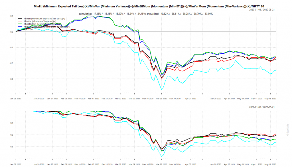
We had discussed portfolios optimized for minimum volatility back in January (see: Low Volatility: Stock vs. Portfolio) and had setup Themes that track such strategies. Broadly, these fall into ETL (Expected Tail Loss) and Min-Var (Minimum Variance) optimized portfolios that either take in the entire universe of stocks or only those that have a high momentum score. So, we have Minimum Expected Tail Loss, Minimum Variance, Momentum (Min-ETL) and Momentum (Min-Variance).
We expect optimized portfolios of momentum stocks to perform better during market up-trends. During bears, we expect them to have lower drawdowns than the market. The Corona Virus Panic put these portfolios in through the wringer. Glad to report that they came out largely unscathed.
Minimum Volatility Portfolios vs. NIFTY 50
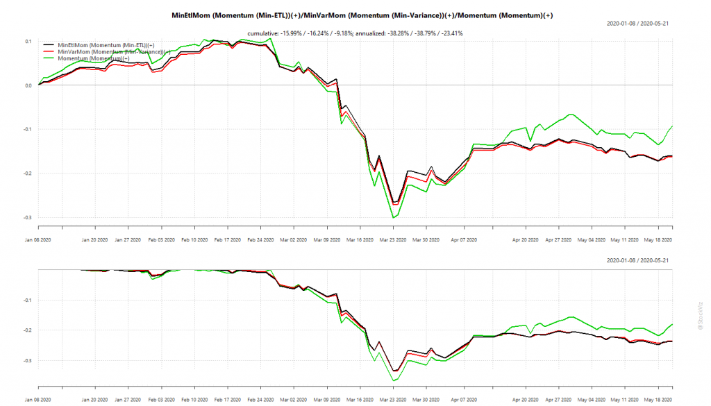
Our back-tests showed that optimized momentum portfolio would under-perform “raw” momentum during up-trends but should have lower drawdowns during down-trends.
Momentum: Optimized vs. raw
Optimized momentum portfolios saved the investor about 3-4% in drawdowns compared to the “raw” momentum portfolio. May not sound like much in this instance but think about the cumulative effect over multiple market corrections when you invest for the long-term.
Overall, optimized portfolios delivered what they promised.
WhatsApp us at +91-80-26650232 if you are interested in knowing more about these strategies.