Factor performance tends to be sticky. If Value, Momentum, Quality, etc. out-performed in the recent past, they continue to out-perform in the near-future.
AQR wrote a paper on it back in January 2019: Factor Momentum Everywhere. More recently, the folks at Research Affiliates extended the research in their Factor Momentum paper. Based on AQR’s research, we setup a portfolio that mimics this for both US and Indian stocks in December 2019. We called it Factor Momentum III and Model Momentum Theme.
The performance of the US portfolio has been gangbusters. It sidestepped the Corona Crash of 2020 and has been on a tear since then. The Indian experience, however, has been disappointing.
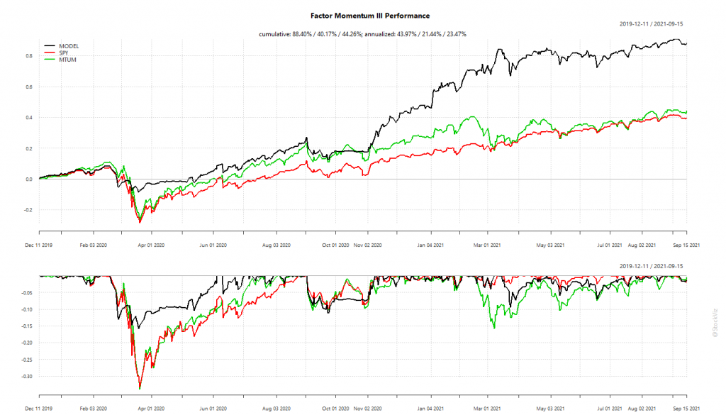
The Indian portfolio suffered from its inability to go into cash/bonds during crashes. Being fully invested took a bite out of its overall performance.
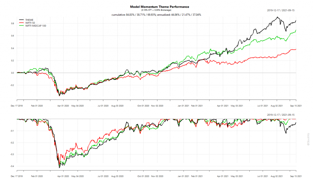
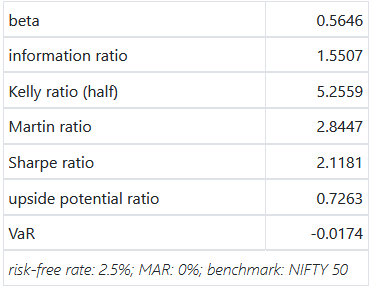
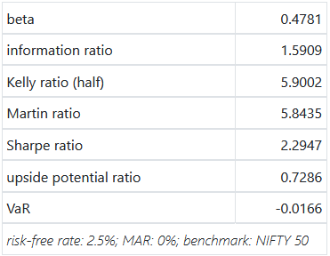
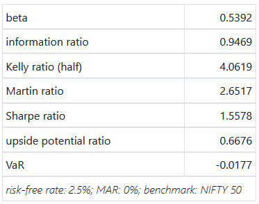
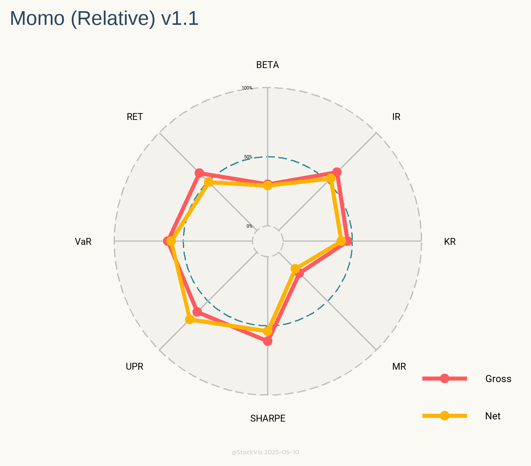
The Indian version comes up short even if you compare its stats with its component factor portfolios.
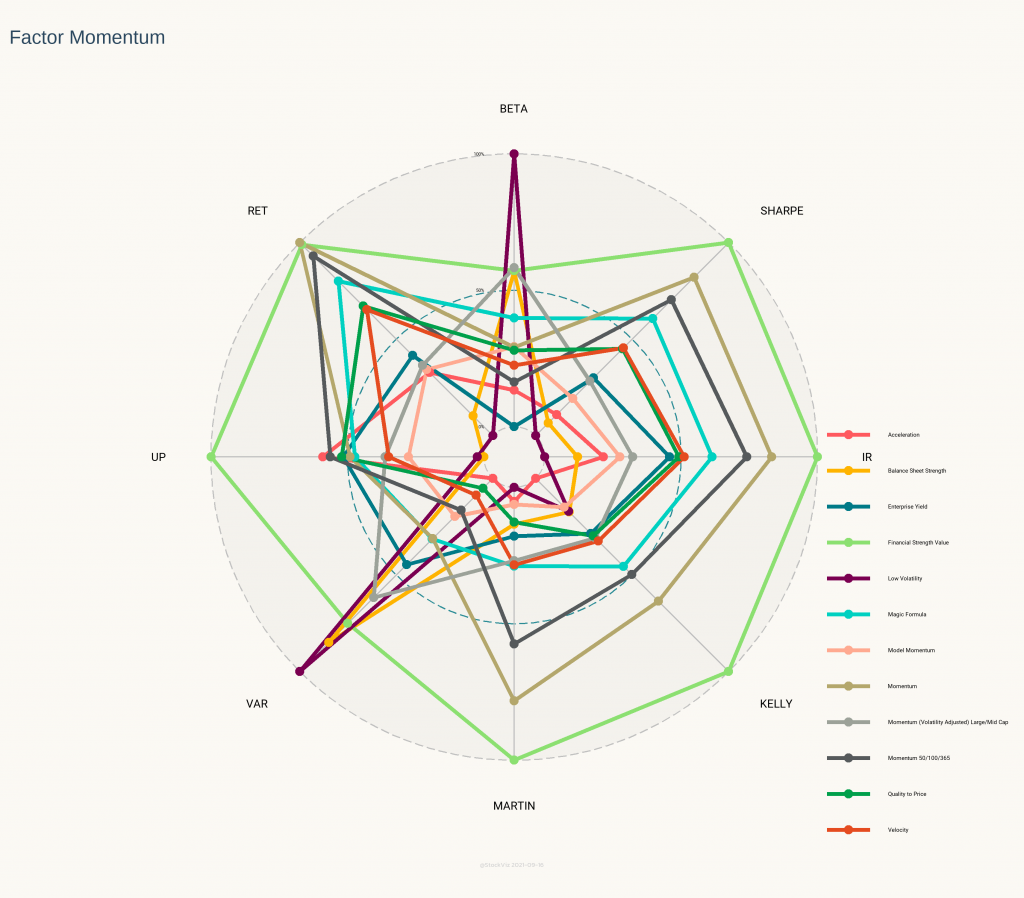
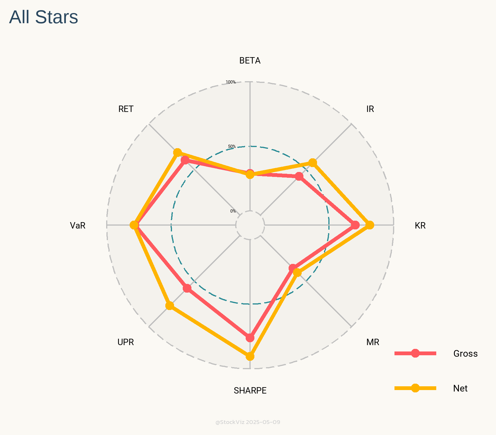
The intuition behind the Radar Plot above is that the larger the area under the points, better the strategy. Model Momentum is in pink and it pales in comparison to most of its constituents. Surprisingly, the Financial Strength Value Theme (light green,) that is rebalanced annually, beat out everything else.
What explains the underperformance?
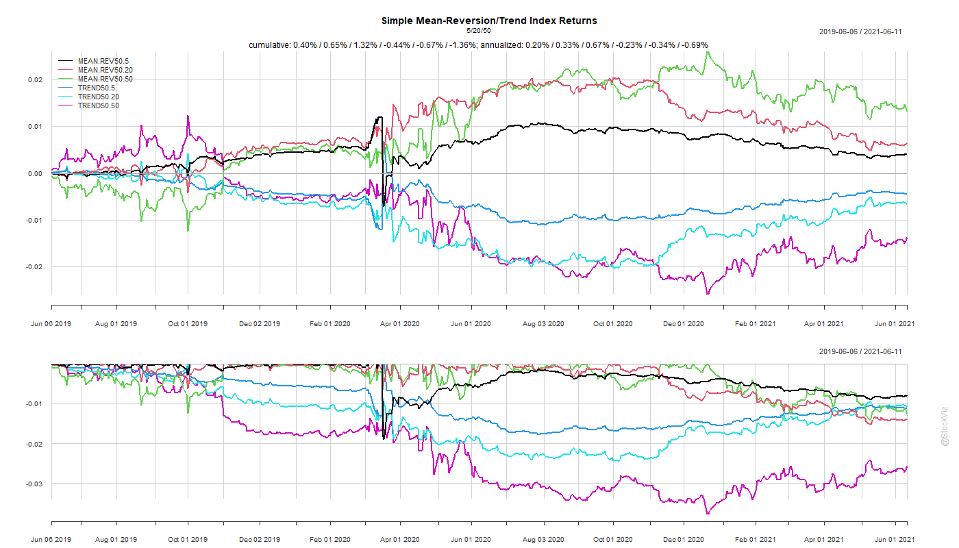
- Not being able to go into cash/bonds meant a larger hill to climb during recoveries. However, cash is a double-edged sword. If you get the timing wrong, you might end up going into cash after the bottom and watch the market recover helplessly. Unless the trend formation period is really short, cash is not a viable option.
- High transaction costs can also be playing a role here. The difference between Gross and Net returns is ~15%. Not as high as a pure momentum strategy but not trivial either. Also, US portfolios do not incur STT and brokerages are essentially zero.
- Maybe 20-months is too short a window to judge such a slow-moving strategy. The research looks solid and maybe all we need is to give it some time?