Know thy enemy
Mutual fund asset managers face a lot of ‘career risk’ if they make an unpopular bet and are proven wrong. They end up following the herd in selling on the face of bad news so it pays to keep an eye on the how much exposure funds have to a specific stock. If no mutual fund owns it then you could make a “deep value” case for an undiscovered gem. If a lot of funds own it, then it is probably a momentum play.
However, be vary of outsourcing your investment decisions. For instance, Canara Robeco Emerging Equities’ exposure to DCB Bank stood at 1.86% as per September’s portfolio disclosure – it was a new addition. The stock is down ~40% since it announced an ambitious expansion plan in October.
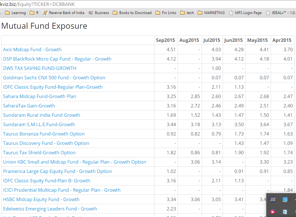
Fund Exposure on StockViz
The ‘Analysis’ section on the equity page gives a 6-month ownership history of a specific stock. For example, this is how it looks for DCB Bank:
Play around and let us know if you have any suggestions!