Equities
| MINTs | |
|---|---|
| JCI(IDN) | +8.65% |
| INMEX(MEX) | +4.12% |
| NGSEINDX(NGA) | -3.37% |
| XU030(TUR) | +6.45% |
| BRICS | |
|---|---|
| IBOV(BRA) | +8.88% |
| SHCOMP(CHN) | +4.27% |
| NIFTY(IND) | +3.00% |
| INDEXCF(RUS) | +6.24% |
| TOP40(ZAF) | +5.65% |
Commodities
| Energy | |
|---|---|
| Brent Crude Oil | +9.37% |
| Natural Gas | +4.09% |
| Heating Oil | +3.53% |
| Ethanol | -2.34% |
| RBOB Gasoline | +3.14% |
| WTI Crude Oil | +9.25% |
| Metals | |
|---|---|
| Copper | +4.76% |
| Silver 5000oz | +8.97% |
| Palladium | +5.16% |
| Platinum | +8.59% |
| Gold 100oz | +3.85% |
Currencies
| MINTs | |
|---|---|
| USDIDR(IDN) | -8.85% |
| USDMXN(MEX) | -2.69% |
| USDNGN(NGA) | +0.43% |
| USDTRY(TUR) | -3.89% |
| BRICS | |
|---|---|
| USDBRL(BRA) | -6.14% |
| USDCNY(CHN) | -0.19% |
| USDINR(IND) | -1.19% |
| USDRUB(RUS) | -6.23% |
| USDZAR(ZAF) | -4.16% |
| Agricultural | |
|---|---|
| Cocoa | -2.16% |
| Coffee (Robusta) | +3.98% |
| Cotton | +3.77% |
| Sugar #11 | +7.09% |
| Lean Hogs | +1.75% |
| Lumber | +8.36% |
| Orange Juice | +10.30% |
| Soybean Meal | +1.05% |
| White Sugar | +3.09% |
| Coffee (Arabica) | +7.78% |
| Feeder Cattle | +6.87% |
| Wheat | -2.17% |
| Cattle | +8.30% |
| Corn | -1.86% |
| Soybeans | +0.83% |
Credit Indices
| Index | Change |
|---|---|
| Markit CDX EM | +1.73% |
| Markit CDX NA HY | +2.03% |
| Markit CDX NA IG | -9.85% |
| Markit iTraxx Asia ex-Japan IG | -18.19% |
| Markit iTraxx Australia | -11.71% |
| Markit iTraxx Europe | -7.10% |
| Markit iTraxx Europe Crossover | -37.22% |
| Markit iTraxx Japan | -8.18% |
| Markit iTraxx SovX Western Europe | -2.20% |
| Markit LCDX (Loan CDS) | +0.00% |
| Markit MCDX (Municipal CDS) | -6.68% |
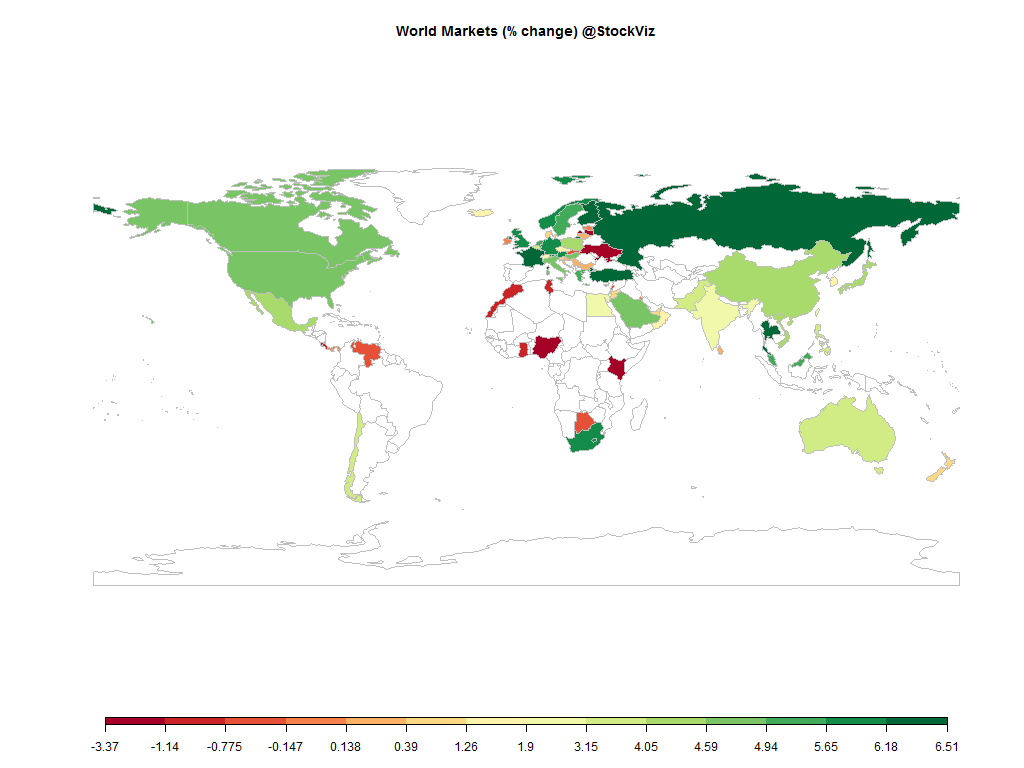
Not even the Fed knows when it is going to raise rates but that did not prevent the markets to party like its 1999.
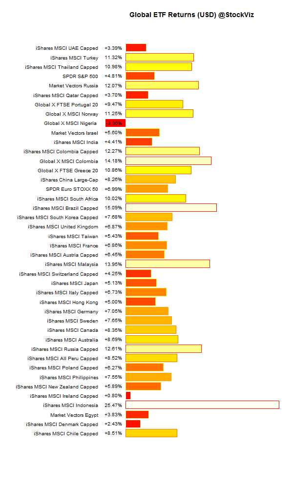
Global ETFs (USD)
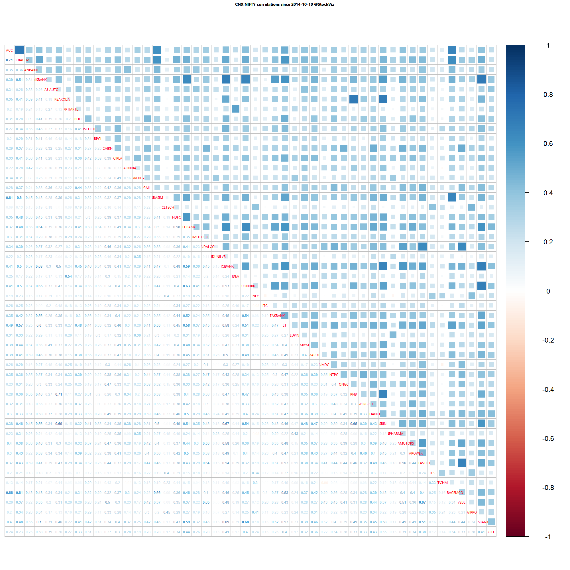
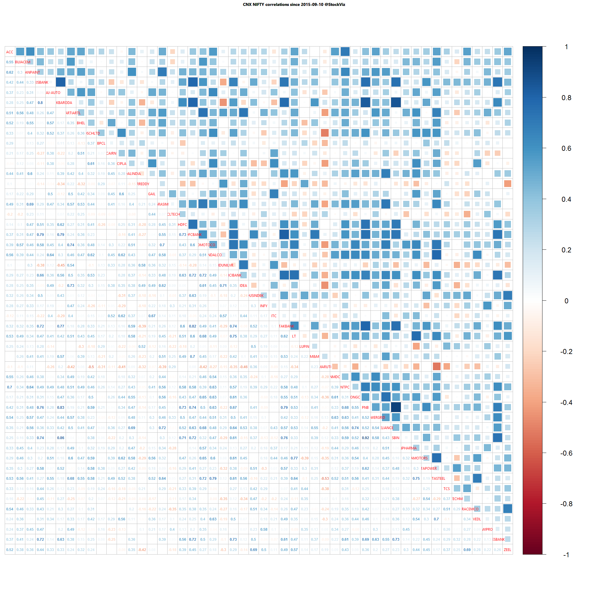
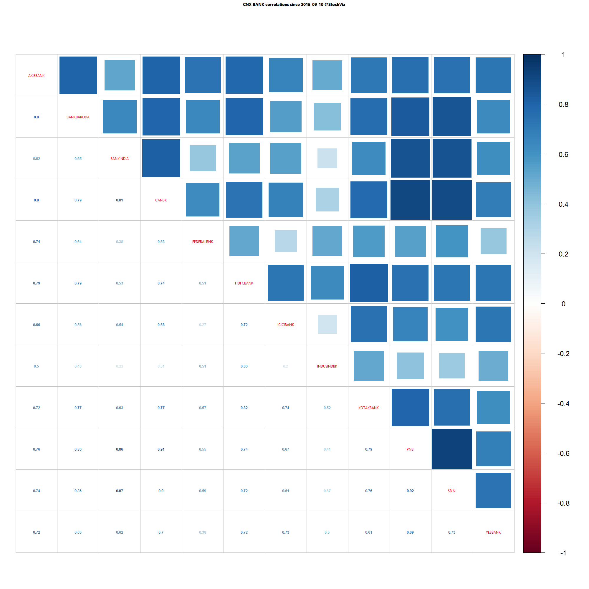
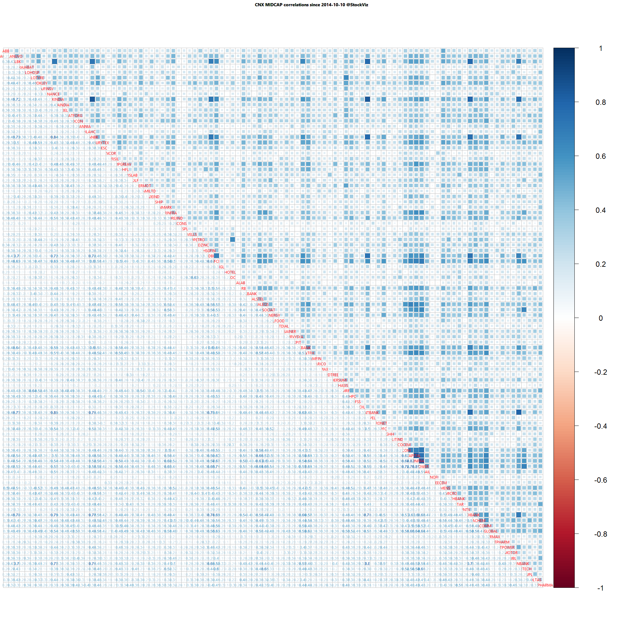
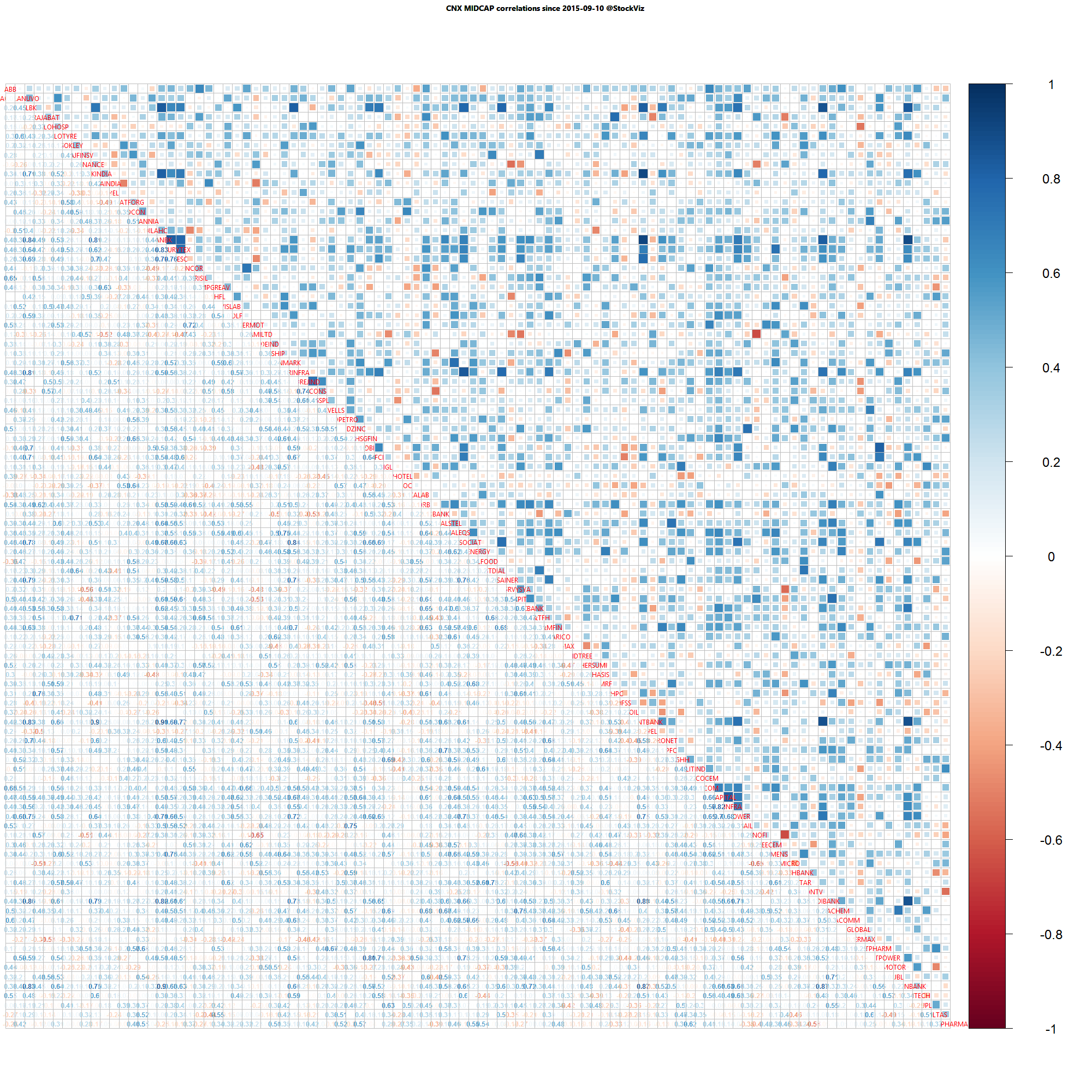
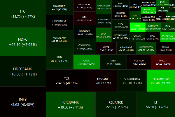
Nifty Heatmap
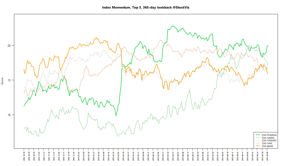
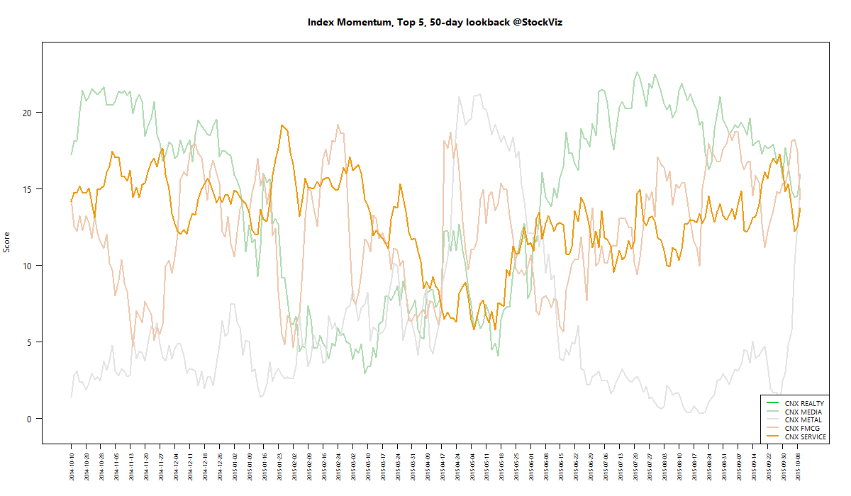
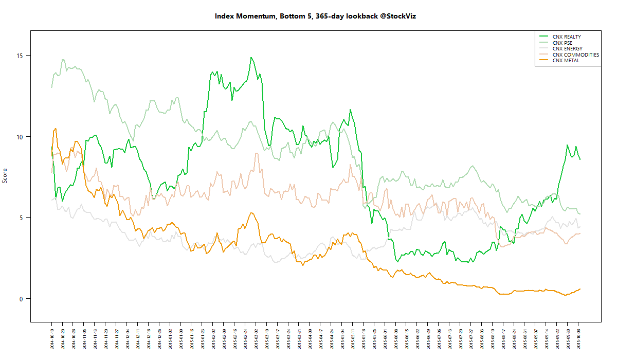
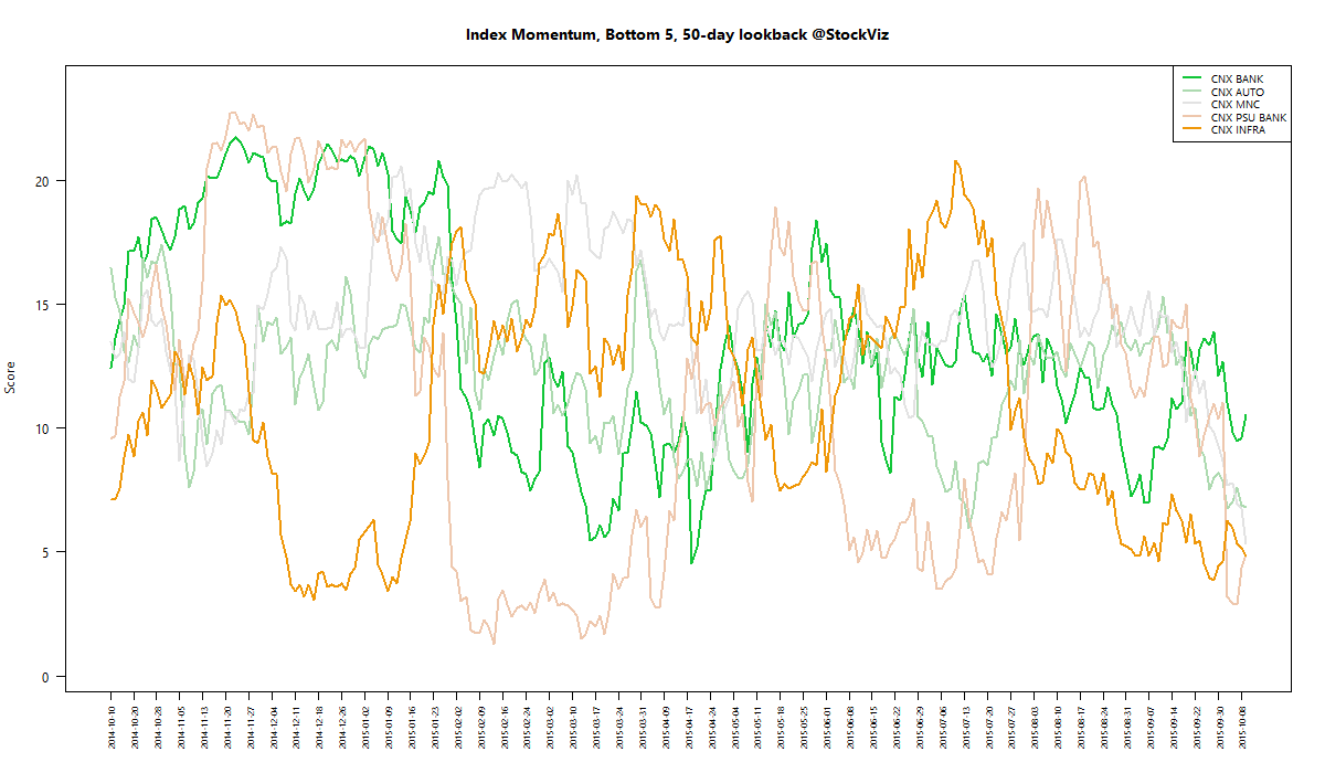
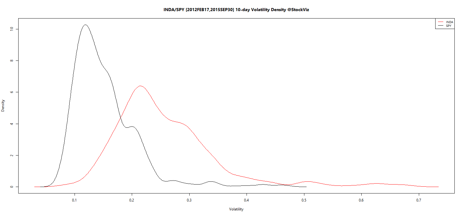
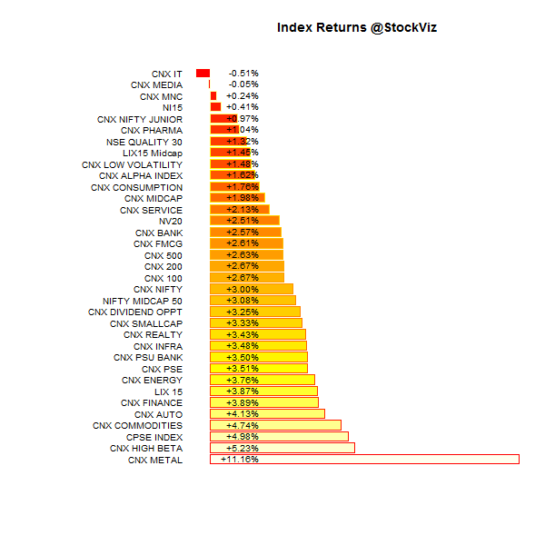
Index Returns
For a deeper dive into indices, check out our weekly Index Update.
Market Cap Decile Performance
| Decile | Mkt. Cap. | Adv/Decl |
|---|---|---|
| 1 (micro) | +4.84% | 74/57 |
| 2 | +7.45% | 83/47 |
| 3 | +4.50% | 76/54 |
| 4 | +6.77% | 74/56 |
| 5 | +5.63% | 74/56 |
| 6 | +5.99% | 71/60 |
| 7 | +4.23% | 71/59 |
| 8 | +3.29% | 74/56 |
| 9 | +1.77% | 66/64 |
| 10 (mega) | +1.89% | 65/66 |
Green is the color of passion…
Top Winners and Losers
| HINDALCO | +18.41% |
| TATAMOTORS | +19.71% |
| VEDL | +24.22% |
| MARUTI | -6.64% |
| IBULHSGFIN | -6.62% |
| RECLTD | -3.99% |
Have metals finally found a bottom?
ETF Performance
| CPSEETF | +5.23% |
| PSUBNKBEES | +4.51% |
| INFRABEES | +2.98% |
| NIFTYBEES | +2.86% |
| BANKBEES | +2.65% |
| GOLDBEES | +1.96% |
| JUNIORBEES | +1.59% |
Gold finally found some takers…
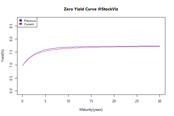
Yield Curve
Bond Indices
| Sub Index | Change in YTM | Total Return(%) |
|---|---|---|
| 0 5 | -0.02 | +0.22% |
| 5 10 | -0.04 | +0.37% |
| 10 15 | -0.04 | +0.47% |
| 15 20 | -0.03 | +0.45% |
| 20 30 | -0.04 | +0.59% |
Bonds continued their rate-cut rally. Plus, FPIs can now buy more.
Investment Theme Performance
| Momentum | +5.64% |
| ADAG stocks | +4.50% |
| High Beta | +4.48% |
| Velocity | +4.07% |
| Next Trillion | +2.64% |
| ASK Life | +2.56% |
| The RBI Restricted List | +2.51% |
| PPFAS Long Term Value | +2.35% |
| Magic Formula | +1.95% |
| Quality to Price | +1.94% |
| CNX 100 Enterprise Yield | +1.81% |
| Financial Strength Value | +1.79% |
| Low Volatility | +1.57% |
| Balance Sheet Strength | +0.67% |
| Tactical CNX 100 | +0.00% |
Momentum came back with a bang! Pretty much every investment strategy ended this week in the green…
Equity Mutual Funds
Bond Mutual Funds
Thought for the weekend
- High stock prices, just like high house prices, are harbingers of low returns.
- Investing in price-depressed residential rental property in Atlanta is like investing in EM equities today—the future expected long-term yield is much superior to their respective high-priced alternatives.
- Many parallels exist between the political/economic environment and the relative valuation of U.S. and EM equities in the periods from 1994 to 2002 and 2008 to 2015.
- Our forecast of the 10-year real return for U.S. equities is 1% compared to that of EM equities at 8%, now valued at less than half the U.S. CAPE.
Source: Investing versus Flipping