Author: shyam

Mutual Fund Performance Chasing

Introduction

Mutual fund sales brochures and distributors often highlight past performance. Why? Because performance sells. The disclaimer that “past performance is not an indicator of future returns” is buried in small-print at the back of the book.

To see how bad a predictor past performance is of future returns, we came up with a novel idea. We used the Relative Strength Spread that we wrote about recently and applied it to mutual fund returns. This gave us three things:

  1. Normalized returns with respect to CNX 500 irrespective of the fund’s benchmark.
  2. A visualization of the performance gap between the best and the worst funds. And,
  3. A parade of top-10 and bottom-10 funds across different periods of time.

Relative Performance

Here’s how the spread between the top and bottom-decile looks like with a 100-day lookback:
CNX 500.mf.relative-spread-index.100

And with a 365-day lookback:
CNX 500.mf.relative-spread-index.365

When the broad markets go up, the performance gap between the best and the worst funds widen. Some managers wring more out the markets than the others. However, during the bear phase, the relative performance between different funds compress. If the market is bad, they all look beige.

Longevity of returns

Is the out-performance sustainable? If you picked the best performing fund this year, will it retain its position the next? Click to embiggen:

mutual fund relative performance decile

None of the top performers in 2010 retained their spot in 2011; same as in 2013 vs. 2014. There were a few cases where funds in the top-decile slipped to the bottom decile the next year. It is a total crap-shoot.

Conclusion

There is absolutely no connection between past performance and future returns. If fund managers require a broad-based rally in the markets to out-perform, then they are in effect, chasing momentum.

Investing in Non-Rupee Assets

Introduction

Indian investors have a significant home bias – we tend to hold a high proportion of our portfolio, sometimes 100%, in Indian assets. However, if you look at how the rupee has behaved vis-a-vis the US Dollar, the advantage of international diversification becomes obvious.

USDINR has been a one-way trade

Historically, the rupee has only depreciated against the dollar. It is the price we pay for being a socialist democracy with poor fiscal responsibility and an unaccountable central bank.

Depreciation quantified

Nifty investors have seen an IRR of 821% since 1991 and today. However, in dollar terms, the IRR is 286%. The difference of 535% is because of rupee depreciation – even if you had held on to a non-productive dollar asset, you would have made that much in rupee terms.

nifty.vs.defty.1991

Diversification benefit

By being long only Indian assets, your fate is tied to the vagaries of the local market participants, regulators and politicians. In a country where most people have dual-SIM phones, it is surprising that most investors are willing to hitch their ride to that pony.

One of the oldest international funds is from Birla Sun Life, let us see how that fared since the financial crisis:

Between 2008-01-01 and 2015-06-15, Birla Sun Life International Equity Fund Plan A- Growth has returned a cumulative 69.99% with an IRR of 7.37% vs. CNX Midcap’s cumulative return of 32.36% and an IRR of 3.83%. It has a beta of only 0.12825 vs. the Midcap index. (MorningStar)

Caveats

The biggest problem with investing in international funds is manager competence. All the reasons we highlighted in our post, Funds that (also) invest in foreign markets, apply. At the end of the day, you are still investing in equities and equity markets are (loosely) correlated. However, investors are better off choosing a pure international equity fund rather than one where the “international” part is a hobby.

The second problem is that there are some funds that invest in emerging Asia or frontier markets. These funds are not really long the dollar. Investors should pay attention to this detail.

Conclusion

Investing in international funds makes sense from a depreciation and diversification point of view. In our Aggressive Fund portfolio, we assign 30% of investor allocation to international funds.

Weekly Recap: Profit Destroying Innovation

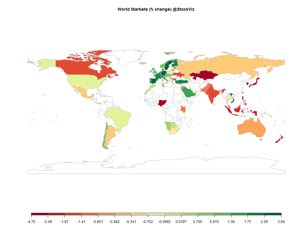
world.2015-06-05.2015-06-12

Equities

Major
DAX(DEU) -0.01%
CAC(FRA) -0.40%
UKX(GBR) -0.29%
NKY(JPN) -0.26%
SPX(USA) -0.09%
MINTs
JCI(IDN) -3.23%
INMEX(MEX) +0.25%
NGSEINDX(NGA) -0.13%
XU030(TUR) -1.88%
BRICS
IBOV(BRA) +0.44%
SHCOMP(CHN) +2.85%
NIFTY(IND) -1.62%
INDEXCF(RUS) +0.01%
TOP40(ZAF) +0.30%

Commodities

Energy
Natural Gas +6.59%
Ethanol -4.26%
Brent Crude Oil +1.08%
Heating Oil +0.94%
WTI Crude Oil +1.64%
RBOB Gasoline +4.58%
Metals
Copper -0.74%
Gold 100oz +1.02%
Palladium -1.90%
Platinum +0.16%
Silver 5000oz -0.63%

Currencies

USDEUR:-1.33% USDJPY:-1.77%

MINTs
USDIDR(IDN) +0.34%
USDMXN(MEX) -2.04%
USDNGN(NGA) +0.22%
USDTRY(TUR) +1.75%
BRICS
USDBRL(BRA) -1.09%
USDCNY(CHN) +0.09%
USDINR(IND) +0.48%
USDRUB(RUS) -2.13%
USDZAR(ZAF) -1.56%
Agricultural
Cattle -0.28%
Cocoa +0.05%
White Sugar -0.97%
Cotton +0.61%
Lumber +1.45%
Orange Juice +5.35%
Corn -2.15%
Feeder Cattle +0.90%
Coffee (Arabica) -2.01%
Coffee (Robusta) +0.17%
Lean Hogs -0.61%
Soybean Meal +4.00%
Soybeans +0.13%
Sugar #11 -2.98%
Wheat -2.65%

Credit Indices

Index Change
Markit CDX EM -0.48%
Markit CDX NA HY -0.19%
Markit CDX NA IG +0.14%
Markit iTraxx Asia ex-Japan IG +1.99%
Markit iTraxx Australia +1.42%
Markit iTraxx Europe +1.14%
Markit iTraxx Europe Crossover +0.36%
Markit iTraxx Japan +2.32%
Markit iTraxx SovX Western Europe +0.28%
Markit LCDX (Loan CDS) -0.02%
Markit MCDX (Municipal CDS) -0.16%
A huge wave of volatility consumed pretty much all asset classes this week. Bonds – down, equities – down, rupee – down; euro – up. Are we done yet?

Nifty Heatmap

CNX NIFTY.2015-06-05.2015-06-12

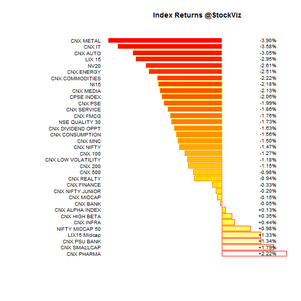
Index Returns

For a deeper dive into indices, check out our weekly Index Update.
indexperformance.2015-06-05.2015-06-12

Sector Performance

sectorperformance.2015-06-05.2015-06-12

Advance Decline

advance.decline.line2.2015-06-05.2015-06-12

Market Cap Decile Performance

Decile Mkt. Cap. Adv/Decl
1 (micro) -8.21% 59/68
2 -2.71% 58/70
3 -2.35% 58/70
4 -3.39% 61/67
5 -2.31% 58/70
6 -2.26% 61/67
7 -2.15% 57/71
8 -3.77% 58/70
9 -2.61% 58/70
10 (mega) -1.82% 60/68
A total bloodbath across market caps…

Top Winners and Losers

GLENMARK +4.08%
ICICIBANK +4.17%
OFSS +4.18%
BANKBARODA -8.30%
PNB -8.21%
BOSCHLTD -7.71%
Bosch was once a boring old manufacturing company but they had to go and include it in the Nifty and ruin it for everyone…

ETF Performance

INFRABEES +0.43%
BANKBEES +0.21%
GOLDBEES +0.01%
JUNIORBEES -1.45%
CPSEETF -1.58%
NIFTYBEES -1.58%
PSUBNKBEES -2.63%
PSU banks back to being kicked around…

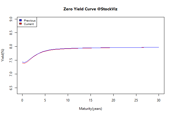
Yield Curve

yield Curve.2015-06-05.2015-06-12

Bond Indices

Sub Index Change in YTM Total Return(%)
GSEC TB -0.63 +0.33%
GSEC SUB 1-3 -0.29 +0.84%
GSEC SUB 3-8 -0.07 +0.17%
GSEC SUB 8 +0.29 -2.69%
Are long bonds reflecting global liquidity jitters or are they signalling higher inflation?

Investment Theme Performance

Equity Mutual Funds

Bond Mutual Funds

Thought for the weekend

We may have entered a great period of profit destroying innovation where the benefits accrue more and more to the customers and not the providers.

For instance, for almost every SaaS company that charges for features there are now new companies being built that give the features away with the goal of charging for some activity in the network that they are looking to build.

Source: Valuations, Profit Destroying Innovation and Winner’s Curse

Mutual Fund Performance in Bear Markets

Introduction

During our discussion on Relative Strength Spread, we saw how the relative performance between winners and losers were compressed in the bear markets of 2011, 2012 and 2013. During these doldrums, most active investment strategies fail to outperform their benchmarks. Since most mutual fund investments span multiple bull and bear markets, it makes sense to have a look at how funds performed in the most recent bear market.

For our analysis, we took funds that had more than 90% allocated in equities and ignored sector and international funds. We then applied the same benchmark, the CNX Midcap Index, to make sure that we had an apples-to-apples comparison. A total of 200 funds were analyzed.

The 10 worst funds

Information Ratio

Sharpe Ratio

Beta

Bear Beta

Draw down depth

Draw down length

The 10 best funds

Information Ratio

Sharpe Ratio

Beta

Bear Beta

Draw down depth

Draw down length

Conclusion

The Birla MNC fund stands out as one having the most points in its favour: low and shallow drawdown, better sharpe and higher returns. The next stand outs were the Axis Long-term equity fund and the Mirae Asset Emerging Bluechip Fund.

In terms of the worst funds, HSBC Progressive Themes was definitely regressive to your wealth. JM Basic and Sundram SMILE funds also laid a deuce.

Mutual funds are marketed as wealth builders. However, the truth is that most of them struggle. At last count, there were more than 5300 different schemes that you could choose from.

Are you getting the right advise? Get in touch with us if you are looking to invest! Call us or Whatsapp us at +918026650232

Relative Strength Spread

Introduction

The Relative Strength Spread takes all the stocks in the CNX 500 index, sorts them by their relative performance vs. the index and takes the ratio between the median relative performance of the top decile and the bottom decile. When you plot the spread, a rising chart indicates that relative strength leaders are performing better than relative strength laggards.

Relative Strength Spread Charts

CNX 500.relative-spread-index.50

CNX 500.relative-spread-index.100

CNX 500.relative-spread-index.365

High Relative Strength Spread environments provide the largest momentum profits – winning trades easily eclipse losing trades.

The 365-day RS-Spread chart clearly demarcates the “Modi-Mania.” The Modi-Mania was manna from heaven for trend-following strategies. However, the post-Modi-Mania phase has seem most momentum algorithms struggle.

A silver-lining is that the 50-day chart shows that we are probably due for a momentum comeback. But it is not uncommon to have prolonged periods of the “doldrums” where momentum is just “average.” It maybe tempting to give up on trend-following strategies during these periods. But just like how we cannot predict momentum crashes, we cannot predict momentum comebacks. So it is important to maintain allocation to momentum strategies.

Conclusion

The Relative Strength Spread index can be useful in explaining momentum profits. However, it is not much of a predictor of future momentum returns. It could also be used to explain the “skill vs. luck” question of returns – just like how a rising tide lifts all boats, a high RS-Spread environment will lift all portfolio returns.

Going forward, we will update the 50-day Relative Strength Spread chart on our weekly Index Update posts.