Tag: returns

The Buy and Hold Bet

The biggest bet that buy and hold investors of a given country are making is that their government stays committed to increase, preserve and protect their citizen’s wealth. It is a combination of regulation, property rights, human capital, investor sentiment and global capital flows.

Buy and hold worked out great for US investors in the last 30-years. Inflation was mostly under control and they enjoyed a dollarized world with the rest of the world sending their surpluses to the US. But It wasn’t always like this.

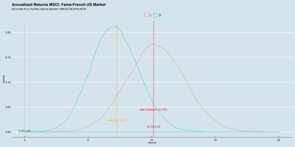
The year 1980 was a turning point for US bonds and equities. Not that there weren’t hiccups along the way – Black Friday, tech bust, GFC, etc – but it was the beginning of a huge tail-wind that continues to blow even today. Compare the simulation results of pre-1980 equity returns vs. what came next:

Pre-1980: 5% possibility of loss in a buy-and-hold portfolio
Post-1980: 0% possibility of loss in a buy-and-hold portfolio

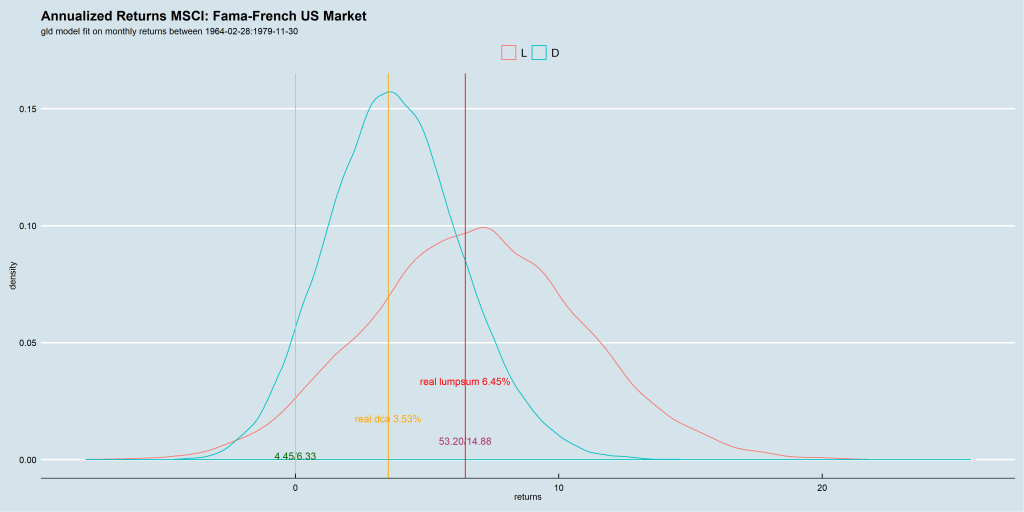
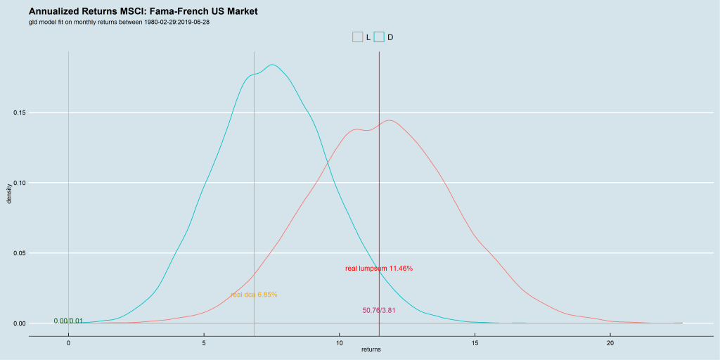
The post 1980 data-set is so skewed that when you use the entire data-set – 1964 through 2019 – for running the simulation, you end up with a 0% loss as well.

1964-2019: 0% possibility of loss in a buy-and-hold portfolio

With this data-set, it is easy to conclude that a buy-the-market “passive” buy-and-hold strategy is superior to everything else. But that would be a very aggressive conclusion to draw.

There are quite a few countries with equity returns (since 1993) in the low single digits: GREECE, CHINA, JORDAN, JAPAN, IRELAND, AUSTRIA, PAKISTAN.

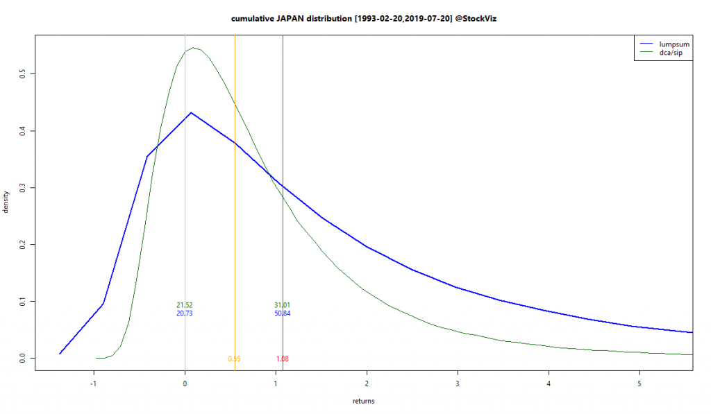
CHINA, a country that grew its GDP in double digits, was a very poor equity investment. And JAPAN was the world’s second largest economy in 1995 but their equities are a joke on twitter.

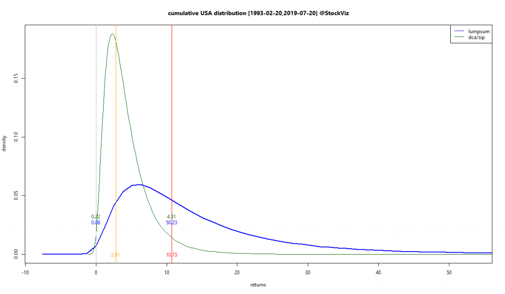
Only DENMARK, USA and SWITZERLAND had an extremely small chance of posting negative buy-and-hold returns.

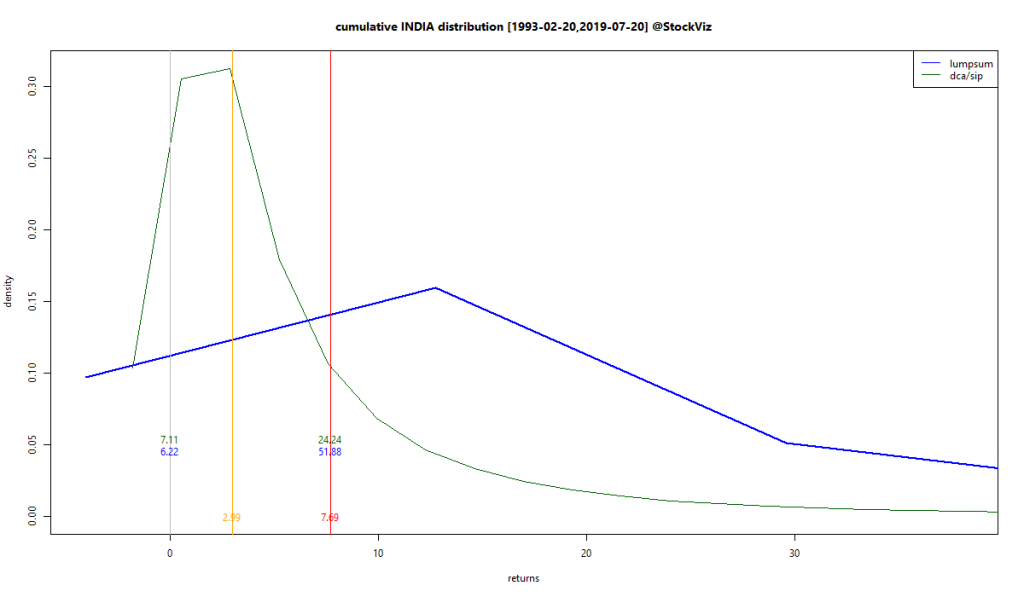
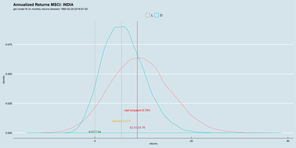
Out of the 43 Country specific MSCI indices we analyzed, half had more than a 10% chance of giving negative returns to buy-and-hold investors. India had a 6% chance.

6% possibility of loss in a buy-and-hold portfolio

Any analysis done on US stocks should be taken with a pinch of salt. The rest of the world does not work that way.

This post expands on an earlier one on the same topic.

Buy and Hold probably works only for US stocks

Social science research is said to have a WAGS problem. Most of their research is based on White American Graduate Students and fail to replicate in the real world.

Finance has a similar problem where, thanks to the depth of the data available on the US markets, most investment research is based on American data.

And US data clearly demonstrates the superiority of Buy and Hold. Over a 25+ year period, the probability of ending up with a loss is less than 0.1%

MSCI USA

If future returns are in the same vein as their past returns, US investors would be fools not to buy and hold forever.

However, this does not mean that the rest of the world should do the same thing. Every market is different. The Japanese experience is a study in contrast.

MSCI JAPAN

The probability of a negative outcome is a whopping 21% for them. i.e., there is a one-in-five chance that investors will not make any money investing in Japanese equities. If past is indeed prelude.

Indian investors have been better off than their Japanese counterparts. There is only a 6% chance of not making any money investing in Indian equities.

MSCI INDIA

All this goes to show that the US is a statistical outlier. “Buy and Hold” working in the US is an outlier. In every other market, there is a non-trivial chance that you will not make any money buying-and-holding equities.

When you look at research based on US markets, keep in mind that the probability distribution of returns that it is based on are an outlier. Anything that is long US equities will “look good.”

All investing is forecasting. And these probabilities will change – we are talking about equity markets after all. But know this before you adopt the “buy and hold” mantra.

Portfolio Churn

There is a famous scene in the “Wolf of Wall Street” where Matthew McConaughey (Mark Hanna) is explaining to Leonardo DiCaprio (Jordan Belfort) the concept of fugazi:

Mark Hanna: Number one rule of Wall Street. Nobody… and I don’t care if you’re Warren Buffet or if you’re Jimmy Buffet. Nobody knows if a stock is gonna go up, down, sideways or in f***ing circles. Least of all, stockbrokers, right? You know what a fugazi is?”

Jordan Belfort: *Fugayzi*, it’s a fake.

Mark Hanna: *Fugayzi*, fugazi. It’s a whazy. It’s a woozie. It’s fairy dust. it doesn’t exist. It’s never landed. It is no matter. It’s not on the elemental chart. It’s not f***ing real.

IMDB

Gross returns of a high turnover portfolio is just that – fugazi.

Assume that there is an investment strategy that produces 12% in gross returns every year. Notionally, $1 should grow to $3.11 in 10 years. However, even if you assume brokerage charges are zero, demat charges don’t exist and there are no other taxes whatsoever, STT – Securities Transaction Tax – will take a slice of the portfolio at every churn.

A x600 churn, where 25% of the portfolio is replaced every month, will leave you only $2.94 in 10 years. A x1200 churn, where 50% of the portfolio is replaced every month – not uncommon with most momentum strategies – will leave you with only $2.79.

12% notional returns

And STT is not the only tax that is paid on a direct-equity portfolio. Capital gains tax of 10-15% also apply. These taxes have a non-linear impact on a portfolio’s compounded returns.

Investors should keep these in mind while comparing direct-equity portfolio returns.

Also, mutual fund NAVs are net returns. It is highly inappropriate to compare gross direct-equity returns with mutual fund NAVs.

Code for this analysis can be found on github. You can play around with it on pluto.

Factor Holding Periods for Excess Returns

The NSE has different “strategy” indices that reflect some well known equity factors like low-volatility, quality, momentum and value. They are all shown to out-perform the NIFTY 50 TR index since inception:
cumulative returns of NSE factor 'strategy' indices

However, the excess returns of these indices, like everything else in equities, is unevenly distributed. As an investor, it could get frustrating to watch their “quality” factor investment under-perform the plain-old NIFTY 50 over many months. So broadly, for a given factor/strategy, what should the minimum holding period be for an investor to see only a positive excess return?

holding periods and excess returns for different factor/strategy indices

Factors take time to work. The longer the holding period, the less frustrating the experience. Low-volatility and Quality have the shortest holding periods of 5 years. The Alpha and Value indices require about 10 years for investors to see only positive excess returns. Also, given the lack of liquid, low-cost ETFs and index funds that track these factor indices, investors have to also contend with STT and capital-gains tax if they go the DIY route.

The edge that statistical factors have over market-cap based indices are measured over decades and require investors to be patient.

Charts and code on github.

Are Stop-Losses Worth It? Part II

We saw how, in aggregate, stop-losses do not add any value to a momentum portfolio after taxes and transaction costs (Are Stop-Losses Worth It?) When you dig a little deeper into the actual positions that get stop-lossed and analyze their subsequent returns, we find that, on average, subsequent returns are not negative enough to justify trading costs.

During mid-2016 through April-2019 Bull and Bear phases

Here’s how the Momo (Relative) v1.1 Theme’s stop-lossed positions behaved 20-days after they got booted out, mid-2016 through April-2019:

Momo (Relative) v1.1.density-T20.2016-08-23.2019-04-24

Summarized statistics across different holding periods:
Momo (Relative) v1.1.density-table.2016-08-23.2019-04-24

Now let’s partition the total period into two. The first part covers the “bullish” market of mid-2016 through Dec-2017 and the second Jan-2018 through April-2019.

During the mid-2016 through Dec-2017 Bull

Momo (Relative) v1.1.density-T20.2016-08-23.2017-12-29

Summarized statistics across different holding periods:
Momo (Relative) v1.1.density-table.2016-08-23.2017-12-29

During the Jan-2018 through April-2019 Bear

Momo (Relative) v1.1.density-T20.2018-01-01.2019-04-24

Summarized statistics across different holding periods:
Momo (Relative) v1.1.density-table.2018-01-01.2019-04-24

Conclusion

When looked at from the perspective of a single position, a stop-loss removes red ink and is out-of-sight/out-of-mind. However, it is only when you look at their subsequent returns in the aggregate, that you realize that peace-of-mind comes at a cost.

During the bull phase, when the whole market was shooting higher, stop-lossed positions recovered from their losses. Note how the skew is slightly positive. Stop-losses here were a definite drag after taking costs into account.

During the bear phase, it does look like stop-losses helped – the subsequent returns of stop-lossed positions were skewed left. However, as we saw in our previous post, in aggregate, they did not add value after taking costs into account.