Tag: returns

MSCI: Momentum trumps Value

Our previous posts explored how swapping market-cap weighted indices with momentum indices considerably boosted returns in the classic GEM dual-momentum model. And we followed that up with a post comparing different momentum indices. Here, we try to address the quintessential question for times: which strategy should you bet on? Value or momentum?

Thankfully, MSCI has an exhaustive set of factor indices that cover both quantitative value and momentum. Going back to 1995.

MSCI Prime Value

MSCI Prime Value indices are a pretty good quality and value screen that cover a diversified universe of securities in a country/region.

From their factsheet about index construction methodology:
Quality scores are calculated for all Parent Index constituents. The Quality Z-scores are calculated using fundamental variables such as Return on Equity, Earnings Variability and Debt to Equity. The securities are sorted in descending order of the quality scores.
The Prime Value score for each security in the Quality Parent Universe is calculated by combining the z-scores of four value descriptors, namely Trailing Price to Earnings (P/E), Price to Book Value (P/B), Price to Sales (P/S) and Price to Cash Earnings (P/CE).

MSCI Momentum

MSCI Momentum indices are a pretty good momentum screen that covers a diversified universe of securities in a country/region.

From their factsheet about index construction methodology:
The Momentum value for each security is calculated by combining recent 12-month and 6-month local price performance of the security. The price performance is computed excluding recent 1-month. The Momentum value thus computed is further adjusted with corresponding volatility of the security.
Risk-adjusted Price Momentum (for the 6-month horizon and 12-month horizon) computed above are standardized into z-scores. The z-scores are combined in equal proportion and standardized to arrive at a single Momentum combined score.

Index coverage

The MSCI ACWI is the mothership capturing all sources of equity returns in 23 developed and 24 emerging markets. Other indices feed into this. From their website:

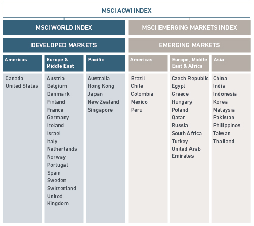
The MSCI IMI – Investable Market Index – covers all investable large-, mid- and small-cap securities.

We went diving through their website to list those countries/regions that have all three of Prime Value, Momentum and IMI indices. We landed with: USA, UK, Europe, Japan, World, EM and ACWI.

Value vs. Momentum for both Developed and Emerging Markets

The ACWI pretty much covers everything under the sun, except Frontier markets. And here’s how Value, Momentum and All-Market strategies performed:
MSCI.ACWI.prime.momentum.cumulative

Momentum trumped Value.

Value vs. Momentum for Emerging Markets

MSCI.EM.prime.momentum.cumulative

Momentum and Value seem neck-and-neck with the former slightly ahead. Both trump All-Market.

Value vs. Momentum for Developed Markets

MSCI.WORLD.prime.momentum.cumulative

Once again, Momentum trumped Value.

Value vs. Momentum for US, UK and JP

USA:
MSCI.USA.prime.momentum.cumulative

United Kingdom:
MSCI.UNITED.prime.momentum.cumulative

Japan:
MSCI.JAPAN.prime.momentum.cumulative

Take-away

Unless you expect the country/region you are planning to invest in to experience a Japanese style 20-year deflationary death spiral with zombie companies roaming about, you are better off with momentum.

Source and annual performance charts are on github.

MSCI Country-wise Momentum Indices

MSCI momentum indices are a boon to anyone wishing to analyze the base case returns over long time horizons. Irrespective of the index launch date, they back-fill strategy returns to give a sense of how they would have performed in previous years. Also, with the US Dollar as their base currency, it makes apples-to-apples comparisons possible.

All country momentum indices

MSCI.country.momentum.yearwise.heat.2000-01-31.2018-12-31

Select country momentum indices

MSCI.sub-country.momentum.yearwise.heat.1996-05-31.2018-12-31

The cumulative returns chart tells a better story:
MSCI.sub-country.momentum.cumulative

Two things

  1. Strikingly narrow difference between India and World momentum indices.
  2. Shallow drawdowns of USA Momentum compared to the rest.

Code and more charts on github.

How long is long term?

Most new equity investors think “long term” is three years. Some think its five. This leads to expectations that are setup to fail. We wrote about projecting future returns recently where we showed how we expect 20-year returns to be statistically distributed. In the simulations that we ran for that article, we also projected returns for 10- and 30-year horizons. We reproduce the charts below.

10-year S&P 500 return distribution

SP500.GLD 10-year

20-year S&P 500 return distribution

SP500.GLD 20-year

30-year S&P 500 return distribution

SP500.GLD 30-year

As your investment horizon grows larger, the probability of you facing severe losses come down and the overall probability of positive outcomes increase.

Fama and French agree

In a recent paper, Volatility Lessons for the Financial Analysts Journal, Eugene F. Fama and Kenneth R. French pretty much arrive at the same result. Here are the charts from their paper:

And they conclude:

The high volatility of monthly stock returns and premiums means that for the three- and five-year periods used by many professional investors to evaluate asset allocations, the probabilities that premiums are negative on a purely chance basis are substantial, and they are nontrivial even for 10- and 20-year periods.

Basically, long-term is ~30 years, anything less that is prone to be influenced by noise (luck.)

Country Equity Index Drawdowns vs. Returns

Previously, we saw how US Midcaps have out-performed Indian midcaps in dollar terms (US vs. Indian Midcaps.) But that is only one part of a bigger question: How do Indian equities stack up with the rest of the world?

Here is a chart of peak drawdown (largest loss) vs. cumulative return for country equity total return NASDAQOMX indices:
NASDAQOMX.dd.vs.returns
India: red square. World: black triangle. Full key: here.

Sure, Indian equities have put up a decent show. However, they have by no means been the best market out there. Investors would have got similar returns but with a vastly lower drawdown if they had just bought a NASDAQ-100 ETF (XNDX on the chart, ETF ticker: QQQ). Moreover, diversifying and asset allocation strategies are cheaper in the US than in India – both in terms of management fees and tax impact.

Related: Funding Your Dollar Dreams.

Source: NASDAQOMX data from Quandl.

Country Index Returns 2018

NASDAQ OMX indices are a great way to get same currency, apples-to-apples datasets. Here are the country specific total-return index returns (key) for 2018:
INDEX-NQ.absolute

And here are returns relative to the NASDAQ Global TR Index (NQGIT):
INDEX-NQ.NQGIT

Russia, dinged by US sanctions and a stalling economy, surprisingly put in one of the best equity returns.

Code and charts are on github.