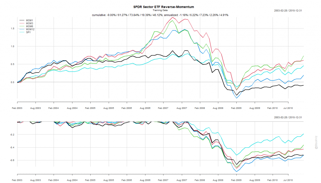
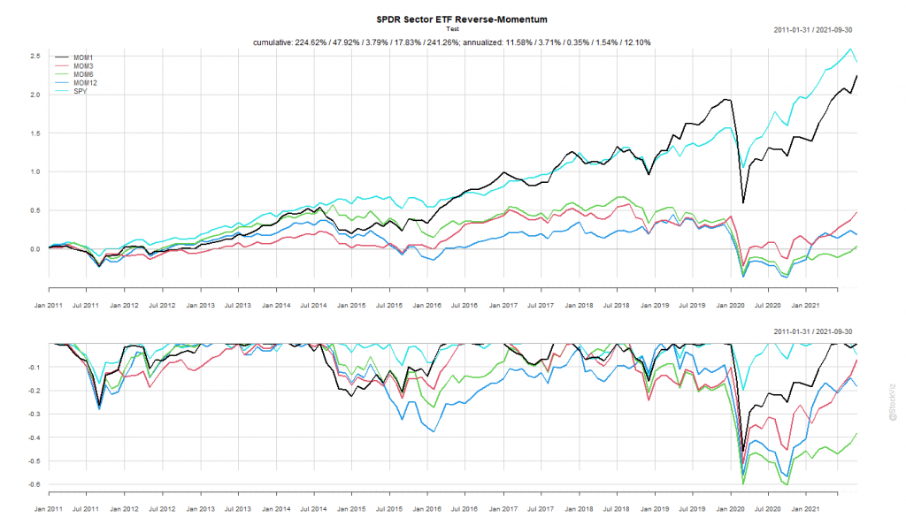
Previously, we saw how buying the best performing sector and holding it for a month didn’t quite pan out. What if, we bought the worst performing sector instead? The “Dogs of Sector Spiders,” if you will.
Calculate rolling returns over n months. Where n = 1, 3, 6, 12.
For the n+1th month, go long the ETF that had the lowest return in Step 1.
Like before, we split the dataset into Before 2010 and After 2011.
Pick your Fighter
The Before 2010 dataset shows rotation by 3- and 6-month look-back periods to be better than buying-and-holding the S&P 500.
The 6-month look-back rotation strategy – MOM6 – would’ve been the strategy to bet on.
The SPY Rope-a-Dope
“Sure-things” don’t exist in finance.
MOM6 spent the last decade getting absolutely decimated by the S&P 500.
Once again, by simply holding onto the ropes, a passive buy-and-hold S&P 500 investor would’ve come out miles ahead of someone who employed this rotation strategy.
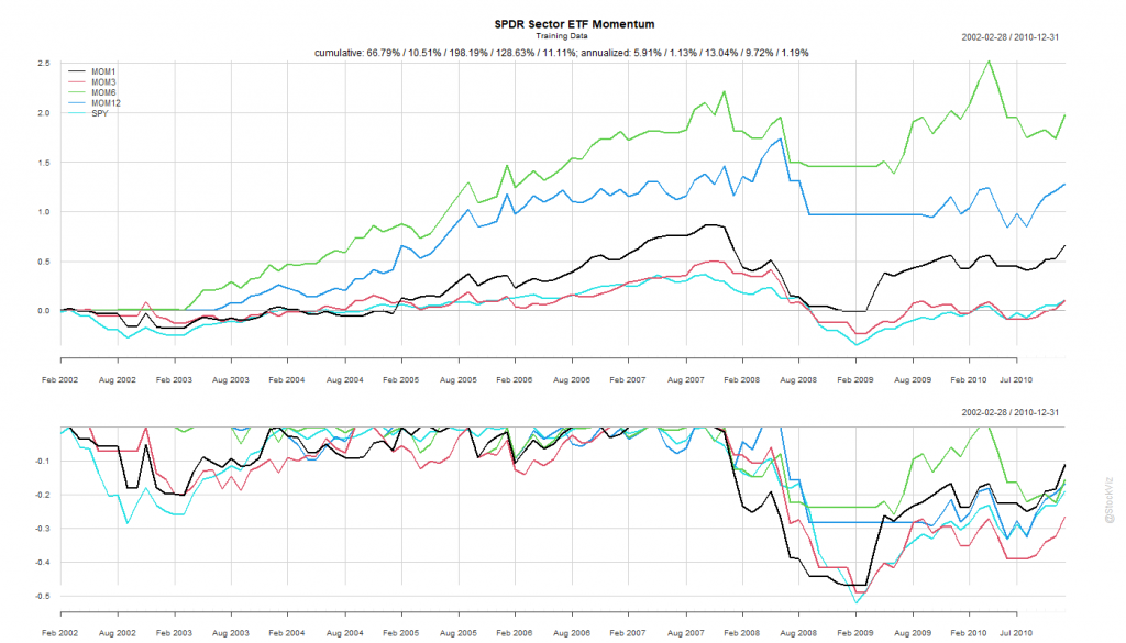
While introducing S&P 500 sector ETFs, we showed how the cross-correlations between them were unstable. This makes developing simple strategies challenging. One common momentum strategy is to simply go long whatever worked best in the previous period.
Rules of Rotation
For ETFs: XLY, XLP, XLE, XLF, XLV, XLI, XLB, XLK, XLU, and SPY
Calculate rolling returns over n months. Where n = 1, 3, 6, 12.
For the n+1th month, go long the ETF that had the highest return in Step 1.
In Step 2, if the selected ETF has -ve returns, stay in cash and earn zero.
We split the dataset into Before 2010 and After 2011.
Pick your Fighter
The Before 2010 dataset shows rotation by all look-back periods to be better than buying-and-holding the S&P 500.
Probably because of the prolonged dislocation caused by the GFC in 2008 and 2009, all rotation strategies based on the rules above exhibited great stats.
The 6-month look-back rotation strategy – MOM6 – gave an annualized return of 13.04% vs. S&P 500’s 1.19%. Coming out of the crisis, this would have been the fighter to bet on.
The SPY Rope-a-Dope
In boxing parlance, a “Rope-a-Dope” is
When you maintain a defensive posture on the ropes in an attempt to outlast or tire your opponent. It is most recognized and was actually given that name by Muhammad Ali when he employed the technique to defeat George Foreman.
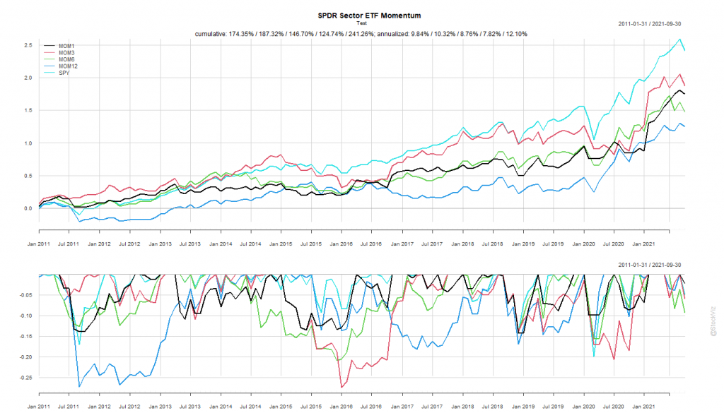
The After 2011 dataset is a prime exhibit of why “sure-things” don’t exist in finance.
The S&P 500 spent the next decade demolishing everything.
MOM6, the winner from our first round, went on to underperform the S&P 500 for the next 10 years by ~4%
By simply holding onto the ropes, a passive buy-and-hold S&P 500 investor would’ve come out miles ahead of someone who employed this rotation strategy.
Factor performance tends to be sticky. If Value, Momentum, Quality, etc. out-performed in the recent past, they continue to out-perform in the near-future.
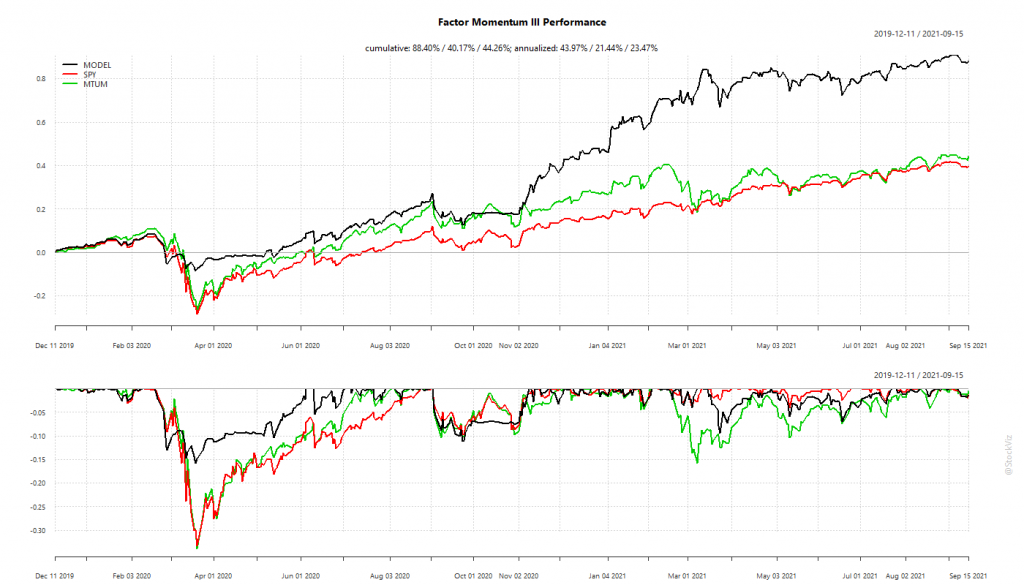
The performance of the US portfolio has been gangbusters. It sidestepped the Corona Crash of 2020 and has been on a tear since then. The Indian experience, however, has been disappointing.
US Factor Momentum
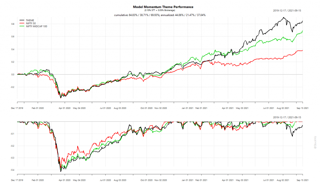
The Indian portfolio suffered from its inability to go into cash/bonds during crashes. Being fully invested took a bite out of its overall performance.
India Factor Momentum
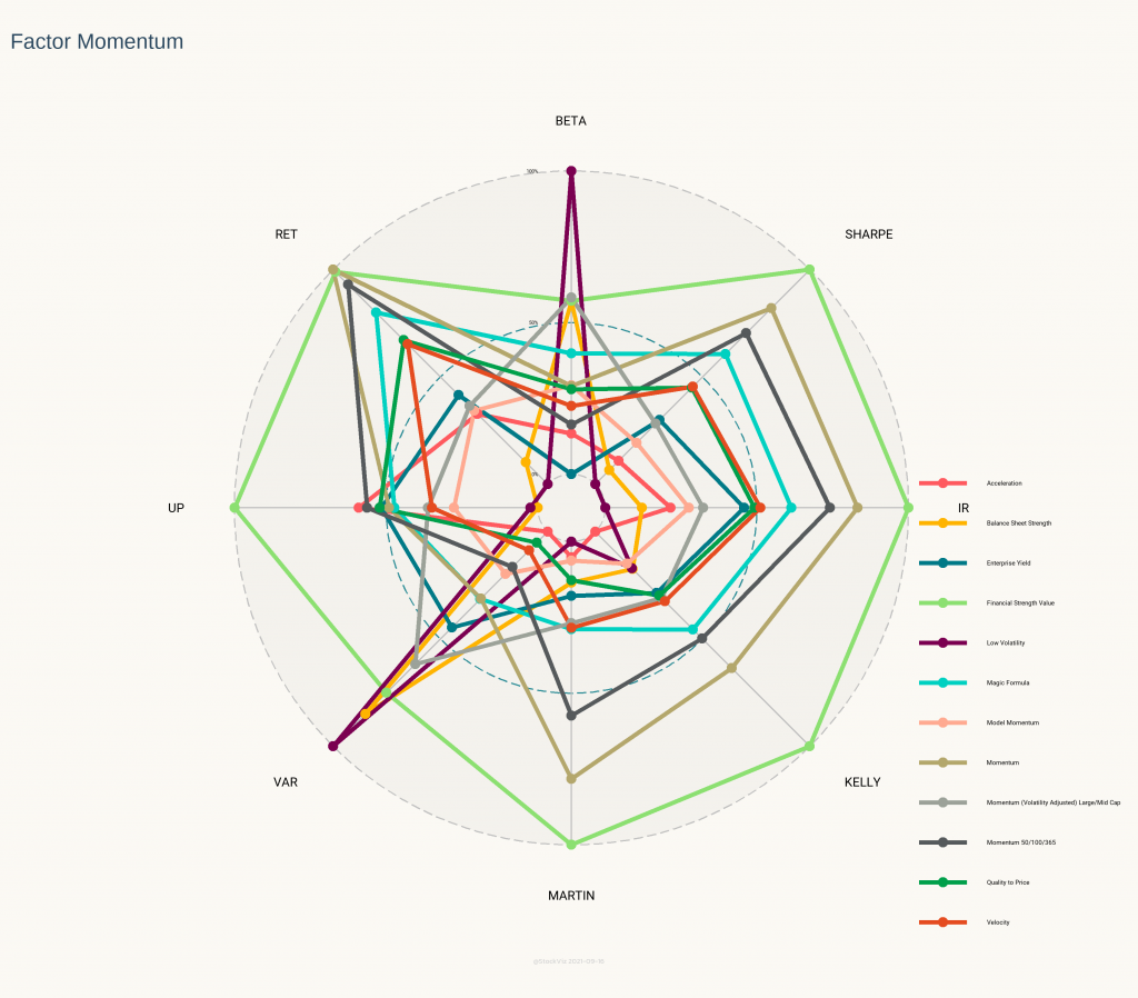
The Indian version comes up short even if you compare its stats with its component factor portfolios.
India Factor Momentum Statistics
The intuition behind the Radar Plot above is that the larger the area under the points, better the strategy. Model Momentum is in pink and it pales in comparison to most of its constituents. Surprisingly, the Financial Strength Value Theme (light green,) that is rebalanced annually, beat out everything else.
What explains the underperformance?
Not being able to go into cash/bonds meant a larger hill to climb during recoveries. However, cash is a double-edged sword. If you get the timing wrong, you might end up going into cash after the bottom and watch the market recover helplessly. Unless the trend formation period is really short, cash is not a viable option.
High transaction costs can also be playing a role here. The difference between Gross and Net returns is ~15%. Not as high as a pure momentum strategy but not trivial either. Also, US portfolios do not incur STT and brokerages are essentially zero.
Maybe 20-months is too short a window to judge such a slow-moving strategy. The research looks solid and maybe all we need is to give it some time?
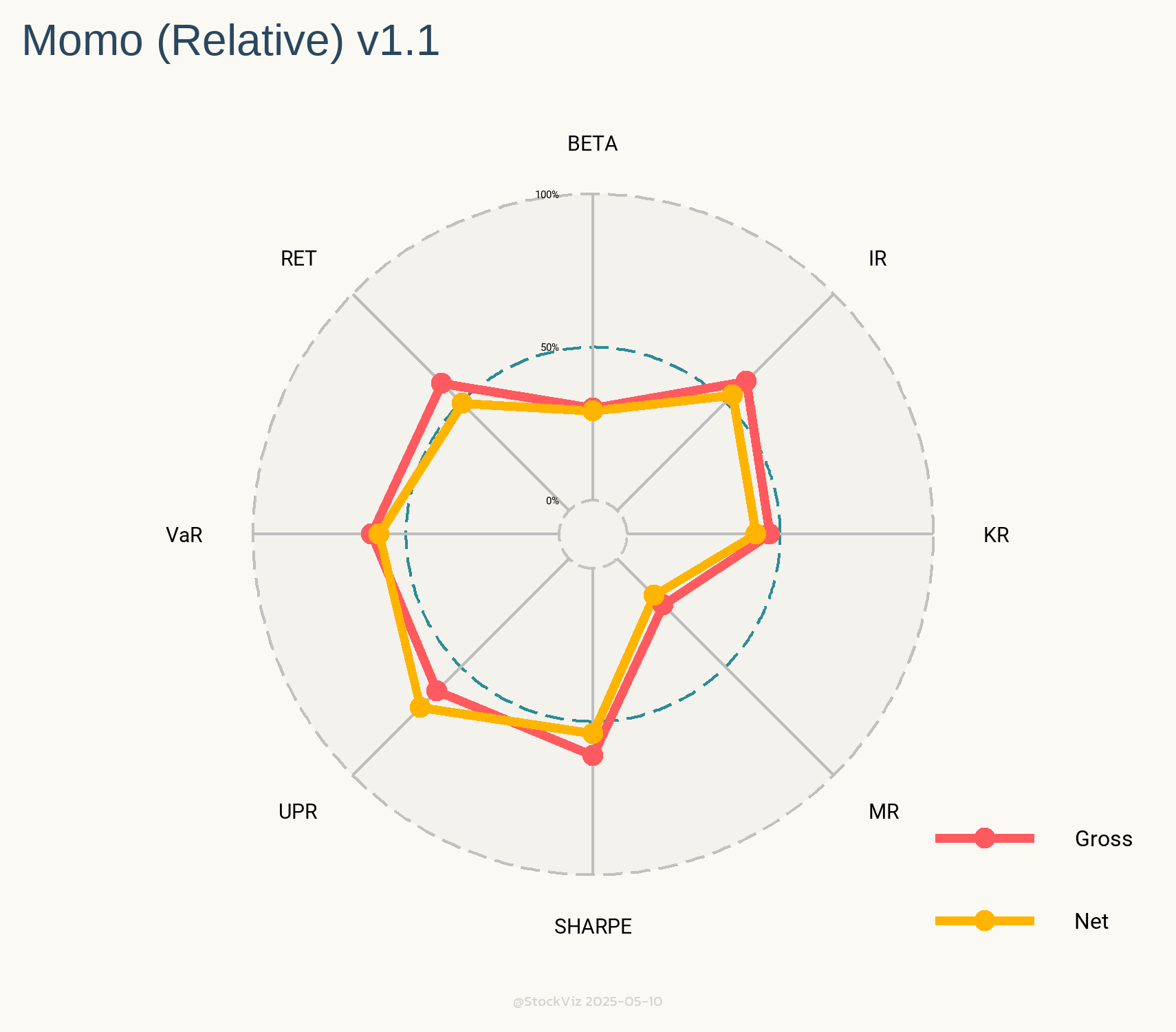
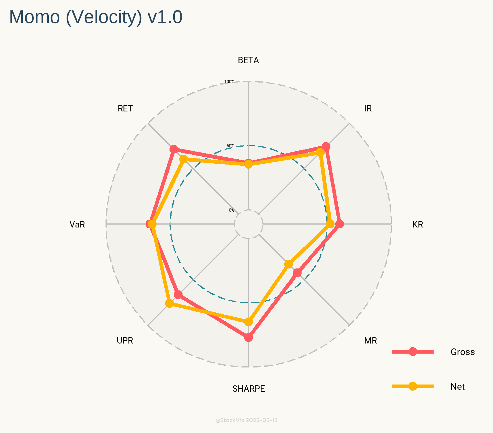
On StockViz, we have over 50 quantitative models that are available for investing. They all have different risk and return profiles. It is fairly simple to pull up, say, the Sharpe Ratio of a particular model by navigating to its home page. However, it doesn’t say how it compares to all the other models we have going.
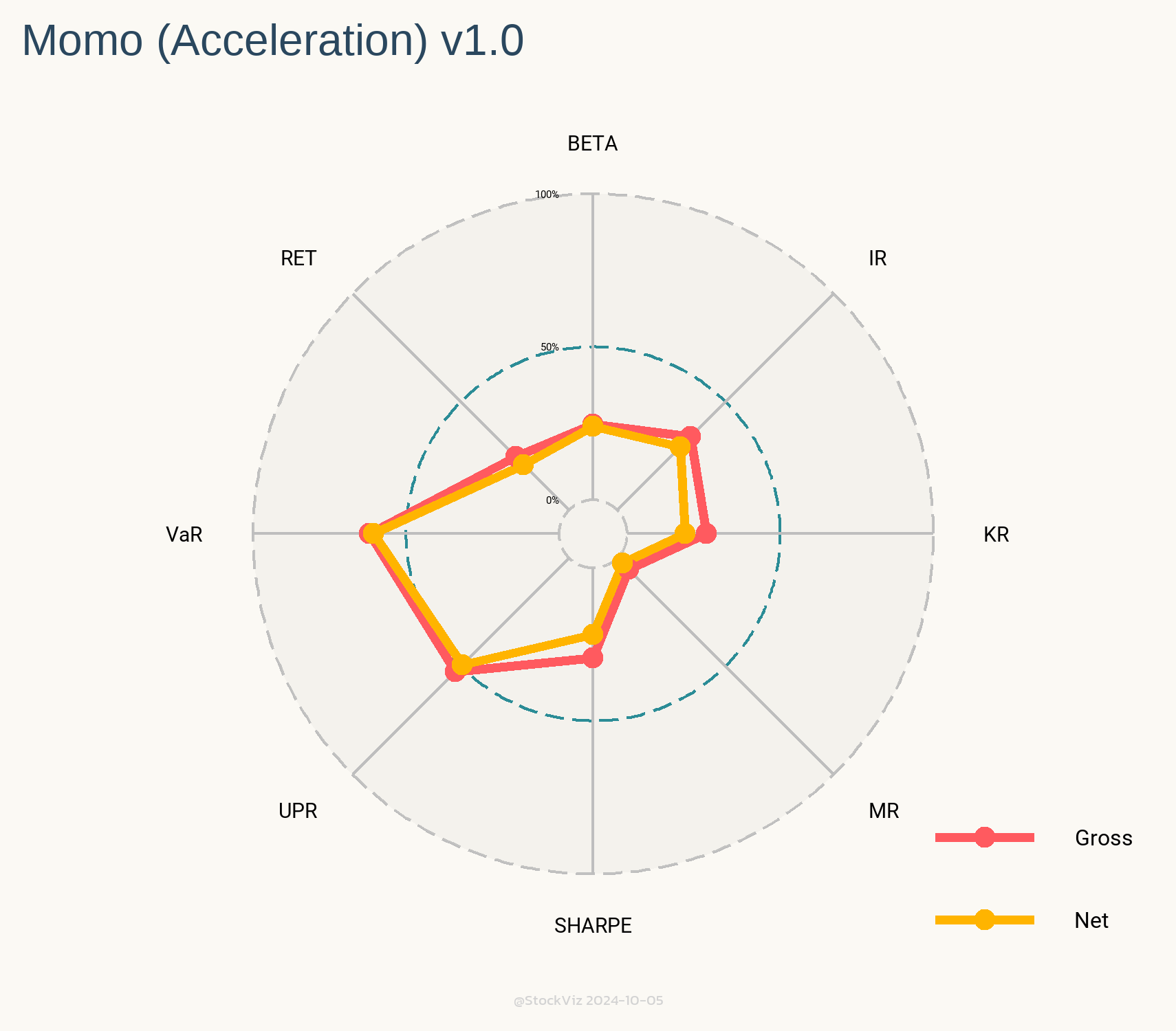
Let’s say you are looking to invest in one of our “Rapid-fire” Momo strategies. Our oldest ones are Relative, Velocity and Acceleration. Their (gross) performance metrics are displayed in a table.
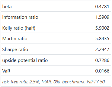
Relative
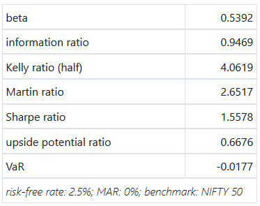
Velocity
Acceleration
If you add net performance metrics into the mix, you’ll end up with a combinatorial explosion. How do you pick the “best” one of them to invest in?
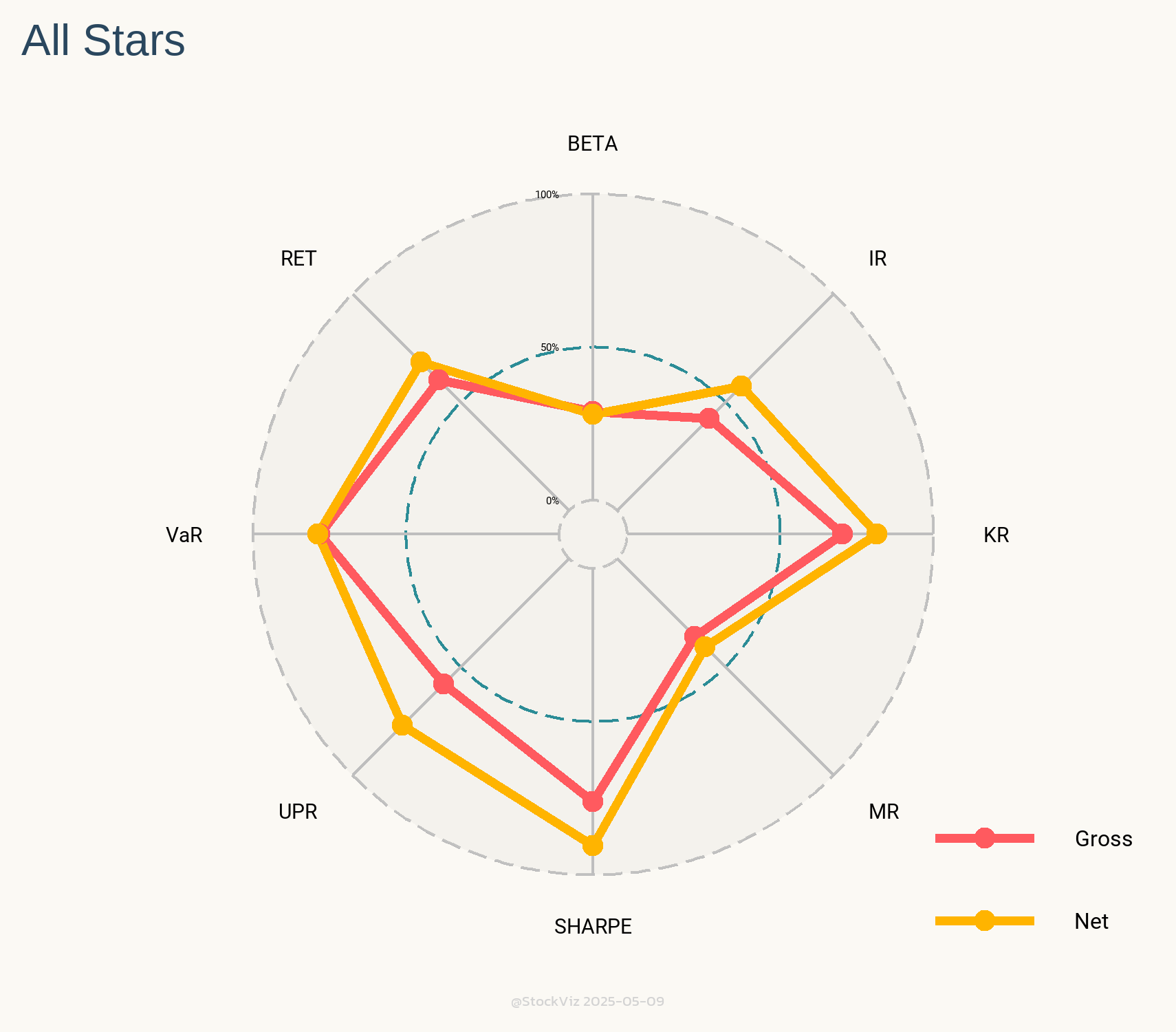
Enter Radar Charts.
These charts show you the relative rank of each of these models against all the other 50+ models we have going. Intuitively, larger the area under the yellow (net) lines, better the model.
The only caveat with these Radars is that you should compare them against models of similar vintage. For example, we went live with our All Star momentum model in May 2020. Since then, the market regime has been extremely favorable to momentum strategies. It should come as no surprise that its Radar looks like the Queen’s Crown.
With that caveat out of the way, Radars are a great way to visualize how models square up against each other.
Popular indices, like NIFTY 50 & MIDCAP 150, are useful if you are benchmarking long-only portfolios. However, if you have a long-short portfolio, then you need a long-short benchmark.
When Are Contrarian Profits Due To Stock Market Overreaction? (Lo, MacKinlay, 1990) describes a naïve portfolio construction process that is fit for purpose.
For momentum, portfolio weights are in proportion of excess returns over an equal-weighted index and for mean-reversion, they are the inverse.
For example, if you subtract the returns of each of the components of the NIFTY 50 index with the returns of NIFTY 50 EQUAL-WEIGHT index and divide by 50, you end up with the portfolio weights for the next day. Each look-back period used to calculate returns will produce a different set of weights (and a different synthetic index.)
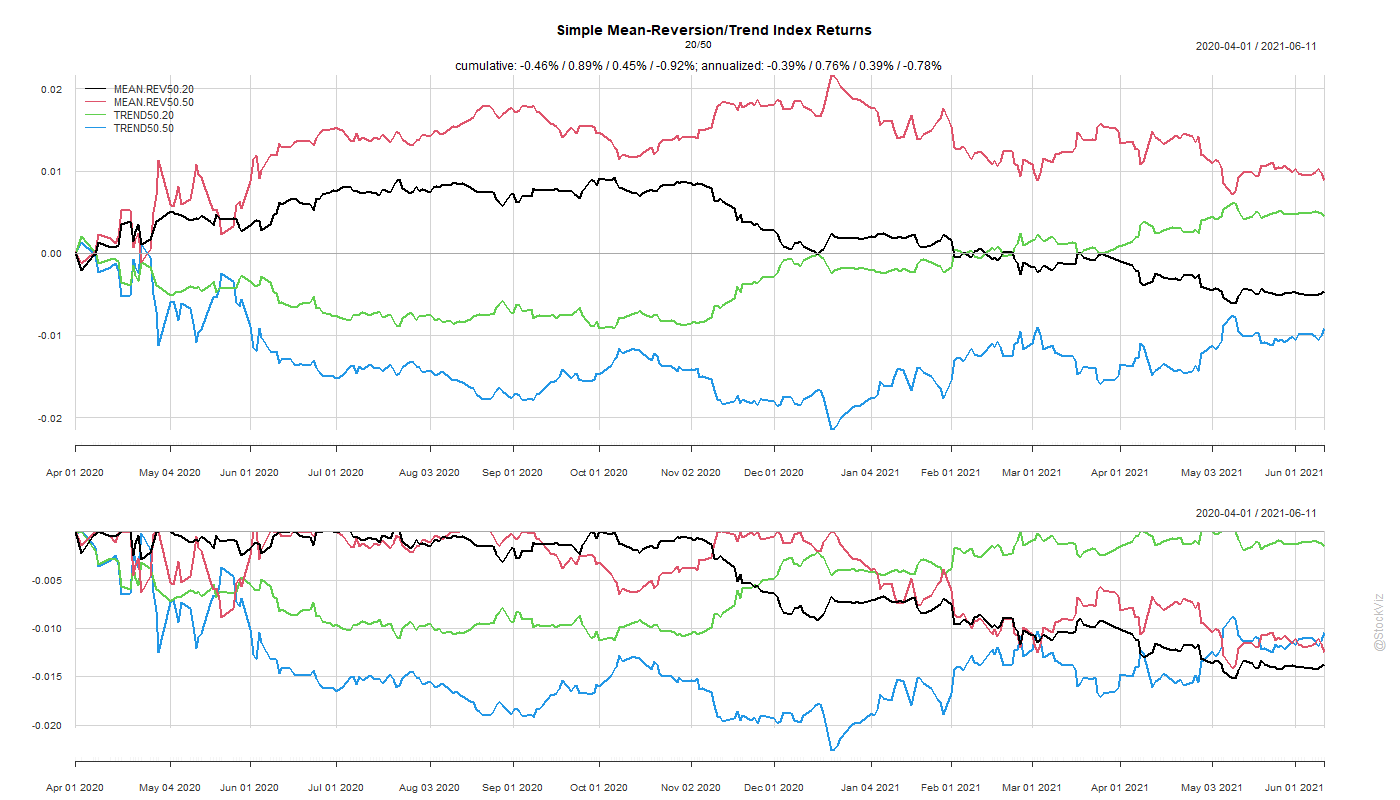
As impractical as constructing such a portfolio may seem, they are useful as a benchmark for long-short mean-reversion/momentum portfolios. Here are index returns since April 2020 with 20- and 50-day look-backs.
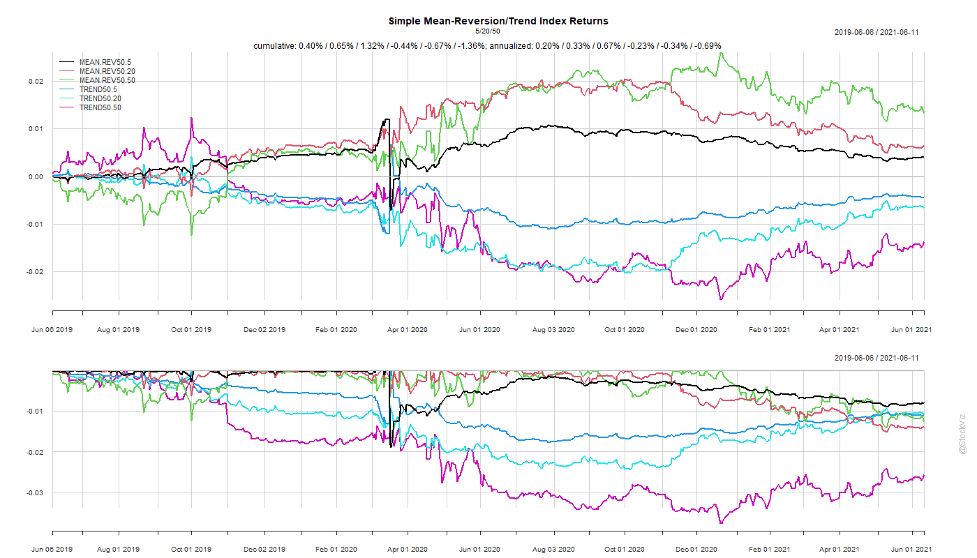
This is especially interesting if you are looking at market dislocations and subsequent recoveries. Here are indices since June 2019 with 5-, 20- and 50-day look-backs.
Counter-intuitively, naïve mean-reverting long-short seems to out-perform momentum.