Category: Investing Insight

Investing insight to make you a better investor.

Momentum: Peek under the hood before you invest

Quantitative momentum investing is fairly new in India. To compare different strategies, you need real-world data spanning a complete cycle. The best proxy for this turns out to be US listed ETFs – they have one price (unlike mutual fund share classes) and their adjusted prices can be easily downloaded. Here, we take a look at two momentum ETFs, DWAQ and MTUM, to highlight why investors should go beyond just running a screen for “momentum” and investing in whatever comes up first.

DWAQ vs. QQQ

DWAQ, the Invesco DWA NASDAQ Momentum ETF, was listed back in May 2003. QQQ is a plain vanilla market cap ETF based on the Nasdaq-100 Index. Here are the descriptions from their issuer websites:

The Invesco DWA NASDAQ Momentum ETF is based on the Dorsey Wright® NASDAQ Technical Leaders Index. The Index is comprised of approximately 100 securities from an eligible universe of approximately 1,000 securities of large capitalization companies from the NASDAQ US Benchmark Index. All securities in the universe are ranked using a proprietary relative strength (momentum) measure. Each security’s score is based on intermediate and long-term price movements relative to a representative market benchmark and the other eligible securities. The top 100 securities are selected for the Index. (Invesco)

The Invesco QQQ is an exchange-traded fund based on the Nasdaq-100 Index®. The Index includes 100 of the largest domestic and international nonfinancial companies listed on the Nasdaq Stock Market based on market capitalization. (Invesco)

Here are their relative returns:

Not the torch bearer for momentum that we had hoped for.

MTUM vs. VONE

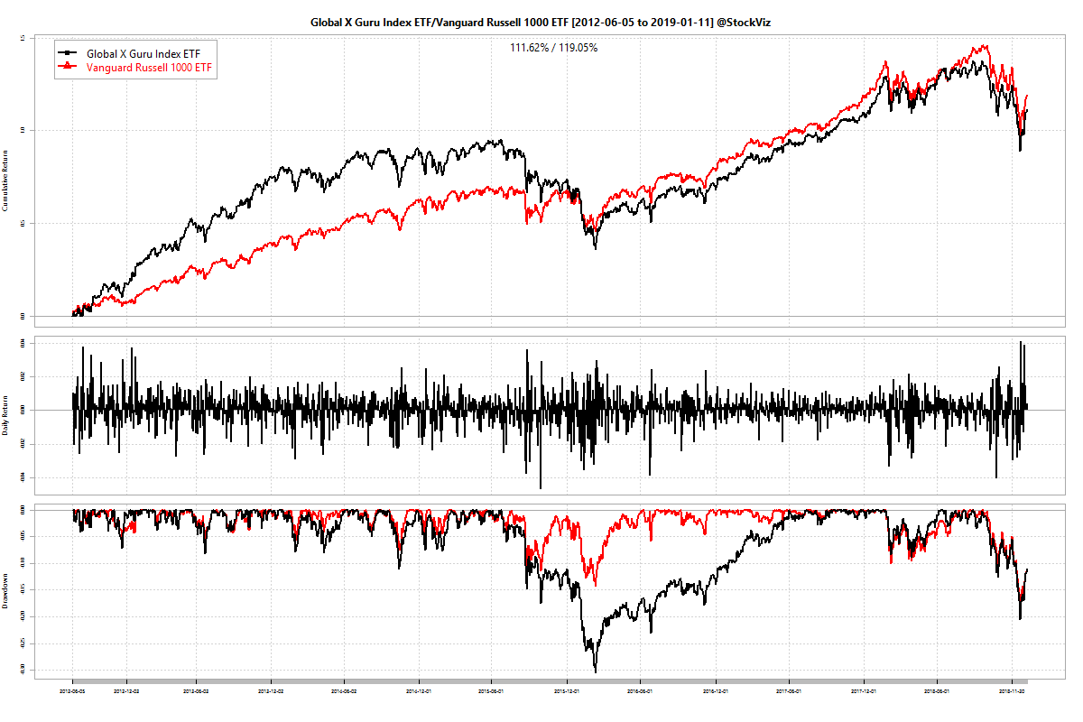
MTUM, the iShares Edge MSCI USA Momentum Factor ETF, came a good 10 years after DWAQ. Not constrained just to the Nasdaq, it provides wider exposure to large- and mid-cap U.S. stocks exhibiting relatively higher price momentum. (iShares) It is only fair that we compare it to VONE, which is Vanguard’s Russell 1000 ETF. Russell 1000 covers most of the US large- and mid-cap universe. (Vanguard)

Here are their relative returns:

Not bad! That’s almost a 4% difference in annualized returns.

MTUM vs. DWAQ

DWAQ trailed MTUM by about 5% in annualized returns for the period. Probably because it has a more diversified portfolio compared to MTUM’s. This should have lead to shallower drawdowns but that is not the case – DWAQ returns are a lot more volatile than MTUM’s. Will MTUM’s volatility adjusted price momentum continue to out-perform DWAQ’s “proprietary relative strength” momentum? Who knows?

If you think it is a tough job deciding between the two, consider this: there are over 40 momentum ETFs currently listed in the US. Each one slices the data a bit differently, making it absolutely essential that you peek under the hood before you click that buy button!

Charts created using the StockViz Compare Tool.

Streaks, Part II – Backtest

In Part I of this series, we saw that it is very rare for two consecutive down months to be followed by a third one. Here, we present a simple backtest that goes long NIFTY 50 for a month if the previous two months were negative.

backtest cumulative returns

The shallow drawdowns of this strategy makes it ideal for leveraged trades. NIFTY futures are about 7x levered. That should transform the 190% gross return to about 1330%, beating buy and hold by a wide margin. The MIDCAP 100 index behaves similar to this between the 2005 through 2018 time-frame. However, the results are not so great if you include data prior to 2005.

This looks like a case of severe data-mining and should be discounted as such. But it is an interesting result nevertheless.

Code and charts are on github.

Streaks, Part I

A streak of returns is an unbroken set of up or down days, weeks or months. For example, if the market went up on each of the last four days, then it is a streak of 4 daily returns. Can streaks predict the direction of subsequent returns? Before we answer that, let us look at the density plots of up and down streaks over different periods of time. In the charts below, green lines represent positive returns and red represent the negative ones.

Distribution of NIFTY 50 daily return streaks:

Distribution of NIFTY 50 weekly return streaks:

Distribution of NIFTY 50 monthly return streaks:

Looks like something could be done with monthly returns. Click through to Part II for a quick backtest!

Code and images are on github.

Why Anomalies Persist

Academics label momentum as an “anomaly.” Multiple studies have shown that this anomaly has persisted over long periods of time and across markets (AA). Based on this insight, quite a few quantitative momentum funds sprung up. And since nothing good is ever left alone at Wall Street, a whole bunch of momentum factor ETFs launched to ride the wave during the recent bull market. Currently, there are more than 40 momentum ETFs listed in the US.

So, does this mean that the momentum anomaly has been arbitraged out? After all, with over $12 billion in momentum ETFs alone, shouldn’t the strategy have topped out? We posit that it is unlikely to happen anytime soon. Why? Because investors just can’t help themselves.

Consider the asset under management (AUM) of these momentum ETFs. If, for an ETF, the price is down 10% and its AUM is down 20% over the same period, it means that there has been a net outflow of 10%. If you run this math on all the momentum ETFs traded in the US since October this year, you end up with about $2 billion in outflows in 3 months. That is roughly 11.5% of momentum assets on the 1st of October.

It has been well documented that investors chase performance, often piling into “hot” funds and strategies and exiting on the slight whiff of under-performance. We are seeing this in action on momentum ETFs. And as long as investors are caught in this doom-loop, momentum (and by extension, value, investment and volatility anomalies) will persist.

Also read: Investor education is a waste of time (Aug, 2014)

Code and data are on github.

Country ETF Returns 2018

There are over 1300 equity ETFs listed in the US. Of these, a fair number are country specific market-cap ETFs. With 2018 almost over, here’s how various country ETFs performed:

Thankfully, there is also an “all country” ETF – VT – the Vanguard Total World Stock ETF. Here’s the chart of excess returns over VT:

Very few markets managed to stay positive this year. Interesting times indeed!

Code and charts are on github.