Open sourced by Meta back in 2017, Prophet is a procedure for forecasting time series data. How does it compare to GARCH(1,1) and locf (last one carried forward) for forecasting VIX 20 days out?
We fit 500-days of rolling VIX data using Prophet and GARCH(1,1) and forecast forward 20-days. We then calculate the RMSE (Root Mean Squared Error) of the forecast vs. actual of both the models and locf. Plot RMSE of all three.
Ideally, you want the error to be low and the tail of errors to be as short as possible. GARCH(1,1) looks worse than Prophet. However, locf beat both?
Previously, we discussed using Meta’s Prophet to create a momentum portfolio that was rebalanced monthly. Is there a benefit to rebalancing this at a higher frequency?
Turns out that there isn’t. Even before factoring in costs, Prophet works best with a monthly schedule.
And does significantly worse if bring costs into the equation.
The problem is that Prophet portfolios have little overlap.
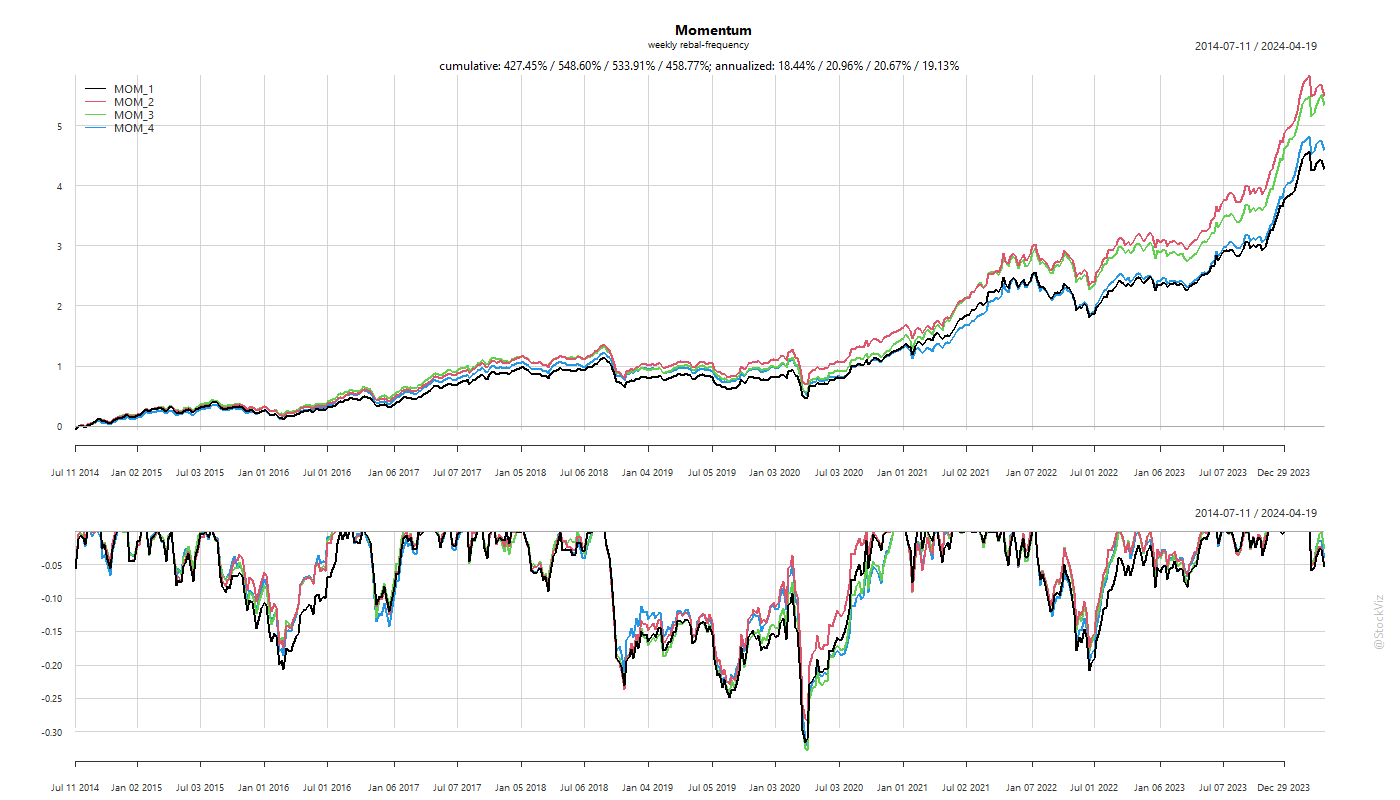
Previously, we looked at momentum rebalance frequencies with a monthly increment. However, if you observe the individual returns of momentum stocks (Returns under Momentum), you’ll notice that the returns of momentum stocks tail off after the first two weeks. Does switching to a weekly rebalance frequency make sense?
The biggest problem with a higher frequency of rebalance is the higher transaction cost that comes with it. So, we set the drag to be 0.5% and run 1- through 4-week rebalancing scenarios.
Turns out, there is an advantage to rebalancing a momentum portfolio once in two weeks rather than once a month.
The transaction costs are roughly 5% (annualized) vs. 3% of the monthly rebalanced version.
The main thing to watch out for is the portfolio overlap between rebalancing. The lower the overlap, higher the costs.
Costs are permanent and immediate while returns are hypothetical and distant. Make of this what you will.
Sometimes, you many not be able to directly buy an index or access a strategy because of regulatory hurdles, mandates etc… In these situations, replicating it using a basket of accessible securities might make sense.
For example, you can replicate the S&P 500 index using Indian indices: NIFTY 50, MIDCAP SELECT and NIFTY BANK.
In fact, you can do for any reference timeseries (strategies/funds) and apply leverage as desired.
Also, the loadings give you and idea of the shifting relationship between the reference asset and the basket over time.
There are a number of ways to construct low-volatility portfolios. You could either use a bottom-up approach of selecting individual stocks that have low-volatility or you could you could run them through a portfolio optimizer (Low Volatility: Stock vs. Portfolio) to get target weights. However, if you are trading a single index, then you could use its own volatility to scale your exposure up and down. The advantage here is that if you trade index futures, you can set the volatility and leverage dials to the risk that you are most comfortable with.
Let’s take our own NIFTY 50, for example. Calculate the std-dev of daily returns over a sensible window. The index exposure is simply the ratio of the median std-dev vs. the current std-dev. Use a scaling factor (tvf) to further fine-tune the risk. To reduce transaction costs, rebalance once a week.
A tvf of 0.25 has roughly half the returns of buy & hold but with superior risk metrics that makes it receptive to leverage.
The problem with this approach is that the weights are continuous. What if you want them discrete so that it directly maps to how many lots of NIFTY you need to trade?
Here, we bucket the std. dev. into quintiles and use that to set our exposures in discrete steps.
At 2x leverage, you will outperform buy & hold by 5% with only half its drawdown.
The same for NIFTY MIDCAP SELECT looks like this:
The stats for this index looks worse than buy & hold. However, volatility sizing has resulted in lower drawdowns.
Stats and charts for different indices and code are on github.