Came across an intriguing post by Markku Kurtti: Employing volatility of volatility in long-term volatility forecasts (outcastbeta). The gist of it is that the volatility of volatility and average volatility is more predictable. So, predict them separately and then put them together to get a volatility forecast.
Our previous attempts at forecasting VIX have led us the conclude that nothing beats locf. Just extending the last value of VIX forward has beaten all of the models we’ve looked at.
What if, we applied the process outlined in Mr. Kurtti’s blog for VIX?
Not looking so good if you forecast out for 20-days.
A good forecasting model should be able to estimate large spikes and reversion to mean from them. If not the former, then at least the latter. So, if a model is good at the mean-reverting bit, then you can combine both locf and the model to get better predictions.
For example, if you only consider the 1-day forecast, then obviously locf has the upper hand.
However, as you try to predict farther away, you expect the model to nail the mean-reversion bit.
Previously, we explored using Meta’s Prophet library to predict VIX. It turned out that simply extrapolating the last value of the index worked better (Prophet for VIX). In fact, locf (last one carried forward) works better than GARCH(1, 1) and most other approaches. Can the same be said about Conditional Gaussian Mixture Models?
We used the cgmm python library to forecast 20-day forward VIX and compared its root-mean-squared errors (rmse) to those of locf‘s.
locf is pretty hard to beat.
Especially so when the VIX index itself is volatile.
While the concept of volatility smirk is simple, the pattern itself is unstable. For example, different expiries have different shapes.
And these shapes change across days as well.
One way to keep track of these changes is by fitting a model through the implied volatilities. Here, we fit a parabola (y = ax2 + bx + c). a, the coefficient of strike_pct2, gives a measure of the narrowness/steepness of the smirk.
By sampling the curve and tracking these coefficients, you can begin to form an opinion on what is “normal” vs. a trading opportunity.
The volatility risk premium (VRP) is the difference between implied volatility and realized (or actual historical) volatility. Implied volatility is, on average, overpriced compared to realized volatility.
The VRP exists because investors are essentially “selling insurance” when they sell implied volatility.
Volatility is negatively correlated with equity returns; typically, volatility increases when equity markets decline. Therefore, a short volatility position is implicitly “long equity risk”. Since equities are generally expected to earn an equity risk premium (ERP) over the risk-free rate, strategies that are implicitly long equity risk should also be abnormally profitable. This is why short volatility strategies tend to be profitable on average.
Just like how you can get long ERP by getting long an equity index, you should be able to get long VRP by programmatically shorting options and delta-hedging them. Volatility becomes a beta that you allocate towards.
Building Blocks
An option’s value changes relative to the price of the underlying – the rate of this change is called delta.
Gamma is the rate of change of delta given a change in the price of the underlying. As the underlying price moves, an option’s delta does not remain constant; gamma quantifies how much that delta will change.
Since we are only interested in volatility and not price, we can hedge out this delta. Delta-hedging a basket of options mitigates the exposure to the directional movement of the underlying. Profitability becomes solely determined by the volatility (not direction) of the underlying.
Vega is the rate of change of an option’s value relative to a change in implied volatility (IV). If IV rises or declines by one percentage point, the value of the option is expected to rise or decline by the amount of the option’s vega, respectively.
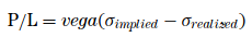
When you short options, you have negative gamma (you don’t want large price movements) and negative vega (you don’t want IV to rise). You hope for low realized volatility and falling IV. However, you have positive theta — time works in your favor.
Theoretically, a delta-hedged short option position’s P&L = vega(IV – RV).1
Construction
Historically, NIFTY ATM option Implied Volatility across days-to-expiry, looks like this:
So, theoretically, if you shorted 30dte ATM calls and exited them at 7dte, your P&L distribution will look like this:
And the same thing with puts:
If you are willing to treat volatility as just-an-other beta, then by creating programmatic delta-hedged short ATM straddle/strangle portfolio, you can get long this beta.
Just as it is with ERP, one could build models to time VRP. Having a beta portfolio as a benchmark should help.
When you decompose the series, you can see the ebb and flow of monthly seasonality.
The pattern largely holds post-COVID as well — even after Bitcoin began its journey as an institutionally accepted asset.
Zooming in on the seasonal component alone, you can see how it troughs around October-November.
And this has tracked post-COVID as well.
The seasonal component has been negative during the months of July through December indicating that the volatility experienced during that time was idiosyncratic.