Tag: NIFTY

Macro: Using Currencies to Predict NIFTY, Part I

This series of posts pulls together two things we observed in our previous posts:

  1. There is a non-linear relationship between USDINR and the NIFTY (NIFTY vs. INR/OIL Correlation)
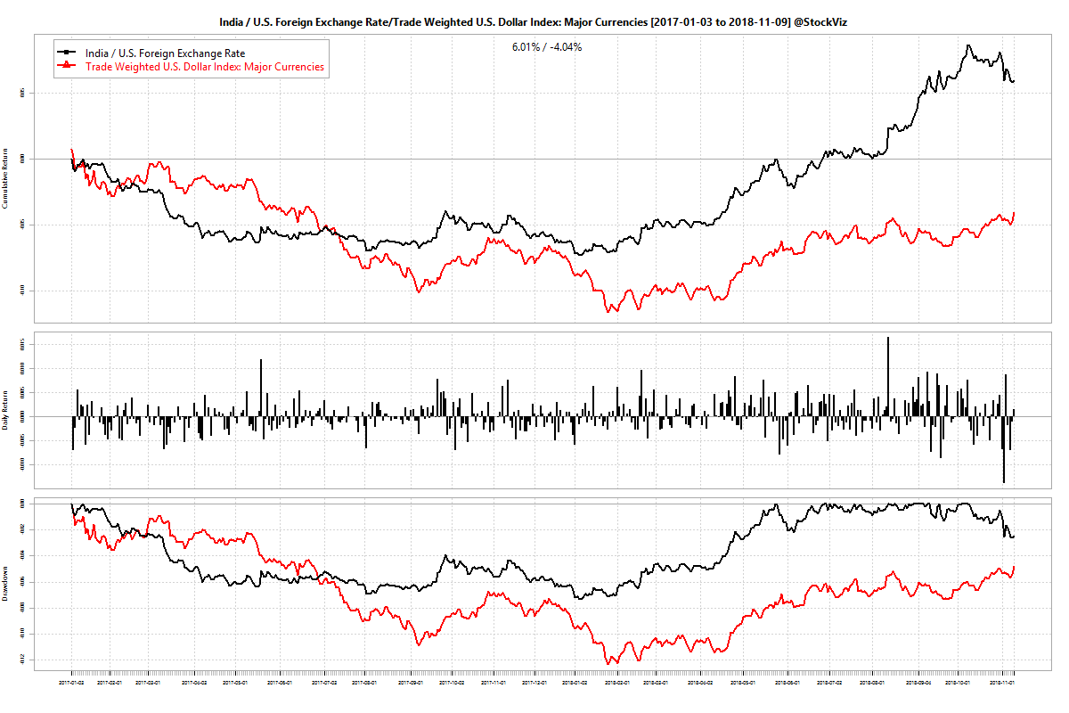
  2. There is a stable spread between USDINR and currency indices published by the FRED (USDINR and Dollar Indices)

Here, we use a Support Vector Machine (SVM) to train a model on the returns between the DTWEXM index (Trade Weighted U.S. Dollar Index: Major Currencies) and the NIFTY 50.

Outline

  1. Use 1-, 2-, 5- and 10-week returns of DTWEXM to train an SVM on subsequent 1-week returns of the NIFTY 50
  2. Consider two datasets: one between the years 2000 and 2018 and the other between 2005 and 2018 to include/exclude the 2008 market dislocation
  3. Divide the dataset into training/validation/test sets in a 60/20/20 ratio
  4. Use the validation test to figure out which SVM kernel to use
  5. Plot the cumulative return of a long-only, long-short and buy&hold NIFTY 50 strategy based on SVM predictions on the test set
  6. Use the common kernel between the #2 datasets for future experiments

Results

We find that an SVM using a 3rd degree (the default) polynomial kernel gives the “best” results. We use the SVM thus trained to predict next week NIFTY returns and construct long-only and long-short portfolios.

Here are the cumulative returns when the dataset considered is the one between 2000 and 2018. The test set runs from 2015 through 2018:
DTWEXM.NIFTY.polynomial svm

There are some points of concern. For one, the model is heavily long-biased. Even when the actual returns were negative, the predicted values was mostly positive:
DTWEXM.NIFTY.polynomial.actual.vs.predicted svm

Second, the model has tracked the buy&hold NIFTY since the beginning of 2018. The narrative has been that the rise in oil prices caused the CAD to blow out that caused investors to pull out investments that caused the rupee and NIFTY to fall (whew!) Either USDINR moved independently of DTWEXM or the relationship between DTWEXM and NIFTY 50 broke down. It looks like its the former:

Third, the cumulative returns seem to have been majorly influenced by small set of predictions that cut a drawdown that occurred in July-2015 by half. We notice a similar effect on the smaller dataset (2005 through 2018):
DTWEXM.NIFTY.polynomial svm
See how a small branch in Nov-2016 lead to the superior returns of the model predicted portfolios.

Next steps

In the next part, we will fiddle around with the degree of the polynomial used in the kernel to see if it leads to better returns. Subsequent posts will cover the use of the other dollar indices (DTWEXB and DTWEXO) and finally USDINR (DEXINUS) itself.

Code and charts for this post are on github

Macro: NIFTY vs. INR/OIL Correlation, Part III

This is the last part of the study. Part I, Part II

The reason why a linear model between NIFTY and USDINR built in Part II failed could have been because:

  1. Weekly returns were not appropriate for the relationship. Perhaps INR affects NIFTY at a higher frequency.
  2. There is no linear relationship because a rising/falling INR. Changes are not uniformly good/bad.

One way to visualize it is to plot the NIFTY returns density at different USDINR return thresholds. If there is no obvious difference in the densities between NIFTY returns when USDINR is positive vs. when it is negative, one could conclude that there is no straight forward relationship between the two.

Here is the NIFTY weekly returns density when USDINR is going up (the rupee is depreciating):
density plot NIFTY vs. USDINR
Note the curve when USDINR weekly returns are greater than 0.5% vs. when are greater than 2%. There is a bearish bias.

And, NIFTY weekly returns density when USDINR is going down (the rupee is appreciating):
density plot NIFTY vs. USDINR

If you juxtapose the above densities, it is apparent that when the rupee is appreciating, the densities skew right, And when the rupee is depreciating, there is a left skew. These charts show that there is “a” relationship – just not what can be captured by a linear model.

Code and density plots for NIFTY vs. OIL can be found on github.

Macro: NIFTY vs. INR/OIL Correlation, Part II

This is a continuation of the correlation study of Part I
Our correlation study showed a -0.54 between NIFTY 50 and USDINR whereas a 0.21 with OIL. Here, we will use weekly returns of the NIFTY and USDINR to build a simple linear model.

Building a linear model

A weak correlation doesn’t usually lend itself to a useful linear model. To illustrate this point, have a look at the diagnostics below:
NIFTY~INR linear model
Ideally, the ‘Residuals vs. Fitted’ plot should show residuals evenly distributed around the zero line – it doesn’t. The Q-Q plot should lie on the diagonal – it is marred by heavy tails. Hence, we should scale-down our expectations from the model.

For this post, we will split the time-series that we have into a “training set” that goes from 2010-01-01 to 2015-12-31 and a “test set” that goes from 2016-01-01 to 2018-09-30. We will build the model with the former and test it with the latter.

Results

Predicted vs. actual weekly NIFTY 50 returns:
actual.vs.pred.NIFTY50
To test our model, we will give it the actual NIFTY 50 returns (x-axis) and plot the predict NIFTY 50 returns (y-axis.) The problem here is immediately apparent: it is heavily bullish! It consistently gives a positive prediction.

Long and Long-short cumulative returns:
linear.model.cumulative.NIFTY50
If we use our model to go long-only (L) or long-short (LS), we get the cumulative returns shown above. The model is no better than buy-and-hold (at least it is no worse, so there is that.)

Take-away

A weak correlation between NIFTY 50 and USDINR is not much to work with and a linear model built over that relationship is no better than buy-and-hold. Given the narrative spun by the media, it is tough to wrap ones head around the results above.

We conclude with density charts of weekly NIFTY returns under different USDINR return thresholds in Part III.

Code and charts on github.

Macro: NIFTY vs. INR/OIL Correlation, Part I

We have all come across these type of headlines recently:
Sensex, Nifty fall further on surging crude oil prices (LiveMint)
Sensex, Nifty drop on fresh spurt in oil price, fall in rupee (ET)
But what exactly is the correlation between the NIFTY, USDINR and OIL?

Macro Caveats

A host of factors affect the prices of a widely tracked benchmark index like the NIFTY. Some of which are intrinsic (valuation, for example) and some that are external (capital flows, for example.) There relationships are dynamic – they keep changing over time.

Also, macro variables usually have a time-alignment problem. For example, the closing-prices of the NIFTY don’t align with the closing prices of, say, the NASDAQ. So to analyze the NIFTY and NASDAQ together, the time-series need to be shifted. And, perhaps, NASDAQ futures being traded at NIFTY close should be considered instead.

Comparing commodity and currency time-series with equity time-series has another problem. The former trades 24/7 in a global marketplace whereas equities predominantly trade in the local time-zone. So “closing” prices for commodities and currencies are hard to pin down at a granular level across markets. One way to tide over this issue is by using a weekly or monthly time-series instead of a daily one.

Time-periods

For the longest time, Indian markets were insulated from global capital flows. It is only recently that we have opened up both or economy and our markets. Currency futures started trading only in 2008 and the RBI still tries to “guide” the exchange rate. With these in mind, lets run the correlation between the NIFTY 50, USDINR and OIL weekly return time-series with NIFTY 50 lagged by on time-period.

NIFTY50.INR.OIL correlations

Data from 1995 through 2018 shows only a small correlation between NIFTY and INR. However, like we mentioned above, Indian markets now are more open than what they were before. So, if you run the same correlations on a smaller dataset – year 2010 through 2018 – we can see an uptick in the NIFTY-INR correlation.

NIFTY50.INR.OIL correlations

Take-away

It appears that the NIFTY has a closer relationship with INR than with OIL prices. In Part II of this thread, we will check if we can build a linear model that can capture this relationship. Stay tuned.

Code and charts are on github.

Can NIFTY be modeled using ARIMA?

A recent paper on SSR, Testing Random Walk Hypothesis: An Empirical Analysis of National Stock Exchange Indices (pdf), had me wondering if the NIFTY could indeed be modeled as an ARIMA(1,1,1) process as the author asserts.

As a first step, I wanted to check if ARIMA(1,1,1) is a given. What would be best fit be across rolling windows of different sizes? Turns out that for the most part, the best fit is ARIMA(0,0,0) aka, white noise. And the second best fits apply less than 20% of the time (Code and Results.)

Second, I wanted to check if ARIMA(1,1,1) has any forecasting ability. It does appear so (Code and Results.)

Buy & Hold Annualized return: 13.25% vs. Long/short NIFTY with different look-backs:
200: 16.75%; 500: 17.41% and 1000: 14.28%
*Not including transaction costs.

Although there is a slight advantage in using an ARIMA(1,1,1) model, I have a hard time reconciling the first set of results with the second. The advantage could very well be random.