What does the pair-wise correlation of the NIFTY 50 constituents look like? Is it sticky? (Intro)
What does the high-correlation regime look like? (Correlation vs. Returns & Volatility)
Can correlation states be used for timing? (Correlation Timing)
Invest Without Emotions
What does the pair-wise correlation of the NIFTY 50 constituents look like? Is it sticky? (Intro)
What does the high-correlation regime look like? (Correlation vs. Returns & Volatility)
Can correlation states be used for timing? (Correlation Timing)
The previous post discussed how high correlation environments have fat left-tails. Can correlation states be used for timing?
A quick look suggests that it might not be possible. Both LO (long-only) and LS (long-short) strategies that use the correlation state seem to underperform buy-and-hold.

There was some “crisis alpha” in using correlation for timing during the COVID crash of 2020. However, Buy & Hold ruled the roost both before…

… and after things normalized.

The slightly better drawdown performance of LO in some circumstances might be interesting for levered investors but the unlevered returns of these timing strategies are not much to write home about.
The previous post presented historical NIFTY 50 constituent pair-wise correlation distributions and discussed how high correlation environments persist. How do the 5th-quintile return and volatility look like?

If you focus on the 5, 10 and 20-day pair-wise correlations (T5, T10 & T20), you’ll see large left-tailed returns and high volatility in the 5th quintile compared to the others (1st, 2nd, 3rd & 4th).
Looking at this the other way, T10 – the 10-day pairwise correlation – has this profile:
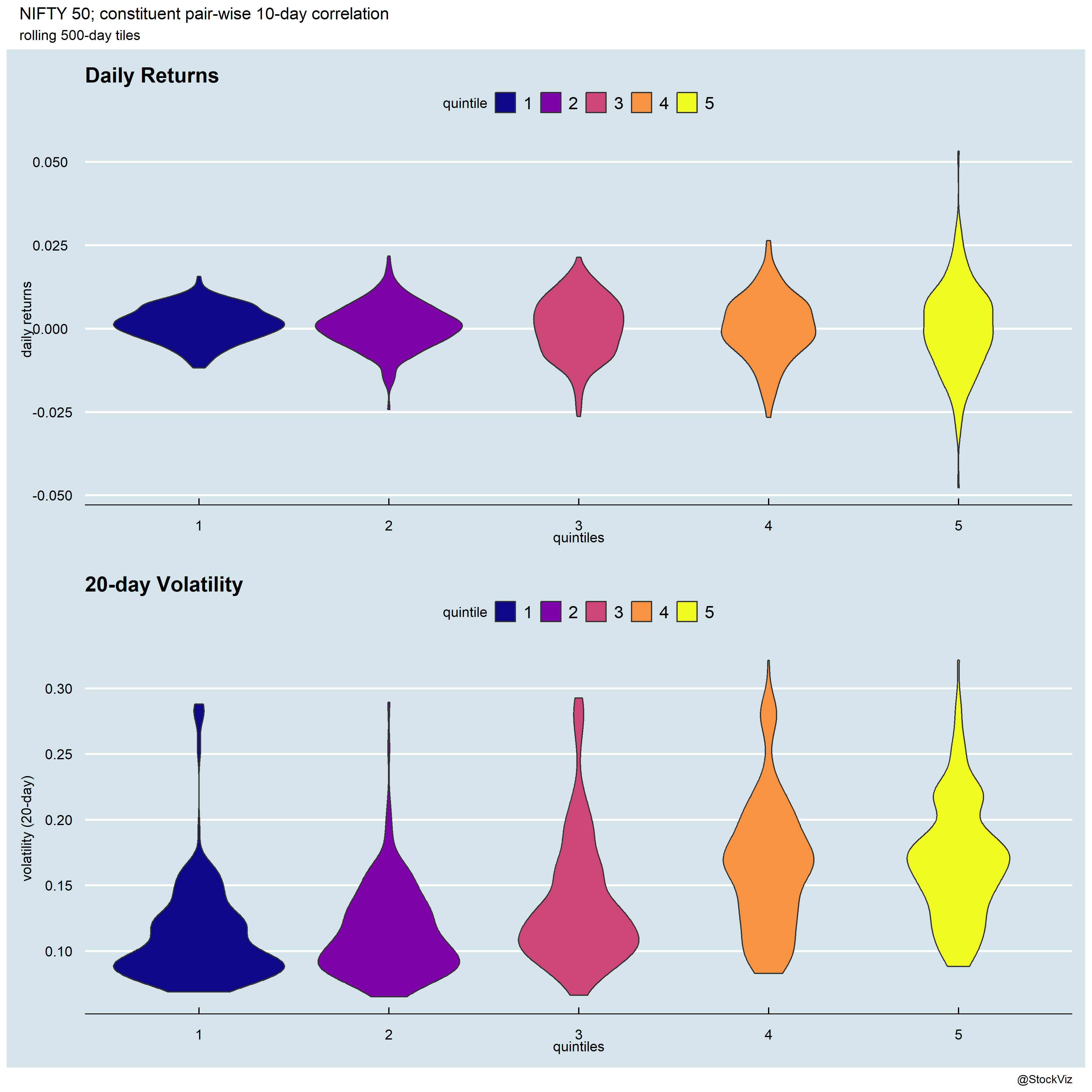
It looks like if you dodge the 5th quintile here, you might be able to boost returns in linear strategies.
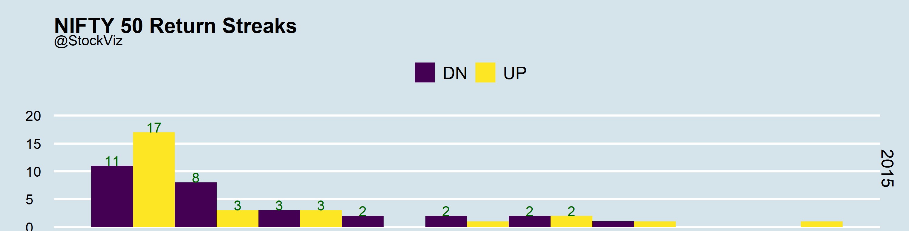
Sometimes, it feels like all stocks in an index are moving in the same direction. Very rarely is there full “chaos.” Sometimes, even when there is some dispersion, it is overshadowed by larger moves in a few index heavy-weights. To get some intuition around this, we calculated the pair-wise correlation of the NIFTY 50 constituents since 2015 across different lookbacks, bucketed the median daily correlations into quintiles and plotted them.

If you do an rle, you’ll get an idea about the number of consecutive days spent in each quintile. It looks like quintile 5, representing a highly correlated state, is sort of sticky.

For example, if you zoom into the 20-day lookback distribution, notice how quintile 5 stands out.

It appears that low-correlation environments are actually not that sticky. So, if you see a quintile 5 form, bet on it lasting a few days.
Autocorrelation represents the degree of similarity between a given time series and a lagged version of itself over successive time intervals. Our previous post on using run length encoding discussed how you can inspect the streakiness of returns. ACF allows you to inspect the relationship between day-0 and day-n returns.
Let’s have a look at the ACF of NIFTY and BANKNIFTY returns. Here is a plot of the ACFs of both real returns and up/down returns in 2015.
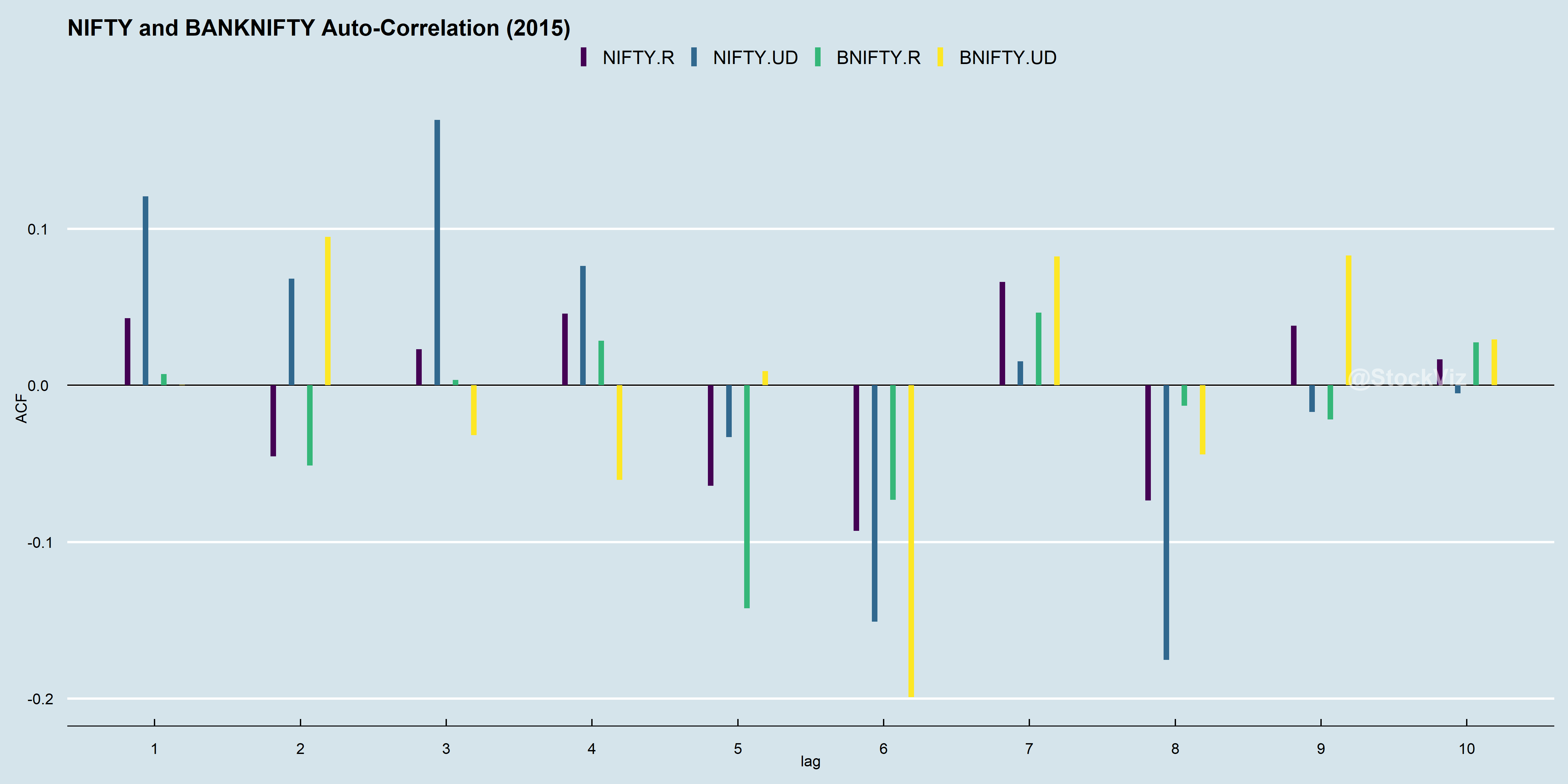
Zoom into the up/down ACF of NIFTY, see how day-0 direction correlates strongly to day-1, day-2 and day-3? Combine this with what we got from running an rle and you might just have a trend-following strategy.
Before we run off to make our millions, lets see how other years faired. Enter 2021.
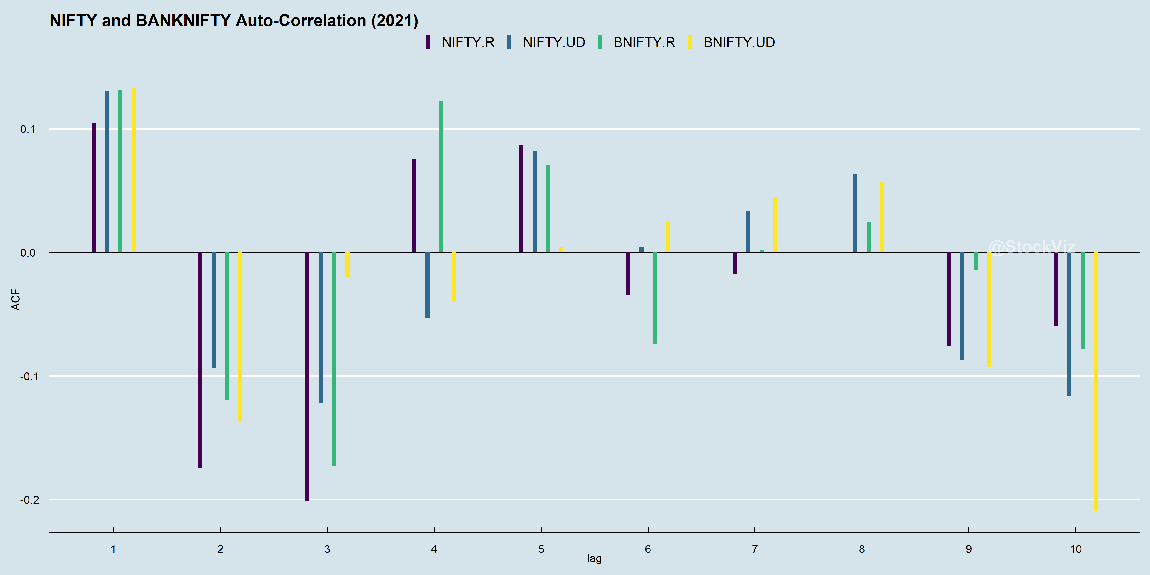
While NIFTY’s day-0 direction correlates strongly to day-1, it is the inverse of day-2’s and day-3’s. Did it become mean-reversion-y? One implication of this give-up is that a trend model tuned to work well with 2015 data is unlikely to repeat its performance in 2021.
However, ACFs from 2015 through 2021 have day-1 correlations as always positive. What if you just bet that an up day will be followed by another up day and vice versa?