Making your portfolio more efficient

We spend way too much time picking stocks and too little time figuring out how to allocate our capital between them. Even if you end up picking the “right” stocks, poor allocation will drag down the performance of your portfolio.

For the first time in India, you can now find out the appropriate weights that individual stocks should have within your portfolio and constantly monitor your portfolio as the market changes – automatically.

Users who have uploaded their portfolio can have a look at these statistics under the “Analytics” section:

efficient portfolio analysis

And if you just want to upload an adhoc set of stocks and just see what the most efficient allocation is, you can do that using our Marko tool, named after Harry Markowitz who introduced Modern Portfolio Theory.

Be efficient, be smart!


The Little Book of Behavioral Investing: Information Overload

Distinguishing the Signal from the Noise

As a writer, I have to read a lot. Sometimes I read up on a topic for hours because the internet is overflowing with information, opinions, expert advice and whatnot. I feel that if I don’t soak it all, I won’t do justice to the subject.  However even after hours travelling the Wikipedia wormhole, I found myself nowhere near a working article.

Thankfully, this is a story from my past. After many such wasteful episodes spread over months, I had the good sense to revise my strategy. Now when I research a topic, I think of 4-5 questions that the article must answer and limit my research to these areas. My research and writing is done in half the time I spent earlier and I feel that I have become a better writer because of it. In fact, now I get to spend more time on editing which is what pruning is to a rose bush.

And I am not alone in this. Study after study shows that we are incapable of telling the difference between more information and better information.

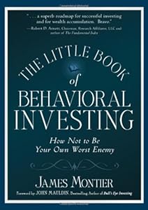
Cover of "The Little Book of Behavioral I...

Montier talks about “information overload” in Chapter 6 of The Little Book of Behavioral Investing: How not to be your worst enemy. We are living in an age where excessive data is thrown at us from every angle – investment experts on multiple TV channels running round the clock, telling us we what we need to know, postmortem reports on failing stocks, and loads more. And not to mention the plethora of investment blogs on the internet that slice, dice and serve up the most arcane of data.

Montier’s advice: Close your eyes and ears to all the noise. He suggests that we first decide what attributes of a business would make it attractive to us. These factors can vary based on our investment goals and that’s ok. Montier himself, being a deep value investor, focuses on questions that are quite different from those asked by Warren Buffet. The goal is to stick to researching the business along these attributes only – thoroughly and deeply.

“More is not always preferable to less;” not unless you’re a computer. Montier illustrates the point with various examples of real life experiments. The premise: The accuracy of forecasts is evaluated based on lesser or more number of data variables provided to the decision maker. Irrespective of the test subjects – bookmakers, football fans, car purchasers or financial analysts – the observations are the same:

  • The accuracy of predicted outcomes with 5 data variables is the same as with 40.
  • The confidence of forecasters goes up as more data variables were handed out.

This means that though the confidence of forecasters goes up as more information is fed to them, they don’t end up making more accurate forecasts. You too may find that many of the financial “analysts” who ooze confidence on media only have a surface knowledge of what they’re talking about.

Montier uses another example to expound on what’s needed to improve the accuracy of forecasts. He refers to a hospital in Michigan where 90% of patients who came in with severe chest pains were inaccurately admitted to the ICU. This led to overcrowding, high costs, and deaths because of diseases contracted in the ICU. Researchers found that doctors were looking at the wrong factors during diagnosis. They corrected this problem by creating cards that doctors could reference for better decisions. The approach worked but that’s not really the moral of the story.

Researchers found that the doctor’s decision making prowess remained the same even when the cards were taken away. The doctors had over time assimilated the correct cues from the cards and started looking at the right factors during diagnosis. Their attention had moved from pseudodiagnostic to truly informative elements.

Researchers used this feedback to create simpler decision making assistants such as checklists. This helped to improve overall healthcare quality by ensuring process adherence across the board. As a result, patient death rate and post-op complications fell from 1.8% and 11% to 0.8% and 7%. Astonishing what a simple checklist helped to achieve!

Now we come to the moral of the story: You need to know what attributes to weigh to assess the soundness of your investment choice. Analyze on those lines only but analyze deep. Make a checklist, why not? Just make sure you don’t do that one thing – become directionless with second hand, surplus information.

Related:
The illusion of knowledge
The value of publicly available information is zero
Monica Samuel is doing a chapter-wise review of the book: The Little Book of Behavioral Investing: How not to be your worst enemy by James Montier. You can follow the series by following this tag: tlbbinvesting or by subscribing to this rss feed: tlbbifeed

Weekly Recap: Time is not money

nifty performance heatmap

The market opened October with a bang, rallying 3% (+5.3% in USD terms).

Index Performance

Pretty much everything except FMCG ended in green.

index performance

Top Winners and Losers

YESBANK +9.74%
SAIL +10.21%
BANKINDIA +10.48%
APOLLOHOSP -4.91%
HINDUNILVR -3.30%
NTPC -3.29%
SAIL away…

ETFs

BANKBEES +5.00%
PSUBNKBEES +2.83%
NIFTYBEES +2.61%
INFRABEES +2.52%
JUNIORBEES +1.12%
GOLDBEES -1.88%
Banks staged an impressive rally…

Advancers and Decliners

advancers and decliners

Yield Curve

The curve seems to be normalizing…

india yield curve chart

Interbank Rates

… and so are interbank lending rates.

mibor

Sector Performance

sector performance

Thought for the weekend

Thinking about time has the opposite effect on people from thinking about money. It makes them more honest than normal, rather than less so. Moreover, the more reflective they are, the more honest they become.

Source: Time is not money

Machine Learning Stocks

There are no “new new” things in finance, there are no “unique” opportunities and the stock that you labored so hard to pick is no “diamond in the rough.”

The perils of static classification

In the olden days, stocks were classified either based on the industry they operated in (i.e., sectors) or based on their market cap (i.e. cap-weighted indices.) But neither of them do justice to the underlying risk or technical behavior of the stocks themselves. Not all stocks in an index are similar, nor do they have a 100% overlap with other stocks within the same sector. Buy say you really liked a stock, like ACCELYA for example, but found its valuation unattractive, how do you go about finding a substitute?

Finding substitutes using clustering

This is where machine learning can help. Using clustering algorithms, stocks can be grouped based on parameters different from just industry or market-cap. What if stocks are grouped based on risk metrics (alpha, beta, Sharpe…) and technicals (RSI, ADX…)?

This was the question we set out to answer and we are now proud to present the results in the “Quant” tab in the equities page. Here’s how the Quant section looks like for Accelya:

ACCELYA Quantitative Analysis

It shows that Accelya, although a retail value favorite, is not alone when it comes to its risk profile and technicals. There are other fish in the sea that is worth a gander.

This might be a scary thought for most investors: their favorite stocks are not alone, and there might be cheaper substitutes to the stocks that they like.

Geek Note

  • All factors are equally weighted and normalized.
  • A lot depends on whether the underlying data is actually clustered or not. For example, if you only cluster based on risk metrics, then by definition, most stocks will cluster around Alpha=0 and Beta=1.
  • Risk metrics look back 365 calendar days whereas technical metrics look back over shorter time-frames.
  • In case you are wondering, there is no information content in observing “cluster migration.”

Related:
Alpha, Beta, Sharpe and Information Ratio
Risk Adjusted Returns

Monthly Recap: September 2013

Nifty monthly performance heatmap

The NIFTY ended the month up 4.82% (+11.16% in USD) on the back of improving sentiment regarding the economy and the US Fed’s continued QE program.

Index Performance

FMCG was the leader but commodities was not too far behind.

Index performance

Top Winners and Losers

ULTRACEMCO +22.68%
ASHOKLEY +26.25%
JSWSTEEL +34.76%
RANBAXY -19.01%
TCS -5.18%
SESAGOA -4.24%
The perfecta: Cement, Auto and Steel

ETFs

JUNIORBEES +8.00%
BANKBEES +7.33%
NIFTYBEES +5.71%
INFRABEES +0.61%
GOLDBEES -2.39%
PSUBNKBEES -6.51%
Better quality midcaps seem to have caught a bid…

Advancers and Decliners

advancers and decliners

Yield Curve

It was the month of the “surprise” rate hike…
Indian yield curve

Interbank Rates

The volatility in the interbank rates over the last month has been phenomenal…

india interbank rates

Sector Performance

sector performance

[stockquote]NEULANDLAB[/stockquote]