We introduced tactical allocation in our Free Float newsletter last week. We saw how, by using a simple moving average to toggle between equities and bonds, one can reduce drawdowns in their portfolios. In the ensuing discussion, we mentioned how excess-returns found during back-tests could be an artifact of illiquidity and high transaction costs of the markets in the past. It is not like people who traded markets before us were dumb (or somehow, we suddenly added 50 IQ points in the last 20 years.) There has to be a reason why the money was left on the table.
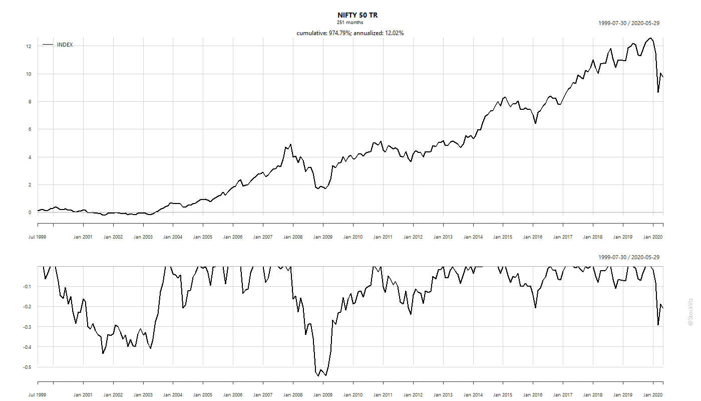
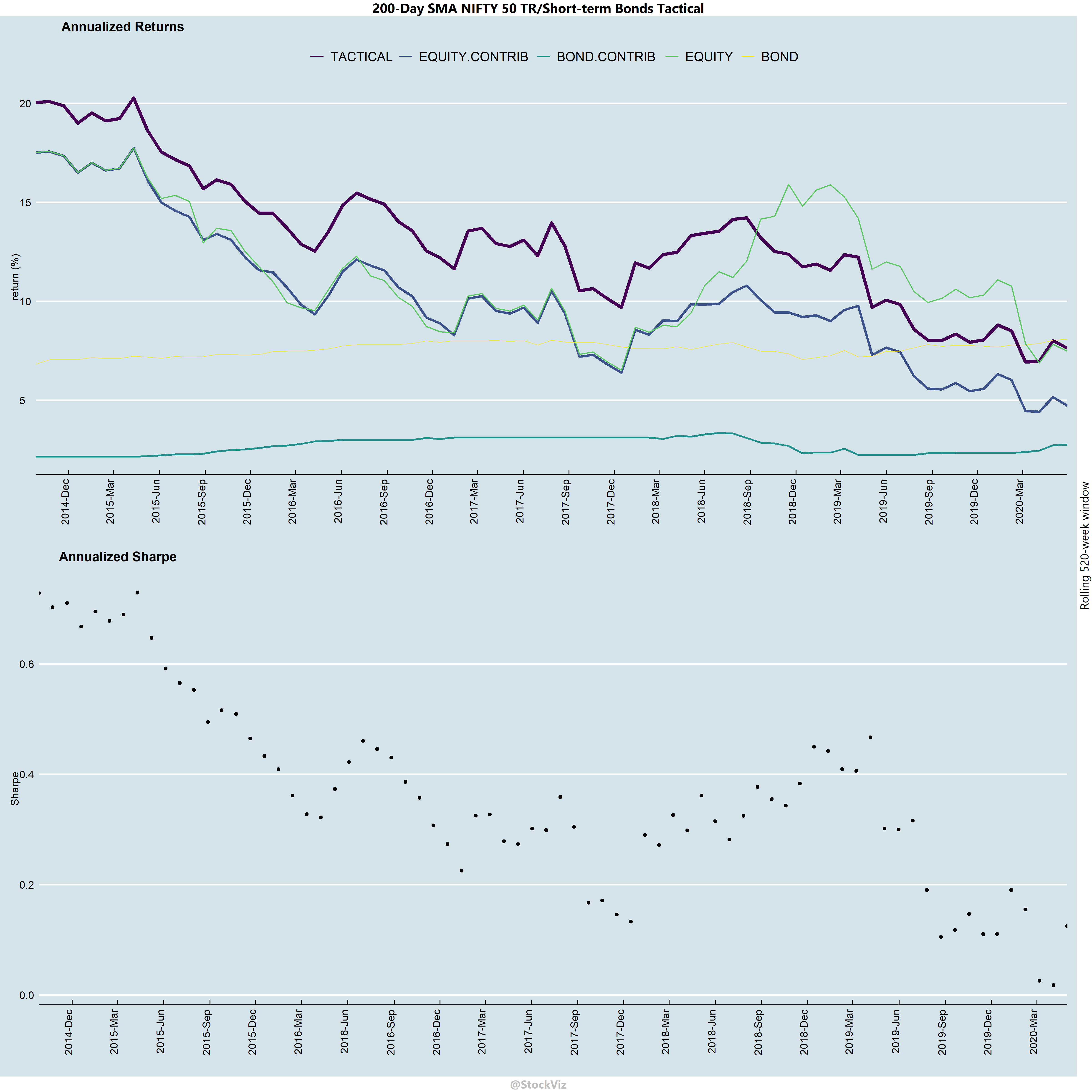
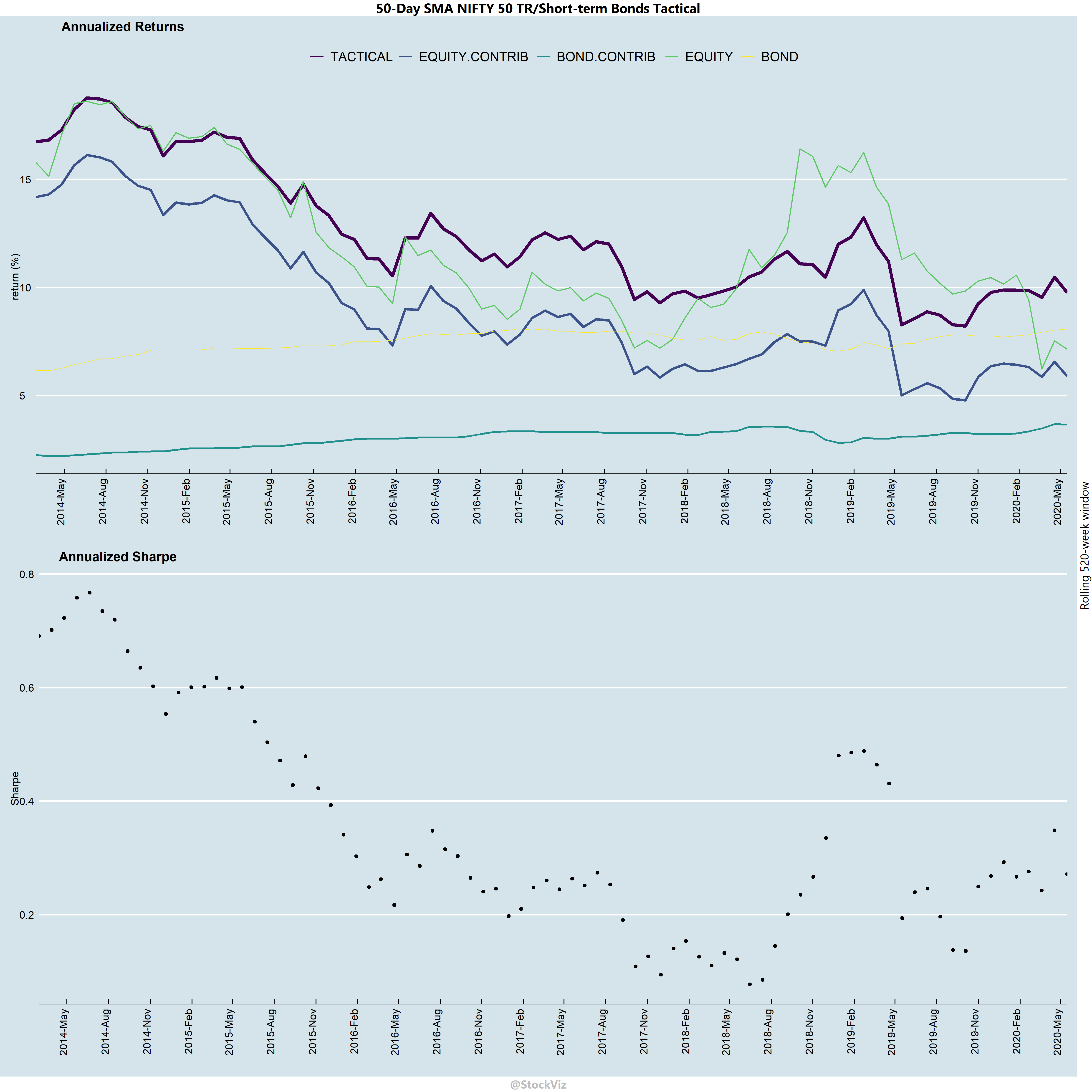
Indian markets have seen significant changes over time. It has got more deeper and wider with better liquidity, lower transaction costs and higher levels of automation. One way to gauge the efficacy of strategies is to use a metric like Sharpe or Information Ratio over rolling-windows through time. Also, the drivers of total returns in allocation strategies will be different across different time-horizons leading to different tax liabilities. It is useful to decompose returns to handicap them from a tax angle.
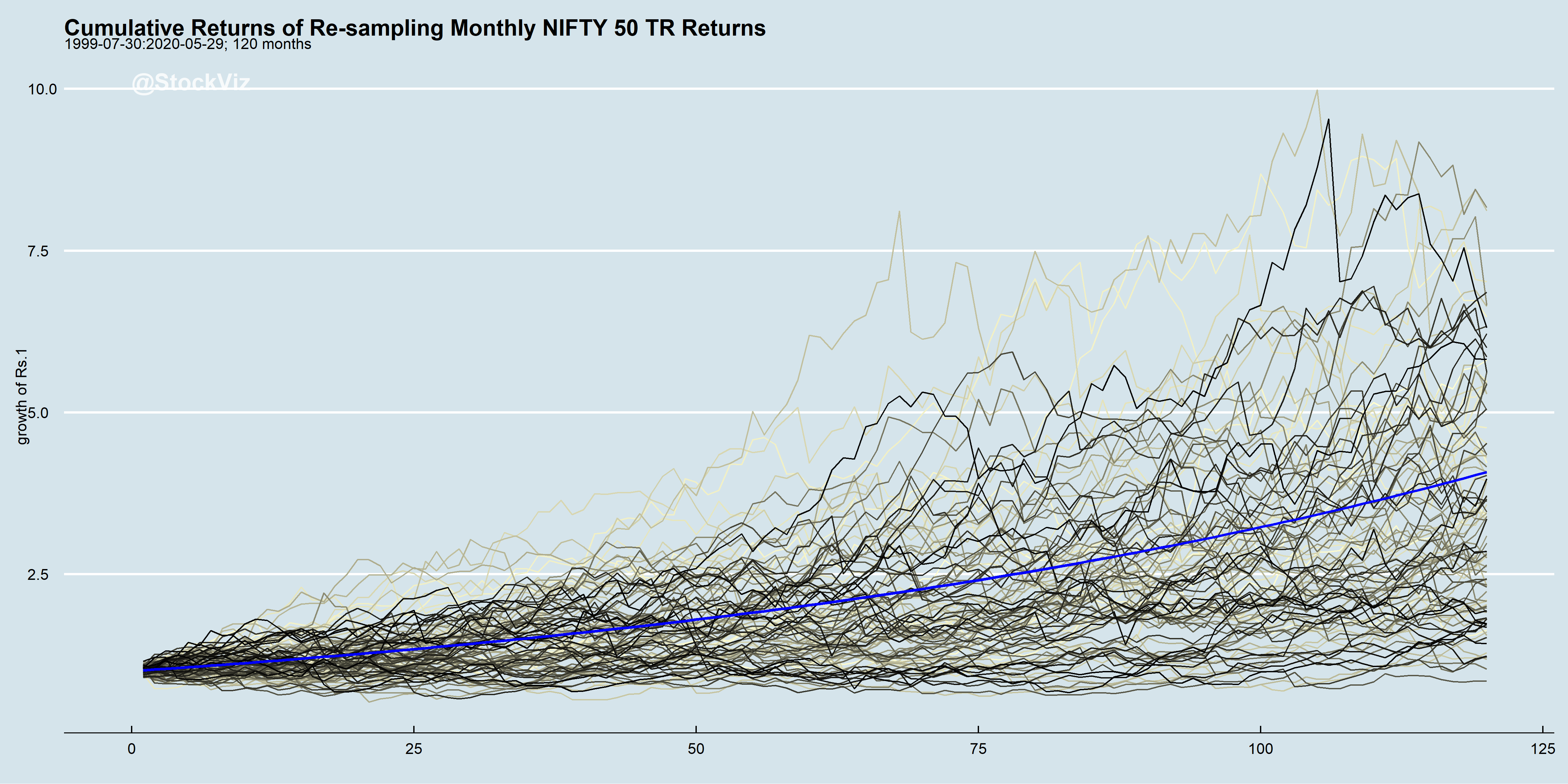
- There are quite a few time-periods where tactical allocations will under-perform buy-and-hold equities.
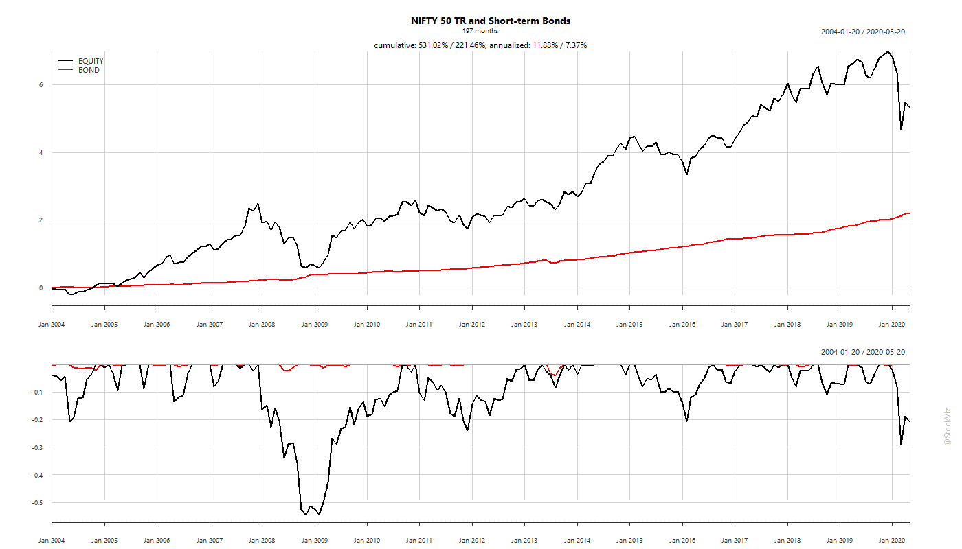
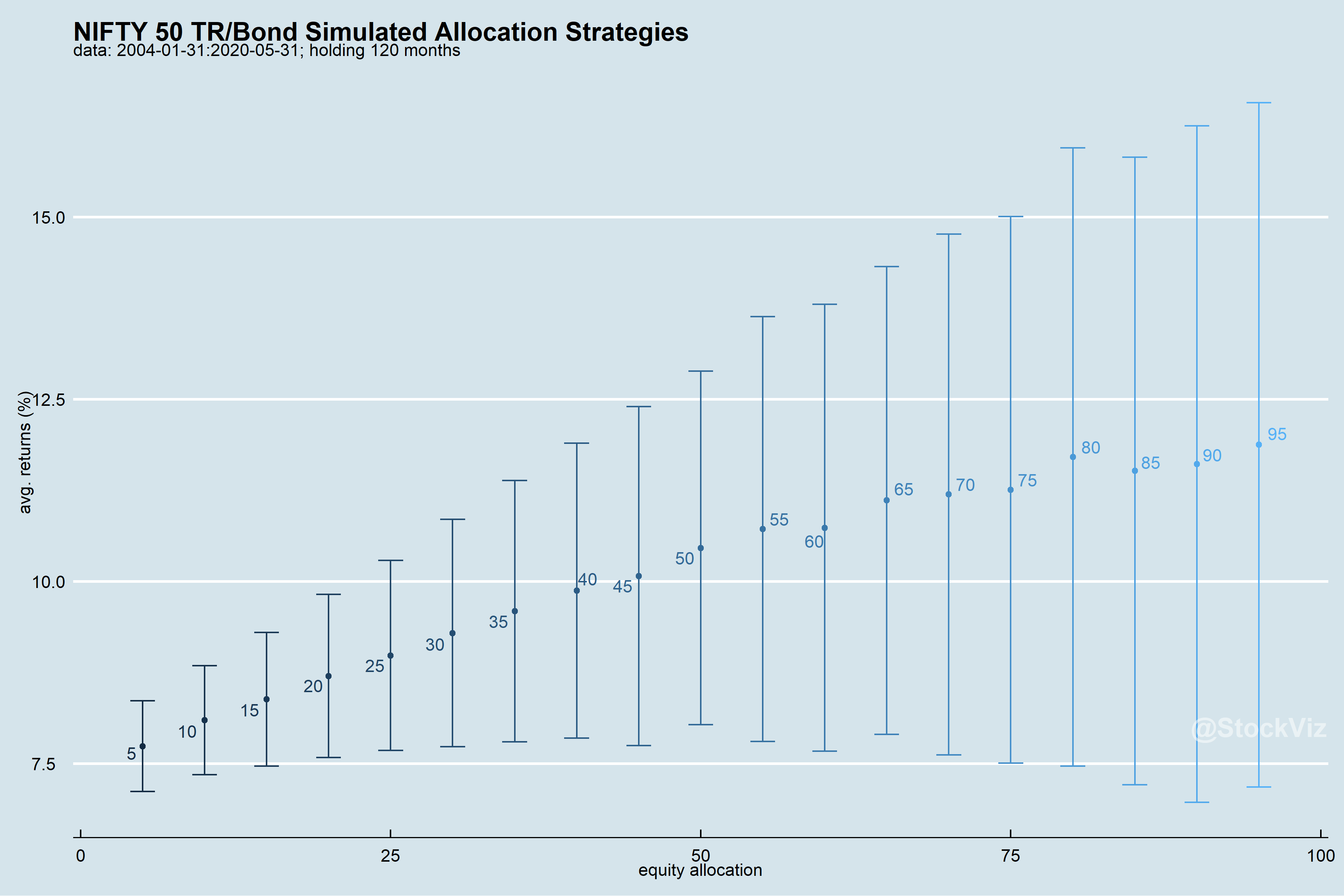
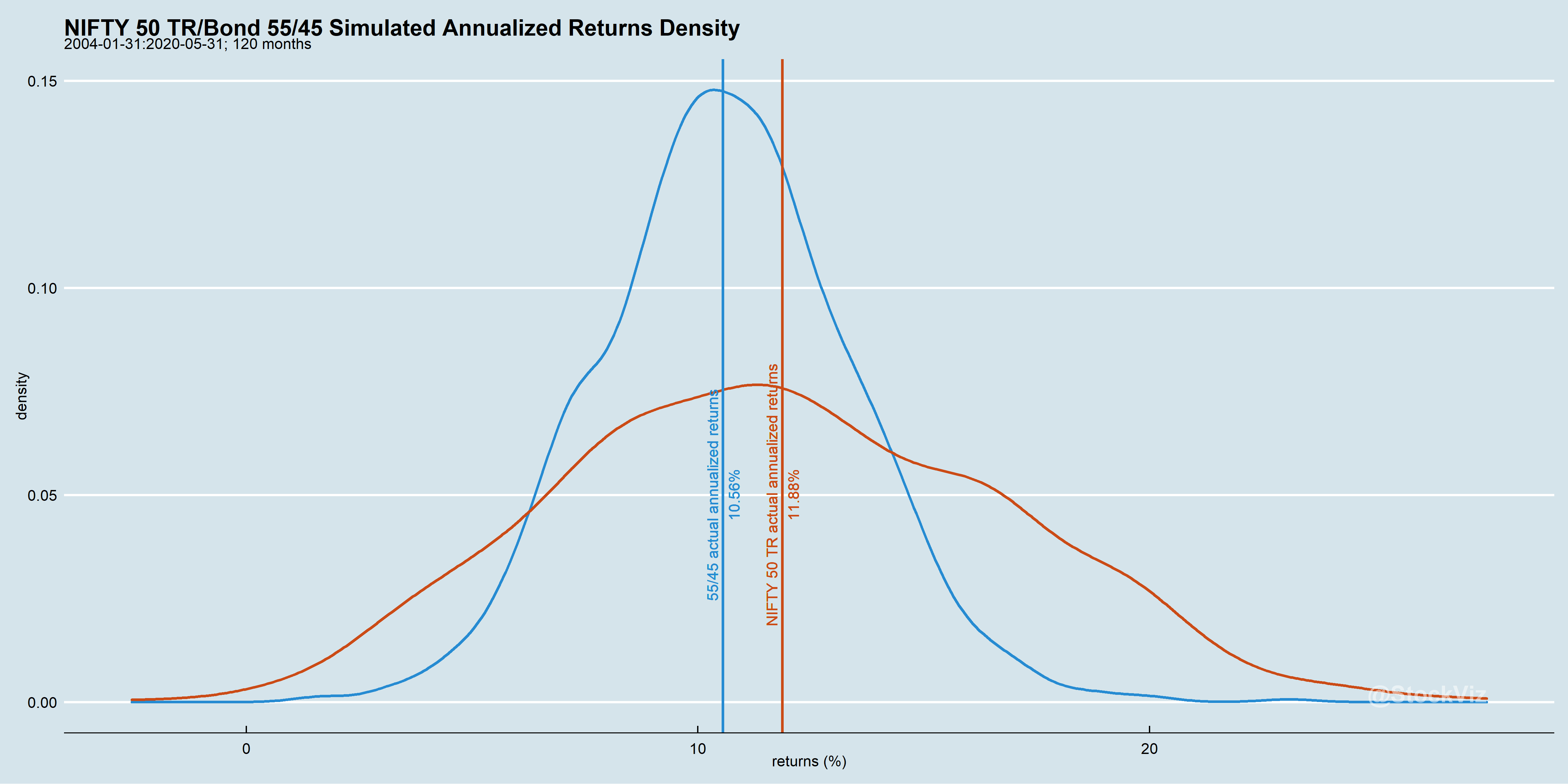
- Over a 10-year horizon, on an annualized basis, bonds have contributed about 1-4% to over-all returns.
- Sharpes have been falling through time. One should expect this strategy to attenuate further.
- Bonds have a bigger say in determining over-all returns in low equity return environments. So, use both assets!
- Bond returns have been less volatile that those of equities’. However, that doesn’t mean that have been constant through time.
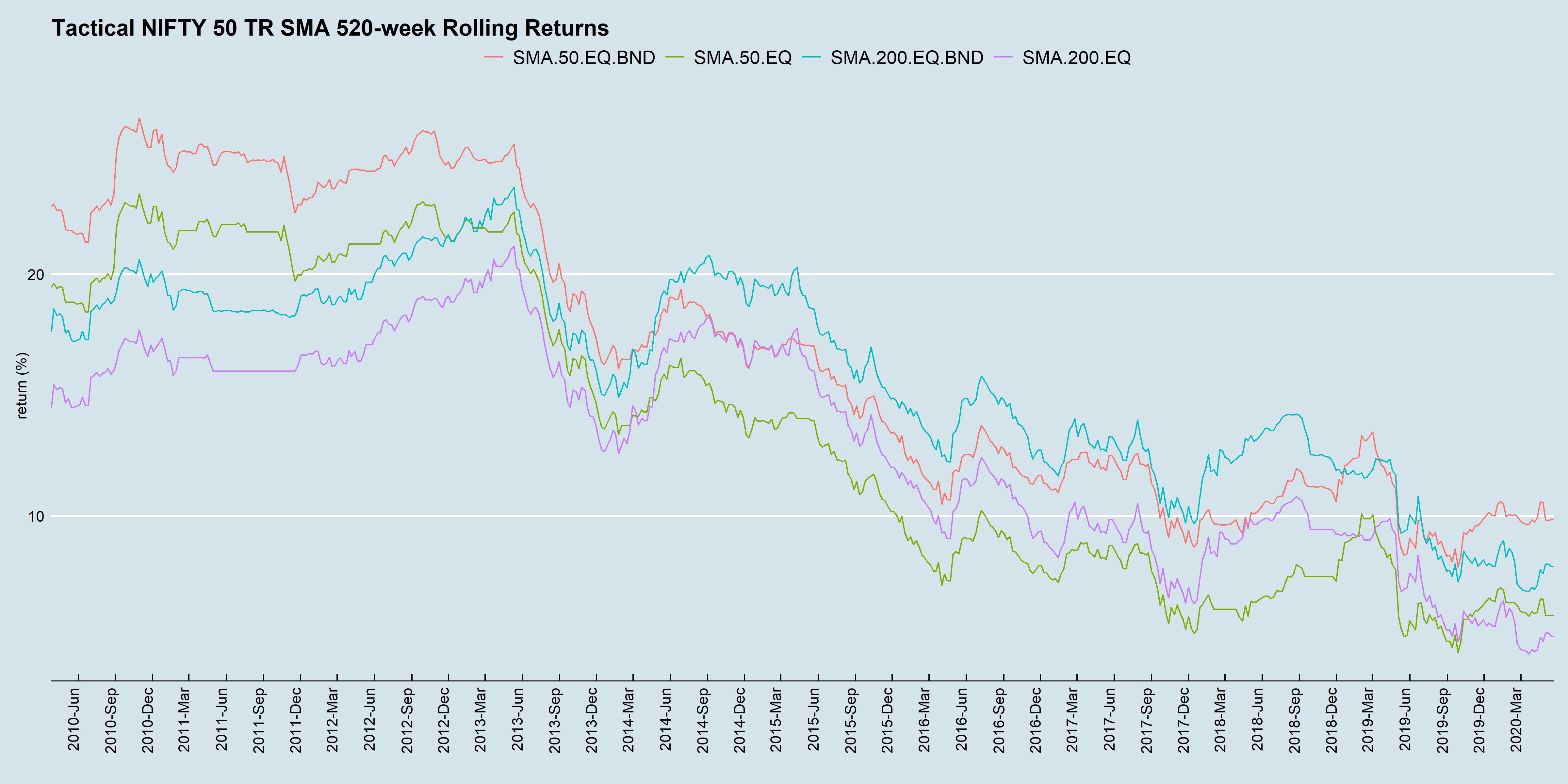
In high equity-returns environments, bonds are usually an after-thought. However, running these strategies “equities-only” is ill-advised. In the chart above, returns in the recent 10-year periods have been palatable only because of the returns contributed by bonds.
Our personal experience has been that when equities drawdown, investors switch over to tactical strategies, only to abandon them once stocks recover. Thus, leaving their downsides exposed during the next drawdown; ensuring that they end up with the worst of both worlds.
Excess returns aside, SMA strategies are also useful in managing risk. With lower risk, one can employ a bit of leverage to boost returns. We have done deep-dives into variations of these strategies in the past. Interested readers can have a look at our SMA Collection.