What makes sense and for whom.
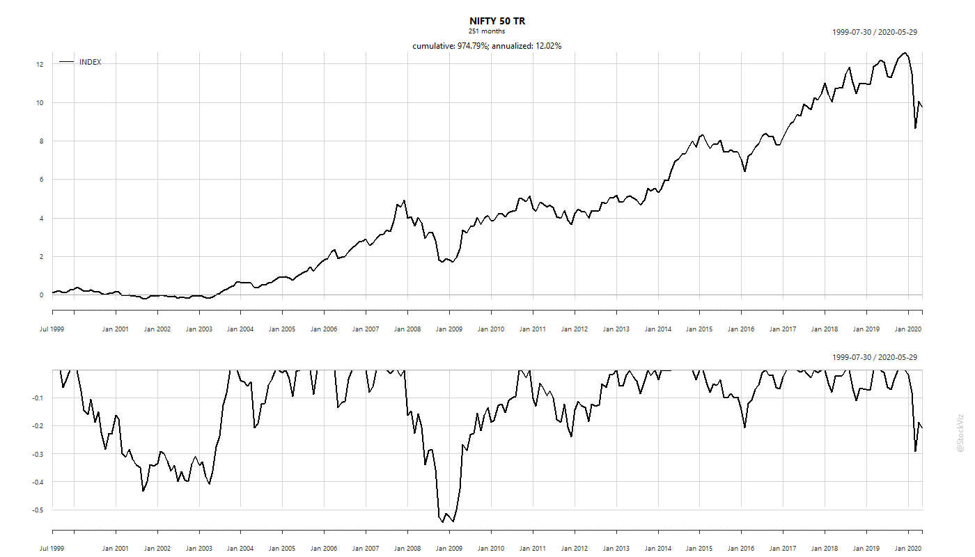
Our first post discussed one of the biggest risk that investors face: sequence-of-returns risk. One way to mitigate this is through asset allocation. You can just put half your investments in equities and half in bonds to reduce your over-all risk. An alternative is tactical allocation. In tactical allocation, you use a signal, like an SMA (Simple Moving Average) or equity valuations to switch between equities and bonds. Here, at any given point in time, you are fully invested in one asset class.
So, which one is “better?”
The answer is, “it depends!”
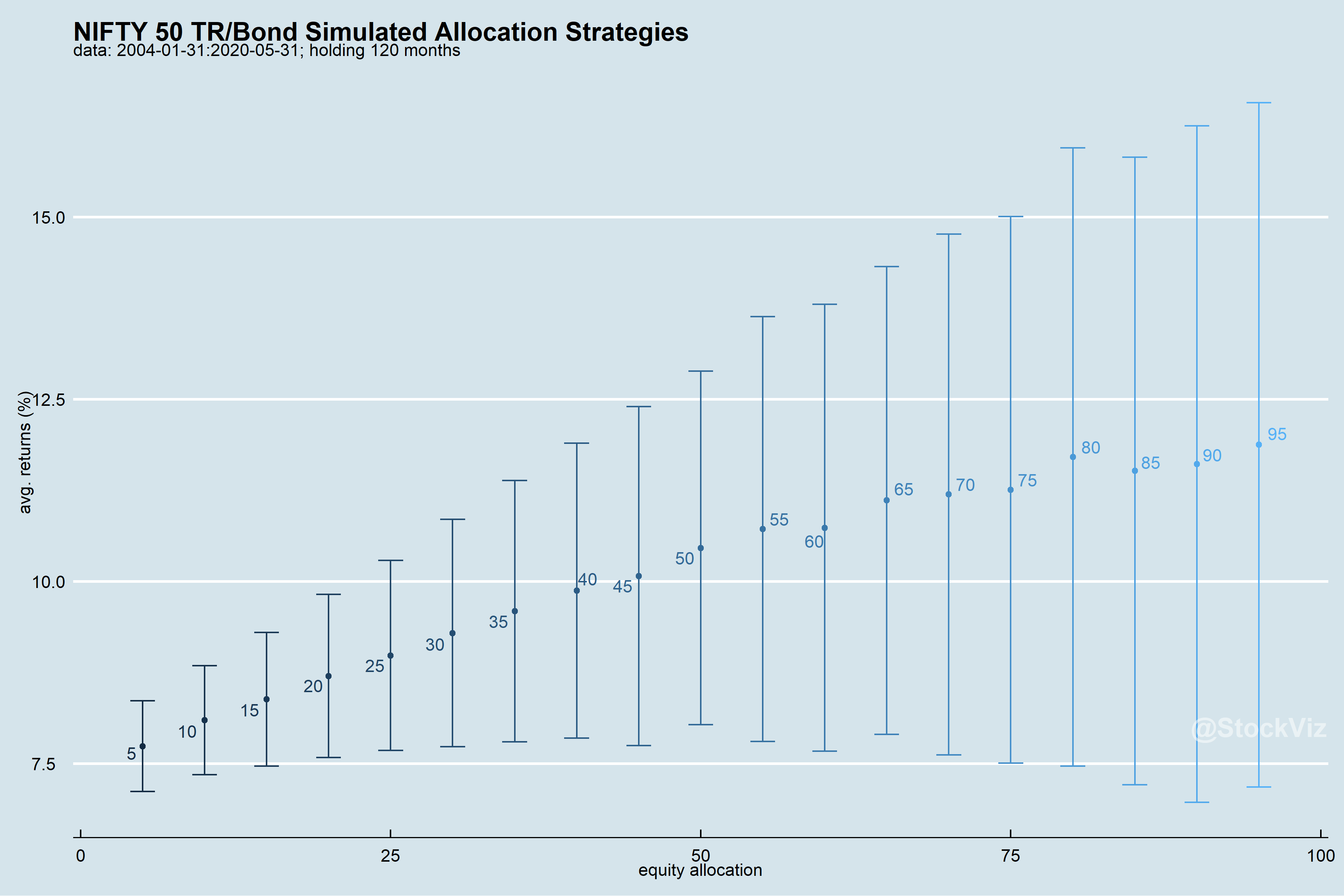
It depends on the investor’s tax slab and whether it is going to be a lump-sum investment or a SIP. For lump-sums, investors are better off with a tactical approach (bonus if you are in a lower tax slab.) For SIP investors, static allocation makes more sense because you can maintain proportions without selling the over-allocated asset. And, surprisingly, the frequency of re-balance did not matter for static allocation.
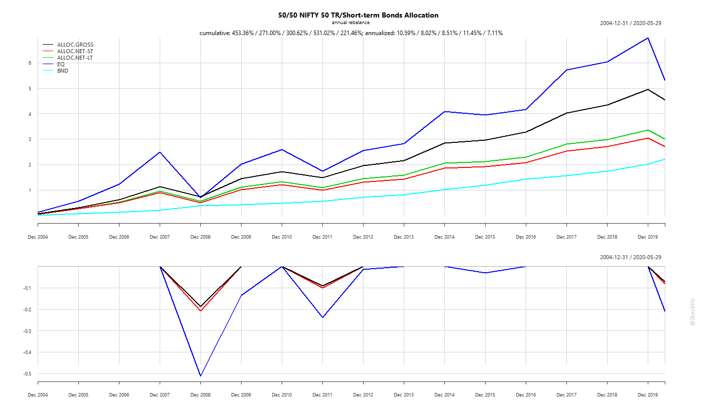
Re-balance Frequency for Static Allocation
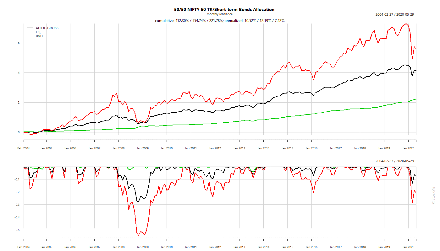
Our back-test shows that there is no difference to overall returns between monthly and annual re-balance frequencies. Focus on the black line on the following charts.
Monthly re-balance:

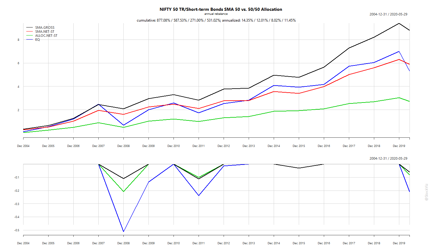
Annual re-balance:
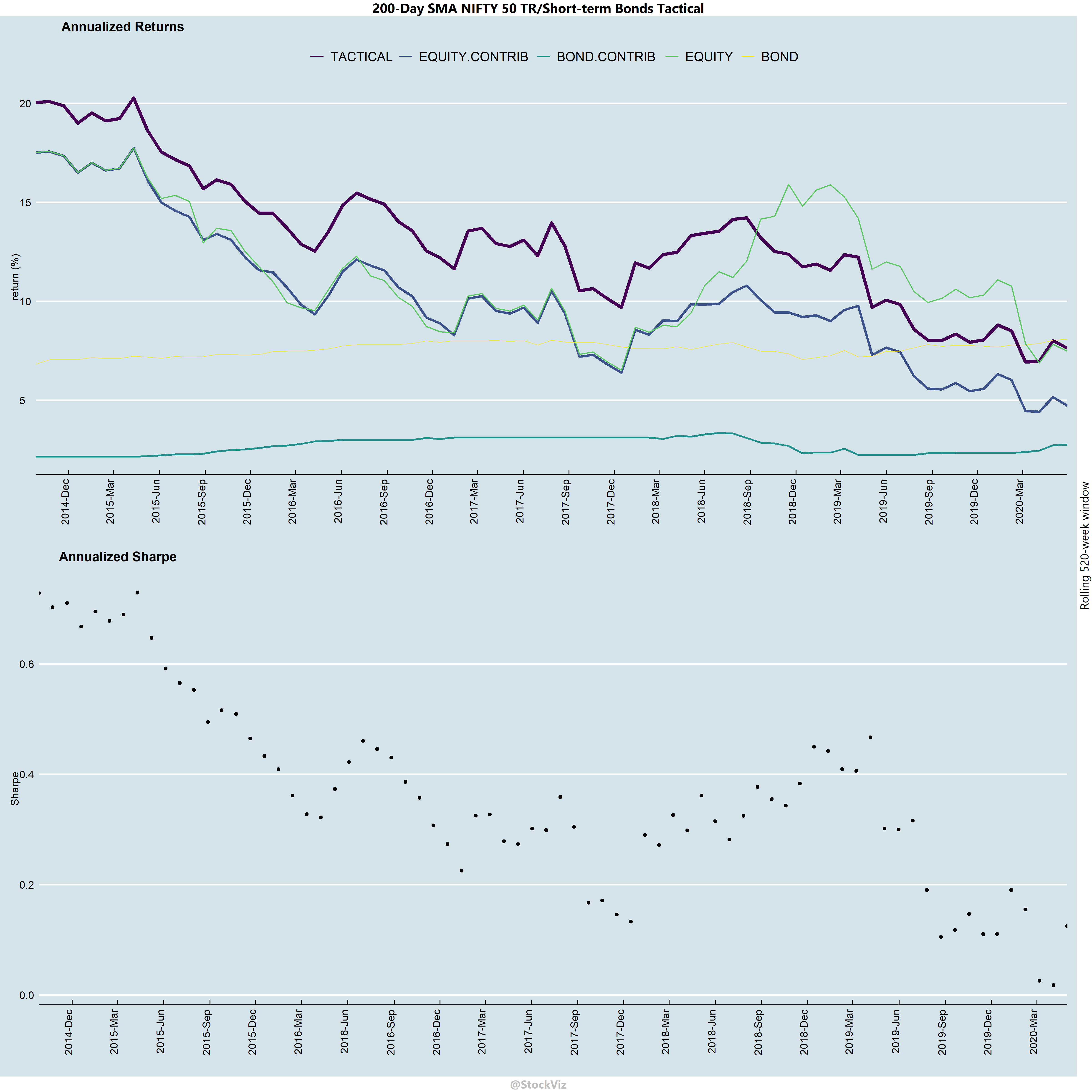
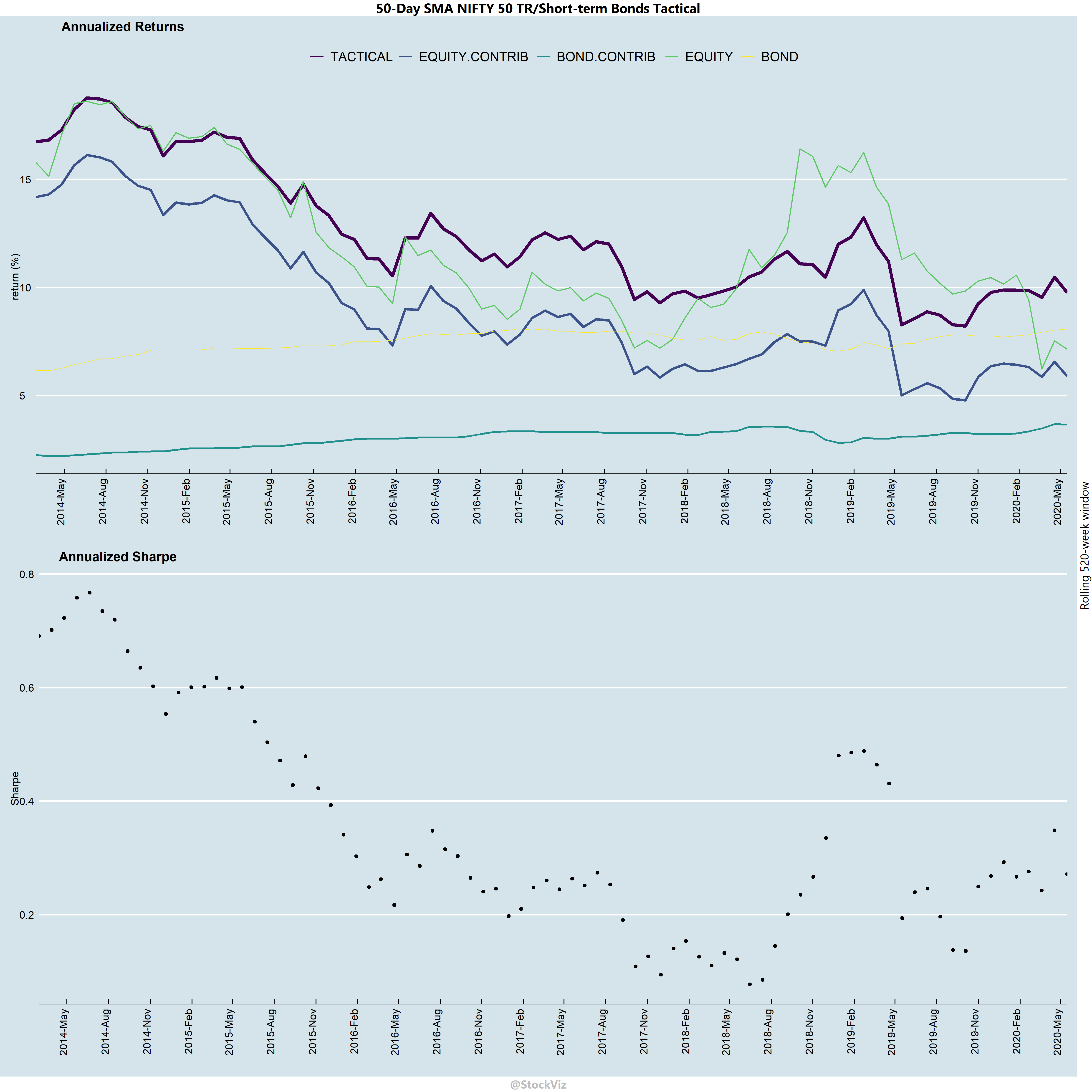
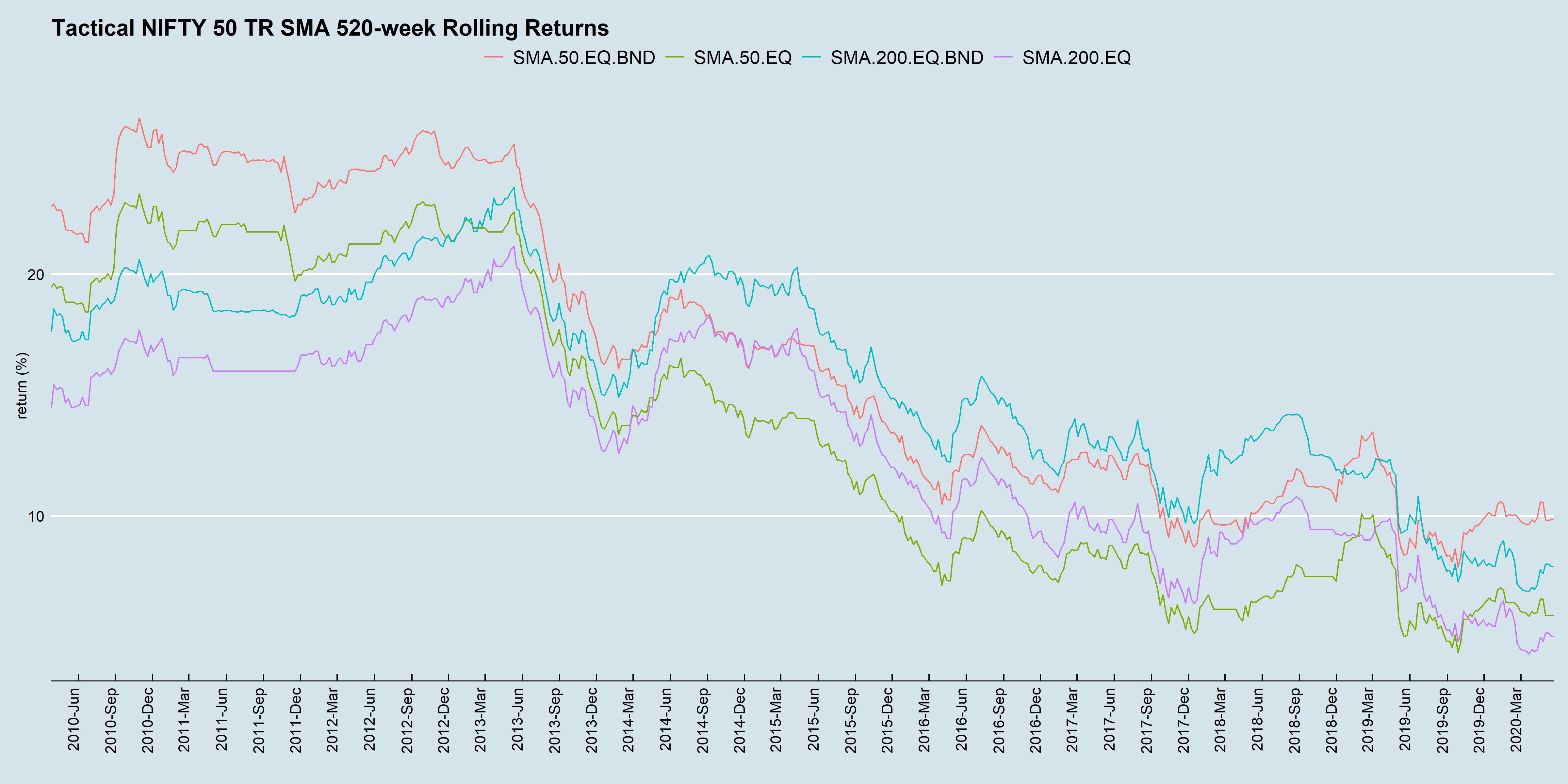
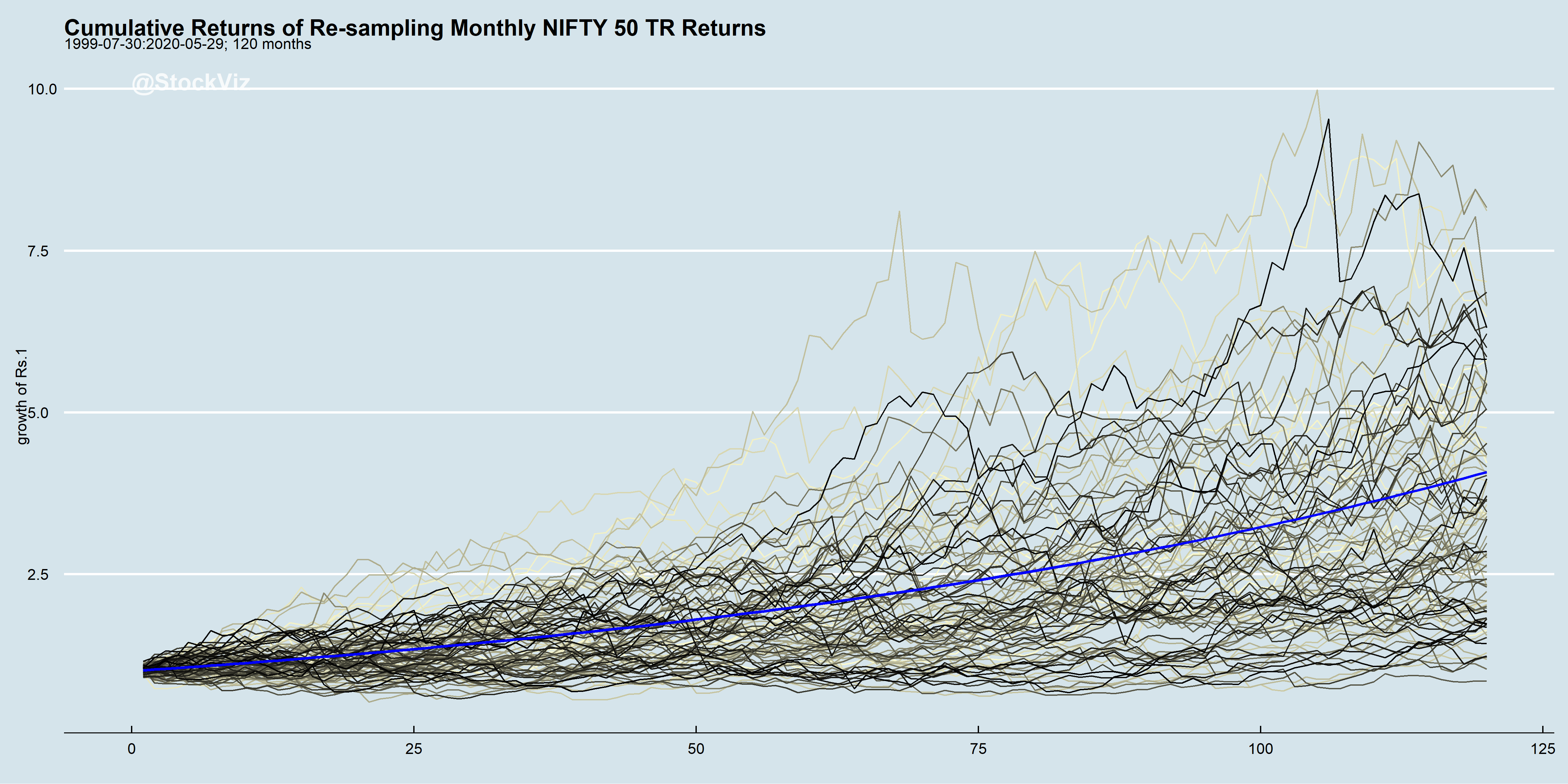
Static vs. Tactical – Rolling 10-year Returns
Static allocation returns have been converging with those of the tactical strategy.
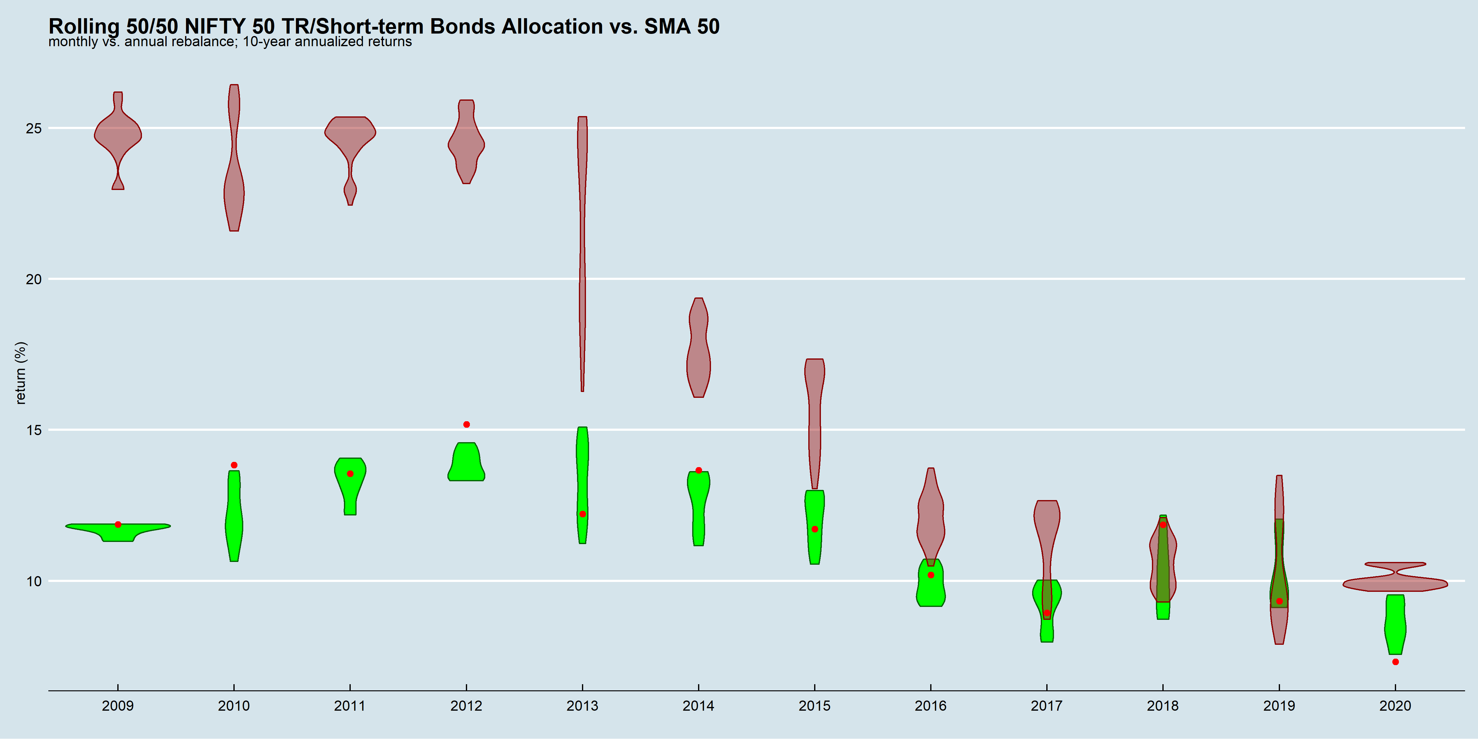
Green: static 50/50 allocation, monthly re-balance
Red dot: static 50/50 allocation, annual re-balance
Brown: 50-day SMA, weekly sampling
The above chart reinforces a couple of points we made earlier:
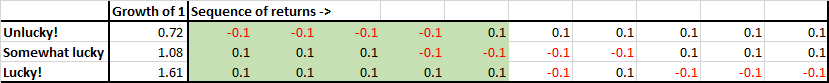
Sequence-of-returns risk is real.
Large impact of when you start and stop your investments (“luck” factor,) is real.
Excess returns in a back-test could be because of high transaction costs or lack of liquidity. In such cases, expect excess returns to diminish as those factors improve.
Barring a couple of instances, annually re-balanced returns were within the range of those that were re-balanced monthly.
Tax impact
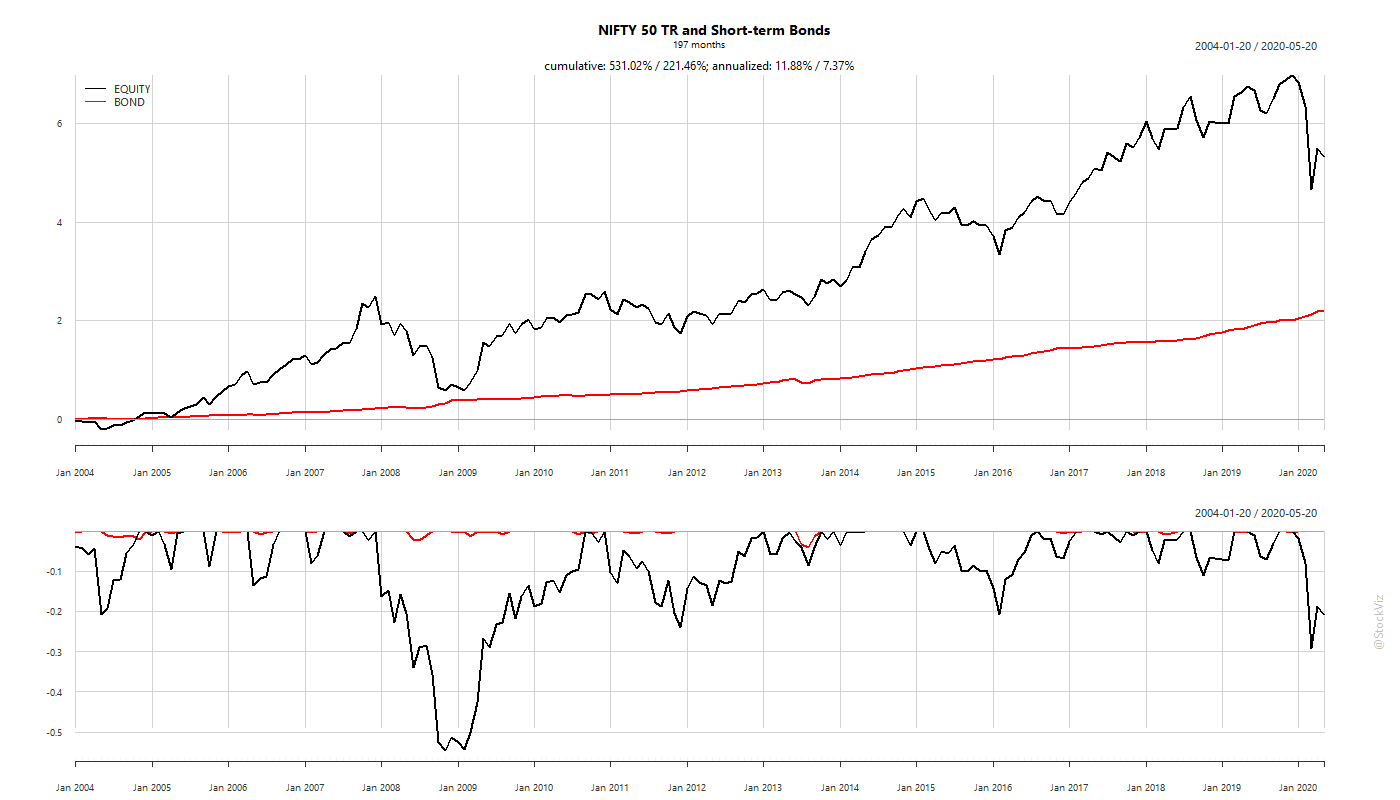
If you do a worst-case tax impact analysis on both static vs tactical (SMA) strategies, over the long-arch of time, tactical wins. In the chart below, static allocation is the ALLOC.NET-ST (green) line and tactical is the SMA.NET-ST (red) line.
However, if you are a SIP investor, then you don’t need to sell the over-allocated asset under a static-allocation setup – you could just buy the under-allocated one till it falls back in line. So, if you plot the after-tax returns of tactical allocation with pre-tax returns of static allocation by year:
Years 2011 through now, there is hardly any difference between them. They both turn in annualized gains in the low 7% range – adding about 1.25% over an all equity portfolio.
Summary
For lump-sums, choose tactical. For SIP choose static allocation.
Don’t ignore bonds. There are periods where a bulk of the returns are driven them.
Don’t ignore the role of taxes in DIY. For example, a mutual fund that wraps the SMA strategy would enjoy a 2+ % boost in annualized returns.