Author: shyam

Factor Holding Periods for Excess Returns

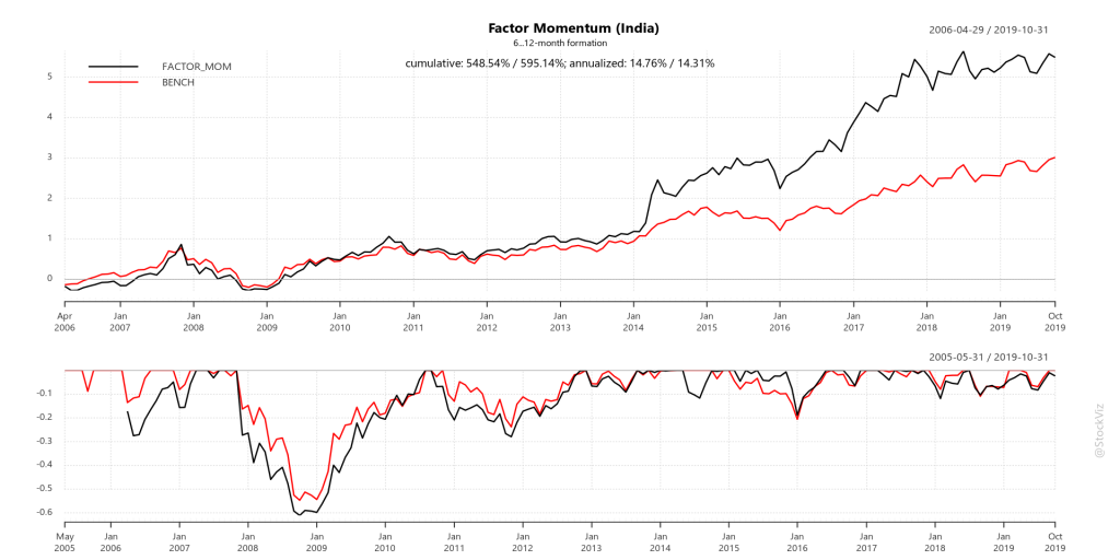
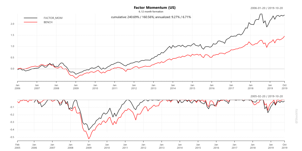
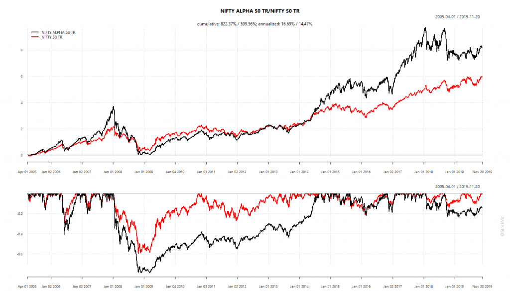
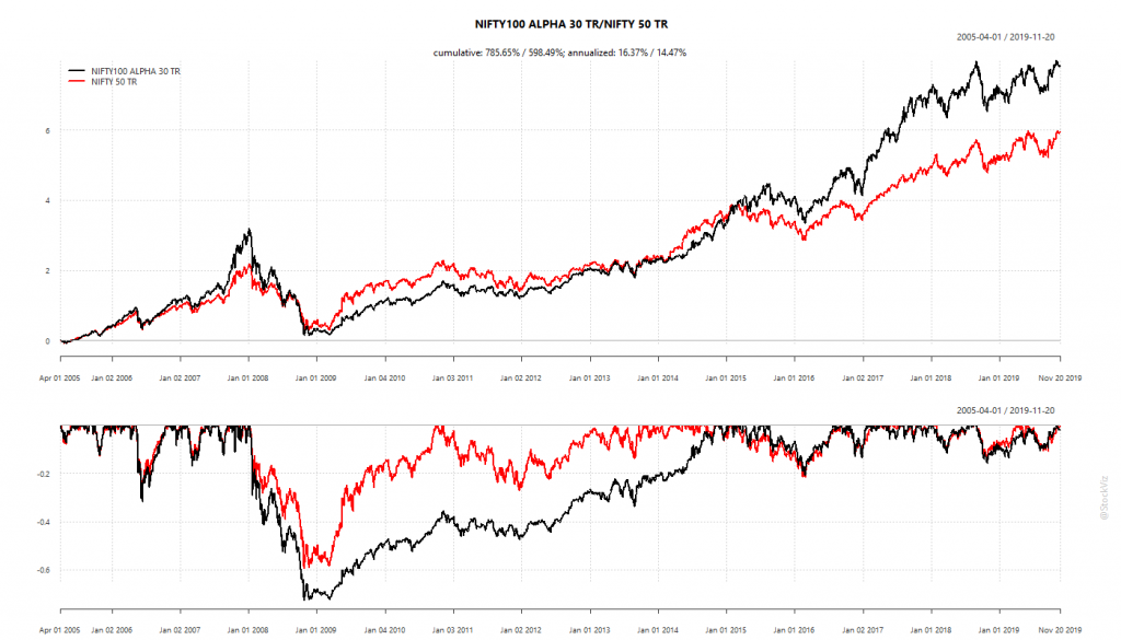
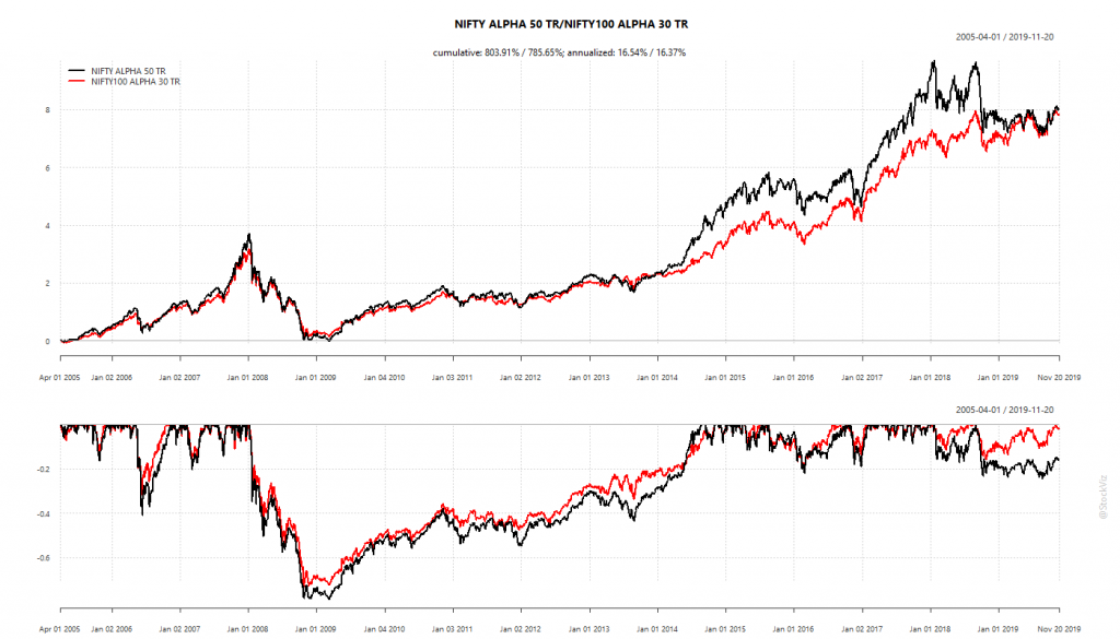
The NSE has different “strategy” indices that reflect some well known equity factors like low-volatility, quality, momentum and value. They are all shown to out-perform the NIFTY 50 TR index since inception:
cumulative returns of NSE factor 'strategy' indices

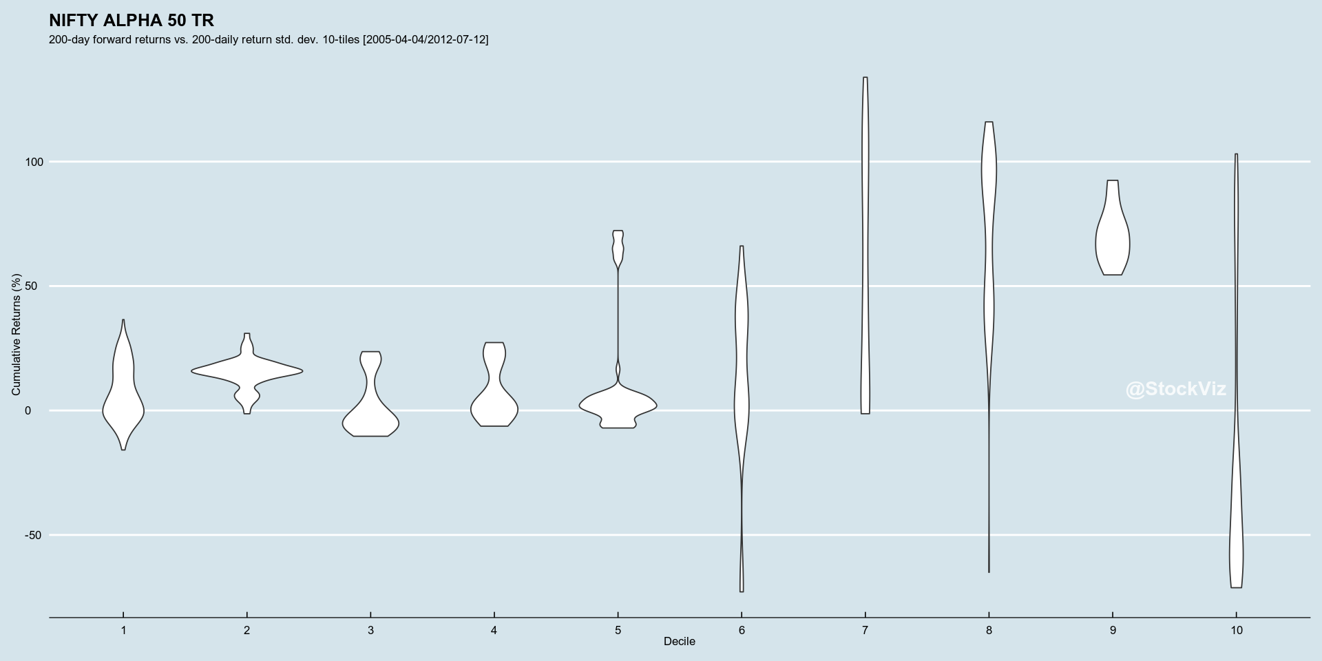
However, the excess returns of these indices, like everything else in equities, is unevenly distributed. As an investor, it could get frustrating to watch their “quality” factor investment under-perform the plain-old NIFTY 50 over many months. So broadly, for a given factor/strategy, what should the minimum holding period be for an investor to see only a positive excess return?

holding periods and excess returns for different factor/strategy indices

Factors take time to work. The longer the holding period, the less frustrating the experience. Low-volatility and Quality have the shortest holding periods of 5 years. The Alpha and Value indices require about 10 years for investors to see only positive excess returns. Also, given the lack of liquid, low-cost ETFs and index funds that track these factor indices, investors have to also contend with STT and capital-gains tax if they go the DIY route.

The edge that statistical factors have over market-cap based indices are measured over decades and require investors to be patient.

Charts and code on github.

Statistics don’t lie. Narratives do.

First, a headline: As U.S. fertility rates collapse, finger-pointing and blame follow (WaPo)

Fact-check: it is true!
Chart from World Bank:

Looks alarming! The government should respond! Mandatory paid maternity and paternity leave! Write-off education loans so that youngsters can afford to start families!

But… could the aggregate reduction in fertility rate be explained by lower teen-pregnancy rate?

And lower infant mortality rates?

Corrected narrative: women are having lesser kids because they expect all of their kids to make it to adulthood. And are having them later in life. Don’t panic.

Before subscribing to a narrative about a statistic, it is important to first figure out why the statistic was created in the first place. The raw fertility rate statistic was probably created to figure out how many midwifes to train/employ if the trend held up. While the second one was setup to measure the efficacy of sex education in schools and the last one to measure the effectiveness of primary healthcare.

It is only when we go beyond the narrative and seek data that falsifies that narrative that we get the full picture. This is the fundamental difference between hypothesis testing and data-mining.

Are Stop-Losses Worth It? Part II

We saw how, in aggregate, stop-losses do not add any value to a momentum portfolio after taxes and transaction costs (Are Stop-Losses Worth It?) When you dig a little deeper into the actual positions that get stop-lossed and analyze their subsequent returns, we find that, on average, subsequent returns are not negative enough to justify trading costs.

During mid-2016 through April-2019 Bull and Bear phases

Here’s how the Momo (Relative) v1.1 Theme’s stop-lossed positions behaved 20-days after they got booted out, mid-2016 through April-2019:

Momo (Relative) v1.1.density-T20.2016-08-23.2019-04-24

Summarized statistics across different holding periods:
Momo (Relative) v1.1.density-table.2016-08-23.2019-04-24

Now let’s partition the total period into two. The first part covers the “bullish” market of mid-2016 through Dec-2017 and the second Jan-2018 through April-2019.

During the mid-2016 through Dec-2017 Bull

Momo (Relative) v1.1.density-T20.2016-08-23.2017-12-29

Summarized statistics across different holding periods:
Momo (Relative) v1.1.density-table.2016-08-23.2017-12-29

During the Jan-2018 through April-2019 Bear

Momo (Relative) v1.1.density-T20.2018-01-01.2019-04-24

Summarized statistics across different holding periods:
Momo (Relative) v1.1.density-table.2018-01-01.2019-04-24

Conclusion

When looked at from the perspective of a single position, a stop-loss removes red ink and is out-of-sight/out-of-mind. However, it is only when you look at their subsequent returns in the aggregate, that you realize that peace-of-mind comes at a cost.

During the bull phase, when the whole market was shooting higher, stop-lossed positions recovered from their losses. Note how the skew is slightly positive. Stop-losses here were a definite drag after taking costs into account.

During the bear phase, it does look like stop-losses helped – the subsequent returns of stop-lossed positions were skewed left. However, as we saw in our previous post, in aggregate, they did not add value after taking costs into account.

Book Review: The Behavioral Investor

The Behavioral Investor (Amazon,) by Daniel Crosby had me nodding in agreement at every page. It is one of those books that produces your thoughts in print.

You are not built to be happy or to make good investment choices, you are built to survive and reproduce. Asking someone built for short-term survival to become a long-term investor is a bit like trying to paint a room with a hammer. You can do it, but it’s not pretty.

Successful investing is hard. It has more to do with controlling one’s own emotions than finding a superior strategy. Being mindful of our decision making process is half the battle won. The book has some good ideas on how we can be aware of when we are making poor decisions so that we can take a pause and reconsider.

Recommendation: Read it now!

Volatility and Returns

Indian mid-caps, represented by the NIFTY MIDCAP 100 TR index, has out-performed its large-cap peer, the NIFTY 50 TR index.
NIFTY 50 TR vs. MIDCAP 100 TR

It has done so with higher volatility. Here is the rolling 200-week standard deviation of weekly returns of the two indices:
standard deviation of weekly returns

MIDCAP volatility has been persistently higher than NIFTY volatility in the past:
ratio of standard deviations

A portfolio of bonds and mid-caps should exhibit lower volatility than an all-equity portfolio. Here are the standard-deviation ratios for different allocations to bonds:
standard deviation ratios of different bond allocations
B05, for example, represents a portfolio of 5% short-term bonds and 95% MIDCAP index. As allocation to bonds increases, portfolio volatility decreases.

We see from the chart above that a 75% MIDCAP + 25% BOND portfolio has almost never seen volatility greater than an all NIFTY portfolio. So, what are we giving up in returns to reduce volatility? About 2% in returns:

75% MIDCAP + 25% BOND returns

Take-away

  1. On an annualized basis, the allocation portfolio gives up about 2% in returns compared to all MIDCAP portfolio and is on par with NIFTY’s.
  2. After taxes and transaction costs, expect the allocation portfolio to under-perform buy-and-hold NIFTY.
  3. No pain. No gain.

Code and charts are on github.