Momentum has proved to be the premier anomaly in different markets. And so has low-volatility. What happens if you combine both of them? Also, what if you also add low volatility of volatility into the mix?
There are a couple of ways to skin this cat. You can start with low-volatility and add momentum. Or, you could go the other way – start with momentum and then add a volatility sort.
tl;dr: go with low-volatility first, momentum second (VOLxMOM).
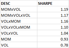
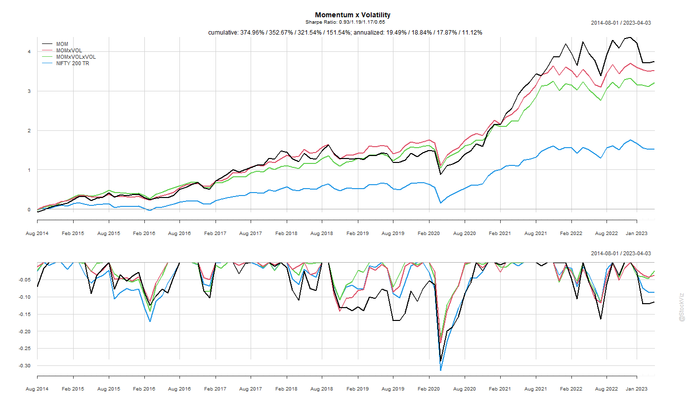
While a simple momentum sort gives the highest return, adding a low-volatility filter to it gets you a better risk-adjusted return.
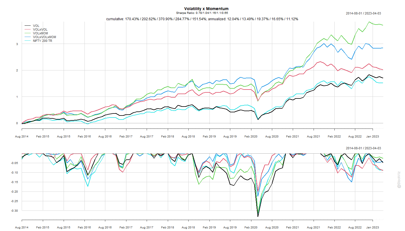
The order of the sort – first volatility and then momentum or first momentum and then volatility – doesn’t seem to matter much for the Sharpe rankings but the former ended up with slightly better returns.
Code and charts on github.