The volatility risk premium (VRP) is the difference between implied volatility and realized (or actual historical) volatility. Implied volatility is, on average, overpriced compared to realized volatility.
The VRP exists because investors are essentially “selling insurance” when they sell implied volatility.
Volatility is negatively correlated with equity returns; typically, volatility increases when equity markets decline. Therefore, a short volatility position is implicitly “long equity risk”. Since equities are generally expected to earn an equity risk premium (ERP) over the risk-free rate, strategies that are implicitly long equity risk should also be abnormally profitable. This is why short volatility strategies tend to be profitable on average.
Just like how you can get long ERP by getting long an equity index, you should be able to get long VRP by programmatically shorting options and delta-hedging them. Volatility becomes a beta that you allocate towards.
Building Blocks
An option’s value changes relative to the price of the underlying – the rate of this change is called delta.
Gamma is the rate of change of delta given a change in the price of the underlying. As the underlying price moves, an option’s delta does not remain constant; gamma quantifies how much that delta will change.
Since we are only interested in volatility and not price, we can hedge out this delta. Delta-hedging a basket of options mitigates the exposure to the directional movement of the underlying. Profitability becomes solely determined by the volatility (not direction) of the underlying.
Vega is the rate of change of an option’s value relative to a change in implied volatility (IV). If IV rises or declines by one percentage point, the value of the option is expected to rise or decline by the amount of the option’s vega, respectively.
When you short options, you have negative gamma (you don’t want large price movements) and negative vega (you don’t want IV to rise). You hope for low realized volatility and falling IV. However, you have positive theta — time works in your favor.
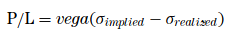
Theoretically, a delta-hedged short option position’s P&L = vega(IV – RV).1
Construction
Historically, NIFTY ATM option Implied Volatility across days-to-expiry, looks like this:

So, theoretically, if you shorted 30dte ATM calls and exited them at 7dte, your P&L distribution will look like this:

And the same thing with puts:

If you are willing to treat volatility as just-an-other beta, then by creating programmatic delta-hedged short ATM straddle/strangle portfolio, you can get long this beta.
Just as it is with ERP, one could build models to time VRP. Having a beta portfolio as a benchmark should help.
- Volatility Trading, Euan Sinclair ↩︎


