Tag: correlation

MSCI Country Momentum Index Correlations

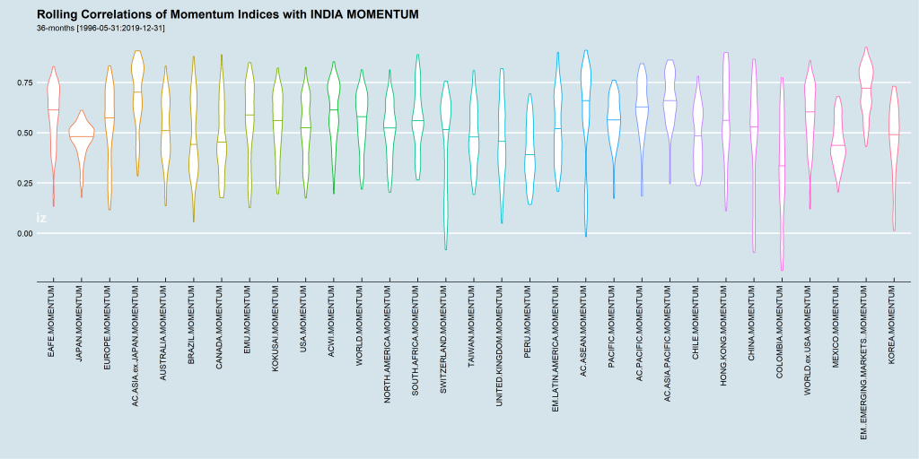
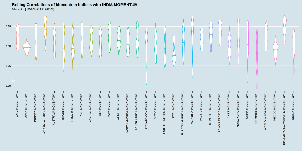
In MSCI Country Index Correlations, we looked at country index correlations through time. Here is a quick update that “flattens” out the rolling correlation of the momentum versions of these indices with the MSCI INDIA MOMENTUM Index.

Three-year Rolling Correlations

MSCI Country Momentum Index 3-year Rolling Correlations

Five-year Rolling Correlations

MSCI Country Momentum Index 5-year Rolling Correlations

Take-away

Momentum is a lose proxy for sentiment and the tides of optimism floats all boats. All equity markets are correlated with each other – some strongly (HONG KONG) and some weakly (CANADA.)

The median correlations across both 3- and 5-year rolling periods are greater than +0.70 between INDIA MOMENTUM and EMERGING MARKETS MOMENTUM.

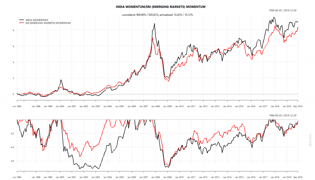
Cumulative Returns of INDIA and EM MOMENTUM (MSCI)

No market is an island. Sentiment is tail that wags the dog.

MSCI Country Index Correlations

All stocks are correlated to one-another. In times of crisis, these correlations explode higher. The same is true for country indices. For example, if you look at the rolling 5-year monthly return correlations between the MSCI INDIA index and other country indices, Jordan is the least correlated and Hong Kong is the most correlated.

Least Correlated:
least correlated with INDIA

Most Correlated:
mostcorrelated with INDIA

The annual return charts show the zig/zag nature of these markets:
MSCI.INDIA-JORDAN-HONG.KONG.annual.returns

So, does it make sense to construct a 50/50 portfolio between INDIA and JORDAN? In theory, the resulting portfolio should have lower draw-downs and lesser volatility than either taken alone.
MSCI.INDIA-JORDAN.cumulative

In contrast, here is the 50/50 INDIA/HONG KONG portfolio:
MSCI.INDIA-HONG.KONG.cumulative

A take-away from this is that diversification within the same asset class (in this case equities,) does not help with drawdowns. Nor does it necessarily lead to higher returns. It is way of protecting yourself from mistakes that are only apparent in hindsight. Just ask investors who were invested 100% in Jordan the last decade.

Code and charts on github.
Related: Stock and Bond Correlations and Volatility

Stock and Bond Correlations and Volatility

Stocks and Bonds are not correlated. They are not negatively correlated. And neither are they positively correlated. One doesn’t “zig” when the other “zags.” This is exactly why portfolio allocations start with stocks and bonds – the diversification math works on uncorrelated asset classes. When you combine the two assets together you get lower portfolio volatility.

Here are some charts that show how the two asset classes differ:

S&P 500 and 3-month t-bills

sp500.tbill.correlation.1mo

sp500.tbill.volatility.1mo

Nifty 50 and 0-5 year TRI

nifty50.z5.correlation.1mo

nifty50.z5.volatility.1mo

Macro: NIFTY vs. INR/OIL Correlation, Part III

This is the last part of the study. Part I, Part II

The reason why a linear model between NIFTY and USDINR built in Part II failed could have been because:

  1. Weekly returns were not appropriate for the relationship. Perhaps INR affects NIFTY at a higher frequency.
  2. There is no linear relationship because a rising/falling INR. Changes are not uniformly good/bad.

One way to visualize it is to plot the NIFTY returns density at different USDINR return thresholds. If there is no obvious difference in the densities between NIFTY returns when USDINR is positive vs. when it is negative, one could conclude that there is no straight forward relationship between the two.

Here is the NIFTY weekly returns density when USDINR is going up (the rupee is depreciating):
density plot NIFTY vs. USDINR
Note the curve when USDINR weekly returns are greater than 0.5% vs. when are greater than 2%. There is a bearish bias.

And, NIFTY weekly returns density when USDINR is going down (the rupee is appreciating):
density plot NIFTY vs. USDINR

If you juxtapose the above densities, it is apparent that when the rupee is appreciating, the densities skew right, And when the rupee is depreciating, there is a left skew. These charts show that there is “a” relationship – just not what can be captured by a linear model.

Code and density plots for NIFTY vs. OIL can be found on github.

Macro: NIFTY vs. INR/OIL Correlation, Part II

This is a continuation of the correlation study of Part I
Our correlation study showed a -0.54 between NIFTY 50 and USDINR whereas a 0.21 with OIL. Here, we will use weekly returns of the NIFTY and USDINR to build a simple linear model.

Building a linear model

A weak correlation doesn’t usually lend itself to a useful linear model. To illustrate this point, have a look at the diagnostics below:
NIFTY~INR linear model
Ideally, the ‘Residuals vs. Fitted’ plot should show residuals evenly distributed around the zero line – it doesn’t. The Q-Q plot should lie on the diagonal – it is marred by heavy tails. Hence, we should scale-down our expectations from the model.

For this post, we will split the time-series that we have into a “training set” that goes from 2010-01-01 to 2015-12-31 and a “test set” that goes from 2016-01-01 to 2018-09-30. We will build the model with the former and test it with the latter.

Results

Predicted vs. actual weekly NIFTY 50 returns:
actual.vs.pred.NIFTY50
To test our model, we will give it the actual NIFTY 50 returns (x-axis) and plot the predict NIFTY 50 returns (y-axis.) The problem here is immediately apparent: it is heavily bullish! It consistently gives a positive prediction.

Long and Long-short cumulative returns:
linear.model.cumulative.NIFTY50
If we use our model to go long-only (L) or long-short (LS), we get the cumulative returns shown above. The model is no better than buy-and-hold (at least it is no worse, so there is that.)

Take-away

A weak correlation between NIFTY 50 and USDINR is not much to work with and a linear model built over that relationship is no better than buy-and-hold. Given the narrative spun by the media, it is tough to wrap ones head around the results above.

We conclude with density charts of weekly NIFTY returns under different USDINR return thresholds in Part III.

Code and charts on github.