Typically, prices and volumes are charted based on time aggregations. The most common aggregation is the daily chart.
The daily chart shows the high/low/open/close and volume traded of a particular instrument. Intraday traders might prefer a more granular version of this. Maybe a minute chart does the trick for them.
Chrono-clocks are intuitive because that’s how we perceive events around us and have been trained to think.
However, time is not the only way to aggregate prices. If prices are information, then volume indicates the speed with which it arrives. You can divide the day into equal volume buckets (eg. in 5000 contract increments) and transform the time-series from chrono-time to event-based time.
In fact, working in volume time presents significant statistical advantages. First, this time transformation removes most intra-session seasonal effects; second, it allows a partial recovery of Normality and the IID assumption; third, sampling in a volume-clock metric addresses the problem of random and asynchronous transactions, which is a major concern when computing correlations on high-frequency data.
The Volume Clock: Insights into the High Frequency Paradigm (SSRN)
We know that trading turnover throughout the day is not constant. If you plot turnover over a trading day, it typically traces a ‘U’ shaped plot. Even widely traded index futures like the NIFTY have “slow” and “fast” periods. A volume clock is one way to match the sampling frequency with information flow frequency.
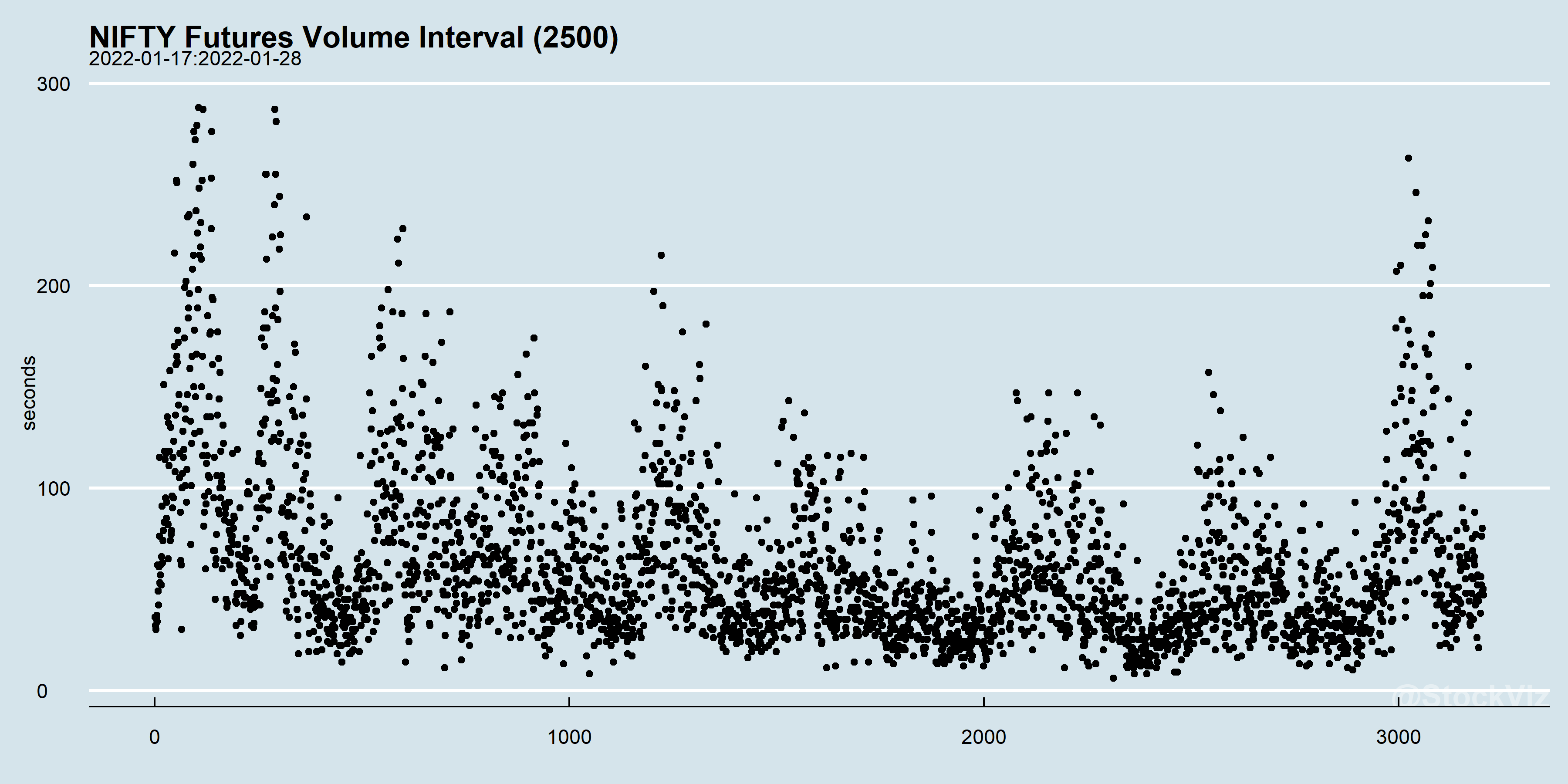
When you aggregate by volume, each slice of time will have different lengths. For example, we streamed NIFTY futures over a couple of weeks and aggregated it by 2500, 5000 & 10000 lots traded. The y-axis is the width of the time-slice of each volume-tick.
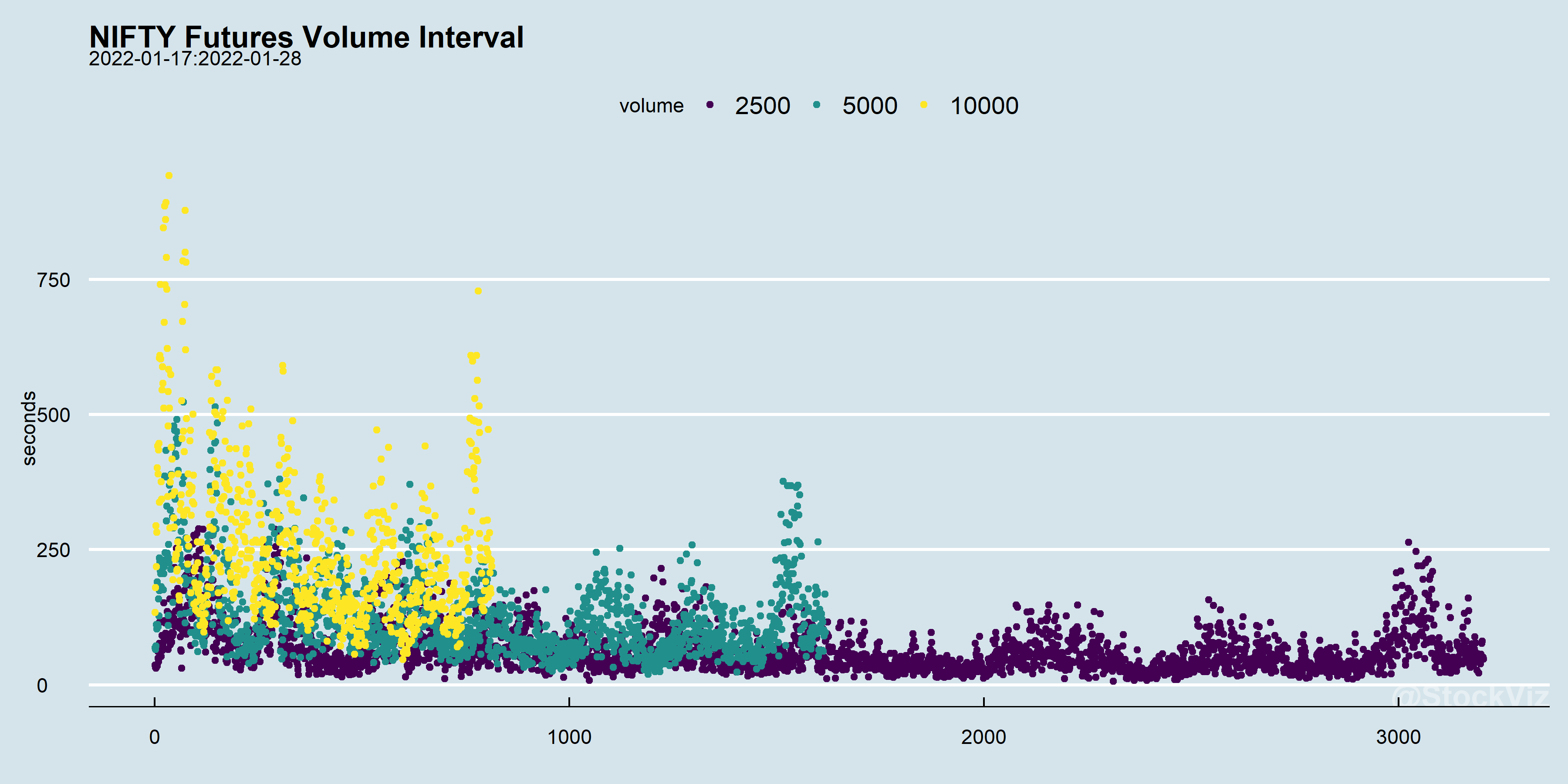
The size of the volume bucket would depend on what one is trying to analyze. Here’s the 2500 lot bucket by itself:
“There are minutes where nothing happens; and there are seconds where minutes happen” – Lenin, the High Frequency Trader.