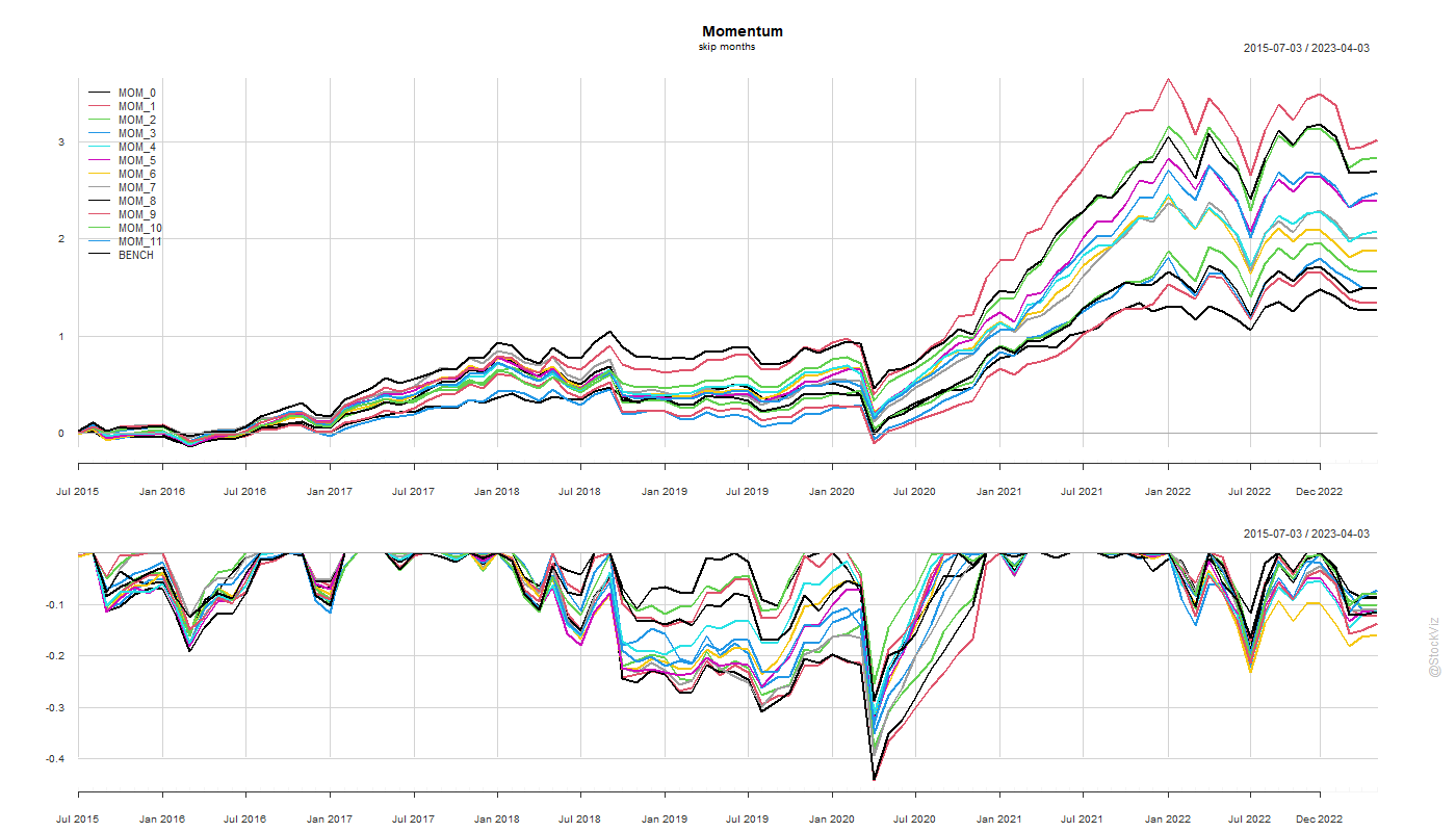
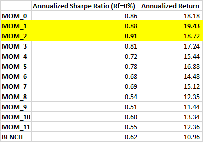
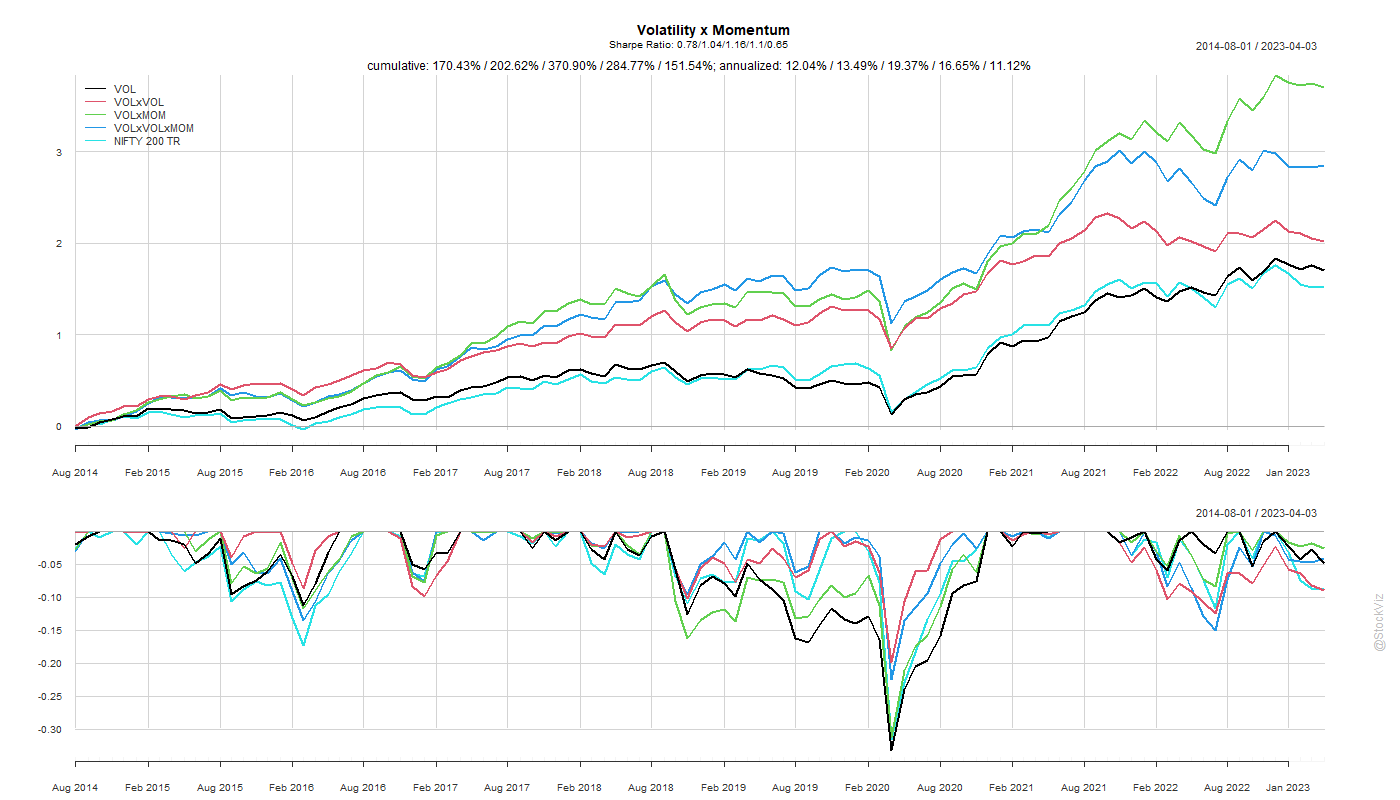
Previously, we found that the traditional 12_1 momentum configuration, where you look at the previous 12-month performance while skipping the most recent month and rebalancing every month, was indeed an ideal config (MOM_1_1). However, there are momentum index funds that rebalance once in 6-months (MOM_[0,1]_6). Is there any performance give-up if you rebalance infrequently?
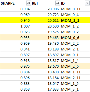
Turns out that the traditional config is quantifiably better than others. However, there’s isn’t much of a performance give-up even if you rebalance once in 6-months (MOM_0_6).
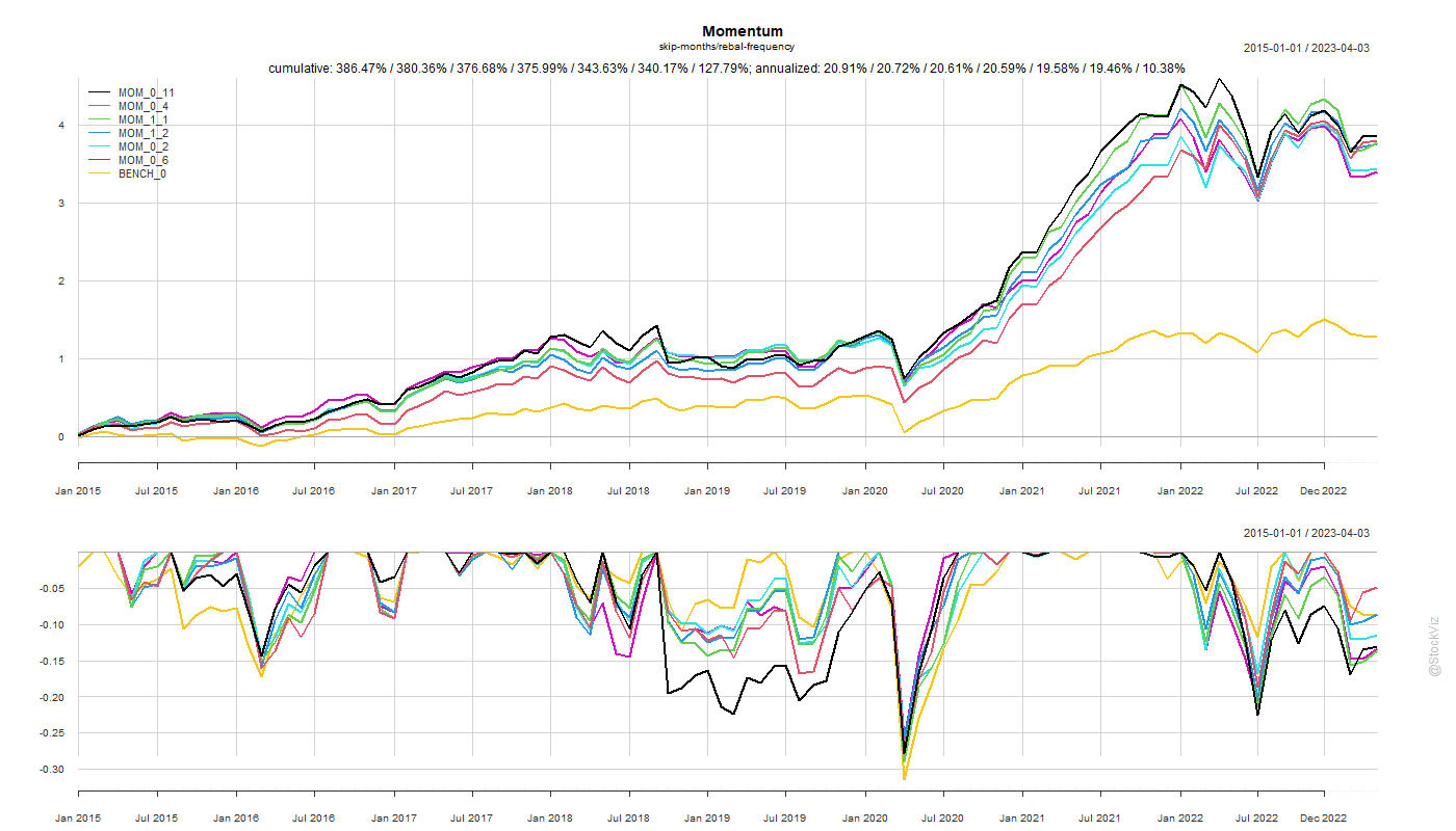
Besides, the analysis here doesn’t factor in transaction costs which would be a bigger drag on the monthly rebalance config. When you add the tax-advantage and low-cost of index funds into the mix, the current crop of momentum index funds don’t look all that shabby.
Code and charts on github.