If we had to point to one financial innovation that upended classical asset management over the last decade, it would be Exchange Traded Funds (ETFs.) At first, there were a handful of them. They were pure market cap weighted funds that mirrored a popular broad market index, the S&P 500 index for example. But over the last decade, the number of ETFs and the strategies they allow investors to access have exploded. Currently, there are over 2,200 ETFs listed in the US. Most of them are cap-weighted, some are “smart-beta”, some are traditional momentum/value, etc. But there are a few of them that are completely bonkers. Here are two of them.
The GURU ETF
Hedge funds, in the US, are supposed to disclose their holdings that cross a certain threshold to the SEC. The GURU ETF parses those filings and creates a portfolio of “highest conviction” ideas. From its website:
GURU allows everyday investors to access the high conviction investments of some of the largest, most sophisticated hedge funds in the world. Traditionally, investing with a hedge fund requires paying an ongoing 2% management fee and 20% of profits. GURU has an expense ratio of 0.75%, potentially allowing for greater cost efficiency, while providing access to hedge fund ideas.
On the face of it, it is a ridiculous idea. Hedge funds are much more than just long-only equity. Besides, the filings are done months after those funds have built a position in those stocks. So surely, it should be a disaster?
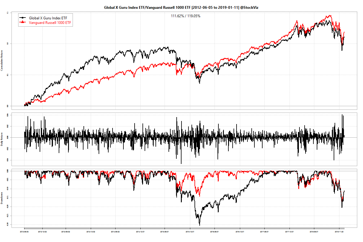
Compared to the broad-market Russell 1000 ETF from Vanguard, it is not so bad. Annualized returns for GURU and VONE were 12.09% and 13.40%, respectively. It seems to have out-performed initially then suffered a deep drawdown from which it staged a middling recovery. Is it a case of the rising tide of a bull market lifting all boats? Can’t say.
We still don’t like the idea but turns out that it was not a very bad one.
The MOAT ETF
All value investors ever want are “attractively priced companies with sustainable competitive advantages.” MOAT promises that for 48bps. Surely, it can’t be that obvious?

Annualized returns for MOAT and VONE were 12.73% and 11.67%, respectively. Back in May 2018, Elon Musk thought “moats are lame.” Not so lame, it turns out.
Epilogue
There are strong reasons for Indian investors to open a US brokerage account and diversify their holdings into dollar assets. ETFs in the US are cheap and cover a wide array of investment strategies – there are at least two for every one that you can think of. Make you move now!
Charts above were created using our Compare Tool. Check it out.