When you buy a stock, you buy a piece of business, not a quote from a broker. – Naved Abdali
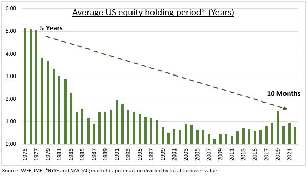
There was a time when people actually believed that buying a stock meant that you were buying a piece of the underlying business. However, we have strayed far, far away from that. The average holding period of equities keeps dropping and everything has become trading sardines.
If we are all traders anyway, why not trade with leverage? Or so goes the clarion call of brokers offering the Margin Trading Facility.
Here’s how it works:
Initial Margin: You pay a portion of the total trade value from your own funds.
Broker Funding: Your broker provides the remaining amount to complete the purchase.
Collateral: The stocks you buy are pledged as collateral to the broker.
Interest: The broker charges daily interest on the borrowed funds.
Margin Trading Facility (MTF) has become a more significant revenue stream than traditional brokerage fees. And the market has been expanding.

Judicious application of leverage, especially on low-volatility portfolios, does make sense. However, the ground reality is different. As a percentage of free-float capitalization, its mid/small-cap momentum stocks that are being financed on margin.

For example, back in August 2024, almost 75% of Motilal Oswal Nifty Smallcap 250 ETF’s free-float capitalization was financed by MTF. If a situation were to have arisen where most of the traders who had bought this on leverage couldn’t meet a margin call, the broker’s risk management team would’ve just dumped this in the market. Given the already abysmal liquidity situation of that ETF, it would have been enough to trigger a cascade of stop-losses, further dislocating the market.
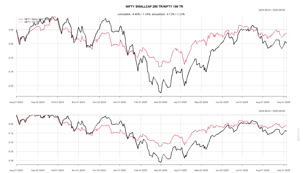
As it turned out, the index would proceed to go down 25% by March 2025.
Currently, more than 15% of Nazara – a company who’s entire business model has been legislated out of existence – is financed under MTF. I hope traders know that MTF is a full recourse loan?

As much as leverage exposes you to risk, there’s another side to this equation. Keeping track of the most leveraged stocks can help you identify margin liquidations and profit from it. However, the pain of liquidations will be felt by many but the profit will go to the few.