Author: shyam
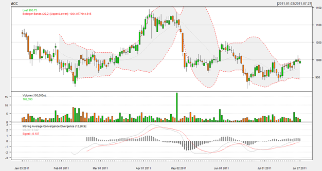
Have been experimenting with R. Will have more to share on that later. But here’s a teaser of things to come!
 The Elliot Wave Principal: Stock market averages rise in 5 ‘waves’ and fall in 3 ‘waves’
The Elliot Wave Principal (EWP) has a strong following amongst technical traders. However, nobody, including Elliot himself, has been able to explain why it works and remains an extraordinarily complex system to apply.
EWP applies to all degrees of price movements. In a 5-3 bull/bear cycle, the first 5 waves themselves are composed of smaller 5-3 bull/bear cycles, etc. So each 5-3 cycle is actually part of a larger, higher-degree cycle.
Indications

The emergence of a 5-wave impulse pattern, either upwards or downwards, indicates the direction of the long-term trend. A rising 5-wave pattern after a sharp fall would indicate further rises, while a falling 5-wave pattern after a sharp rise would indicate further loses.
Within each 5-wave movement:
- Wave 4 will not penetrate below the peak of wave 2.
- Wave 3 is often the longest, but never the shortest of the 5 waves the constitute the whole movement
- Two of the three waves will be of equal length.
Within each 3-wave movement:
- No ABC formation will ever fully retrace the preceding 5-wave formation of the same degree.
- Each correction will be at least as large and as long as all lower degree corrections that preceded it.
- Each correction tends to return to the price range spanned by a corrective wave of one degree lower (i.e., either to wave 2 or 4)
There are some variations that exist
- Failures and extensions of the 5th wave
- Diagonal triangles of the 5th wave
- The three-phase A wave during corrections
Combined with the variations, the EWP covers the complete catalogue of price movements.
This is one of a series of posts reviewing The Psychology of Technical Analysis by Tony Plummer.
There are three categories of price patterns that yield profitable signals.
Trend-line break
This signal is given when the market price level penetrates the extension of a straight line drawn through successive troughs (in a rising market) or successive peaks (in a falling market).
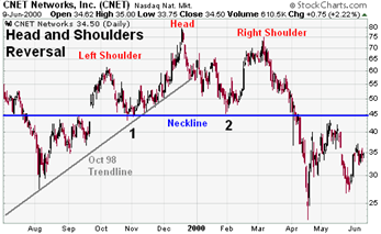
Head and Shoulders
 The H&S formation is similar in shape to a silhouette of a person’s head and shoulders. In the case of a top formation, the ‘left shoulder’ is formed by the period of price weakness just prior to the market moving to a new high; the ‘head’ is formed by the new high itself; and the ‘right shoulder’ is formed by a period of price strength just after the new height. The base of both the left and right shoulder occur at roughly the same price levels – you can draw a ‘neckline’ between the two. A sell signal is generated when prices penetrate the neckline.
Multiple top/bottom

A trading signal is generated when the price bounces away from a particular level at least twice. At market peaks, such a pattern is called the double top.
This is one of a series of posts reviewing The Psychology of Technical Analysis by Tony Plummer.
A few big themes:
- Microsoft is toast because we’re moving to a post-PC era;
- HTML5, the new web standard that allows to make interactive web pages, is going to revolutionize the media and advertising industries;
- Social is “done”, it’s now a feature, don’t go do a social startup.
via Facebook Investor Roger McNamee Explains Why Social Is Over.


