If you concentrate your portfolio, your mistakes will kill you;
If you diversify, the payoff from your successes will be diminished.
-Howard Marks
If you diversify, the payoff from your successes will be diminished.
-Howard Marks
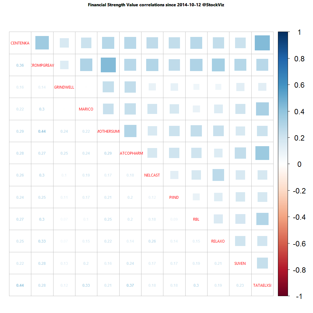
Investors can now look at the correlation (over one-year and one-month horizons) between stocks that make up an investment ‘Theme’ strategy. For example, here’s how the one-year correlation of the Financial Strength Value Theme looks like:
A lot of thick blue squares mean that positive correlations are high. Red squares mean negative correlations are high. Whites are the doldrums.
Happy Sankranti and Pongal!
