
Our previous discussion of correlation in the NSE looked at a years worth of data for the NIFTY 50 components to see how individual stocks correlated with the index. There are three ways to look at correlation:
- Highly correlated stocks can be substituted with each other. For example, if the price of stock A is highly correlated with the price of stock B (r approaching 1), then investors should be indifferent between owning A or B.
- Correlation can be used to expose relative value. For example, in the above example, if A pays more dividends than B, then owning A is better than owning B.
- Correlation as a trading tool. In the above example, say on a particular day A drops (or rises) more than B, then you can put on a trade betting on mean reversion – that ultimately A & B will start behaving similarly.
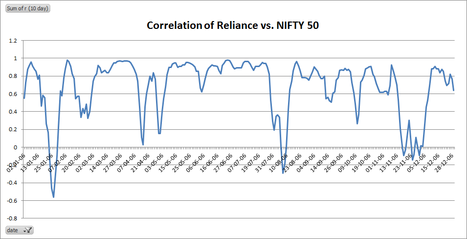
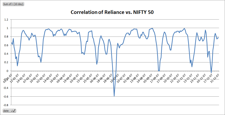
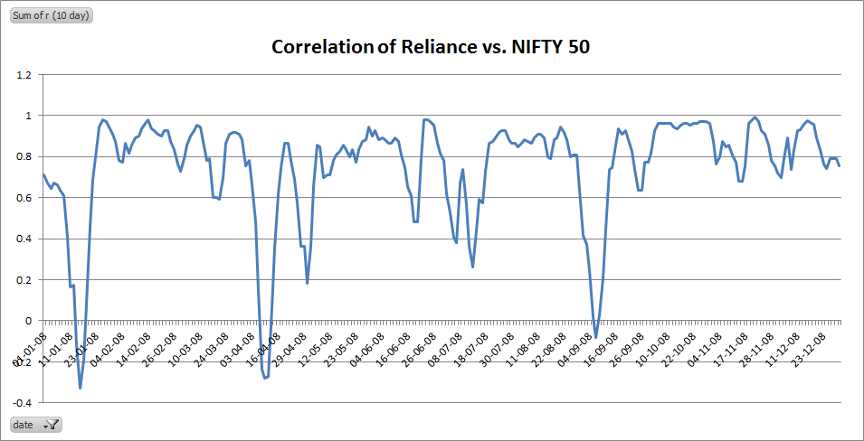
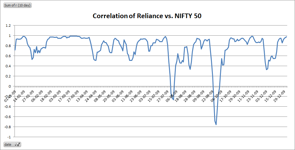
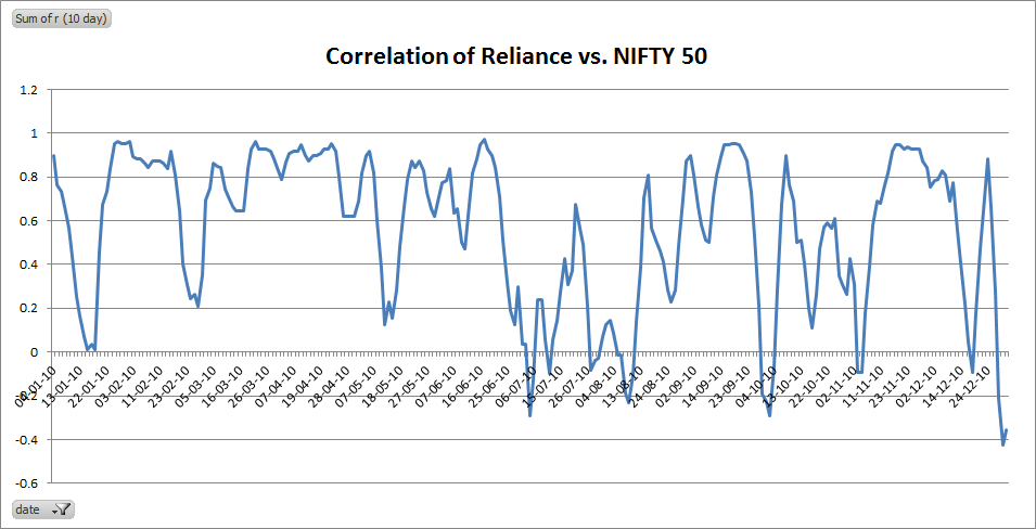
For example, lets have a look at RELIANCE over the NIFTY 50 index. I created a series of 10-day correlations (r)
For 2006:
For 2007:
For 2008:
For 2009:
For 2010:
and lastly for 2011:
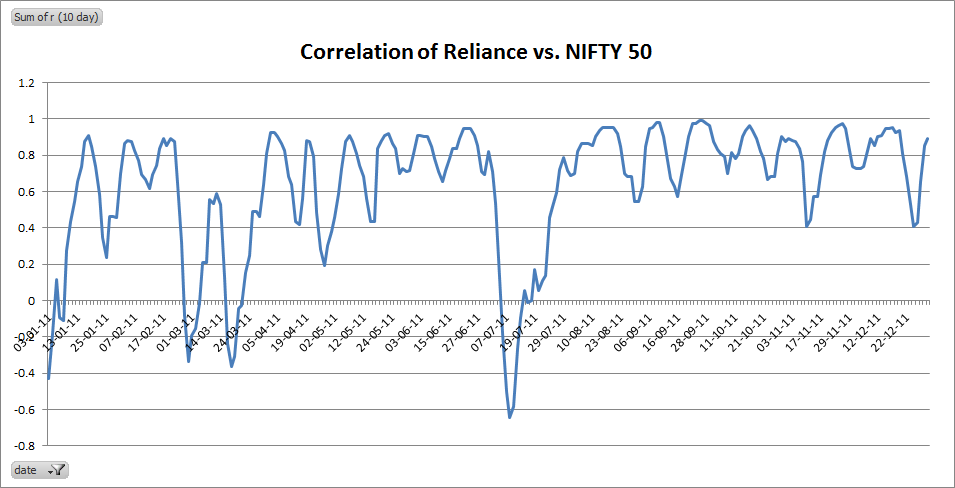
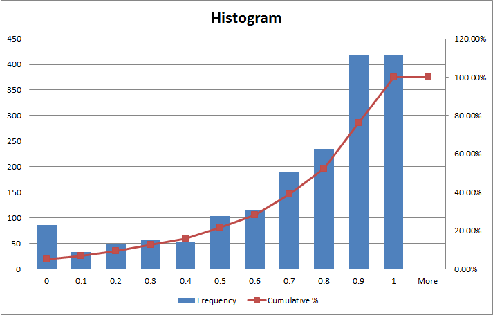
It looks like RELIANCE is usually highly correlated to the NIFTY 50 and the range is somewhere between 0.7 and 1.0. Lets have a look at the histogram to get a better idea:
You need to ignore the deviations around stock splits and dividend ex-dates (for example, on 26-Nov-2009, RELIANCE issued a 1:1 bonus so the displacement that you see surrounding that date should be ignored) to truly appreciate what’s going here.
The charts show that there are significant number of instances when the correlation breaks down but it always moves back into the range. Looks like betting on convergence seems to be a no-brainer.
Have a trade idea? Let me know!
