Tag: quant

Bank Nifty vs. HDFC Bank and ICICI Bank

We recently discussed linear regression by using it to inspect the relationship between two banking stocks. Lets try and extend that treatment to an index and its predominant constituents.

Bank Nifty

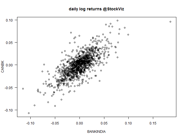
The Bank Nifty is composed of 12 bank stocks with ICICIBANK and HDFCBANK making up 29.27% and 28.26% of the index, respectively. Lets start with the scatterplot of daily log returns of the nearest to expiration futures.

bank-futures

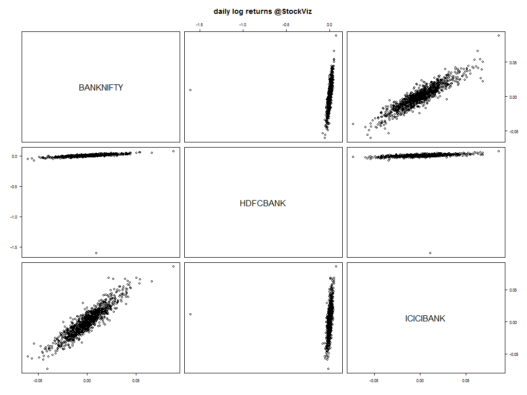
Notice the strong relationship between the index and the banks?
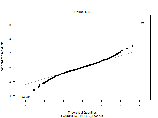
Q-Q Plots

ICICIBANK~HDFCBANK-q-q-plot

BANKNIFTY~ICICIBANK-q-q-plot

BANKNIFTY~HDFCBANK-q-q-plot

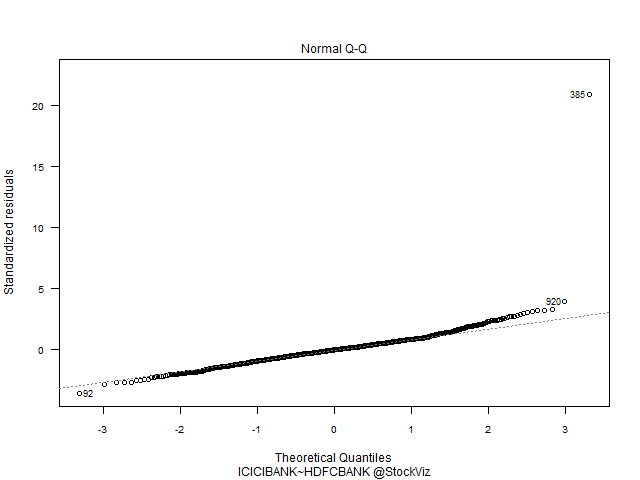
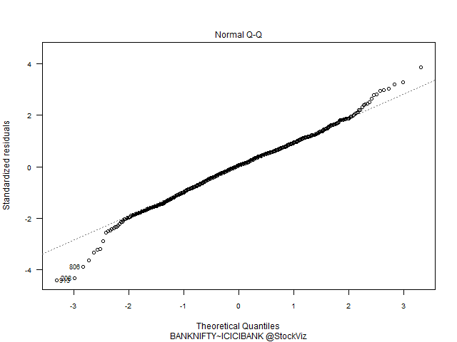
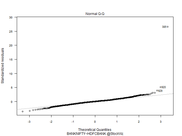
Index vs. Banks have a predominantly Gaussian distribution. HDFC vs. ICICI – not so much.

Pairs trading

With this knowledge in hand, can we trade pairs made out of these three? The rules for pairs trading is fairly straightforward:

  1. find stocks that move together
  2. take a long–short position when they diverge and unwind on convergence

The execution of a pairs trading strategy involves answering these questions:

  1. How do you identify “stocks that move together?”
  2. Should they be in the same industry?
  3. How far should they have to diverge before you enter the trade?
  4. When is a position unwound?

Bank Nifty, HDFC Bank and ICICI Bank certainly fit the criteria.

Co-integrated prices

If the long and short components fluctuate due to common factors, then the prices of the component portfolios would be co-integrated and the pairs trading strategy should work.

If we have two non-stationary time series X and Y that become stationary when differenced (these are called integrated of order one series, or I(1) series) such that some linear combination of X and Y is stationary (aka, I(0)), then we say that X and Y are cointegrated. In other words, while neither X nor Y alone hovers around a constant value, some combination of them does, so we can think of cointegration as describing a particular kind of long-run equilibrium relationship.

For a light introduction to co-integration, read this post on Quora.

To be continued…

Relationship between a pair of stocks

Linear Regression

The easiest relationship to examine between a pair of stocks is linearity. You can try and fit a linear model through their daily log returns first and then decide further course of action.

Here’s a scatter-plot that shows how Bank of India and Canara Bank could be related to each other.

BANKINDIA-CANBK

Results of linear regression:

Residuals:
      Min        1Q    Median        3Q       Max 
-0.055050 -0.009995  0.000331  0.009440  0.063258 

Coefficients:
              Estimate Std. Error t value Pr(>|t|)    
(Intercept) -0.0002843  0.0006817  -0.417    0.677    
BANKINDIA    0.7451950  0.0232860  32.002   <2e-16 ***
---
Residual standard error: 0.01638 on 575 degrees of freedom
Multiple R-squared:  0.6404,    Adjusted R-squared:  0.6398 
F-statistic:  1024 on 1 and 575 DF,  p-value: < 2.2e-16

After fitting a regression model it is important to determine whether all the necessary model assumptions are valid before performing inference. If there are any violations, subsequent inferential procedures may be invalid resulting in faulty conclusions. Therefore, it is crucial to perform appropriate model diagnostics.

Residuals vs. Fitted

Residuals are estimates of experimental error obtained by subtracting the observed responses from the predicted responses. The predicted response is calculated from the model after all the unknown model parameters have been estimated from the data. Ideally, we should not see any pattern here.

BANKINDIA-CANBK-1

BANKINDIA-CANBK-3

Q-Q Plot of Residuals

The QQ Plot shows fat tails.

QQ plot BANKINDIA-CANBK-2

Residuals vs. Leverage

The leverage of an observation measures its ability to move the regression model all by itself by simply moving in the y-direction. The leverage measures the amount by which the predicted value would change if the observation was shifted one unit in the y-direction. The leverage always takes values between 0 and 1. A point with zero leverage has no effect on the regression model. If a point has leverage equal to 1 the line must follow the point perfectly.

Labeled points on this plot represent cases we may want to investigate as possibly having undue influence on the regression relationship.

BANKINDIA-CANBK-4

Conclusion

A linear model on daily log returns may not be the best way to understand the relationship between the two stocks. We can either change the model (linear) or change the attribute (daily log returns) that we are using.

To be continued…

Source: Model Diagnostics for Regression

Nifty Statistical Study

Returns vs. Log Returns

We had discussed how the most important assumption in finance is that returns are normally distributed. Also, the benefit of using returns, versus prices, is normalization. All your variables are now on the same scale and can be compared easily. But if you pick up any book on financial statistical modelling, you’ll run into log returns more often.

nifty-daily-returns

nifty-daily-log-returns

As you can see from the charts above, visually, they don’t make a difference. However, taking the log of returns makes the math easier:

  1. If we assume that prices are distributed log normally, then log(1+ri), where ri is the ith period return, is normally distributed. And we know how to work with normal distributions.
  2. When returns are very small, log(1+ri) ≈ r
  3. Calculating compounding return goes from series multiplication (∏) to series summation (∑).

nifty-histogram

nifty-log-histogram

Quantiles

The easiest way to summarize a frequency distribution is through quantiles. Quantiles are values which divide the distribution such that there is a given proportion of observations below the quantile. For example, the median is a quantile such that half the points are less than or equal to it and half are greater than or equal to it.

Raw-returns (%):

1% 5% 25% 50% 75% 95% 99%
-4.1986 -2.4994 -0.6992 0.0967 0.8585 2.4387 4.4465

Log-returns:

1% 5% 25% 50% 75% 95% 99%
-0.04289 -0.0253 -0.0070 0.0009 0.0085 0.0240 0.0435

Q-Q Plot

Once we know the qunatiles of our log returns, we can compare it to that of a normal distribution. When you plot the quantiles of the sample (Nifty daily log returns) to the quantiles of a theoretical normal distribution, you get a visual feel for the outliers – the fat tails.

nifty-log-returns-normal-qq-plot

This plot shows that both tails are heavier than the tails of the normal distribution. So, although using log returns and assuming that prices are distributed log normally makes the math easier, we should always be aware that it is a sleight of hand.

To be continued…

Sources:

Understanding Nifty Volatility

Definition

Volatility (σ) is a measure for variation of price of a financial instrument over time. Historic volatility is derived from time series of past market prices. There are different ways of calculating volatility. At StockViz, we use Yang Zhang Volatility.

σ is one of the biggest contributor of option premiums. Understanding its true nature will help you trade it better.

Volatility spikes

Observe the volatility spikes since 2005. Even though the average is around 0.3, its not uncommon to have huge swings.

nifty-volatility

Fat tails abound

nifty-volatility-10-histogram

nifty-volatility-20-histogram

nifty-volatility-30-histogram

nifty-volatility-50-histogram

Trading strategy

Always try to be on the long-side of volatility. It might be tempting, while trading options, to try and clip the carry on θ-decay. But you should always be aware of the fat-tails of volatility that can crush many months of carry P&L overnight.

The most important assumption

Prices and Returns

Prices don’t follow a statistical distribution (they are not ‘stationary’.) There is no obvious mean price and it doesn’t make sense to talk about the standard deviation of the price. Working with such non-stationary timeseries is a hassle.

NIFTY 2005-2014

But returns, on the other hand, are distributed somewhat like a normal (Gaussian) distribution.

nifty-histogram

And there doesn’t seem to be any auto-correlation between consecutive returns.

nifty-autocorrelation

If returns are normally distributed, then how are prices distributed? It turns out that the logarithm of the price is normally distributed. Why? Because

returns(t) = log(price(t)/price(t-1))

Now statisticians can magically transform a random time-series (prices) into something that is normally distributed (returns) and work with that instead. Almost all asset pricing models that you will come across in literature has this basic assumption at heart.

Fat tails

The assumption that returns are normally distributed allow mathematically precise models to be constructed. However, they are not very accurate.

In the normal distribution, events that deviate from the mean by five or more standard deviations (“5-sigma events”) have lower probability, thus meaning that in the normal distribution rare events can happen but are likely to be more mild in comparison to fat-tailed distributions. On the other hand, fat-tailed distributions have “undefined sigma” (more technically, the variance is not bounded).

For example, the Black–Scholes model of option pricing is based on a normal distribution. If the distribution is actually a fat-tailed one, then the model will under-price options that are far out of the money, since a 5- or 7-sigma event is much more likely than the normal distribution would predict.

Precision vs Accuracy

When you build models, the precision that they provide may lull you into a false sense of security. You maybe able to compute risk right down to the 8th decimal point. However, it is important to remember that the assumptions on which these models are build don’t led themselves to accuracy. At best, these models are guides to good behavior, and nothing more.

accuracy vs precision

Sources:
Fat-tailed distribution