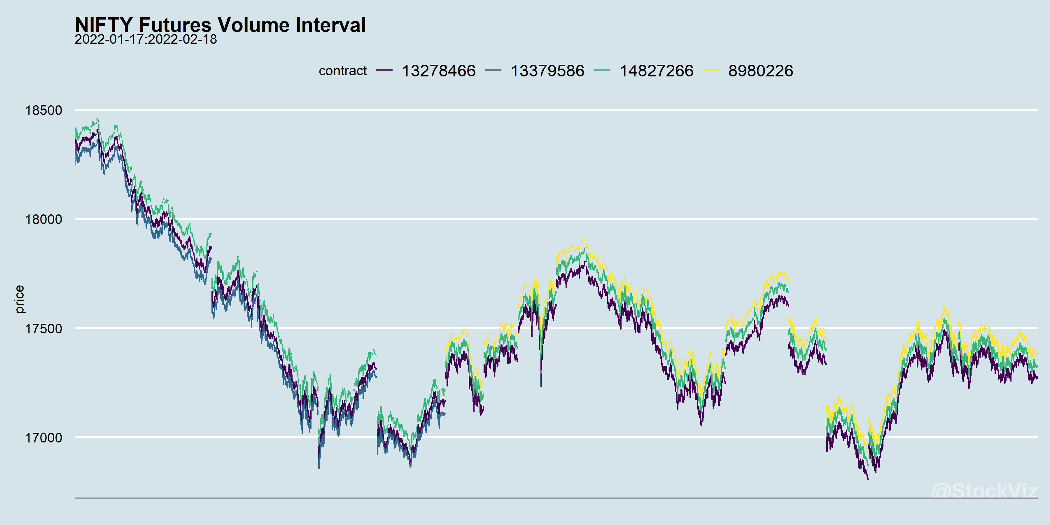
Our previous post showed how a chrono-clock frequency can be translated into a volume-clock frequency. The aggregated High-Low price data looks very similar to a candle-stick chart.
The difference between the high and the low on each “candle” of the longest living contract doesn’t vary a lot between the two clocks.
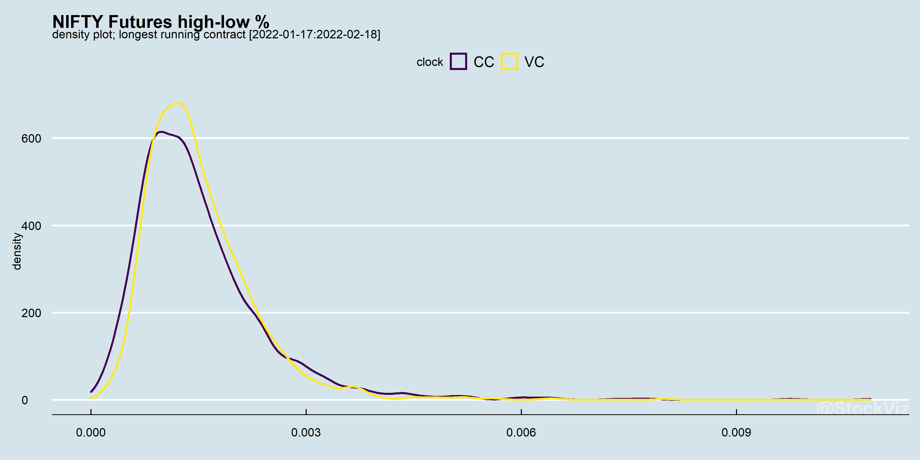
The distribution is based on a month’s worth of streaming data. As we accumulate more data points, it is likely that the divergence between the Chrono-Clock and the Volume-Clock increases.