On StockViz, we have over 50 quantitative models that are available for investing. They all have different risk and return profiles. It is fairly simple to pull up, say, the Sharpe Ratio of a particular model by navigating to its home page. However, it doesn’t say how it compares to all the other models we have going.
Let’s say you are looking to invest in one of our “Rapid-fire” Momo strategies. Our oldest ones are Relative, Velocity and Acceleration. Their (gross) performance metrics are displayed in a table.
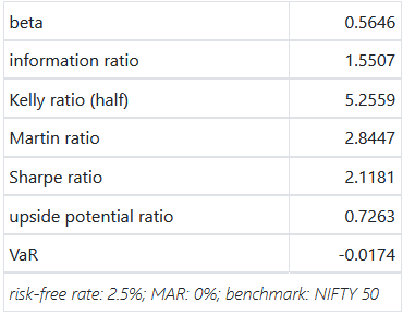
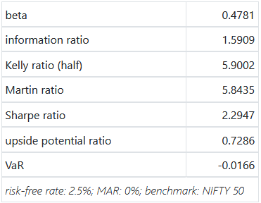
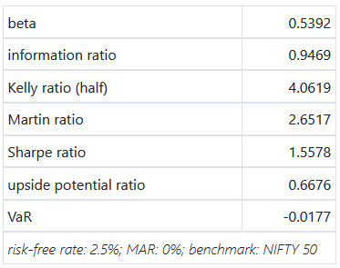
If you add net performance metrics into the mix, you’ll end up with a combinatorial explosion. How do you pick the “best” one of them to invest in?
Enter Radar Charts.
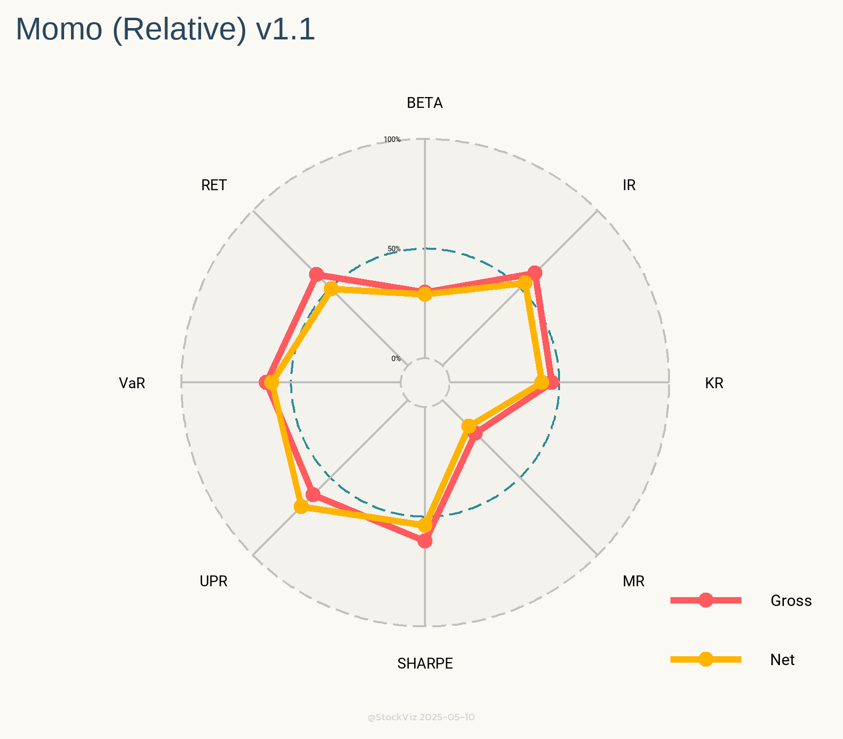
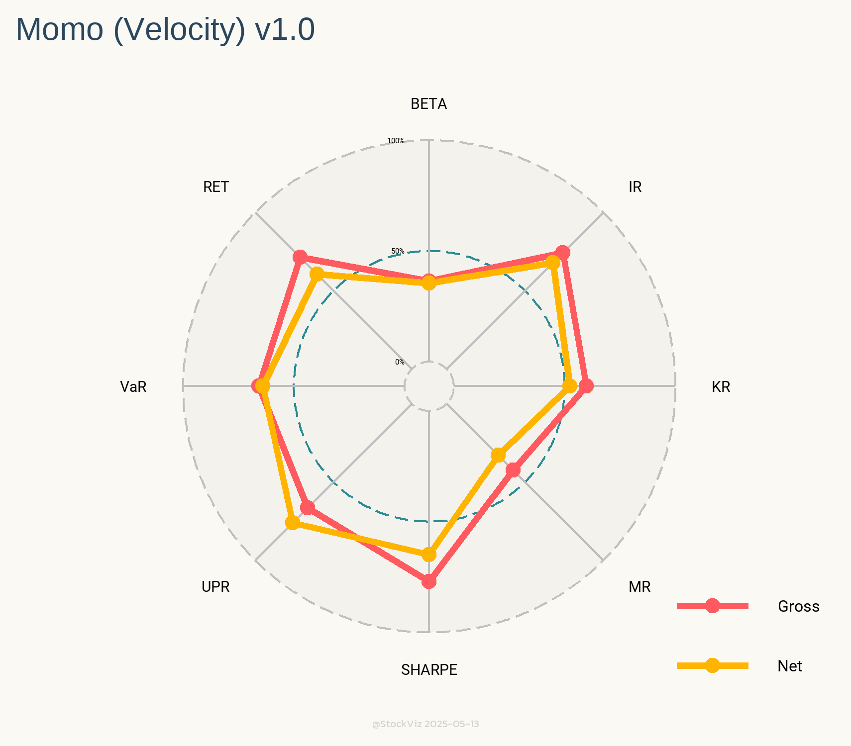
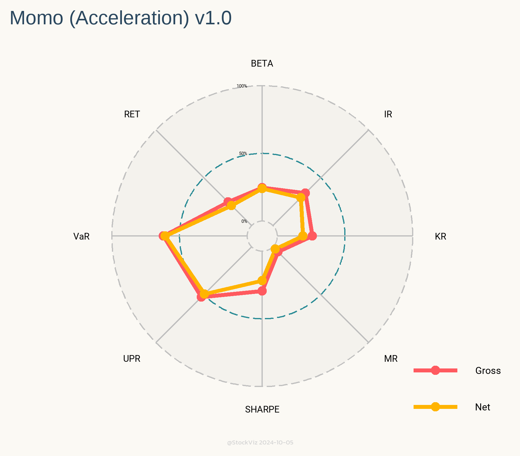
These charts show you the relative rank of each of these models against all the other 50+ models we have going. Intuitively, larger the area under the yellow (net) lines, better the model.
The only caveat with these Radars is that you should compare them against models of similar vintage. For example, we went live with our All Star momentum model in May 2020. Since then, the market regime has been extremely favorable to momentum strategies. It should come as no surprise that its Radar looks like the Queen’s Crown.
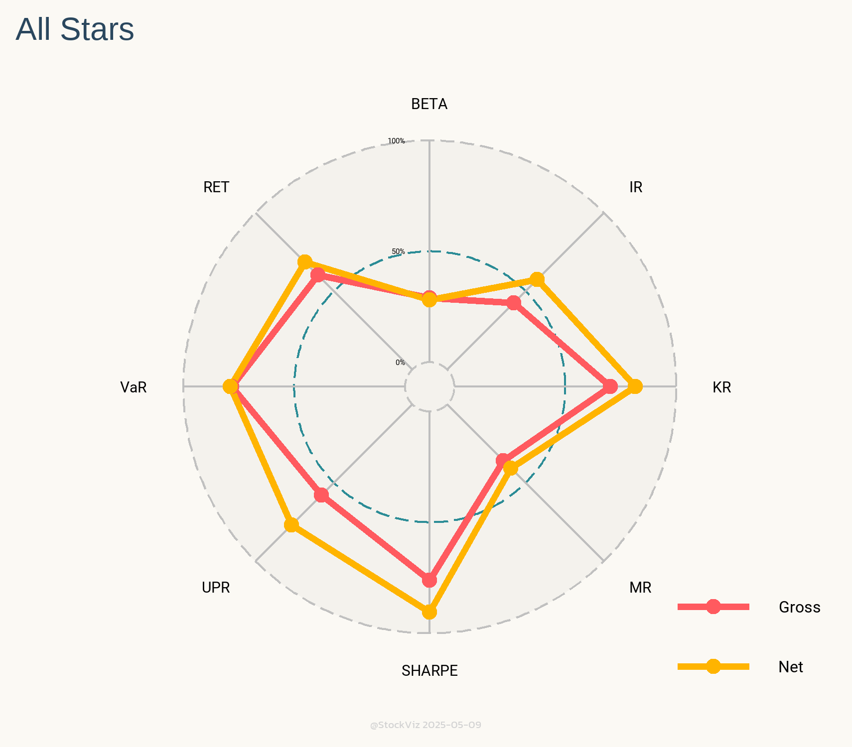
With that caveat out of the way, Radars are a great way to visualize how models square up against each other.