In our previous post, we discussed how you can use a Nifty May 6600/6750 Long Put Spread to express a bearish view. However, the payoff diagram, only shows the P&L at expiry. The underlying can take a completely random path towards that payoff, impacting your daily mark-to-market.
Visualizing θ
One way to visualize it to keep all inputs to the model the same and compute the prices of the the options at different price points. Additionally, you can also plot historical values of your spread to give you an idea of where they are at.
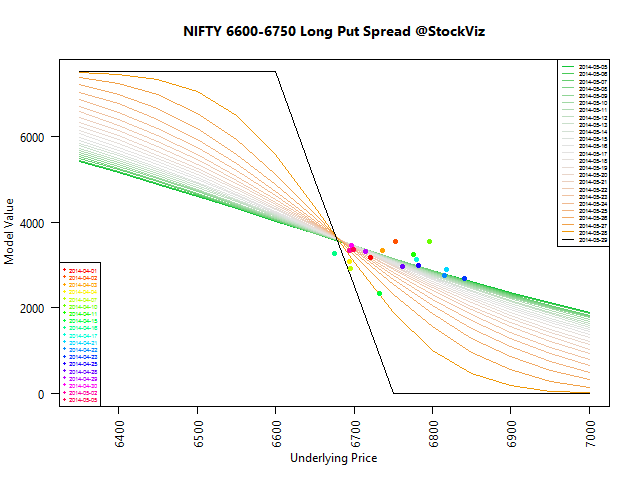
Note: y-axis is not P&L
As you can see, its only at the very end of the spread’s life that its model value gets pulled towards the values shown in the payoff diagram. This is largely due to θ-decay.
Takeaways
If you are in-the-money on your spreads, then it makes sense to keep the position open till expiry. Most of the gains are accrued at the fag-end of the term.